The Mystery of Mac OS’ Mangled Image Interpolation Implementation

Here in Userlandia, I’m talking rainbows, I’m talking pixels.

Bugs. Glitches. Unintended consequences. Computer software, like everything made by us imperfect humans, is full of imperfections of its own. When weird things happen, most people just mutter and/or swear. But I'm one of the few who feels compelled to learn why. When there’s something strange in the Network Neighborhood, I’m the one you called. But there’s nothing supernatural about software. Computers do exactly what they’re told, like a vexatiously literal genie. It’s not always obvious why bad things happen to good programs. And, as with any whodunit, they may only be obvious in retrospect.

One such mystery crossed my path back in June. I ran into an interesting thread on one of my usual Mac haunts: Ars Technica’s Macintoshian Achaia forum. Forum user almops was having a weird problem with Keynote. When a specific PDF was placed into Keynote, its contents—a series of colored squares—became a smooth rainbow gradient! Don't get me wrong, rainbows look cool, but they're not helpful when you need distinct solid blocks of color. The PDFs in question had been created by a  suite of command line apps called generic-mapping-tools, or GMT, which generates maps and map accessories… like color bars. Almops said Adobe Acrobat displayed the PDF correctly, as did Chrome, and PDF viewers on other operating systems. Anything Apple, on the other hand—be it iWork, Preview, or Safari—displayed those color blocks as a gradient, ruining his presentation.

When I saw that thread, I knew I had to tackle the mystery. It’s the kind of obscure problem that calls for my very particular set of skills, skills I acquired over a long career. For fifteen years I worked for OEMs in the graphic arts industry—more specifically, in workflow software. These applications do the hard work of managing color, rasterizing vectors, and compositing transparencies so designs can be put on paper, film, or plates. I was part of the QA teams for these companies, where I designed features, sniffed out bugs, and figured out why things go sideways. This wasn't the first time I've seen an interpreter mangle something beyond recognition, but there's almost always a way to work around it. I requested a copy of the problem file, and almops sent along both the PDF they imported into Keynote and the PostScript file used to generate said PDF. Concealed in those files was code that could clarify this this calamitous conundrum of colorful confusion. Time to put on the deerstalker cap and do some old-fashioned detective work.

Layers of Quartz

This mystery revolves around Quartz, the display engine at the heart of Apple’s operating systems. Every copy of Mac OS (and iOS) uses Quartz to draw and composite on-screen graphics. The special thing about Quartz is that its programming model is based on PDF. That's why Mac OS applications can import PDFs into their documents without needing to roll their own PDF import routines. This is a legacy inherited from Mac OS X’s predecessor, NeXTSTEP. Though Mac OS’s Quartz is very different from NeXT’s Display PostScript, both systems are designed to bring the flexibility and fidelity of a print-oriented graphics model to a computer display.

Display PostScript had a lot of intricacies and gotchas—and I’m not even talking about the licensing fees. NeXTSTEP’s window server was a Display PostScript interpreter which executed PostScript code to update the display. When NeXTSTEP was remodeled into Mac OS X, Apple replaced Display PostScript with the Quartz display model. Quartz isn’t just a renderer—it’s a complete technology stack. One facet is Quartz 2D, better known today as Core Graphics. Quartz 2D is the graphics framework that does the hard work of drawing and rasterizing the contents of your windows. Those graphics are then passed on to the Quartz Compositor—also known as Mac OS’ Window Server—which composites all the windows together into a complete computer display.

Separating rendering from compositing was the trick that let Mac OS X build compatibility for legacy graphics and lead us into the future. Now the OS could easily combine the results of very different graphics APIs. Quartz 2D and the Cocoa framework was the way of the future but apps built using the Carbon framework could carry over QuickDraw routines from classic Mac OS. QuickTime and OpenGL could render video and 3D graphics. Quartz Compositor combined the results from all these graphics libraries into one coherent display. Another advantage of this model was its extensibility—new libraries and APIs could be added without reinventing the entire display model, something that was very difficult to do in classic Mac OS.

An average user on the web might say “I’m not a developer. Why should I care what Quartz 2D can do for me?”  Well, being able to print anything to a PDF file in Mac OS without shelling out big bucks for a copy of Adobe Acrobat Pro is pretty big. So is being able to import a PDF into almost any application. Since PDF is a superset of PostScript, it’s still code that needs to be interpreted by something to display a result. That something could be a viewer application, like Adobe Acrobat, PDFPen, or PDF Expert. It could be an editor, like Callas PDFToolbox, Markzware FlightCheck, or Enfocus Pitstop Pro. Or it could be a renderer, like Adobe PDF Print Engine, Global Graphics Harlequin, or Quartz 2D.  Because PDF is a codified standard, all of these applications adhere to the rules and principles of that standard when interpreting PDFs. Or, at least, that's what's supposed to happen.

An example of banding.

An example of banding.

Almops’ PDF problem was perplexing, that’s for sure. My first theory was a blend detection bug. Making gradients in older versions of PostScript and PDF wasn’t easy. In PostScript Level 1 and 2, gradients were built from an array of paths of varying color values. Think of it like arranging a series of color slices that, from a distance, look like a smooth gradation. There were a lot of problems with this, of course—too many slices, and the interpreter would run out of memory or crash. Not enough slices, and it would show hard color edges instead of a smooth blend. This is called banding, and it looks really awkward. Most interpreters detected these arrays as blends and post-processed them to improve their smoothness. Since the introduction of PostScript Level 3, making a gradient in an application is super easy. Set the start and end points along with the number of colors in-between, and ta-da—your PDF or PS file has an actual gradient object called an shfill. But there’s still plenty of old-school level 1 and 2 blends out there, and maybe that's what Quartz thought almop’s color bar was.

This theory was quickly disproven when I used Pitstop Pro’s inspector to examine individual objects. I discovered that they weren’t a series of fills, but an image! This couldn’t be—what would cause an image to transform into a gradient? An image should just be an image! Unlike a vector object, which needs to be rasterized, an image is just a series of pixels! All it needs is scaling to render at the appropriate size. What could possibly have happened to transform these chunky blocks of color into a smooth gradient?

I needed to look closer at the image’s details. I’m not talking about zooming in—I wanted to see the metadata attributes of the image. Once again, it's Pitstop’s inspector to the rescue. It was an RGB image, eight bits per pixel, and four inches tall by four tenths of an inch wide. In pixels, it was ten pixels tall by one pixel wide, giving an effective DPI of about two and a half... wait, what? ONE pixel wide?! I opened the image in Photoshop, and confirmed the ghastly truth: Almops' image was a single pixel wide. At one pixel wide by ten pixels tall, each pixel was a single block in the color bar. The rainbow, I realized, was the result of Keynote upscaling the lowest-resolution image possible.

Resolving Power

Why does resolution matter? If you’ve ever taken a photo from a random website, sent it your printer, and been horrified by its lack of sharpness, congratulations—you’ve fallen prey to a low-res image. Computer displays historically have low resolution compared to printers, much to the consternation of graphic designers, typographers, tattoo artists, cake decorators, or anyone who just wants a high-fidelity image. An image designed for screens doesn't need as much pixel resolution as one that's going to be printed, because screens can't resolve that much detail. Files used for printing often require three to four times the resolution that your monitor is capable of displaying! So how can we put a high resolution image in a page layout or drawing application, and be sure it’ll be printed at full resolution?

That's where device-independent page description languages like PostScript and PDF come in. These languages bridge the gap between the chunky pixel layouts of a display and the fine, densely packed dots of a printer. By describing the logical elements of a page—like shapes, text, and images—as a program, PostScript and PDF abstract away messy device dependencies like pixel grids. It’s up to an interpreter to rasterize PostScript or PDF objects into a format the device can understand.

Some PostScript code describing an image. An interpreter must parse this code to render it for an output device.

Remember, pixels don’t tell you anything about the physical size of an image. How big is a six-hundred-by-six-hundred-pixel image, for instance? On a six-hundred-DPI printer... it's one square inch. One very crisp and sharp square inch, because your eye can't see the individual pixels. But if you opened that same image on a one-hundred DPI computer monitor, it would display at six inches by six inches... with very obvious individual pixels. So if you wanted it to show as one square inch on both the monitor and the printer, there has to be some way to tell both the computer and the printer how large the image should be.

Well, that way is the DPI value. Take that same six hundred by six hundred pixel image mentioned earlier, set its DPI to three hundred, and a page layout application will size it at two inches by two inches. A printer will also know that image should be two inches by two inches, and it'll paint the source pixels into the device pixels, after which ink pixels will embed themselves into paper pixels, so that you can look at it with your eyeball pixels. We could scale the image up or down, but that will make the DPI go down or up. The more pixels you can pack into the same area, the sharper the image will look when printed. This isn't the same as making it bigger. If you make the image bigger but don't have more pixels to back that up, you won't get more detail no matter how many times you yell ENHANCE at the computer. 

Given the barely-there resolution of almops' image, I wondered what would happen if it got a bit of help. I opened the image in Photoshop and resampled it to 100x1000, using the nearest neighbor algorithm to preserve its hard pixel edges.  I saved my edits, updated the PDF, and reopened it in Preview. The gradient was gone! I was greeted with a nice column of colors that looked just like the original file did in Acrobat. Case closed, mystery solved! I posted a theory for the rainbowfying in the thread:

My guess is that when Quartz sees images like this, it has a special handling exception. Quartz creates a replacement true gradient blend with those pixels as the control points of the blend. My hunch is that this is used somewhere in Quartz for UI drawing performance reasons when using small raster elements, and because Preview is a Quartz renderer, well...

Trust me—if you eat, sleep, and breathe Mac graphics software, it almost makes perfect sense. No other viewer was doing something like this, so Quartz had to be doing something special and unusual. I even helped almops tweak their software to output a file that would never rainbow again—but we’ll come back to that later.

Objection!

As the weeks went by, I gradually lost confidence in this theory. I just couldn’t shake the feeling that there was a simpler explanation. The gradient shortcut theory sounded right, yes, but what evidence did I actually have? After all, the first version of Quartz was PDF version 1.4 compatible, and PDF had added support for gradient shfill objects back in PDF version 1.3. Why, then, would Apple use one-pixel strips as a shortcut for gradient generation? That didn’t make any sense. What was I missing? I had to reopen the case, reexamine the evidence, and figure out the truth.

What’s the piece of evidence that will blow this case wide open?

I compared myself to Holmes earlier, and maybe that was wrong too. No, maybe I’m more like Phoenix Wright, from the Ace Attorney games. Ace Attorney is about finding contradictions. You comb through crime scenes, present your evidence, and examine witness testimony. Even when you think you’ve found the culprit, your reasoning and deductions are constantly challenged. I had to accept that my initial conclusion could be wrong and look at the case from another angle—just like Phoenix Wright.

I recalled some complaints that Mac OS’ Preview application made certain images look blurry. Could that be related to the rainbow gradient problem? I opened a PDF file containing some classic Mac OS icons—first in in Preview, then in Acrobat Pro. These icons were only 32 pixels by 32, but they were scaled up to fill a page. Acrobat displayed clean, sharp pixels while Preview was a blurry mess—a tell-tale sign of bilinear interpolation. I opened that one-pixel-wide color-bar image and resampled it to 100 pixels by 1000, but this time I used the bilinear algorithm. The result was a familiar rainbow. That’s when it hit me—Preview wasn’t using a nearest neighbor or matrix transformation, it was using a bilinear algorithm to smooth out the color values! How could I have missed this? It was right there the whole time! I sure hope somebody got fired for that blunder.

The last piece of the puzzle was to check if Quartz 2D was in fact modifying the image contents,  or just displaying them with a filter. I dumped Quartz 2D’s output to a PDF file, using Mac OS’ built-in print to PDF function. I cracked the new file open with BBEdit, and scrolled to the image dictionary to examine the code. The image was still defined as one pixel wide by ten pixels tall, and it was still the same physical size. But there was a new wrinkle: when Preview interpreted the PDF, it added the interpolate flag to the PDF’s code and set it to true. I opened this new file in Acrobat Pro, and sure enough, there was a rainbow gradient instead of solid blocks of color. I’ve cracked the case, just like Phoenix Wright when—spoiler for the tutorial—he realized the clock wasn’t three hours slow, but nine hours fast! Cue the dramatic courtroom music.

Interpolation Interpretation

I hadn’t thought about the interpolate flag in years! But Quartz 2D is a PDF interpreter, and I should’ve known it was a possibility. Because PostScript and PDF are device independent, it’s up to the interpreter to scale the source pixels of the original image to the appropriate device pixels. Almops’ color bar consists of ten color swatches, each made of one image pixel and physically sized at four tenths of an inch. When viewed on a 100 DPI computer monitor, it would take forty device pixels to render one of those image pixels at the requested size. So where do all these new pixels come from?

Why, the computer makes them up, using the PIDOOMA method: Pulled It Directly Out Of My... uh, Algorithm. To scale one image pixel to forty device pixels, the PostScript or PDF interpreter uses a matrix transformation. Think of it like the paint bucket tool in an image editor—the interpreter samples the nearest source pixel’s color values and paints those values into the required device pixels. The interpreter calculates all the necessary values with a simple function that consumes a minimal amount of CPU cycles. Sounds great, doesn't it—but that efficiency has a cost, and the cost is image quality. If you've ever resized an actual photo using Photoshop's nearest neighbor algorithm, you know what I mean. When upscaling, continuous tone images like photographs look blocky or show jagged edges. When downscaling, fine details are smudged out, and you can get artifacts like moiréthat weird screen-door effect in repeating patterns.

To solve these problems some very smart mathematicians invented resampling algorithms to smoothly resize raster images. If you've ever looked at what Photoshop's menus actually say, you might recognize terms like nearest neighbor, bilinear, and bicubic—they’re all different ways of filling in those missing pixels. Nearest neighbor is great for images that need hard edges, like retro video game sprites, but as mentioned earlier, it’s not great for images that need smooth color transitions. Bilinear is better for continuous tone images because it interpolates two nearby pixels to create smooth color transitions. Bicubic is even better for photos because it uses four adjacent pixels, creating a sharper image at the cost of more processor power. Wouldn’t it be cool if the printer’s interpreter could apply these fancier algorithms when scaling images to print them, so you wouldn't have to open Photoshop every single time? Then all our photos would be as smooth as the music of Steely Dan!

Downsampling comparison

The original image has been downsampled using nearest neighbor and bicubic methods. Notice the lack of jaggies on the bicubic example.

Adobe heard the demands for smoothness. They released the new and improved PostScript Level 2 in 1990, which added support for color graphics. Level 2 also added countless improvements for image objects, like the interpolate flag. Setting an image dictionary’s interpolate flag to true tells the interpreter to resample the image using a fancier algorithm like bilinear or bicubic. Even if your file had the flag set to false, you could override it at any time if the interpreter had options like “enable image smoothing.” Or the renderer could just ignore the flag entirely. The PDF and PostScript specs grant a lot of leeway to the interpreter in how it, well… interprets the interpolate flag. To wit, the PostScript Level 3 reference guide has this note at the end of interpolate’s definition:

Note: the interpolation algorithm is implementation-dependent and not under PostScript program control. Image interpolation may not always be performed for some classes of image or on some output devices.

A similar note can be found in the PDF reference guide.

NOTE: A conforming Reader may choose to not implement this feature of PDF, or may use any specific implementation of interpolation that it wishes.

This explains the difference between Adobe Acrobat and Apple’s apps. Acrobat obeys Adobe’s default spec. if the image object lacked the interpolate flag, Acrobat wouldn’t apply any fancy algorithms when upscaling the image. When set to true, Acrobat applies a bilinear interpolation, which averages the values of adjacent pixels together when scaling the image. This blurs the single pixel values together and creates—you guessed it—a smooth rainbow gradient.

Acrobat respecting the PDF interpolate flag.

The original PDF file didn’t have any interpolate flags set, but Preview interpolated all images anyway—which, as per the reference guide, it's completely allowed to do. But what if I set the flag to false? I opened almops’ original PDF in BBEdit, added an interpolate flag with a value of false, saved it, and reopened the file in Preview. No dice—it was the same old rainbow gradient. Preview doesn’t care if it was missing or false—it will always interpolate.

I should’ve expected as much because Apple frequently uses interpolation in its own apps. Keynote, Numbers, and Pages apply interpolation to any images placed in your documents. Same goes for using Preview to view PDFs with embedded images. Images in Safari are interpolated when they’re scaled, usually because they lack high-res alternates. Parts of the operating system are constantly scaling, like growing icons in the Dock or dynamically scaled windows in Mission Control. Without interpolation, all those actions would be a rough, jagged mess. But does it make sense to always interpolate images in apps like the iWork suite? After all, look what happened to almops. Luckily, there is a way for almops to create PDFs that won’t go all rainbow in Keynote.

The Fix is In

If this was a one-off problem that wasn’t likely to happen again, I would just edit the image in the PDF, resize it with nearest neighbor to 100x1000 pixels, save the file, and call it a day. But that would just be a band-aid—I wanted a cure. After some research, I found a promising solution. Remember back at the beginning I mentioned that these color bars were created by a program called GMT, or generic-mapping-tools. GMT is an open source library of command line tools for generating maps and map related graphics, and a major feature is its scriptability. Unlike iWork or Preview, GMT has a lot of knobs to turn.

I knew nothing about GMT, so I Googled “GMT psscale options” and the first hit was the command’s official documentation. Turns out that there’s a flag for psscale that determines how it writes out the color bar! Everything hinges on the -N flag and its arguments. The first helpful argument is P. When the P argument is called, psscale draws the color bar components as a series of vector squares instead of as an image. This is the perfect solution for this scenario because vector objects are paths made out of points connected by curves or lines. Because they’re math and not pixels, vectors are infinitely scaleable, and drawn at the device’s output resolution.

So if this option is available, why would you want to generate a color bar as an image? GMT recommends using an image for gradients—my guess is that they don’t write smooth shades as shfill objects. Luckily, the other flag is DPI, which does exactly what you think it does. When set, psscale will generate the image at the requested effective DPI. So if you need an image, you can set -N[600] and it’ll generate the color bar at 600 DPI. Some interpreters also handle color management on raster versus vector objects differently, but that's a problem for its own episode. Lastly, if you’re using GMT’s Modern mode and you stumble upon this same problem, the same -N flag and arguments exist for the colorbar command.

The Final Cut

Well, there it is. Mystery solved—at least, for almops. I’d still like to talk to whoever it was at Apple who decided to force all images to interpolate in most of their own apps without small image exceptions. I know, I know—exceptions are a rabbit hole that’ll leave somebody unhappy. If I were to file a bug radar or feedback about this behavior, it’ll likely be closed with a “works as designed, won’t fix.” An anticlimactic end to an otherwise enjoyable investigation.

No matter how strange or inexplicable, there’s always a rational explanation—or, at least, an explanation—for why a piece of software behaves the way it does.  Even the gnarliest of bugs—the ones that crash your computer and ruin your day—can be explained. It only takes the will to decipher the clues, and maybe a little stack tracing. What separates a bug from a glitch or unintended consequence? To someone unfamiliar with the fiendishly clever intricacies of software development, almops’ rainbow problem seems like a bug. Show the rainbow problem to a developer or product manager, and you'd get a different answer.

That’s why some of your software annoyances can hang on for so long. In the case of Preview and other Apple apps, they decided that always-on interpolation provides the best image quality for photos, which is what most images are. And you know what? I agree with them! Photos are the most common type of image, by a longshot. The only flaw in Apple's plan is that you can't turn it off when it doesn’t work. A few users complaining about the occasional blurry image, versus a lot of users complaining about jaggies and moiré, isn’t a hard choice. That's not to say that the occasional blurry image isn't something to be disappointed by—but that's the thing about compromises: they don't make everyone happy.

But this time I don’t have to worry about convincing some PM that their decision is a problem. There’s something nice about figuring out a computer mystery without job-related stakes. Yes, Preview’s still going to interpolate images even when it’s a bad idea, and I can’t change that. But I managed to solve the mystery and supply a solution to prevent it from happening again. As far as I’m concerned, my job is done. Now only if Preview could interpolate an end to this episode…

Aldus PageMaker 4.0 for Windows - Nifty Thrifties

It wasn’t that long ago that you could find all sorts of big box PC software at the thrift store. But as the years go on, it gets rarer and rarer. People who don’t know about the collector’s market just toss old software in the trash. People who do know about the collector’s market are putting anything remotely interesting on eBay, which cuts into the number of bargain finds. It’s still worth the effort, though, because interesting items cross my path now and again. Luck was on my side in October when I found a boxed copy of Aldus PageMaker at a thrift store in southern New Hampshire. I brought home a piece of my career history for the cool cost of four dollars—a fraction of its original MSRP.

PageMaker found in store.

It belongs in a computer museum!

I first encountered PageMaker when I enrolled in my high school’s graphic arts program. I didn’t know a point from a pica, but I was a budding artist and a hopeless computer nerd, and so computer graphic design seemed like the best way to mash all of my interests together.. Before I knew it I was thrust into a world of Illustrator, Photoshop, and yes, PageMaker. My high school used PageMaker extensively, thanks to educational licensing deals with Adobe. QuarkXPress had completely captured the professional market by the late nineties, but it was too XPensive for us. Adobe squeezed revenue out of the flagging PageMaker by catering to price sensitive organizations like schools. Plenty of millennial designers like me graduated into PageMaker after an elementary curriculum of Print Shop and KidPix.

 If you’ve got eagle eyes, you might notice that this copy of PageMaker is for Windows. The Mac’s long reign as the king of graphic arts was thanks largely to PageMaker being the Mac’s first killer app. But Paul Brainerd, founder of Aldus, knew that staying exclusive to the Mac would limit Aldus’ growth. IBM PC users needed page layout programs too, so in 1987 Aldus released PageMaker for IBM compatibles.

One problem with porting to IBM was that PageMaker required a graphical user interface. Instead of rolling their own GUI toolkit, Aldus ported PageMaker to Microsoft Windows and included a copy of Windows 1.0 in the box. It was a bold move at the time, since Windows was rough around the edges and years away from being the dominant PC OS we all know and tolerate. Later versions utilized the stripped-down Windows runtime to provide a graphical interface without the expense of a full copy of Windows. Shipping a GUI runtime with an app wasn’t unusual at the time—Microsoft did this with Word and Excel for years, and America Online’s standalone version used the Windows runtime too. By version 4.0 Aldus expected you to supply your own copy of Windows 3.0—there’s no runtime included at all. If Windows wasn’t your jam, PageMaker was also available for IBM’s 32-bit operating system, OS/2. That might be the business equivalent of lighting money on fire, but I’m sure OS/2 users appreciated it.

Aldus wasn’t the only company bringing graphical page layout apps to the PC. Ventura Publisher and Frame Technology’s FrameMaker were just a few of PageMaker’s contemporary competitors. There was a healthy business selling to PC users, but the Mac continued to dominate the graphics and publishing industries. There was just one problem—Apple’s mid-nineties malaise meant that if Apple went down, they’d take the graphics industry ship with them. Eventually Quark and Adobe followed Aldus’ lead and ported their applications to Windows, giving them insurance against Apple’s business blunders.

What’s In The Box?

If you were one of those Windows users who bought a copy of PageMaker, what did you get in the box? The software itself comes on five 1.2 megabyte high density 5 1/4 inch floppy diskettes. In addition to these actual-floppies, Aldus offered PageMaker 4.0 on seven 3 1/2 inch 720k not-so-floppies. You could even order a copy on 360K double-density 5 1/4 inch disks, but I bet only a handful took Aldus up on that offer. I wonder which format was more popular, because computers of 1991 often had both styles of floppy drive. Since the 3 1/2 inch disks are 720K, that version needs seven disks compared to five for the larger format. Version 4.0 was the last version to offer 5 1/4 inch floppies, since 5.0 offered a CD-ROM option in their place.

Inside the box is a full complement of manuals and documentation. The first group is what I’d call the supplementary materials. Things like a quick reference for keyboard shortcuts, a printed version of the software license agreement, and a listing of Aldus-approved educational materials, training companies, and service bureaus. A printed template guide provided a handy visual reference for all the included design templates for things like business cards, newsletters, and calendars.

The most amusing of these pack-in items is a very condescending anti-piracy leaflet. It implores you to think of all the theoretical sales you’re depriving from the poor Aldus Corporation when you copy that floppy. I won’t dwell on that leaflet too long, except to point out the irony of Aldus lecturing someone who already paid them for the software in question.

Next is a quick start guide along with the primary reference manual, table editor guide, and the version supplement. The quick start guide has all the steps for installing the software, a listing of menus and tools, and a quick tutorial for making a sample document. It’s nice and all, but that’s just a warmup for the main event: the reference manual. I love the reference manual—it’s well written and comparable to a guide book you’d buy in a store. This was back in the day when manuals were written like actual books, and companies ran their documentation teams like real publishers. Manuals like these died for a variety of reasons—they were heavy, costly, and not as convenient as online help. I also think a lot of companies—especially Adobe—realized that manuals were an untapped source of revenue. It’s no coincidence that Classroom in a Book's popularity soared after Adobe excised the printed materials from their software.

Improvements in PageMaker 4.0

If you ponied up $150 of 1991 dollars to buy a PageMaker 4.0 upgrade, you got a lot of new features for your money. A lot of these were playing catch-up to QuarkXPress after it stole a lot of PageMaker’s marketshare at the end of the eighties. Still, if you were an everyday user, a lot of these features seem mighty compelling. Let’s check them out.

  • Long document support. PageMaker 3.0 had a 128 page limit per file. 4.0 introduced a 999 page limit per file, which as far as I can remember hung on until the bitter end of 7.0.

  • Color graphics support. Version 3.0 supported spot colors and you could colorize text or linework, but displaying actual color images was right out. 4.0 added support for 24-bit full color images. Better late than never.

  • Story editor with spell checking. Instead of writing in the pasteboard view, a word processor-like story editor allowed for composing long text documents without writing them in a different word processor first.

  • Search and Replace. Searching a document isn’t just for words, it’s also for styles and metadata. PageMaker 4.0 added style-based search and replace, making it easy to reformat documents without needing to manually select every instance of fourteen point Helvetica.

  • Inline graphics placement. Previous versions always required placing images in their own frames. Now you could place graphics inside of a text box. This made PageMaker easier to use for users coming from word processing programs like Microsoft Word. Inline images didn’t replace the old frame method, so you could use whichever mode you preferred.

  • Paragraph line control. Customizable paragraph break controls prevented widows and orphans from ruining the flow of your document. Hyphenation support was also new for 4.0.

  • Advanced type and text controls. PageMaker 4.0 could scale or compress type for stylish effects. 90 degree rotations for text lines were added as well. Kerning, tracking, and leading precision were also enhanced in 4.0. This was in response to QuarkXPress, which had much better type handling than PageMaker 3.0.

  • Book publication features. Previous versions of PageMaker lacked features that could help assemble books. Things like indexing, automatic page numbering with special section formats, and tables of contents were all new to 4.0. No more manually adjusting your TOC and page counts after cutting a weak chapter or page!

  • File linking improvements. PageMaker could now tell you the date and time that you placed or updated linked images and text files. It could even offer to update them automatically if it detected a new version. This was also in response to Quark, which had better link management. Alas, this is an area where PageMaker was always playing catchup.

  • Tables and chart support. A new utility could read table and chart data from various database and spreadsheet applications. Lotus 1-2-3, Microsoft Excel, and Ashton-Tate dBase were just a few of the available data sources.

Making the Page

It’s one thing to list and read about features—let’s give PageMaker a spin and check them out first-hand. Unfortunately, I don’t have a system with 5 1/4 inch disk drives to run this exact copy of PageMaker, so running a copy in DOSbox will have to do. There’s an installer app that copies all the files and configures all the settings, and it’s about as easy as 1991-era installers go. If hard drive space is tight, you can omit unnecessary printer drivers and template files during installation. One advantage of DOSox is that things are much zippier thanks to solid-state storage. Actual hardware would require a lot more time and floppy swapping, so that’s one bullet dodged. Printer drivers come on a separate disk, and PageMaker supports HP LaserJets, a generic PCL device, and a generic PostScript device. PostScript Printer Description files—PPDs—are included for common PostScript printers of the day, like Apple LaserWriters. There’s no copy protection other than a serial number, though I wouldn’t be surprised if it checked for other copies running on a local area network.

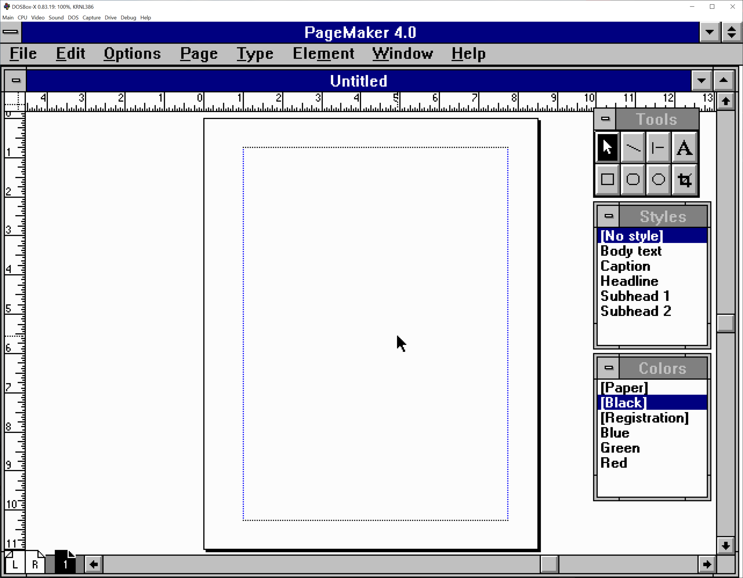
After the installation finished there was a shiny new Aldus group in Program Manager. After the first launch complained about configuration settings—I needed to add some PATH entries to autoexec.bat—PageMaker finally came to life. So many memories came back to me after perusing the palettes and combing through the commands. I didn’t even need a refresher from the manual to place an image, set some text, and print a file—just like old times! PageMaker 4.0’s user interface is remarkably bare compared to 1990s Quark XPress, let alone modern InDesign. It’s riddled with modal dialog boxes and pull-down menus—definitely signs of a pre-toolbar and tabbed palette world. Speaking of those dialog boxes, their layouts were ripped right out the Mac version. Seasoned PageMaker users will appreciate the consistency, but they definitely look out of place in a Windows environment. When it comes to toolboxes, three palettes are all you get for your computer pasteup needs: tools, styles, and colors. Make it work, designers!

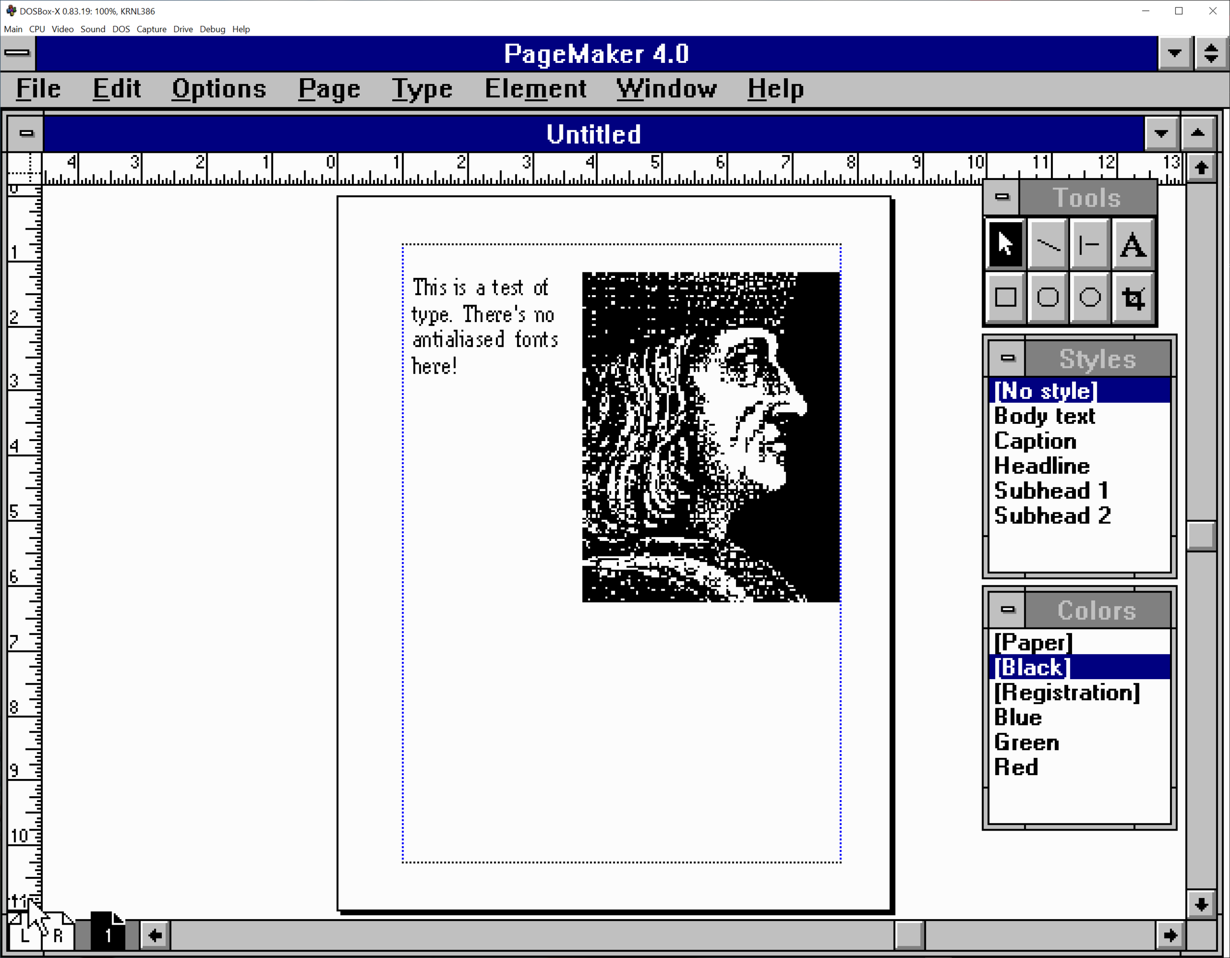
Despite its age, this software can still produce legitimate work—after all, PostScript is one of its output options. Just tell the PostScript printer driver to write your output to a PS file and you’ve got something that can be opened in Illustrator or distilled to a PDF. If you have a PostScript-compatible printer, I bet you could print to it directly with the appropriate PPD. I made a quick test document with some text and a graphic, saved it to a PostScript file, and dumped it into Acrobat Distiller. After a few seconds, I had a PDF file that I could send to any print shop in the world. If you go to the blog post for this episode, you can compare PageMaker’s on-screen display versus the finished PDF, which is equivalent to a “printed” piece. PageMaker’s display is a jagged, low resolution mess, while printed output is crisp and precise. Quite the difference, no?

Despite the popularity of “What You See Is What You Get” marketing, the actual quality of our screens paled in comparison to what a laser printer could do. 1991 was still the era of separate screen and printer fonts. Screen fonts were hand-drawn with pixels to match specific point sizes, whereas printer fonts used glyphs composed from curves and lines that could be rasterized to any point size. This was necessary at the time because computers were too slow to dynamically render those outline fonts to the display. Screen fonts also had hints to help fonts look better on low-resolution computer displays. So long as you stuck to the provided point sizes, you’d be fine. But choosing a non-standard point size with a screen font transformed your type into terrible tacky trash. Eventually programs like Adobe Type Manager brought the power of outline fonts to computer displays using antialiasing techniques, so long as you had a computer powerful enough to use it without lag.

Graphics also used low-resolution previews to save precious memory and CPU cycles. Vector graphics were infinitely scalable when printed, but all the user saw on screen was a blocky, low-resolution proxy. Raster images could also use a proxy workflow thanks to another Aldus invention: the Open Prepress Interface, or OPI for short. A designer would place a low-res proxy image into their document along with an OPI link to a high resolution file. At print time the raster image processor follows the link and overwrites the low-res image with the high-res one. By using OPI, all the heavy high-res files could live on a big, beefy server and reduce the time it takes to spool files to a printer or imagesetter. Because of these limitations, I frequently printed scrap proofs to double check my work. When InDesign launched with a high resolution preview mode for images and graphics, it was a revelation.

To Aldus’ credit, they ate their own dog food—the manuals and boxes were designed with PageMaker and Freehand. The jury’s out on whether they used SuperPaint for the raster graphics. Even with all the improvements included in PageMaker 4.0 and 5.0, nothing could really stem the bleeding of users to Quark XPress, because XPress’ frame-based toolset and mathematical precision were just that good. It made layout easier and more predictable than PageMaker, and its library of third-party XTensions helped you create designs that were impossible in PageMaker.

How could Aldus beat Quark under those tough circumstances? PageMaker’s code aged poorly, and rewriting it would take a lot of time and money. Maybe it was time to start over. Aldus was already developing a replacement for PageMaker at the time of their merger with Adobe in 1994. This project, codenamed K2, wouldn’t just replace PageMaker; it would challenge QuarkXPress for the title of desktop publishing champion. Speaking of Quark, they attempted to buy Adobe in 1998. This incensed Adobe cofounder John Warnock. What gave Quark, a company a third the size of Adobe, the right to commit a hostile takeover? Fueled by Adobe’s money and spite, the former Aldus team redoubled their efforts to build a Quark killer. K2 launched as Adobe InDesign in 1999, featuring high-res previews, native Illustrator and Photoshop file support, and killer typography. By 2003 it was the hot new design package everyone wanted to use—but we’ll come back to that story another day.

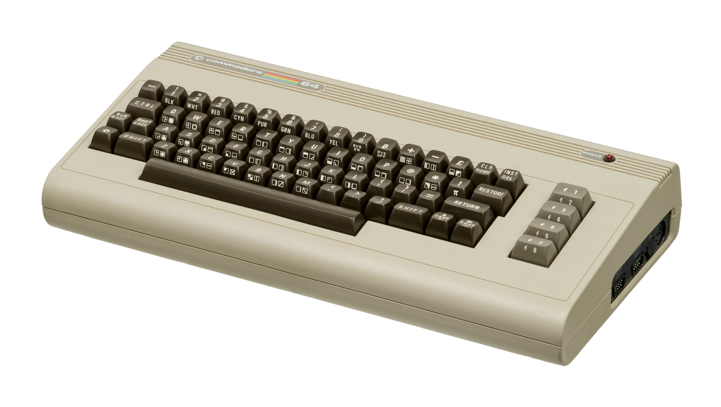
Looking back, I don’t think I have much fondness for PageMaker as a program. I was more productive when I used QuarkXPress, and the work I produced with Quark looked better, too. But it’s hard for me to separate my memories of PageMaker from my memories of learning the basics of design. It’s like looking back at the Commodore 64—I recognize PageMaker’s achievements, and the things we did together, but I’m perfectly fine with not using it on a daily basis anymore. I produced a lot of printed materials for the city of Pittsfield, Massachusetts and its public schools using PageMaker. None of it was particularly good or remarkable, but all artists say that about their early work. Still, I couldn’t have built my career in the graphic arts without PageMaker. I’m glad I found this copy, and I hope it enjoys a comfortable retirement on my shelf.

The 2021 MacBook Pro Review

Here in Userlandia, the Power’s back in the ‘Book.


I’ve always been a fan of The Incredibles, Brad Bird’s exploration of family dynamics with superhero set dressing. There’s a bit in the movie where Bob Parr—Mister Incredible—has one of his worst days ever. Getting chewed out by his boss for helping people was just the start. Indignities pile up one after another: monotonous stop-and-go traffic, nearly slipping to death on a loose skateboard, and accidentally breaking the door on his comically tiny car. Pushed to his absolute limit, Bob Hulks out and hoists his car into the air. Just as he’s about to hurl it down the street with all of his super-strength, he locks eyes with a neighborhood kid. Both Bob and the kid are trapped in an awkward silence. The poor boy’s staring with his mouth agape, his understanding of human strength now completely destroyed. Bob, realizing he accidentally outed himself as a superhero, quietly sets the car down and backs away, hoping the kid will forget and move on.

Time passes, but things aren’t any better the next time we see Bob arriving home from work. He’s at his absolute nadir—you’d be too for being fired after punching your boss through four concrete walls. Facing another disruptive relocation of his family, Bob Parr can’t muster up the anger anymore—he’s just depressed. Bob steps out of his car, and meets the hopeful gaze of the kid once again. “Well, what are you waiting for?” asks Bob. After a brief pause, the kid shrugs and says “I dunno… something amazing, I guess.” With a regretful sigh, Mister Incredible forlornly replies: “Me too, kid. Me too.”

For the past, oh, six years or so, Apple has found itself in a Mister Incredible-esque pickle when it comes to the MacBook Pro. And the iPhone, and iPad, and, well, everything else. People are always expecting something amazing, I guess. Apple really thought they had something amazing with the 2016 MacBook Pro. The lightest, thinnest, most powerful laptop that had the most advanced I/O interface on the market. It could have worked in the alternate universe where Intel didn’t fumble their ten and seven nanometer process nodes. Even if Intel had delivered perfect processors, the design was still fatally flawed. You have to go back to the PowerBook 5300 to find Apple laptops getting so much bad press. Skyrocketing warranty costs from failing keyboards and resentment for the dongle life dragged these machines for their entire run. Most MacBook Pro users were still waiting for something amazing, and it turned out Apple was too.

Spending five years chained to this albatross of a design felt like an eternity. But Apple hopes that a brand-new chassis design powered by their mightiest processors yet will be enough for you to forgive them. Last year’s highly anticipated Apple Silicon announcements made a lot of crazy promises. Could Apple Silicon really do all the things they said? Turns out the Apple Man can deliver—at least, at the lower end. But could it scale? Was Apple really capable of delivering a processor that could meet or beat the current high end? There’s only one way to find out—I coughed up $3500 of my own Tricky Dick Fun Bills and bought one. Now it’s time to see if it’s the real deal. 

Back to the (Retro) Future

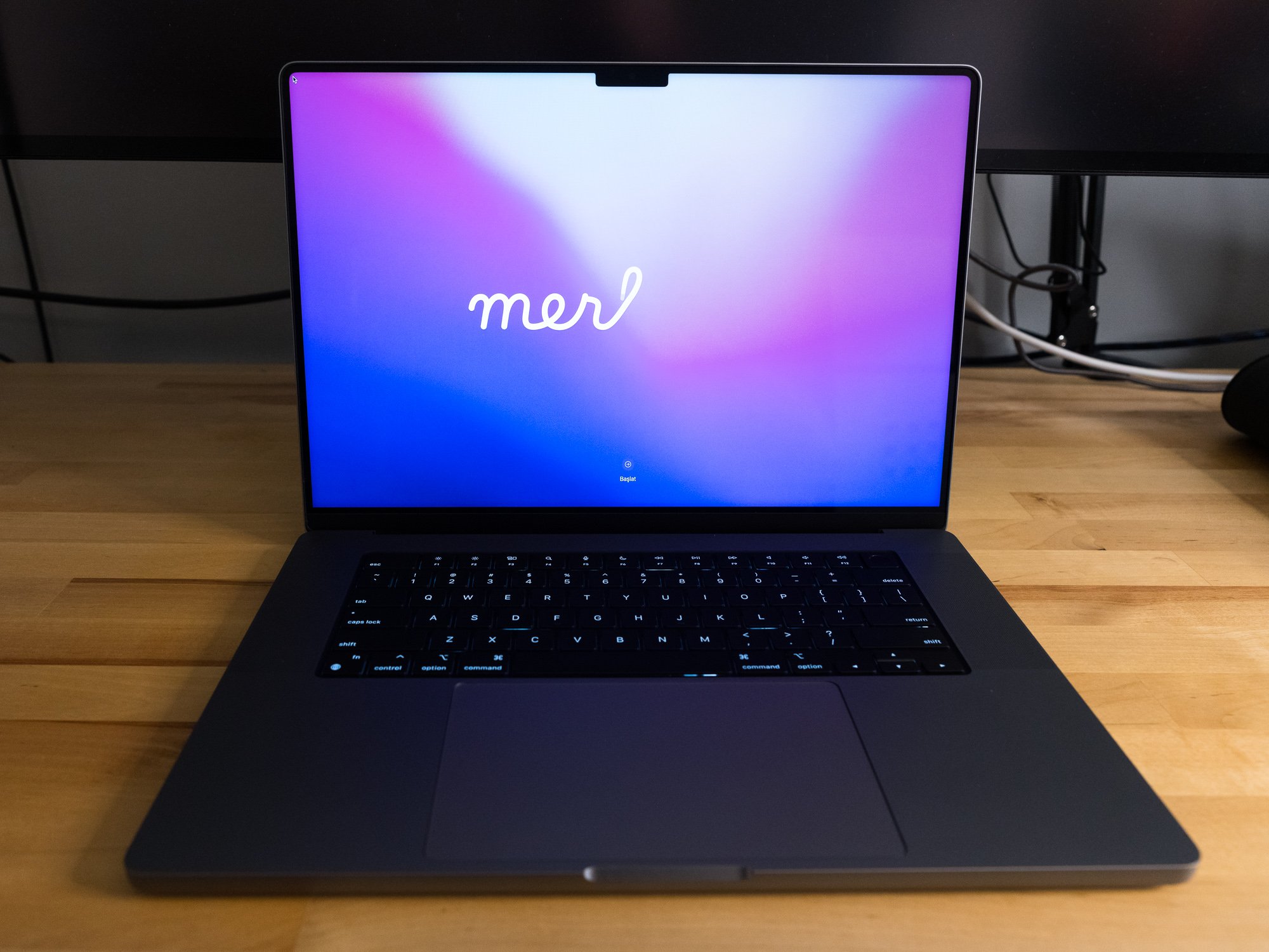
For some context, I’ve been living the 13 inch laptop life since the 2006 white MacBook, which replaced a 15 inch Titanium PowerBook G4 from 2002. My current MacBook Pro was a 2018 13 inch Touch Bar model with 16 gigabytes of RAM, a 512 gigabyte SSD, and four Thunderbolt ports. My new 16 inch MacBook Pro is the stock $3499 config: it comes equipped with a M1 Max with 32 GPU cores, 32 gigabytes of RAM, and a 1 terabyte SSD.

Think back thirteen years ago, when Apple announced the first aluminum unibody MacBook Pro. The unibody design was revealed eight months after the MacBook Air, and the lessons learned from that machine are apparent. Both computers explored new design techniques afforded by investments in new manufacturing processes. CNC milling and laser cutting of solid aluminum blocks allowed for more complex shapes in a sturdier package. For the first time, a laptop could have smooth curved surfaces while being made out of metal. While the unibody laptops were slightly thinner, they were about the same weight as their predecessors.

Apple reinvested all of the gains from the unibody manufacturing process into building a stronger chassis. PowerBooks and early MacBooks Pro were known for being a little, oh, flexible. The Unibody design fixed that problem for good with class-leading structural rigidity. But once chassis flex was solved, the designers wondered where to go next. Inspired by the success of the MacBook Air, every future MacBook Pro design pushed that original unibody language towards a thinner and lighter goal. While professionals appreciate a lighter portable—no one really misses seven pound laptops—they don’t like sacrificing performance. Toss Intel’s unanticipated thermal troubles onto the pile and Apple’s limit-pushing traded old limitations for new ones. It was time for a change.

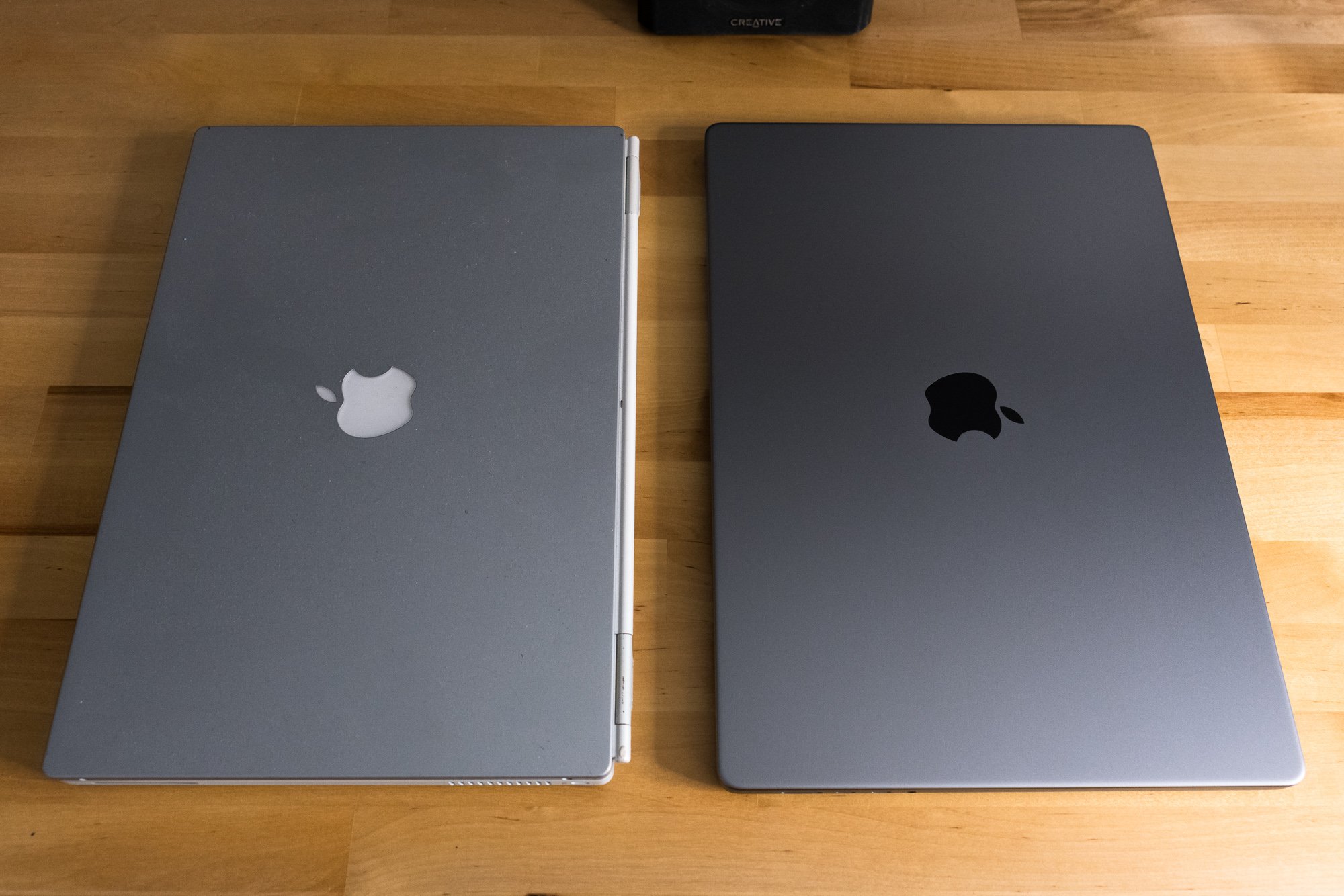
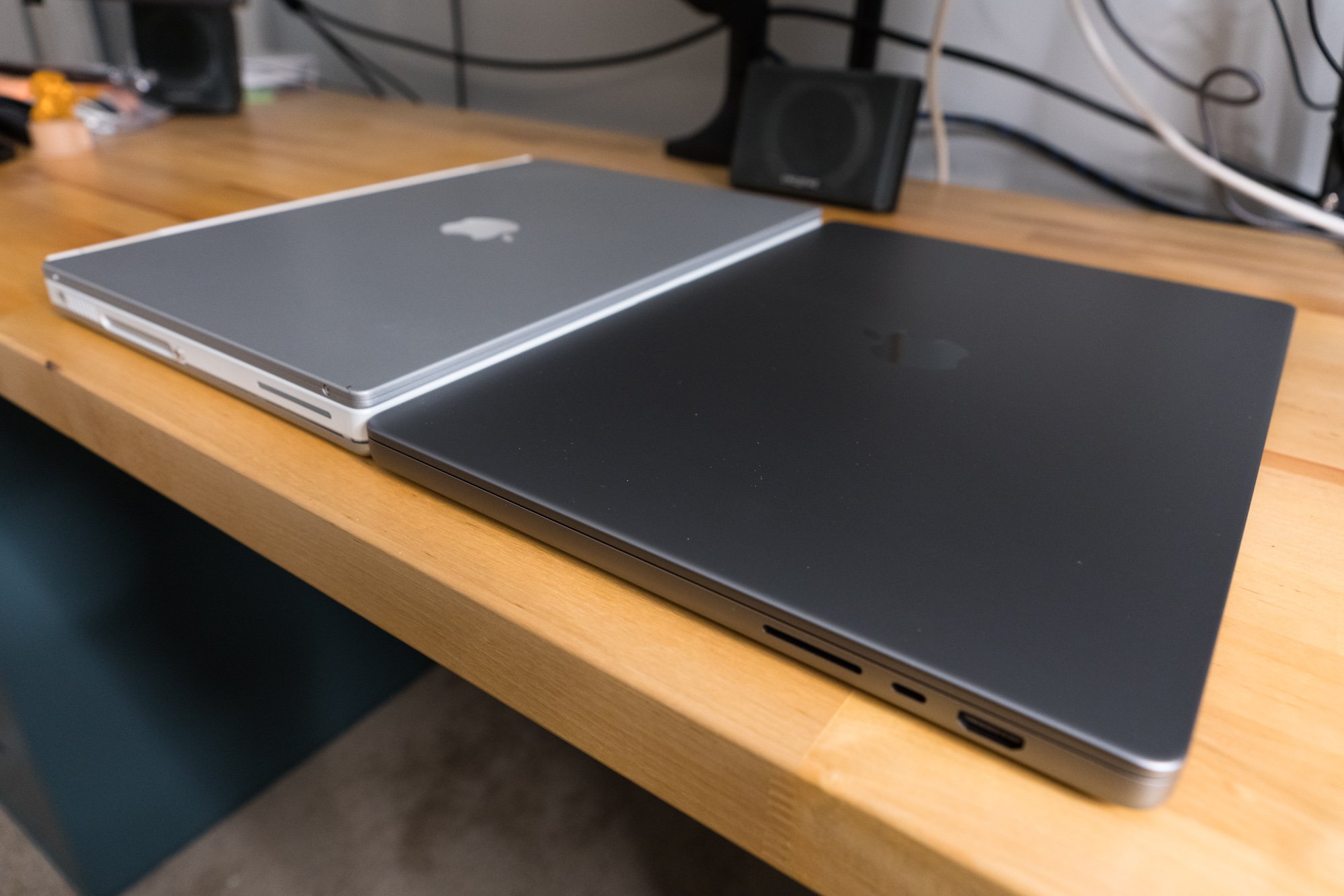
Instead of taking inspiration from the MacBook Air, the 2021 MacBook Pro looks elsewhere: the current iPad Pro, and the Titanium PowerBook G4. The new models are square and angular, yet rounded in all the right places. Subtle rounded corners and edges along the bottom are reminiscent of an iPod classic. A slight radius along the edge of the display feels exactly like the TiBook. Put it all together and you have a machine that maximizes the internal volume of its external dimensions. Visual tricks to minimize the feeling of thickness are set aside for practical concerns like thermal capacity, repairability, and connectivity.

I’m seeing double. Four PowerBooks!

The downside of this approach is the computer feels significantly thicker in your hands. And yet the new 16 inch MacBook Pro is barely taller than its predecessor—.66 inches versus .64 (or 168mm versus 166). The 14 inch model is exactly the same thickness as its predecessor at .61 inches or 150mm. It feels thicker because the thickness is uniform, and there’s no hiding it when you pick it up from the table. The prior model's gentle, pillowy curves weren’t just for show—they made the machine feel thinner because the part you grabbed was thinner.

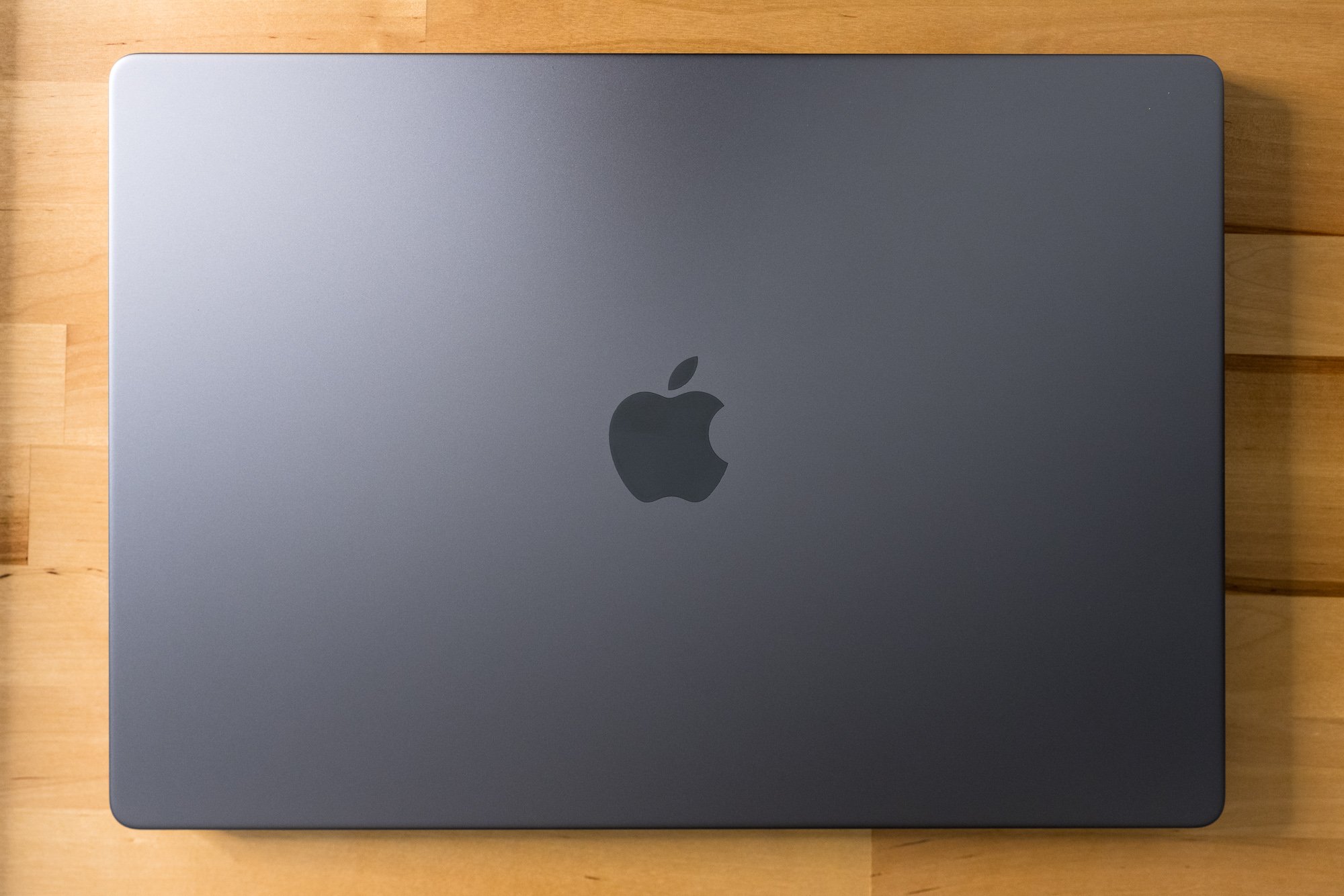
Memories of PowerBooks past are on display the moment you lift the notebook out of its box. I know others have made this observation, but it’s hard to miss the resemblance between the new MacBooks and the titanium PowerBook G4. As a fan of the TiBook’s aesthetics, I understand the reference. The side profiles are remarkably similar, with the same square upper body and rounded bottom edges. A perfectly flat lid with gently rolled edges looks and feels just like a Titanium. If only the new MacBook Pro had a contrasting color around the top case edges like the Titanium’s carbon-fiber ring—it really makes the TiBook look smaller than it is. Lastly, blacking out the keyboard well helps the top look less like a sea of silver or grey, fixing one of my dislikes about the prior 15 and 16 inchers.

What the new MacBook Pro doesn’t borrow from the Titanium are weak hinges and chassis flex. The redesigned hinge mechanism is smoother, and according to teardowns less likely to break display cables. It also fixes one of my biggest gripes: the dirt trap. On the previous generation MacBooks, the hinge was so close to the display that it created this crevice that seemed to attract every stray piece of lint, hair, and dust it could find. I resorted to toothbrushes and toothpicks to get the gunk out. Now, it’s more like the 2012 to 2015 models, with a wide gap and a sloping body join that lets the dust fall right out. Damp cloths are all it takes to clean out that gap, like how it used to be. That gap was my number one annoyance after the keyboard, and I thank whoever fixed it.

Something else you’ll notice if you’re coming from a 2016 through 2020 model is some extra mass. The 14 and 16 inch models, at 3.5 and 4.7 pounds respectively, have gained half a pound compared to their predecessors, which likely comes from a combination of battery, heatsink, metal, and screen. There’s no getting around that extra mass, but how you perceive it is a matter of distribution. I toted 2011 and 2012 13 inch models everywhere, and those weighed four and a half pounds. It may feel the same in a bag, but in your hands, the bigger laptop feels subjectively heavier. If you’re using a 2012 through 2015 model, you won’t notice a difference at all—the new 14 and 16 inch models weigh the same as the 13 and 15 inchers of that generation.

I don’t think Apple is going to completely abandon groundbreaking thin-and-light designs, but I do think they’re going to leave the envelope-pushing crown to the MacBook Air. There is one place Apple could throw us a bone on the style front, though, and that’s color choices. I would have bought an MBP in a “Special edition” color if they offered it, and I probably would have paid more too. Space Gray just isn’t dark enough for my tastes. Take the onyx black shade used in the keyboard surround and apply it to the entire machine—it would be the NeXT laptop we never had. I’d kill to have midnight green as well. Can’t win ‘em all, but I know people are dying for something other than “I only build in silver, and sometimes, very very dark gray.”

Alone Again, Notch-urally

There’s no getting around it: I gotta talk about the webcam. Because some people decided that bezels are now qualita non grata on modern laptops, everyone’s been racing to make computers as borderless as possible. But the want of a bezel-free life conflicts with the need for videoconferencing equipment, and you can’t have a camera inside your screen… or can you? An inch and a half wide by a quarter inch tall strip at the top of the display has been sacrificed for the webcam in an area we’ve collectively dubbed “the notch.” Now the MacBook Pro has skinny bezels measuring 3/16s of an inch, at the cost of some menu bar area.

Oh, hello. I didn’t… see you there. Would you like some… iStat menu items?

Dell once tried solving this problem in 2015 by embedding a webcam in the display hinge of their XPS series laptops. There’s a reason nobody else did it—the camera angle captured a view straight up your nose. Was that tiny top bezel really worth the cost of looking terrible to your family or coworkers? Eventually Dell made the top bezel slightly taller and crammed the least objectionable tiny 720p webcam into it. When other competitors started shrinking their bezels, people asked why Apple couldn’t do the same. Meanwhile, other users kept complaining about Apple’s lackluster webcam video quality. The only way to get better image quality is to have a bigger sensor and/or a better lens, and both solutions take up space in all three axes. Something had to give, and the loyal menu bar took one for the team.

The menu bar’s been a fixture on Macintoshes since 1984—a one-stop shop for all your commands and sometimes questionable system add-ons. It’s always there, claiming 20 to 24 precious lines of vertical real estate. Apple’s usually conservative when it comes to changing how the bar looks or operates. When they have touched it, the reactions haven’t been kind. Center-aligned Apple logo in the Mac OS X Public Beta, anyone? Yet here we are, faced with a significant chunk of the menu bar’s lawn taken away by an act of eminent domain. As they say, progress has a price.

A few blurry pictures of a notched screen surfaced on MacRumors a few days before the announcement. I was baffled by the very idea. No way would Apple score such an own-goal on a machine that was trying to right all the wrongs of the past five years. They needed to avoid controversy, not create it! I couldn’t believe they would step on yet another rake. And yet, two days later, there was Craig Federighi revealing two newly benotched screens. I had to order up a heaping helping of roasted crow for dinner.

Now that the notch has staked its claim, what does that actually mean for prospective buyers? First, about an inch and a half of menubar is no longer available for either menus or menu extras. If an app menu goes into the notch, it’ll shift over to the right-hand side automatically. Existing truncation and hiding mechanisms in the OS help conserve space if both sides of your menu bar are full. Second, fullscreen apps won’t intrude into the menubar area by default. When an app enters fullscreen mode the menu bar slides away, the mini-LED backlights turn off, and the blackened area blends in with the remaining bezel and notch. It’s as if there was nothing at all—a pretty clever illusion! Sling your mouse cursor up top and menu items fade back in, giving you access to your commands. When you’re done, it fades to black again. If an app doesn’t play nice with the notch, you can check a box in Get Info to force it to scale the display below the notch.

Menu bar gif

How the menu bar fades and slides in fullscreen mode.

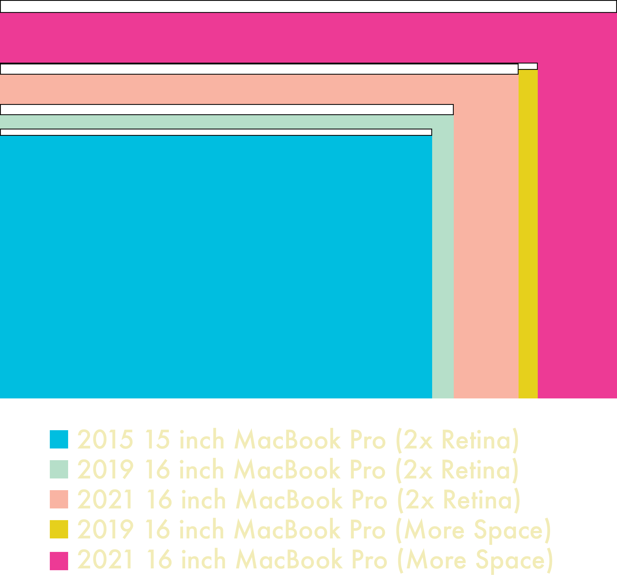
But are you losing any usable screen space due to the notch? Let’s do some math. The new 16 inch screen’s resolution is 3456 pixels wide by 2234 tall, compared to the previous model’s 3072 by 1920. Divide that by two for a native Retina scale and you get usable points of 1728 by 1117 versus 1536 by 960. So if you’re used to 2x integer scaling, the answer is no—you’re actually gaining vertical real estate with a notched Mac. Since I hate non-native scaling, I’ll take that as a win. If you’re coming from a prior generation 15 inch Retina MacBook Pro with a 1440 point by 900 display, that’s almost a 24 percent increase in vertical real estate. You could even switch to the 14 inch model and net more vertical space and save size and weight!

Working space

What did the menu bar give up to make this happen? The notch claims about ten percent of the menu bar on a 16 inch screen, and fifteen percent on a 14 inch. In point terms, it takes up about 188 horizontal points of space. Smaller displays are definitely going to feel the pinch, especially if you’re running a lot of iStat Menus or haven’t invested in Bartender. Some applications like Pro Tools have enough menus that they’ll spill over to the other side of the notch. With so many menus, you might trip Mac OS’ menu triage. It hides NSMenuBar items first, and then starts truncating app menu titles. Depending on where you start clicking, certain menu items might end up overlapping each other, which is disconcerting the first time you experience it. That’s not even getting into the bugs, like a menu extra sometimes showing up under the notch when it definitely shouldn’t. I think this is an area where Apple needs to rethink how we use menulings, menu extras, or whatever you want to call them. Microsoft had its reckoning with Status Tray items two decades ago, and Apple’s bill is way past due. On the flip side, if you’re the developer of Bartender, you should expect a register full of revenue this quarter.

Audacity's window menu scoots over.

Audacity’s Window menu scoots over to the other side of the notch atuomatically.

On the vertical side, the menu bar is now 37 points tall versus the previous 24 in 2x retina scale. Not a lot, but worth noting. It just means your effective working space is increased by 44 points, not 57. The bigger question is how the vertical height works in non-native resolutions. Selecting a virtual scaled resolution keeps the menu bar at the same physical size, but shrinks or grows its contents to match the scaling factor. It looks unusual, but if you’re fine with non-native scaling you’re probably fine with that too. The notch will never dip below the menu bar regardless of the scaling factor.

What about the camera? Has its quality improved enough to justify the land takings from the menu bar? Subjective results say yes, and you’ll get picture quality similar to the new iMac. People on the other side of my video conferences noticed the difference right away. iPads and iPhones with better front cameras will still beat it, but this is at least a usable camera versus an awful one. I’ve taken some comparison photos between my 2018 model, the new 2021 model, and a Logitech C920x, one of the most popular webcams on the market. It’s also a pretty old camera and not competitive to the current crop of $200+ “4K” webcams—and I use that term loosely—but it’s good enough quality for most people.

The 720p camera on the 2018 model is just plain terrible. The C920x is better than that, but it’s still pretty soft and has bluer white balance. Apple actually comes out ahead in this comparison in terms of detail and sharpness. Note that the new cameras field of view is wider than the old 720p camera—it’s something you’ll have to keep in mind.

Looking at the tradeoffs and benefits, I understand why Apple went with the notch. Camera quality is considerably improved, the bezels are tiny, and that area of the menu bar is dead space for an overwhelming majority of users. It doesn’t affect me much—I already use Bartender to tidy up my menu extras, and the occasional menu scooting to the other side of it is fine. Unless your menu extras consume half of your menu bar, the notch probably won’t affect your day to day Mac life either.

Bartender in action.

Without Bartender, I would have a crowded menu bar—regardless of a notch.

But there’s one thing we’ll all have to live with, and that’s the aesthetics. There’s a reason that almost all of Apple’s publicity photos on their website feature apps running in fullscreen mode, which conveniently blacks out the menubar area. All of Apple’s software tricks to reduce the downsides of the notch can’t hide the fact that it’s, well… ugly. If you work primarily in light mode, there’s no avoiding it. Granted, you’re not looking at the menu bar all the time, but when you do, the notch stares back at you. If you’re like me and you use dark mode with a dark desktop picture, then the darker menu bar has a camouflage effect, making the notch less noticeable. There’s also apps like Boring Old Menu Bar and Top Notch that can black out the menubar completely in light mode. Even if you don’t care about the notch, you might like the all-black aesthetic.
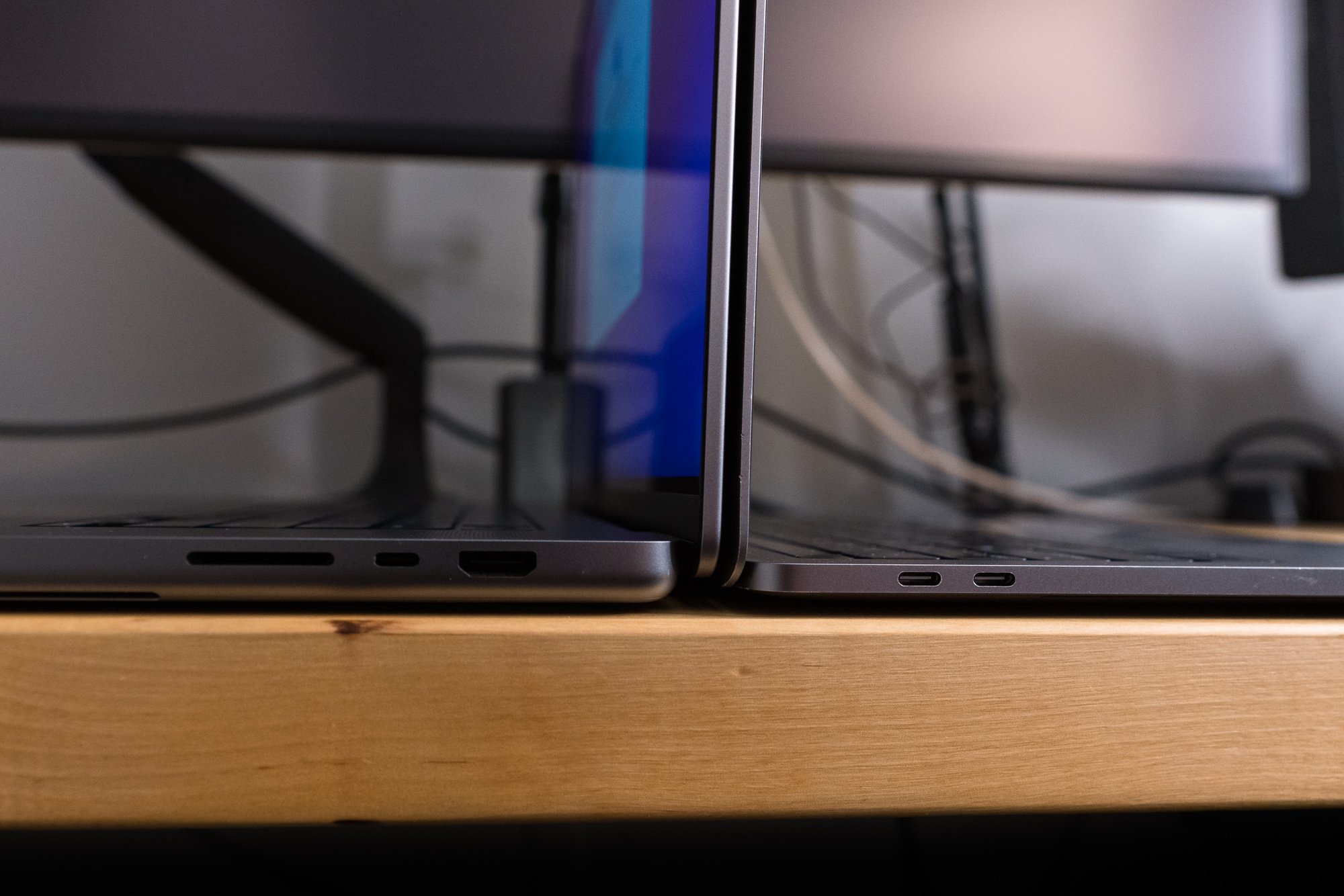
Is it worse than a bezel? Personally, I don’t hate bezels. It’s helpful to have some separation between your content and the outside world. I have desktop displays with bezels so skinny that mounting a webcam on top of them introduces a notch, which also grinds my gears. At least I can solve that problem by mounting the webcam on a scissor arm. I also like the chin on the iMac—everyone sticks Post-Its to it and that’s a valid use case. It’s also nice to have somewhere to grab to adjust the display angle without actually touching the screen itself. Oh, and the rounded corners on each side of the menu bar? They’re fine. In fact, they’re retro—just like Macs of old. Round corners on the top and square at the bottom is the best compromise on that front.

All the logic is there. And yet, this intrusion upon my display still offends me in some way. I can rationalize it all I want, but the full-screen shame on display in Apple’s promotional photos is proof enough that if they could get tiny bezels without the notch, they would. It’s a compromise, and nobody likes those. The minute Apple is able to deliver a notch-less experience, there will be much rejoicing. Until then, we’ll just have to deal with it.

We All Scream for HDR Screens

The new Liquid Retina ProMotion XDR display’s been rumored for years, and not just for the mouthful of buzzwords required to name it. It’s the first major advancement in image quality for the MacBook Pro since the retina display in 2012. Instead of using an edge-lit LED or fluorescent backlight, the new display features ten thousand individually addressable mini-LEDs behind the liquid crystal panel. If you’ve seen a TV with “adaptive backlighting zones,” it’s basically the same idea—the difference is that there’s a lot more zones and they’re a lot smaller. Making an array of tiny, powerful, efficient LEDs with great response time and proper color response isn’t trivial. Now do it all at scale without costs going out of control. No wonder manufacturers struggled with these panels.

According to the spec sheet, the 16 inch MacBook Pro’s backlight consists of 10,000 mini-LEDs. I’ll be generous and assume each is an individually addressable backlight zone. The 16.2 inch diagonal display, at 13.6 by 8.8 inches, has about 119.5 square inches of screen area that needs backlighting. With 10,000 zones, that results in about 83.6 mini-LEDs per square inch. Each square inch of screen contains 64,516 individual pixels. That means each LED is responsible for around 771 pixels, which makes for a zone area of 27.76 pixels squared. Now, I’m not a math guy—I’ve got an art degree. But if you’re expecting OLED per-pixel backlighting, you’ll need to keep waiting.

All these zones means adaptive backlighting—previously found on the Pro XDR display and the iPad Pro—is now a mainstream feature for Macs. Overall contrast is improved because blacks are darker and “dark” areas are getting less light than bright areas. It largely works as advertised—HDR content looks great. For average desktop use, you’ll see a noticeable increase in contrast across the board even at medium brightness levels.

Safari HDR support

Safari supports HDR video playback on youtube, and while you can’t see the effects in this screenshot, it looks great on screen.

But that contrast boost doesn’t come for free. Because backlight zones cover multiple pixels, pinpoint light sources will exhibit some amount of glow. Bright white objects moving across a black background in a dark room will show some moving glow effect as well. Higher brightness levels and HDR mode make the effect more obvious. Whether this affects you or not depends on your workflow. The problem is most noticeable with small, bright white objects on large black areas. If you want a surefire way to demonstrate this, open up Photoshop, make a 1000x1000 document of just black pixels, and switch to the hand tool. Wave your cursor around the screen and you’ll see the subtle glow that follows the cursor as it moves. Other scenarios are less obvious—say, if you use terminal in dark mode. Lines of text will be big enough that they straddle multiple zones, so you may see a slight glow. I don’t think the effect is very noticeable unless you are intentionally trying to trigger it or you view a lot of tiny, pure white objects on a black screen in a dark room. I’ve only noticed it during software updates and reboots, and even then it is very subtle.

Watch this on a Mini-LED screen to see the glow effect. It’s otherwise unnoticeable in daily usage.

I don’t think this is a dealbreaker—I don’t work with tiny white squares on large black backgrounds all day long. But if you’re into astrophotography, you might want to try before you buy. Edge-lit displays have their own backlight foibles too, like piano keys and backlight uniformity problems, which mini-LEDs either eliminate or reduce significantly. Even CRTs suffered from bloom and blur, not to mention convergence issues. It’s just a tradeoff that you’ll have to judge. I believe the many positives will outweigh the few negatives for a majority of users.

The other major change with this screen and Mac OS Monterey is support for variable refresh rates. With a maximum refresh rate of 120Hz, the high frame rate life is now mainstream on the Mac. If you’re watching cinematic 24 frames per second content, you’ll notice the lack of judder right away. Grab a window and drag it around the screen and you’ll see how smooth it is. Most apps that support some kind of GPU rendering with vsync will yield good results. Photoshop’s rotate view tool is a great example—it’s smooth as butter. System animations and most scrolling operations are silky smooth. A great example is using Mission Control—the extra frames dramatically improve the shrinking and moving animations. Switching to fullscreen mode has a similar effect.

But the real gotcha is that most apps don’t render their content at 120 FPS. It’s a real mixed bag out there at the moment, and switching between a high frame rate app to a boring old 60Hz one is jarring. Safari, for instance, is stuck at 60 FPS. This is baffling, because a browser is the most used application on the system. Hopefully it’s fixed in 12.1.

But pushing frames is just one part of a responsive display. Pixel response time is still a factor in LCD displays, and Apple tends to use panels that are middle of the pack. Is the new MacBook Pro any different? My subjective opinion is that the 16 inch MBP is good, but not great in terms of pixel response. Compared to my ProMotion equipped 2018 iPad Pro, the Mac exhibits a lot less ghosting. Unfortunately, it’s not going to win awards for pixel response time. Until objective measurements are available, I’m going to hold off from saying it’s terrible, but compared to a 120 or 144Hz gaming-focused display, you’ll notice a difference. 

In addition to supporting variable and high refresh rates on the internal screen, the new MacBooks also support DisplayPort adaptive refresh rates—what you might know as AMD’s FreeSync. Plug in a FreeSync or DisplayPort adaptive refresh display using a Thunderbolt to DisplayPort cable and you’ll be able to set the refresh rate along with adaptive sync. Unfortunately, Adaptive Sync doesn’t work via the built-in HDMI port, because HDMI Variable Refresh Rate requires an HDMI 2.1 port. Also, Apple’s implemented the DisplayPort standard, and FreeSync over HDMI 2.0 is proprietary to AMD. I’m also not sure if Thunderbolt to HDMI 2.1 adapters will work either, because I don’t have one to test.

LG Display Prefs

The LG 5K2K Ultrawide works perfectly with these Macs and Monterey.

Speaking of external displays, I have a bunch that I tested with the M1 Max. The good news is that my LG 5K ultrawide works perfectly fine when attached via Thunderbolt. HiDPI modes are available and there’s no issues with the downstream USB ports. The LG 5K ultrawide is the most obscure monitor I own, so this bodes well for other ultrawide displays, but I can’t speak definitively about those curved ultrawides that run at 144Hz. I wasn’t able to enable HDR output, and I believe this is due to a limitation of the display’s Thunderbolt controller—if I had a DisplayPort adapter, it might be different. My Windows PC attached via DisplayPort switches to HDR just fine. I can’t definitely call it until tested that way. My aging Wacom Cintiq 21UX DTK2100 works just fine with an HDMI to DVI adapter. An LG 27 inch 4K display works well over HDMI, and HDR is supported there too. The only missing feature with the LG 4K is Adaptive Sync, which requires a DisplayPort connection from this Mac. Despite that, you can still set a specific refresh rate via HDMI.

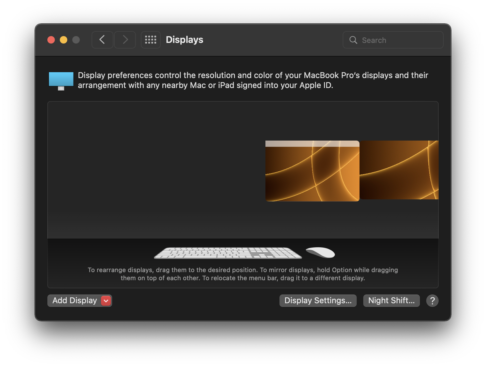
If multi-monitor limitations kept you away from the first round of M1 Macs, those limits are gone. The M1 Pro supports two 6K external displays, and the Max supports three 6K displays plus a 4K60 over HDMI. I was indeed able to hook up to three external displays, and it worked just like on my Intel Macs. I did run into a few funny layout bugs with Monterey’s new display layout pane, which I’m sure will be ironed out in time. Or not—you never know what Apple will fix these days.

This happened a few times. Sometimes it fixed itself after a few minutes, other times it just sat there.

How about calibration? Something I’ve seen floating around is that “The XDR displays can’t be hardware calibrated,” and that’s not true. What most people think of as “hardware calibrating” is actually profiling, where a spectrophotometer or colorimeter is used to linearize and generate a color profile for managing a display’s color. You are using a piece of hardware to do the profiling, but you’re not actually calibrating anything internal to the monitor. For most users, this is fine—adjusting the color at the graphics card level does the job. For very demanding users, this isn’t enough, and that’s why companies like NEC and Eizo sell displays with hardware LUTs that can be calibrated by very special—and very expensive—equipment.

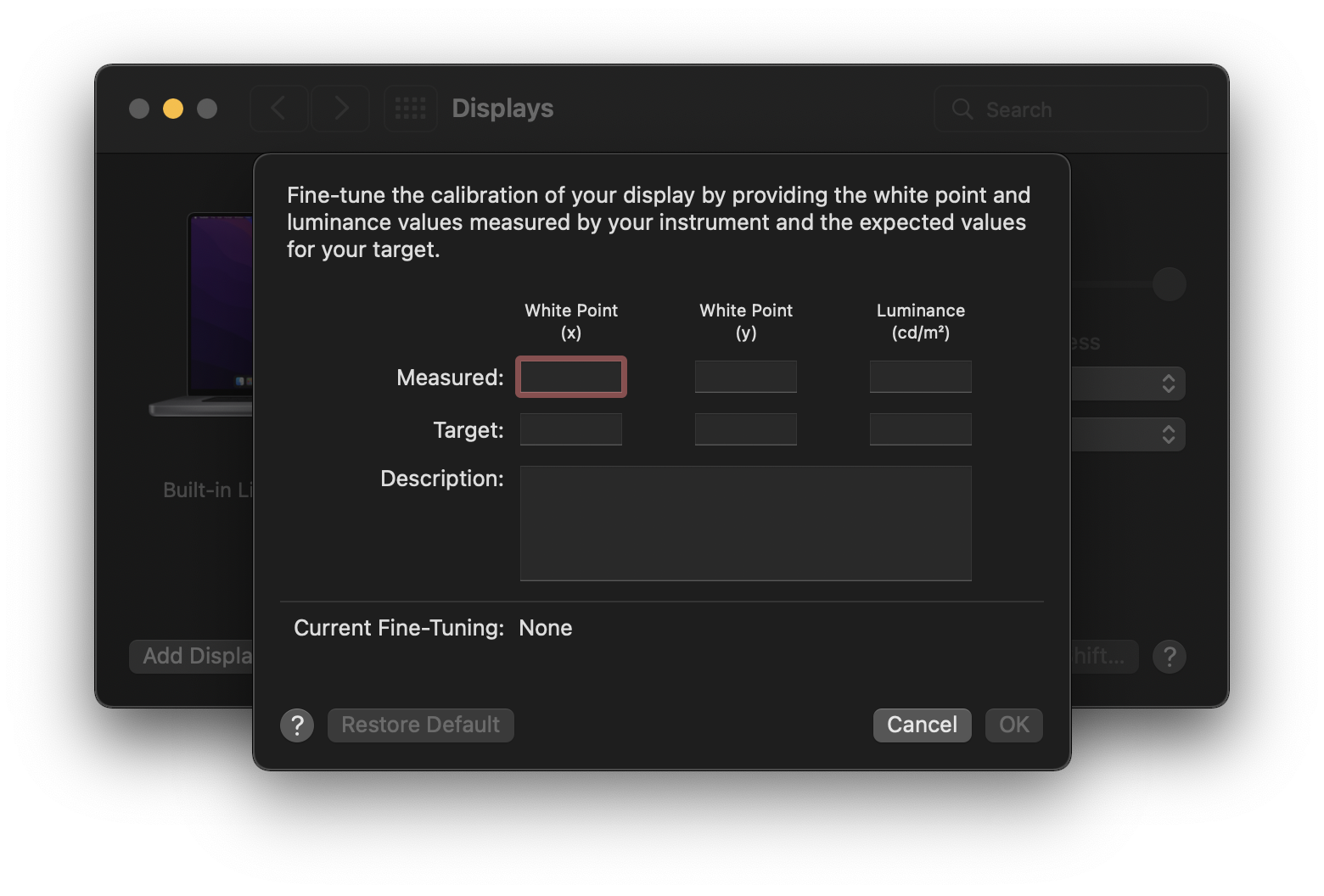
You can still run X-Rite i1 Profiler and use an i1 Display to generate a profile, and you can still assign it to a display preset. But the laptop XDR displays now have the same level of complexity as the Pro Display XDR when it comes to hardware profiles. You can use a spectroradiometer to fine-tune these built-in picture modes for the various gamuts in System Preferences, and Apple has a convenient support document detailing this process. This is not the same thing as a tristimulus colorimeter, which is what most people think of as a “monitor calibrator!” I’m still new to this, so I’m still working out the process. I’m used to profiling traditional displays for graphic arts, so these video-focused modes are out of my wheelhouse. I’ll be revisiting the subject of profiling these displays in a future episode.

Fine tune calibration

Here there be dragons, if you’re not equipped with expensive gear.

Related to this, a new (to me) feature in System Preference’s Display pane is a Display Presets feature, allowing you choose different gamut and profile presets for the display. This was only available previously for the Pro Display XDR, but a much wider audience will see these for the first time thanks to the MacBook Pro. Toggling between different targets is a handy shortcut, even though I don’t think I’ll ever use it. The majority are video mode simulations, and since I’m not a video editor, they don’t mean much to me. If they matter to you, then maybe the XDR might make your on-the-go editing a little easier.

Bye Bye, Little Butterfly

When the final MacBook with a butterfly keyboard was eliminated from Apple’s portable lineup in the spring of 2020, many breathed a sigh of relief. Even if you weren’t a fan of the Dongle Life, you’d adjust to it. But a keyboard with busted keys drives me crazier than Walter White hunting a troublesome fly. The costs of the butterfly keyboard were greater than what Apple paid in product service programs and warranty repairs. The Unibody MacBook Pro built a ton of mind- and marketshare for Apple on the back of its structural integrity. It’s no ToughBook, but compared to the plasticky PC laptops and flexible MacBook Pro of 2008, it was a revelation. People were buying Macs just to run Windows because they didn’t crumble at first touch. All that goodwill flew away thanks to the butterfly effect. Though Apple rectified that mistake in 2020, winning back user trust is an uphill battle.

Part of rebuilding that trust is ditching the Touch Bar, the 2016 models’ other controversial keyboard addition. The 2021 models have sent the OLED strip packing in favor of full-sized function keys. Apple has an ugly habit of never admitting fault. If they made a mistake—like the Touch Bar—they tend to frame a reversion as “bringing back the thing you love, but now it’s better than ever!” That’s exactly what Apple’s done with the function keys—these MacBooks are the first Apple laptop to feature full-height function keys. Lastly, the Touch ID-equipped power button gets an upgrade too—it’s now a full sized key with a guide ring.

Keyboard 2 Keyboard.

How does typing feel on this so-called “Magic” keyboard? I didn’t have any of the Magic keyboard MacBooks, but I do have a desktop Magic keyboard that I picked up at the thrift store for five bucks. It feels nearly the same as that desktop keyboard in terms of travel. It felt way more responsive than a fresh butterfly keyboard, and I’m happy for the return of proper arrow keys.  Keyboards are subjective, and if you’re unsure, try it yourself. If you’re happy with 2012 through 2015 MacBook Pro keyboards, you’ll be happy with this one. My opinion on keyboards is that you shouldn’t have to think about them. Whatever switch type works for you and lets your fingers fly is the right keyboard for you. My preferred mechanical switch is something like a Cherry Brown, though I’ve always had an affinity for the Alps on the Apple Extended Keyboard II and IBM’s buckling springs.

Since the revised keyboard introduced in the late 2019 to spring 2020 notebooks hasn’t suffered a sea of tweets and posts claiming it’s the worst keyboard ever, it’s probably fine. I’m ready to just not think about it anymore. My mid-2018 MacBook Pro had a keyboard replacement in the fall of 2019. It wasn’t even a year old—I bought it in January 2019! That replacement keyboard is now succumbing to bad keys, even though it features the “better” butterfly switches introduced in the mid-2019 models. My N key’s been misbehaving since springtime, and I’ve nursed it along waiting for a worthy replacement. On top of mechanical failures, the legends flaked off a few keys, which had never happened to me before on these laser-etched keycaps. With all of the problems Apple’s endured, will the new keyboard be easier to repair? Based on teardown reports, replacing the entire keyboard is still a very involved process, but at least you can remove keycaps again without breaking the keys.

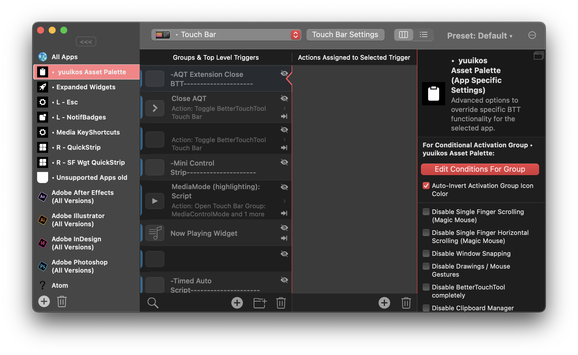
More people will lament the passing of the Touch Bar than the butterfly, because it provided some interesting functionality. I completely understand the logic behind it. F-keys are a completely opaque mechanism for providing useful shortcuts, and the Fn key alternates always felt like a kludge. The sliders to adjust volume or brightness are a slick demo, and I do like me some context-sensitive shortcut switching. But without folivora’s BetterTouchTool, I don’t think I would have liked the Touch Bar as much as I did. 

BetterTouchTool

Goodbye, old friends. You made the Touch Bar tolerable.

Unfortunately, Apple just didn’t commit to the Touch Bar, and that’s why it failed. An update with haptic feedback and an always-on screen would have made a lot of users happy. At least, it would have made me happy, but haptic feedback wouldn’t fix the “you need to look at it” or “I accidentally brushed against it” problems. But I think what really killed it was the unwillingness to expand it to other Macs by, say, external keyboards. The only users that truly loved the Touch Bar were the ones who embraced BetterTouchTool’s contextual presets and customization. With every OS update I expected Apple to bring more power to the Touch Bar, but it never came. Ironically, by killing the Touch Bar, Apple killed a major reason to buy BetterTouchTool. It’s like Sherlocking, but in reverse… a Moriartying! Sure, let’s roll with that.

I’ll miss my BTT shortcuts. I really thought Apple was going to add  half-height function keys and keep the Touch Bar. Maybe that was the plan at some point. Either way, the bill of materials for the Touch Bar has been traded for something else—a better screen, the beefier SOC, whatever. I may like BettterTouchTool, but I’m OK with trading the Touch Bar for an HDR screen.

Regardless of the technical merits for or against the Touch Bar, it will be remembered as a monument to Apple’s arrogance. They weren’t the first company to make a laptop with a touch-sensitive OLED strip on the keyboard. Lenovo’s Thinkpad X1 Carbon tried the same exact idea as the Touch Bar in 2014, only to ditch it a year later. Apple’s attempt reeked of “anything you can do, I can do better!” After all, Apple had vertical integration on their side and provided third-party hooks to let developers leverage this new UI. But Apple never pushed the Touch Bar as hard as it could have, and users sense half-heartedness. If Apple wanted to make the Touch Bar a real thing, they should have gone all-out. Commit to the bit. Without upgrades and investments, people see half-measure gimmicks for what they really are. Hopefully they’ve learned a lesson.

Any Port in a Storm

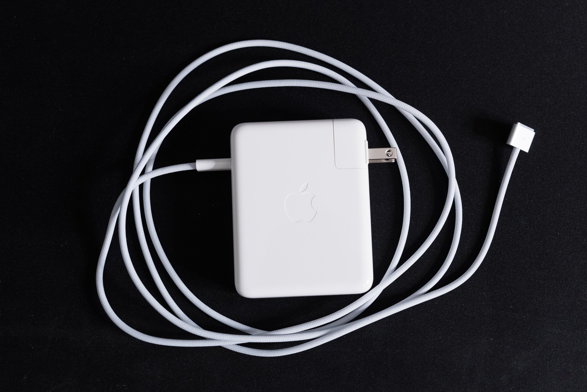
When the leaked schematics for these new MacBooks spoiled the return of MagSafe, HDMI, and an SD card slot, users across Mac forums threw a party. Apple finally conceded that one kind of port wasn’t going to rule them all. It’s not the first time Apple’s course corrected like this—adding arrow keys back to the Mac’s keyboard, adding slots to the Macintosh II, everything about the 2019 Mac Pro. When those rumors were proven true in the announcement stream, many viewers breathed a sigh of relief. The whole band isn’t back together—USB A didn’t get a return invite—but three out of four is enough for a Hall of Fame performance.

From left to right: MagSafe, Thunderbolt4, and headphones.

Let’s start with the the left-hand side of the laptop. Two Thunderbolt 4 ports are joined by a relocated headphone jack and the returning champion of power ports: MagSafe. After five years of living on the right side of Apple’s pro notebooks, the headphone jack has returned to its historical home. The headphone jack can double as a microphone jack when used with TRRS headsets, and still supports wired remote commands like pause, fast forward, and rewind. Unfortunately, I can’t test its newest feature: support for high-impedance headphones, but if you’re interested in that, Apple’s got a support document for you. Optical TOSLINK hasn’t returned, so if you want a digital out to an amplifier, you’ll need to use HDMI or an adapter.

Next is the return of MagSafe. If you ask a group of geeks which Star Trek captain was the superior officer, you might cause a fistfight. But poll that same group about laptop power connectors, and they’ll all agree that MagSafe was the perfect proprietary power port. When the baby pulls your power cable or the dog runs over your extension cord, MagSafe prevents a multi-thousand dollar disaster. After all, you always watch where you’re going. You’d never be so careless… right? Perish the thought.

But every rose has its thorns, just like every port has its cons. Replacing a frayed or broken MagSafe cord was expensive and inconvenient because that fancy proprietary cable was permanently attached to the power brick. When MagSafe connectors were melting, Apple had to replace whole bricks instead of just swapping cables. Even after that problem was solved, my MagSafe cables kept fraying apart at the connector. I replaced three original MagSafe blocks on my white MacBook, two of which were complementary under Apple’s official replacement plan. My aluminum MacBook Pro, which used the right-angle style connector, frayed apart at a similar rate. Having to replace a whole power brick due to fraying cables really soured me on this otherwise superior power plug.

Meet the new MagSafe—not the same as the old MagSafe.

When Apple moved away from MagSafe in 2016, I was one of the few people actually happy about it! All things equal, I prefer non-proprietary ports. When Lightning finally dies, I’ll throw a party. By adopting USB Power Delivery, Apple actually gave up some control and allowed users to charge from any PD-capable charger. Don’t want an expensive Apple charger? Buy Anker or Belkin chargers instead! Another advantage I love is the ability to charge from either side of the laptop. Sometimes charging on the right hand side is better! You could also choose your favorite kind of cable—I prefer braided right-angle ones.

But with every benefit comes a tradeoff. USB Power Delivery had a long-standing 100 watt limit when using a specially rated cable. If a laptop needed more power, OEMs had no choice but to use a proprietary connector. What’s worse, 100 watts might not be enough to run your CPU and GPU at full-tilt while maintaining a fast charging rate. If USB-C was going to displace proprietary chargers, it needed to deliver MORE POWER!

The USB Implementation Forum fixed these issues in May when they announced the Power Delivery 3.1 specification. The new spec allows for 140, 180, and 240 watt power supplies when paired with appropriately rated cables. These new power standards mean the clock is ticking on proprietary power plugs. So how can MagSafe return in a world where USB-C is getting more powerful?

Logo Soup

Of course, the proliferation of standards means adding a new logo every time. Thus sulving the problem once and for all.

The good news is that the new power supply has a Type C connector and supports the new USB Power Delivery 3.1 standard. Apple’s 145 watt power supply will work just fine with 140W USB C cables. It so happens that Apple’s cable has Type C on one end and MagSafe on the other. That makes it user replaceable, to which I say thank freakin’ God. You can even use the MagSafe cable with other PD chargers, but you won’t get super fast charging if you use a lower-rated brick. The cable is now braided, which should provide better protection against strain and fraying, and the charging status light is back too.

Don’t fret if you use docks, hubs, or certain monitors—you can still charge over the Thunderbolt ports, though you’ll be limited to 100W of power draw. This means no half-hour fast charging on the 16 inch models, but depending on your CPU and GPU usage you’ll still charge at a reasonable rate. If you lose your MagSafe cable or otherwise need an emergency charge, regular USB power delivery is ready and waiting for you. I’ve been using my old 65W Apple charger and 45W Anker charger with the 16 inch and it still charges, just not as quickly.

Does the third iteration of MagSafe live up to the legacy of its forebears? Short answer: yes. The connector’s profile is thin and flat, measuring an eighth of an inch tall by three quarters wide. My first test was how well it grabs the port when I’m not looking at it. Well, it works—most of the time. One of the nice things about the taller MagSafe 1 connector was the magnet’s strong proximity effect. So long as the plug was in the general vicinity of the socket, it’d snap right into place. MagSafe 2 was a little shorter and wider, necessitating more precision to connect the cord. That same precision is required with MagSafe 3, but all it means is that you can’t just wave the cord near the port and expect it to connect. As long as you grasp the plug with your thumb and index finger you’ll always hit the spot, especially if you use the edge of the laptop as a guide.

In a remarkable act of faith, I subjected my new laptop to intentional yanks and trips to test MagSafe’s effectiveness. Yanking the cable straight out of the laptop is the easiest test, and unsurprisingly it works as expected. It takes a reasonable amount of force to dislodge the connector, so nuisance disconnects won’t happen when you pick up and move the laptop. The next test was tripping over the cord while the laptop was perched on my kitchen table. MagSafe passed the test—the cable broke away and the laptop barely moved. It’s much easier to disconnect the connector when pulling it up or down versus left or right, and that’s due to the magnet’s aspect ratio. There’s just more magnetic force acting on the left and right side of the connector. I would say this is a good tradeoff for the usual patterns of yanks and tugs that MagSafe defends against, like people tripping over cables on the floor that are attached to laptops perched on a desk, sofa, or table. The downside is that if your tug isn’t tough enough, you might end up yanking the laptop instead. USB-C could theoretically disconnect when pulled, but more often than not a laptop would go with it. Or your cable would take one for the team and break away literally and figuratively. Overall, I think everyone is glad to have MagSafe back on the team.

Oh, and one last thing: the MagSafe cable should have been color matched to the machine it came with. If Apple could do that for the iMac’s power supply cable, they should have done it for the laptops. My Space Gray machine demands a Space Gray power cable!

From left to right: UHS-II SD Card, Thunderbolt 4, and HDMI 2.0.

Let’s move on to the right-hand side’s ports. Apple has traded a Thunderbolt port for an HDMI 2.0 port and a full-sized SD card slot. These returning guests join the system’s third Thunderbolt 4 port. The necessity of these connections depends on who you ask, but for the MacBook Pro’s target audience of videographers, photographers, and traveling power users, they’ll say “yes, please!” TVs, projectors, and monitors aren’t abandoning HDMI any time soon. SD is still the most common card format for digital stills and video cameras, along with audio recorders. Don’t forget all the single board computers, game consoles, and other devices that use either SD or MicroSD cards.

First up: the HDMI port. There’s already grousing and grumbling about the fact that it’s only HDMI 2.0 compatible and not 2.1. There’s a few reasons why this might be the case—bandwidth is a primary one, as HDMI 2.1 requires 48 gigabits per second bidirectional to fully exploit its potential. There’s also the physical layer, which is radically different compared to HDMI 2.0 PHYs. 4k120 monitors aren’t too common today, and the ones that do exist are focused on gamers. The most common use case for the HDMI port is connecting to TVs and projectors on the go, and supporting a native 4k60 is fine for today. It might not be fine in five years, but there’s still the Thunderbolt ports for more demanding monitors. You know what would have been really cool? If the HDMI port could also act like a video capture card when tethered to a camera. Let the laptop work like an Atomos external video recorder! I have no idea how practical it would be, but that hasn’t stopped me from dreaming before.

The SD card sticks out pretty far from the slot.

Meanwhile, the SD slot does what it says on the tin. The port is capable of UHS-II speeds and is connected via PCI Express. Apple System Profiler says it’s a 1x link capable of 2.5GT/s—basically, a PCI-E 1.0 connection. That puts an effective cap of 250MB/s on the transfers. My stable of UHS-I V30 SanDisk Extreme cards work just fine, reading and writing the expected 80 to 90 megabytes per second. Alas, I don’t have any UHS-II cards to test. The acronym soup applied to SD cards is as confusing as ever, but if you’re looking at the latest crop of UHS-II cards, they tend to fall in two groups: slower v60, and faster v90. The fastest cards can reach over 300 megabytes per second, but Apple’s slot won’t go that fast. If you have the fastest, most expensive cards and demand the fastest speeds, you’ll still want to use a USB 3.0 or Thunderbolt card reader. As for why it’s not UHS-III, well, those cards don’t really exist yet. UHS-III slots also fall back to UHS-I speeds, not UHS-II. Given these realities, UHS-II is a safe choice.

Even if you’re not a pro or enthusiast camera user, the SD slot is still handy for always-available auxiliary storage. The fastest UHS-II cards can’t hope to compete with Apple’s 7.4 gigabytes-per-second NVME monster, but you still have some kind of escape hatch against soldered-on storage. Just keep in mind that the fastest UHS-II cards are not cheap—as of this writing, 256 gig V90 cards range between $250 and $400 depending on the brand. V60 cards are considerably cheaper, but you’ll sacrifice write performance. Also, the highest capacity UHS-II card you can buy is 256 gigs. If you want 512 gig or one terabyte cards, you’ll need to downgrade to UHS-I speeds. Also, an SD card sticks out pretty far from the slot—something to keep in mind if you plan on leaving one attached all the time.

I know a few people who attach a lot of USB devices that are unhappy about the loss of a fourth Thunderbolt port. But the needs of the many outweigh the needs of the few, and there are many more who need always available SD cards and HDMI connectors without the pain of losing an adapter. Plus, having an escape hatch for auxiliary storage takes some of the sting out of Apple’s pricey storage upgrades.

Awesome. Awesome to the (M1) Max.

Yes, yes, we’ve finally arrived at the fireworks factory. Endless forum and twitter posts debated the possibilities of  what Apple’s chip design team could do when designing a high-end chip. Would Apple stick to a monolithic die or use chiplets? How many GPU cores could they cram in there? What about the memory architecture? And how would they deal with yields? Years of leaks and speculation whetted our appetites, and now the M1 Pro and Max are finally here to answer those questions.

The answer was obvious: take the recipe that worked in the M1 and double it. Heck, quadruple it! Throw the latest LPDDR5 memory technology in the package and you’ve got a killer system on chip. It honestly surprised me that Apple went all-out like this—I’m used to them holding back. Despite all its power, the first M1 was still an entry level chip. Power users who liked the CPU performance were turned off by memory, GPU, or display limitations. Now that Apple is making an offering to the more demanding user, will they accept it?

M1, M1 Pro, M1 Max

The M1 Pro is a chonky chip, but the M1 Max goes to an absurd size. (Apple official image)

Choosing between the M1 Pro and M1 Max was a tough decision to make in the moment. If you thought ARMageddon would mean less variety in processor choices, think again. It used to be that the 13 inch was stuck with less capable CPUs and a wimpy integrated GPU, while the 15 and 16 inch models were graced with more powerful CPUs and a discrete GPU. Now the most powerful processor and GPU options are available in both 14 and 16 inch forms for the first time. In fact, the average price difference between an equally equipped 14 and 16 inch model is just $200. Big power now comes in a small package.

Next, let’s talk performance. Everyone’s seen the Geekbench numbers, and if you haven’t, you can check out AnandTech. I look at performance from an application standpoint. My usage of a laptop largely fits into two categories: productivity and creativity. Productivity tasks would be things like word processing, browsing the web, listening to music, and so on. The M1 Max is absolutely overkill for these tasks, and if that’s all you did on the computer, the M1 MacBook Air is fast enough to keep you happy. But if you want a bigger screen, you’ll have to pay more for compute you don’t need in a heavier chassis. I think there’s room in the market for a 15 inch MacBook Air that prioritizes thinness and screen space over processor power. I’ll put a pin in that for a future episode.

In average use, the efficiency cores take control and even the behemoth M1 Max is passively cooled. My 2018 13 inch MacBook Pro with four Thunderbolt ports was always warm, even if the fans didn’t run. My usual suspects include things like Music, Discord, Tweetdeck, Safari, Telegram, Pages, and so on. That scenario is nothing for the 16 inch M1 Max—the bottom is cool to the touch. 4K YouTube turned my old Mac into a hand warmer, and now it doesn’t even register. For everyday uses like these, the E-cores keep everything moving. Just like the regular M1, they keep the system responsive under heavy load. Trading two E-cores for two P-cores negatively affects battery life, but not as much as you’d think. Doing light browsing, chatting, and listening to music at medium brightness used about 20% battery over the course of two and a half hours. Not a bad performance at all, but not as good as an M1 Air. The M1 Pro uses less power thanks to a lower transistor count, so if you need more battery life, get the Pro instead of the Max.

Izotope

Izotope RX is a suite of powerful audio processing tools, and it’s very CPU intensive.

How about something a bit more challenging? These podcasts don’t just produce themselves—it takes time for plugins and editing software to render them. My favorite audio plugins are cross-platform, and they’re very CPU intensive, making them perfect for real-world tests. I used a 1 hour 40 minute raw podcast vocal track as a test file for Izotope RX’s spectral de-noise and mouth de-clicker plugins. Izotope RX is still an Intel binary, so it runs under Rosetta and takes a performance penalty. Even with that penalty, I’m betting it’ll have good performance. My old MacBook Pro would transform into a hot, noisy jet engine when running Izotope. Here’s hoping the M1 Max does better.

These laptops also compete against desktop computers, so I’ll enter my workstation into the fight. My desktop features an AMD Ryzen 5950X and Nvidia 3080TI, and I’m very curious how the M1 Max compares. When it’s going full tilt, the CPU and GPU combined guzzle around 550 watts. I undervolt my 3080TI and use curve optimizer on my 5950X, so it’s tweaked for the best performance within its power limits.

For a baseline, my 13 inch Pro ran Spectral De-Noise at 4:02.79. The M1 Max put in two minutes flat. The Max’s fans were barely audible, and the bottom was slightly warm. It was the complete opposite of the 13 inch, which was quite toasty and uncomfortable to put on my lap. It would have been even hotter if the fans weren’t running at full blast. Lastly, the 5950X ran the same test at 2:33.8. The M1 Max actually beat my ridiculously overpowered PC workstation, and it did it with emulation. Consider that HWInfo64 reported 140W of CPU package power draw on the 5950X while Apple’s power metrics reported around 35 watts for the M1X. That’s nearly one quarter the power! Bananas.

Izotope RX Spectral De-Noise

Time in seconds. Shorter bars are better.

Next is Mouth De-click. It took my 13 inch 4 minutes 11.54 seconds to render the test file. The de-clicker stresses the processor in a different way, and it makes the laptop even hotter. It can’t sustain multi-core turbo under this load, and if it had better cooling it may have finished faster. The M1 Max accomplished the same goal in one minute, 26 seconds, again with minimum fan noise and slight heat. Both were left in the dust by the 5950X, which scored a blistering fast 22 seconds—clearly there’s some optimizations going on. While the 5950x was pegged at 100% CPU usage across all cores on both tests, the de-noise test only boosted to 4.0GHz all-core. De-clicker boosted to 4.5GHz all-core and hit the 200W socket power limit. Unfortunately, I don’t know about the inner workings of the RX suite to know which plugins use AVX or other special instruction sets.

Izotope RX Mouth De-Click

Time in seconds. Shorter bars are better.

How about video rendering? I’m not a video guy, but my pal Steve—Mac84 on YouTube—asked me to give Final Cut Pro rendering a try. His current machine, a dual-socket 2012 Cheesegrater Mac Pro, renders an eleven minute Youtube video in 7 minutes 38 seconds. That’s at 1080p with the “better quality” preset, with a project that consists of mixed 4K and 1080P clips.  The 13 inch MBP, in comparison, took 11 minutes 54 seconds to render the same project. Both were no match for the M1 Max, which took 3 minutes 24 seconds. Just for laughs, I exported it at 4K, which took 12 minutes 24 seconds. Again, not a video guy, but near-real time rendering is probably pretty good! I don’t have any material to really push the video benefits of the Max, like the live preview improvements, but I’m sure you can find a video-oriented review to test those claims.

Final Cut Pro 1080p Better Quality Export

Time in minutes. Shorter bars are better.

Lightroom Classic is another app that I use a lot, and the M1 Max shines here too. After last year’s universal binary update, Lightroom runs natively on Apple Silicon, so I’m expecting both machines to run at their fullest potential. Exporting 74 Sony a99ii RAW files at full resolution—42 megapixels—took 1 minute 25 seconds on the M1 Max. My 5950x does the same task in 1 minute 15 seconds. Both machines pushed their CPU usage to 100% across all cores, and the 5950X hit 4.6GHz while drawing 200W. If you trust powerstats, the M1 Max reported around 38 watts of power draw. Now, I know my PC is overclocked—an out-the-box 5950x tops out at 150W and 3.9GHz all-core. But AMD’s PBO features allow the processor to go as fast as cooling allows, and my Noctua cooler is pretty stout. Getting that extra 600 megahertz costs another 40 to 50 watts, and that nets a 17 percent speed improvement. Had I not been running Precision Overdrive Boost 2, the M1 Max may very well have won the match. Even without the help of PBO, it’s remarkable that the M1 Max is so close while using a fifth of the power. If you’re a photo editor doing on-site editing, this kind of performance on battery is remarkable.

Adobe Lightroom Classic 42MP RAW 74 Image Export

Time in seconds. Shorter Bars are better.

Lastly, there’s been a lot of posting about game performance. Benchmarking games is very difficult right now, because anything that’s cross platform is probably running under Rosetta and might not even be optimized for Metal. But if your game is built on an engine like Unity, you might be lucky enough to have Metal support for graphics. I have one such game: Tabletop Simulator. TTS itself still runs in Rosetta, but its renderer can run in OpenGL or Metal modes, and the difference between the two is shocking. With a table like Villainous: Final Fantasy, OpenGL idles around 45-50 FPS with all settings maxed at native resolution. Switch to the Metal renderer and TTS locks at a stable, buttery smooth 120FPS. Even when I spawned several hundred animated manticores, it still ran at a respectable 52 FPS, and ProMotion adaptive sync smoothed out the hitches. Compare that to the OpenGL renderer, which chugged along at a stutter-inducing 25 frames per second. TTS is a resource hungry monster of a game even on Windows, so this is great performance for a laptop. Oh, and even though the GPU was running flat out, the fans were deathly quiet. I had to put my ear against the keyboard to tell if they were running.

Tabletop Simulator Standard

Frames per Second. Taller bars are better.

Tabletop Simulator Stress Test

Frames per Second. Taller bars are better.

My impression of the M1 Max is that it’s a monster. Do I need this level of performance? Truthfully, no—I could have lived with an M1 Pro with 32 gigs of RAM. But there’s something special about witnessing this kind of computing power in a processor that uses so little energy. I was able to run all these tests on battery as well, and the times were identical. Tabletop Simulator was equally performant. Overall, this performance bodes well for upcoming desktop Macs. Most Mac Mini or 27 inch iMac buyers would be thrilled with this level of performance. And of course, the last big question remains: If they can pull off this kind of power in a laptop, what can they do for the Mac Pro?

But it’s not all about raw numbers. If your application hasn’t been ported to ARM or uses the Metal APIs, the M1 Max won’t be running at its full potential, but it’ll still put in a respectable performance. There are still a few apps that won’t run at all in Rosetta or in Monterey, so you should always check with your app’s developers or test things out before committing.

Chips and Bits

Before I close this out, there’s a few miscellaneous observations that don’t quite fit anywhere else.

  • The fans, at minimum RPM, occasionally emit a slight buzz or coil whine. It doesn’t happen all the time, and I can’t hear it unless I put my ear against the keyboard. It doesn’t happen all the time, either.

  • High Power Mode didn’t make a difference in any of my tests. It’s likely good only for very long, sustained periods of CPU or GPU usage.

  • People griped about the shape of the feet, but you can’t see them at all on a table because the machine casts a shadow! I’m just glad they’re flat again and not those round things.

  • Kinda bummed that we still have a nearly square edge along the keyboard top case. I’m still unhappy with those sharp corners in the divot where you put your thumb to open the lid. You couldn’t round them off a little more, Apple?

  • The speakers are a massive improvement compared to the 2018 13 inch, but I don’t know if they’re better than the outgoing 16 inch. Spatial audio does work with them, and it sounds… fine, usually. The quality of spatial audio depends on masters and engineers, and some mixes are bad regardless of listening environment.

  • Unlike Windows laptops with rounded corners, the cursor follows the radius of the corner when you mouse around it. Yet you can hide the cursor behind the notch. Unless a menu is open, then it snaps immediately to the next menu in the overflow.

  • If only Apple could figure out a way to bring back the glowing Apple logo. That would complete these laptops and maybe get people to overlook the notch. Apple still seems to see the value too, because the glowing logo still shows up in their “Look at all these Macs in the field!” segments in livestreams. Apple, you gotta reclaim it back from Razer and bring some class back to light-up logos!

  • Those fan intakes on the bottom of the chassis are positioned right where your hands want to grab the laptop. It feels a little off, like you’re grabbing butter knives out of the dishwasher. They’ve been slightly dulled, but I would have liked more of a radius on them.

  • I haven’t thought of a place to stick those cool new black Apple stickers.

Comparison Corner

So should you buy one of these laptops? I’ve got some suggestions based on what you currently use.

  • Pre-2016 Retina MacBook Pro (or older): My advice is to get the 14 inch with whatever configuration fits your needs. You’ll gain working space and if you’re a 15 inch user you’ll save some size and weight. A 16 inch weighs about the same as a 15 inch, but is slightly larger in footprint, so if you want the extra real estate it’s not much of a stretch. This is the replacement you’ve been waiting for.

  • Post-2016 13 inch MacBook Pro: The 14 inch is slightly larger and is half a pound heavier, but it’ll fit in your favorite bag without breaking your shoulder. Moving up to a 16 inch will be a significant change in size and weight, so you may want to try one in person first. Unless you really want the screen space, stick to the 14 inch. You’ll love the performance improvements even with the base model, but I’d still recommend the $2499 config.

  • Post-2016 15 and 16 inch MacBook Pro: You’ll take a half-pound weight increase. You’ll love the fact that it doesn’t cook your crotch. You won’t love that it feels thicker in your hands. You’ll love sustained performance that won’t cop out when there’s heat all about. If you really liked the thinness and lightness, I’m sorry for your loss. Maybe a 15 inch Air will arrive some day.

  • A Windows Laptop: You don’t need the 16 inch to get high performance. If you want to save size and weight, get the 14 inch. Either way you’ll either be gaining massive amounts of battery life compared to a mobile workstation or a lot of performance compared to an ultrabook-style laptop. There’s no touch screen, and if you need Windows apps, well… Windows on ARM is possible, but there are gotchas. Tread carefully.

  • An M1 MacBook Air or Pro: You’ll give up battery life. If you need more performance, it’s there for you. If you need or want a bigger screen, it’s your only choice, and that’s unfortunate. Stick to the $2699 config for the 16 inch if you only want a bigger screen.

  • A Mac Mini or Intel iMac: If you’re chained to a desk for performance reasons, these machines let you take that performance on the road. Maybe it makes sense to have a laptop stand with a separate external monitor—but the 16 inch is a legit desktop replacement thanks to all that screen area. If you’re not hurting for a new machine, I’d say wait for the theoretical iMac Pro and Mac Mini Pro that might use these exact SoCs.

Two Steps Forward and One Step Back—This Mac Gets Pretty Far Like That

In the climactic battle at the end of The Incredibles, the Parr family rescues baby Jack-Jack from the clutches of Syndrome. The clan touches down in front of their suburban home amidst a backdrop of fiery explosions. Bob, Helen, Violet, and Dash all share a quiet moment of family bonding despite all the ruckus. Just when it might feel a little sappy, a shout rings out. “That was totally wicked!” It turns out that little neighbor boy from way back witnessed the whole thing, and his patience has been rewarded. He finally saw something amazing.

If you’re a professional or power user who’s been waiting for Apple to put out a no-excuses laptop with great performance, congratulations: you’re that kid. It’s like someone shrank a Mac Pro and stuffed it inside a laptop. It tackles every photo, video, and 3D rendering job you can throw at it, all while asking for more. Being able to do it all on battery without throttling is the cherry on top.

So which do you choose? The price delta between similarly equipped 14 and 16 inch machines is only $200, so you should decide your form factor first. I believe most users will be happy with the balance of weight, footprint, and screen size of the 14 inch model, and the sweet spot is the $2499 config. Current 13 inch users will gain a ton of performance without gaining too much size and weight. Current 15 inch users could safely downsize and not sacrifice what they liked about the 15 incher’s performance. For anyone who needs a portable workstation, the 16 inch is a winner, but I think more people are better served with the smaller model. If you just need more screen space, the $2699 model is a good pick. If you need GPU power, step up to the $3499 model.

We’ve made a lot of progress in 30 years.

There’s no getting around the fact that this high level of performance has an equally high price tag. Apple’s BTO options quickly inflate the price tag, so if you can stick to the stock configs, you’ll be okay. Alas, you can’t upgrade them, so you better spec out what you need up front. The only saving grace is the SD slot, which can act as take-anywhere auxiliary storage. Comparing to PC laptops is tricky. There are gamer laptops that can get you similar performance at a lower price, but they won’t last nearly as long on battery and they’ll sound like an F-22. Workstation-class laptops cost just as much and usually throttle when running on batteries. PCs win on upgradability most of the time—it’s cheaper to buy one and replace DIMMs or SSDs. Ultimately I expect most buyers to buy configs priced from two to three grand, which seems competitive with other PC workstation laptops.

The takeaway from these eleven thousand words is that we’ve witnessed a 2019 Mac Pro moment for the MacBook Pro. I think the best way of putting it is that Apple has remembered the “industrial” part of industrial design. That’s why the the Titanium G4 inspiration is so meaningful—it was one of the most beautiful laptops ever made, and its promise was “the most power you can get in an attractive package.” Yes, I know it was fragile, but you get my point. It’s still possible to make a machine that maximizes performance while still having a great looking design. That’s what we’ve wanted all along, and it’s great to see Apple finally coming around. Now, let’s see what new Mac Pro rumors are out there…

The Vintage Computer Festival East 2021 Report

Here in Userlandia, you'll never find a more fascinating hive of geeks and nerdery.

The following post is a transcript of a live, unscripted podcast. It has been edited for clarity.

Hey everybody, and welcome to a special off-the-cuff edition of Userlandia. I'm coming to you today with a post-mortem report for my trip down to the Vintage Computer Festival East, held down in the beautiful Jersey shore in New Jersey. It was a pretty fun show! I had a good time and met a lot of people, saw a lot of neat and interesting old computers and figured it'd be good idea to share some of the experiences of what I felt worked and what maybe could be improved and other fascinating bits.

It was a quite a drive from northeastern Massachusetts. It was a pretty  tough drive to go down on a Friday on a long weekend, but I made it there okay. The event itself was held in the InfoAge science center, which is on the old Camp Evans, a decommissioned army base where they've done radio and signals intelligence. It has a lot of neat history all on its own and would probably be a really interesting museum to visit under normal circumstances. But you might be asking yourself, “Dan, aren't there certain current events going on?” Yep, that’s true! Those current events stopped me from going to Vintage Computer Festival East in 2020 when it was canceled because it was being held right around the time that things started happening with the pandemic.

You know how everything else is going—waves my hands at everything all going on in the world. As for myself, I'm double vaxxed, and I wore N95 masks all the time. The folks at InfoAge and the Vintage Computer Federation had pretty reasonable protocols for people and everything else. It is what it is—it’s a fairly small show. I have no idea how many people were there, but I've done my fair share of conventions over the years where I've tabled as a vendor. I would be surprised if there was more than a few hundred people there, tops, but it was still a very fun and interesting show to go and visit. I'd like to give you guys a feel for what it was like to go down and see this as a first timer. I’m hoping to go back there in the future. They’ve got another one scheduled since this is normally a springtime show. VCF East 2022 is scheduled in the springtime, around April or May of next year. We'll see how it goes. Maybe I'll be there with a Userlandia table! You never know. 

So why would you want to go down to a show like the Vintage Computer Festival? Well, if you go to their website—which is vcfed.org—they’ve got examples and stuff from all the various vintage computer shows that have been held over the. About a month or so ago, there was VCF Midwest, which a friend of mine who is local to the Chicagoland area went to and had a very good time. Based on what he was telling me and other video reports I've seen on the interwebs, VCF Midwest is the bigger show. There's more people, it's held in a hotel, there’s more exhibits. Well, I’m not sure if maybe more exhibits, but there's definitely more tables and other things. Compared to various conventions I've been to over the years, It definitely has a small convention feel. That said, it was a three-day show with Friday, Saturday and Sunday events.

Friday was mostly what they would call learning exhibits, where they're having people giving talks and other things, not so much vendors or exhibitors or other things going on. Most of those people were still getting set up on Friday. The average person would be going on Saturday and indeed at these types of shows, Saturday is almost always the busiest day. That's when there was the most people, the most exhibits, the most stuff to buy. If you're going to pick one day to go, Saturday is probably going to be it, but there was stuff on all days that you could go see and enjoy. 

Exhibits

So what I'm going to do is talk about some of the highlights of the various exhibits and things that are at the show and give some impressions and other things like that, because I really had a good time and supporting the Vintage Computer Federation, which helps keep a lot of these old things alive. They supply knowledge on their forums, they help organize these events for people to buy, sell, trade, and exchange information. I think 90% of this really is just talking to people and giving other people more information about things that you enjoy. So why don't we talk about some of the exhibits and exhibit tours at the show?

Except for the last one, these are listed in no particular order, just things that I thought of when I was driving back in the car and decided to commit to paper. We'll start off with Doug Taylor. So Doug had brought several old graphics workstations that were doing 3D visualizations, graph renders, all sorts of interesting stuff—at least to me. He had a Tektronix workstation, which was awesome. There was a DEC Alpha too. He had a few other things that were running on some simulators doing scientific calculations, plots, charts, 3D graphics, and renders. And I found this to be highly cool and informative because as a computer graphics person, I would've never have seen or used it in real life because it was all before my time.

IMG_4912.jpg

Watching that Tektronix workstation very slowly paint in a 3D map visualization was honestly one of the coolest things that was at the show. It was old and it was slow and it was amazing because they were trying to figure out at that time how to do Z-axis occlusion to say “don't render and paint the things we can't see; just go ahead and paint the things that actually are going to be visible on the display or on the output.” Today your phone can chew that up and spit it out and you'd have no problem with it at all. But I thought it was just very interesting and fun to see that all in action in real time. You can make a screensaver out of that or something—people probably have. I could just put it on in the background and enjoy it all day.

I've found that a lot of attention given to vintage computers is a bit skewed. It’s not just at shows, but on YouTube and other places as well. A lot of the driver is games, and that's fair because for a lot of people who are producing content today, their experience was with games. That was true for me too—when I was a kid, games were certainly a big part of my computer experience, and that's why systems like the Commodore 64, the ZX Spectrum, even the old Apples have so much of a presence because a lot of people played games and want to go back and play those games again. It's a lot harder to find people bringing back stuff that was done with productivity or things like that. I was very happy to see a lot of stuff that was not just games. There was a good balance of games and other applications running on all of these old computers. And I really enjoyed that quite a bit.

One thing I found was very amusingwas a fellow named Alastair Hewitt. He was running a project about building a microcomputer out of these TTL chips, which would connect to modern peripherals and things like that. It's actually a very cool project. A link to these will be in the show notes, but what I found most amazing was that the monitor he was using. It was a LaCie Electron Blue. I love those LaCie monitors. When I saw that, I was like, “Heeeey,” because I owned one of those monitors. I worked with LaCie Electron Blue monitors in the graphic arts industry and I bought a 19 inch ElectronBlue III in like 2001 or something like that. That was a $500 monitor in 2001 money. And I still regret giving that monitor away. I should've hung on to it, but whatever. Had I known he would have it there, I would have brought him the hood shade! In production environments CRT monitors had hoods to shade them from ambient light to prevent contamination of the image. And I still have it here in my closet. Like, "damn dude, if I had known you had that, I would have brought that down and given it to you.”

A LaCie ElectronBlue II.

A LaCie ElectronBlue II.

He also had a Be Box, which is very cool because I've never seen a Be Box in person. It does look very cool. I don't know if I could ever be productive on a Be Box, but I just like seeing it all the same, because part of it is just seeing a lot of these machines in the flesh that you might not have actually seen before and actually touching them and using them. It’s kind of like a traveling museum in some cases where people come and bring all of their materials so that other people might have the chance to enjoy them.

Something else that I thought was really fun and amusing and kind of unusual was in one of the exhibit rooms. They had a series of computers all running MS-DOS or x86 emulators that you wouldn't expect to be running them. I think they were calling it the x86 challenge or something to that effect. So you had machines like an Apple IIGS with a PC Transporter and an Apple IIe also with a PC Transporter. There was an Apple Lisa running some kind of SoftWindows type of thing, which I thought was neat. I didn't even care about it running Windows—I’d never used a Lisa before in my life. So that was fun to be able to go and poke around with it. There was also a Iici that had some kind of PC compatibility card in it.

Gotta love rolling shutter capture artifacts.

Gotta love rolling shutter capture artifacts.

Lastly, there was an Acorn Archimedes. Yep, the good old Archie. It was my first time actually using a RiscOS/Acorn machine in real life. Acorn had those PC podules for the RISC PCs and they probably had something similar for the Archimedes as well that allowed them to do that. That was just really fun. I enjoyed just having hands on an Archimedes. Those were not popular here at all in the United States. So it's definitely a rare thing. Once again, you can't really see that without going to a show like this. The odds of something like that coming up on Craigslist or Facebook Marketplace or whatever is incredibly low.

The x86 challenge was really just one corner of one exhibit hall that featured a lot of IBM and other types of things. They had a whole World of IBM exhibit. There were PS/2s of all different kinds: the all-in-ones, the portable PS2s, and my old PS/2, a Model 30 286. I saw them and was all “aw, straight out of my heart.” It wasn't just PS/2s—there were also PC ATs, PC XTs… basically anything that was pre-1992 IBM, they had it all there. They even had one of these giant 19 or 20 inch IBM CRT monitors, which I had never seen before. I'd only seen the kind of very small PS/2 monitors that they had floating around the show. Part of this was OS/2 throughout the years. They had three machines laid out in a row running OS/2 2.1, OS/2 3, and OS/2 Warp. You could go from each of these machines and see the evolution of OS/2 and just the kind of way that OS/2 fell apart. I've used OS/2 in virtual machines, never on actual hardware, because why would I? But I enjoyed it quite a bit.

OS/2, in the flesh.

It was nice to see the actual evolution of it, to see where it went from that 2.X all the way up to OS/2 Warp. IBM had a lot of neat and interesting things. You know, they had their own scripting language, which was REXX, which people might be familiar with on the Amiga as A/REXX. They had their object model programming, which they tried to adapt OpenDoc and other things into. The System Object Model is what they called it. And the GUI was just really nice. It was responsive for the most part. The 2.x machine, unfortunately, didn't have as much RAM as it should have and the exhibitor apologized profusely, but it was still fun to go and pick it up and poke at it and see,  “Hey, what's going on in this particular machine?” Maybe it's gotten me willing to try OS/2 to a little more and actually dive into it a little bit. For a quickie 10 minute session of interacting with it, it was nice to see that represent not just Windows and DOS, but the other parts of IBM's computing legacy as well.

That world of IBM stuff was really cool. Unfortunately, some of the machines were having trouble as the day went on. That's kind of the risk with these old computers is that they do break. Back in the day they broke and today they're having trouble on and off again with floppy drives and such. Fortunately people had parts and there were people who knew how to fix things and get stuff back up and running again. But if you're going to be presenting at one of these kinds of shows, say with your own hardware, you just got to keep that in mind when you're bringing it all around.

Some other exhibitors had some extremely cool tech. We had Fujinet, which people have been talking about lately. It started off on the Atari, and it's a kind of network attached intelligence that you can use to access things locally over your own network via the retro computers. They're expanding it to more systems, too. I'm interested in picking up the Apple II version to use with my IIGS, because I think that would be interesting. They had the Fujinet weather display up on the monitor and then you'll find out later that weather was kind of a theme at the show.

I talked with Tom Cherryhomes, who was a fellow there doing the presenting—very affable guy. I heard a lot of interesting things about Fujinet and how they were planning on bringing it to other retro computers. I have a feeling that these types of bridges to the outside world are going to become more and more important when it comes to retro devices—to at least give people a reason to use their old computers other than just to say, “oh, I'm going to boot it up and play a game for 15, 20 minutes and turn it off.” It's a way to try to make things a little more overall useful in a modern context. I applaud them for it and I hope more people pick up Fujinet and then it gets more popular.

Another cool thing was the theme of the show, which was adventure gaming. At some of the exhibits there was a lot of adventure gaming going on. Scott Adams was a guest of honor at the show—he wrote many adventure games. His panel was very interesting, but a lot of other people here were in the text adventure theme as well. You had people playing live text adventures. There was a multi-user dungeon, displays of old Infocom games, things like that. One thing that came up was Ken and Roberta Williams' new game. Another exhibitor to keep in with this theme of the adventure game was Marcus Mira, who was there playing the hype man, as he has been for a little while, for Ken and Roberta Williams is new interactive adventure game.

The details on that game are still a little scarce at the moment. I mean, it's been announced and Marcus himself is doing a lot of work. He's doing 3D modeling and other stuff. Marcus offered to teach me some 3D modeling and, uh, hey, if you can make that happen, I'd be happy to stop by and see. As a regular artist I'm average at best, but sculpting was always my weakest point. So I would definitely be willing to try it sometime. He had an Apple III set up too. There were other things running various Sierra at his table. There was a C128 that Bill Herd signed, which was pretty cool. But most of it was talking about the new game and hopefully trying to get people interested in it.

The Apple III.

The Apple III.

I was never a Sierra OnLine guy—I was always a Lucasfilm guy because my platforms didn't really have Sierra games. So I never really played King’s Quest or stuff like that when they were contemporary. It was always kind of after they were past their prime. But I'd be willing to check it out and see what's going on. Marcus was very generous with his time and at least within the span of questions that he was allowed to answer gave some pretty good information about what people should expect about a new game from Ken and Roberta Williams.

But I think the exhibit that really stole the show and the one that everybody was just completely 100% on-board with was Smooth Jazz and Stormy Skies. These people had two tables of old vintage Weather Channel WeatherStar equipment. This is the stuff that would produce the images and slide shows and graphics work that you would see when you tuned to the Weather Channel in the eighties, nineties, and early aughts. They had a bunch of CRTs set up basically showing live local weather as if it was the old Weather Channel. It was great. There was some music too—you know the kind of music that you would hear on the Weather Channel. “And now the forecast for Belmar, New Jersey: cloudy with a high of 70.” They would just run that all weekend long.

I have to say a lot of the fun I had at the show was just sitting there and watching the freaking weather. It certainly attracted the most attention out of any exhibit simply because they had a lot of space and they had a lot of equipment. You could come up and see all the various stages—the SGI-based equipment, the Intel-based equipment, their homegrown equipment. Just seeing it on all these old TVs, like an old Commodore monitor that was running the Weather Channel, which, I dunno, something about that just seems very appropriate to me. I would highly recommend checking it out if you have any kind of affinity for the old aesthetic of the Weather Channel or just how weather used to be delivered in the past 30 or 40 years. I enjoyed it quite a bit.

Classic weather for classic computers.

Classic weather for classic computers.

In addition to these sort of exhibitors who are there to talk about various things like the Heathkit computers and such, there were also people there who are trying to sell things. These shows usually have buy ’n’ trades and there was a consignment and free table, but also there were just people there who are dealers selling things, which is cool—they had a lot of interesting things that I hadn't seen before. I think compared to VCF Midwest, there was definitely less stuff for sale. I stopped by and purchased a SCSI external enclosure from one of these fellows who was selling a whole bunch of various cards of different provenance. Things like ISA network, adapters, ethernet, adapters, serial cards, parallel cards, just all sorts of neat doodads that unfortunately were not on my neat do-dads to buy list, but it was still cool to see them altogether.

Another thing to do was taking photos. I took a lot of pictures. I'll post some in the blog post. Mostly it was to take pictures of old computers to be able to use if I ever write blog posts about them, because getting photos that are not encumbered by copyright are kind of difficult, dnd I don't like taking things from people. So I try to stick to public domain or things that aren’t going to be a problem with somebody if I use them. It's always good to ask permission from photographers, but otherwise I try to stick to public domain things that are released instead of going to Google image search, and trying to just right click and take whatever random person's photo. It’s not my photo, it's their photo, and I would rather use my own pictures if at all possible.

Panels and Keynotes

Aside from the vendors and exhibits, there were talks and panels and keynotes. I saw two panels, and the first one was Mike Tomczyk, who was the first marketing executive at Commodore for their home computers. He had a very interesting life story. He talked about his experience in the army and how it prepared him to be part of this computer market that was “business as war,” as Jack Tramiel said. And it kind of prepared him for it, because he definitely knew what war was about because he was in one. Mike talked about how he was in the early computing days, where he knew people at Atari and Apple and so on, and he decided to go with Commodore and he built those early marketing campaigns for the VIC-20.

Mike Tomczyk.

Mike Tomczyk.

Mike was part of the William Shatner commercials that everybody has seen. He also was part of getting things in magazines, changing their advertising strategy. Mike’s time with Commodore was until, I want to say, 1985-ish. I believe that was around when he left. And so he was part of those early days where they introduced the Commodore 64. It was interesting to hear him talk about some Jack Tramiel story bits that I hadn't heard before. They might've been out there, but I personally hadn't heard some of them. When he was asked about being in the Nazi prison camps, Jack would say “I try not to live in the past. I try to live in the future.” And for a guy who was in the computer business, I think that was kind of an apt way of thinking about it.

Mike didn't gloss over the problems at Commodore. He was willing to talk about Jack's sometimes self-destructive short-term gain at the expense of longterm-ness that went through Jack's way of doing business sometimes. As he said, business was war and cutthroat, and there are positives and negatives to that. I thought it was just really interesting hearing sort of a guy on the inside perspective from that, because I was never really much of a VIC-20 guy, and they talked about how it was important to get something that was cheap and inexpensive.

One thing that was prevalent in what Mike was talking about was how he believed in making computing affordable for everybody. He wanted the VIC-20 to be under $300. They had to have arguments with engineering about changing designs and other things like that. To be fair, a lot of engineers that he had were willing to work with him on that. They produced the VIC-20, which compared to the Commodore 64 is definitely underpowered and has a little bit of problems. But the VIC-20 was a pretty popular machine. It brought in a lot of revenue and kept Commodore going. It would have been nice to have heard some of these Jack Tramiel anecdotes before I went and did my Commodore episode a couple of weeks ago, but c’est la vie.

Following Mike was Bill Herd, one of the designers of the Commodore 128 and had worked on the Ted series of machines, like the Plus/4 and the C16. Bill was wearing a MOS Technologies t-shirt, which was nice to see. Now, I kind of knew what to expect going into Bill's panel because he has done some of these panels before. I think one thing that really makes him a good public speaker is that he kind of knows that some of this stuff is greatest hits material. It's been on YouTube, he’s done talks before. He's talked about how he put certain things together on the 128 or the Ted machines in the past. Here, he did it in such a way that it wasn't the same as how I've seen him talk about these things before. He knows how to mix things up, he knows how to play to the crowd a little bit. For something like this, where some people here have probably heard him say these things before, you don't know what kind of level the audience is at when you're giving these kinds of talks. So for him to be able to go through and say, “Hey, this is what we did at Commodore. This is what I did. These are the machines I made. These are the troubles that we ran into,” and still keep it fresh and interesting is a real skill.

Bill Herd.

Bill Herd.

And that's probably why people enjoy Bill so much because he has a candor that some other people don't have. He's willing to say, “Hey, you know, this is where we did things, right. This is where we might've screwed up a little bit.” It's a honest appraisal of what they were doing back in the day. You can go watch the livestreams that are on the Vintage Computer Festival YouTube channel. They'll probably divvy them up into separate panels eventually, but the livestreams are there and you can go and check them out at your leisure. That's pretty much what I did on Saturday—it was going to those panels, going to all the exhibits, buying stuff, going around and seeing other things like that.

Hanging Out on Sunday

Sunday was a much quieter day. I spent most of it just kind of wandering around, seeing what was going on in consignment and hanging out with various people. So in one corner of the exhibit hall they had the Mac shenanigan zone, which was anchored by some YouTubers. We had Steve, AKA Mac84—you might've heard him before on the Icon Garden. There was Mike from Mike's Mac Shack and Sean from Action Retro who were all in this corner with their prototype Macs and a MUD running on a Quadra 950 server, some clones, and all sorts of interesting things. I hung out with them for the most part on Sunday afternoon. It was cool to hang out and put some names to faces and talk to people in person.

Yours truly on the left, Steve on the right.

Yours truly on the left, Steve on the right.

We had a little bit of shenanigans there themselves because Sean had accidentally torched his G4 upgraded clone by trying to boot it with a Leopard disc. We wound up having to do a little bit of on-the-show surgery to reset something using a spare video card from one of Steve's clones. You never know quite what you're going to get. It was neat to see the prototype iMac G5 with the compact flash slot, which was deleted in the shipping model. We've heard of and seen these things in pictures, but it's nice to actually see them in person. I would recommend you all subscribing to these guys’s channels—they’re all good. They all talk about old Macs. If you're interested in those kinds of old things, they're cool guys to know and hang around with.

Like I said earlier, if you're interested in seeing the majority of stuff in the show, you're better off going on Saturday than Sunday. But one of the nice things about a Sunday at a show is that there's less people and it's more relaxed. It's easier to hang out with people when there's less people around. You can just break off into smaller groups and just chit chat or whatever. It's also easier to do a little more negotiating if you're interested in buying stuff on a Sunday as well. By then I had already done all of my purchasing.

My Big Get: A NeXTstation!

And speaking of purchasing, a thing that I bought was a monochrome NeXTstation. That's right, a NeXT slab—I now own one! I was thinking really hard about buying the color one, but the problem was, would my monitors work with it? I had to think about it a little bit, but unfortunately, hesitation was a problem because by the time I said, “wait a minute, one of my monitors has RGB BNC connectors,” the color workstation was already gone. So I wound up buying the monochrome NeXTstation for 75 buckazoids. Doesn't have a hard drive in it, but the machine otherwise works. So I just have to put a SCSI2SD or something else into it. I can wire up some way to hook it up to a monitor, and I have accessories that can work for keyboards and mice. So I'm looking forward to giving that machine a shot. Plus I've always wanted a NeXT just to have in my collection. It's a pretty good example of one, and it's in very good shape. So even if it's just a display piece, I'm all for it.

NeXTstations, and I got one!

NeXTstations, and I got one!

I bought the NeXT from Matt Goodrich of Drakware. He was also selling some other things like ADB to USB converters, SGI to USB, NeXT to USB, basically just ways of using modern keyboards and mice with older computers. There's still plenty of ADB things out there, but sometimes you just want to use a nice new keyboard and mouse. Those things did what they said on the tin. He had a nice old Mac SE connected with one and it worked. I’d have no complaints if I needed one. He also had a complete NeXT cube, with a SCSI2SD, monitor, keyboard, and mouse. He listed it for a thousand dollars, and somebody bought it for a thousand dollars. Good for you, man. I'm glad that NeXT found a home. It was too rich for my blood, even though I would love to have a full NeXT setup. But a thousand dollars was well out of my budget for big ticket items. I said, “well, I would allow a $250 big ticket item,” and I didn't even spend that much. The NeXTstation was much cheaper than I thought it would be.

Final Thoughts on VCF East 2021

So after I got home, what would I say about the show overall? I enjoyed it a lot—it was a fun time. If you like old computers, you'll definitely have a good time there. I saw somebody with a nice Wang professional computer, which was nice to see as somebody who lived in the shadow of the Wang towers. There was a lot of just unusual things like the Heathkits. I have no attachment to those Heathkit machines, but it was nice to see them and actually play with them. And hopefully it gets some other people involved to say “Hey, now I'm interested in collecting and restoring these.”

I really enjoyed my time at the show, but I hope that we could have some improvements for future ones. I can definitely tell that this show is a labor of love. It's run by volunteers as most all of these conventions are. But I think something that could be improved is how they're handling the consignment section. Consignments would open up at nine o’clock, and if you were not there on time you could miss out. And I will say the pickings were slim half an hour after things opened—you could definitely tell that a lot of things just got picked off very early. It's very hard to survey what was available, and you might not even have known something you wanted was there.

I don't really see how they can improve that in an equitable way without other knock on effects. What I would do is say the consignment hall is allowed to be open at nine o'clock for people to browse and be able to bring stuff in and set up. But people would only be able to purchase after, say, 10 o’clock. That way people at least have a chance to know what was coming. Yes, there was stuff that came in at various points during the day, but you would have had no idea what was coming and going unless you hung out in that hall all day. Truthfully, for a lot of the day it was kind of empty. There was stuff that came and went kind of slowly, but you would have been in there for an hour and you've been okay, I've probably seen enough.

Unless you had like some kind of notification system to know when things were going on sale, you would’ve had no idea as to when to check it out to even be able to buy something. So I didn't get anything in the consignment hall. I was actually going to put a G4 in there, but fortunately somebody contacted me before the show and I was able to trade it for a PowerBook G4 and I didn't have to worry about any of that. My other stuff that I brought with me was specifically to give to Steve: a Power Mac 8100 with a G3 card and a beige G3 tower. Hopefully we'll be seeing that on his channel in the near future.

Something else to improve would be the handling of the VIP guests. I know they had some people out in the front foyer at times, and at the end of Bill’s thing, someone said “you’ll see him in the cafeteria." I'm like, well, where's the cafeteria? Is that the staff room where they're having the lunches and stuff or what? Is that in the consignment area? It wasn't really clear. Most conventions usually have dedicated tables for like the guests of honor and things like that. I think that would have probably made sense here. I had no idea where to find Bill or these other people. Maybe they didn't want people to come by and talk to them. Maybe they just want to walk around and have fun. And they did. I mean, I saw Mike Tomczyk hanging around at various tables, but it's just one of those things where if I was running things, I would probably try to figure out a way to make those guests a little easier to find. I'm not saying they need to be chained to the table the entire show, just more to say, “Hey, Bill Herd is going to be at X table at Y time during the day, come by, buy his book, shake his hand.”

A thing I think they did really well was that even if you weren't at the show, you could still see everything because they livestreamed the keynotes. So if you wanted to see the Bill Herd talk or Mike’s talk, or Bill Mensch, or Scott Adams, you just go on the VCF YouTube channel and watch them, which I think is very fair. It’s tough for people to go to these things and to give them the ability to see it without having to be there is a smart move. Maybe they have other people living in the house that are maybe higher risk. I'm a single guy—there’s nobody else living in my house. So my exposure risk is probably lower than other people's. I think that was pretty smart of them to do something like that.

So the question is, will I be back in April? The answer is maybe. I enjoyed it a lot. I do have a feeling that I would be seeing a lot of the same stuff. If I went back in April, I don't know what they're going to do for more guests or things like that. It is kind of a long drive. Normally if I go to New York city for things, take the train. I don't like driving through there, and even just going around New York City is a pain. Even if you go over the Tappan Zee and take the long way around, it's still a five to six hour drive. For a long weekend, that’s doable, I’ve done it before, but it’s still a slog. Also, getting to the show requires a car. If you want to take the train, there is one that goes from Penn station down to Belmar. Then you'll need to take a lift from the local station or arrange some other transportation to get to the show. It might still be a good idea to bring your car anyway, just because if you decide to buy something, you need a way to lug all that stuff home.

Next year I'm definitely going to try to go to VCF Midwest, mainly because I know people in the area and it would be fun to go with other people, and it is a bigger show. Will this show grow? I don't know, but if you have any kind of interest at all in these old computers, or even just computing in general, there's other stuff to see there at the InfoAge as well. They have a World War II museum. They have other things are going on there as well, which would certainly interest you if you had a family or young kids. I saw a pretty decent amount of teenagers and other people who I could tell are getting into this because it's a fun thing to get into.

I hope that winds up bringing more people into the fold, because these machines are getting older, and the reality is, is we’re all getting a little older. So I'll close out saying it was nice to see some people and see some new things. And hey, now that I've got a NeXTstation, maybe I'll be able to make some more stuff about NeXT. Thanks for listening and check out the Vintage Computer Federation. See if they have an event in your area. They have VCF East VCF, Midwest and VCF Eest, which is in Portland, Oregon. So make sure to check it out if you're at all interested in old computers and old tech.

Commodore 64 Highlights - Chips and Bits

As a followup to Computers of Significant History Part One, here’s some of my favorite Commodore 64 software and doodads, in no particular order:

The Print Shop

Partially responsible for me getting into computer graphics.

Partially responsible for me getting into computer graphics.

I’ve written a very long history of The Print Shop and its influence on computing in an episode of Macinography. The Print Shop is a contender for one of the top ten most influential pieces of eight-bit software, and I spent a lot of time making birthday cards and school banners with it.

Castle Wolfenstein

I’m still playing Wolfenstein games to this day. While Wolfenstein 3D and its follow-ups are very different from Silas Warner’s Castle Wolfenstein, this game cemented my ongoing love for the series at a very young age. Its control scheme was somewhat clunky, especially if you had the wrong kind of joystick, but it’s still mostly playable. The game also taught me my first speedrunning trick—you can glitch doors that are near a wall to short-circuit the normal escape route. As far as the plot and bad guys, I had no context for the game’s setting at the time. No one’s teaching a six year old about Nazis. It wasn’t until years later, when Wolfenstein 3D was available on the Super Nintendo, that I started learning about the series’ World War II inspirations.

Kwik-Write!

I used a lot of word processors on the C64, but Kwik-Write is the most memorable because it’s what I used to craft my childhood letters to Nintendo. To their credit, the game counselors at Nintendo answered every single one of them. Alas, all those letters—both to and from Nintendo—are long gone. It was more like a text editor than more powerful WYSIWYG word processors. It let me type words and send them to the printer, and that’s all I wanted. As a grownup, I’d find its limited formatting and lack of spell check infuriating. At least it had copy and paste.

GEOS

Ah, GEOS. Rarely has so much been made with so little power.

Ah, GEOS. Rarely has so much been made with so little power.

The only application in GEOS that I used for any real amount of time was GeoWrite. Since it was a WYSIWYG word processor, it was much more powerful than programs like Kwik-Write or Bank Street Writer, but it was glacially slow. By the time I had learned about fonts and good typography, I had access to better word processing tools at school, like Microsoft Word. But I still wanted to write things at home, and I tried really hard to make GeoWrite my main word processor. The last thing I ever wrote in GeoWrite was an essay for sixth grade history class, about the Rosetta Stone. I only remember this because it was the same day as the debut of the classic Simpsons episode Summer of 4 Ft. 2—May 19, 1996. I took all day slowly writing the essay, in part because I was a procrastinating thirteen-year-old, and in part because GeoWrite was just so sluggish. I barely finished it in time to catch the episode premiere. From that point forward, any papers or correspondence would be written in something more modern, even if it meant staying after school to write them on a Macintosh. In retrospect, I appreciate the ingenuity required to make a GUI that could run on a C64.

Ghetto Blaster

Here’s another game whose context was completely lost on me as a young child. What can I say, I was five and had no idea about the musical references. All I knew was that it was “the boom box game.” I returned to it over the years, getting better and better at the mechanics, but I never actually finished it. Turns out that was for the best, since the ending’s terrible. Thank God it had one of the best soundtracks ever written for the SID chip—the main theme was a banger. The graphics are very nice too, considering the system’s limitations. I’d take a modern remake of this in a heartbeat.

Tenth Frame and Leader Board

I’m lumping both of these Access Software titles together even though they probably deserve their own entries. They have similar graphical and play styles. These were my dad’s favorite games on the C64. I enjoyed them a lot too—the graphics in Leader Board (and its sequel) were excellent for the time, and there was something fun about printing out your scorecard after a game of bowling in Tenth Frame. All modern golf games owe a debt to Leader Board, which pioneered the dual-meter stroke power system.

Epyx and Quickshot Joysticks

In our household, we had two kinds of joysticks. One was the Epyx 500XJ, and the other was the Spectravideo QuickShot II. The former was designed to be handheld, while the latter attached to the desk via suction cups. Some games just didn’t play well with the Epyx because it required two hands—the aforementioned Castle Wolfenstein was a non-starter—but I don’t think there was anything better for rapid-fire back-and-forth movements required in some titles like Summer Games. The Quickshot wasn’t good for twitchy games, thanks to the longer movements required to engage its microswitches. It had one helpful advantage if you needed to use the keyboard at the same time—the suction cups kept it in one place. Nowadays these joysticks would annoy me due to their terrible build quality. Neither held a candle to an NES pad for responsiveness or toughness.

If you haven’t checked it out already, make sure to read my C64 edition of Computers of Significant History for more Commodore fun..

The Commodore 64 - Computers of Significant History, Part One

Here in Userlandia, a timeline of computing, through the lens of one person's life—mine.

Over the course of four decades I’ve owned many computers, used many more. Most of them are ordinary. Some of them are legendary! These are Computers of Significant History. The timeline starts in October 1982, when the Commodore 64—my first computer, and maybe yours too—was released. I came along six months later.

The Classic Breadbin Commodore 64 - via Wikipedia

The Classic Breadbin Commodore 64 - via Wikipedia

Writing about the C64 is always a little intimidating. There’s an ocean of blog posts, videos, and podcasts out there about the world’s best-selling eight-bit micro—and even more will come next year in celebration of its fortieth birthday. Programmers, geeks, and retro enthusiasts across the globe credit the C64 for giving them their starts. Its sales totaled twelve to seventeen million units depending on who you ask, and with that many out there it’s easy to find someone with ties to the Little Computer That Could.

Commodore founder Jack Tramiel could count the Vincent family among the millions who bought one of his computers for the masses. You can say a lot about old Jack—not all of it nice—but he was right about the power of computing in the hands of the everyman. My lower-middle class family couldn’t afford an extravagance like an IBM PC, so affordable microcomputers like the Commodore 64 gave us an opportunity to join the computer revolution. When I was a small child, my dad taught me commands to load Frogger from the READY prompt. I was four and had no idea what "load star comma eight comma one" meant, except that it was a fun game about crossing the street. Shades of my four year old nephew playing Crossy Road on his mom’s phone. With over a decade in our home, it was like part of the family. It let me play games, print greeting cards, make my homework all tidy, and did my parents' taxes, whatever that meant. It hung around for all that time because of our inability to afford an IBM PC, a Macintosh, or even an Amiga. We accumulated various C64s and accessories over the years—our home seemed to be a dumping ground for retired units. This came to an end in 1997, when my uncle gave me his Compaq 486. A Windows machine meant no more need for a Commodore, and I tossed the C64 aside like Monty Burns ditching Bobo the bear. And like Burns, I’ve also realized the error in my ways.

The Commodore 64 wasn’t the only computer in my youth, of course—but it was the most influential. A C64 was just enough computer to let a curious user learn just enough to be dangerous. It came with a built-in BASIC language interpreter in ROM, and there’s color graphics and sound capabilities, and it’s got enough IO to interface with pretty much anything. That doesn't sound like anything particularly amazing today, but its more expensive competitors needed add-in cards for some of these features. They were also easy to fix and maintain, which, regrettably, was something they needed rather often. If that wasn't enough for you, its expandability meant that the massive userbase was able to generate some truly legendary add-ons, allowing it to do pretty much anything. All the ingredients to entice your hidden—or not-so-hidden—geek.

If packaged software didn't fill your needs, you could always try The Scene, with a capital S. My neighbor up the street ran the local Commodore Users Group, and every now and then, my dad would go to a copy party, and bring home amazing loot. Scenesters were trading diskettes at local user groups, downloading kickin’ SID soundtracks from bulletin boards, and watching—or writing—mind-blowing demo screens when launching cracked games. By the time I was old enough to know about The Scene, Commodore was in its death throes. If ten years is the minimum for something to be retro, then I was a retro enthusiast in 1994 when I discovered my family’s multi-year archive of Compute!’s Gazette. Long past their sell-by dates, those magazines were nevertheless still gripping reads for an eleven-year-old hungry for anything to do with a computer. I even tried my hand at compiling some of the programs included in the magazines. Since we didn’t have the magazine’s optional floppies, this meant typing every line of printed source code from the magazine into the computer. Thanks to bugs or their limited utility, these type-in programs usually ended with type-in disappointment. Old mags wouldn’t sate the hunger for long—I discovered Macintoshes with CD-ROMs later that year, and every trip to the library resulted in a bigger pile of books about IBM compatibles and Macs. Pretty soon I was buying PC/Computing magazine at the drugstore and fully able to explain the benefits of Windows 95. I hadn’t just kept up with the Commodore—I left it in the dust.


Today, the C64 is undergoing a bit of a revival. You can buy new software and hardware accessories for a computer that’s spent more years being obsolete than useful. SID emulators are available as plugins for major digital audio workstations to generate smooth retro grooves. Thanks to bloggers and Youtubers creating step-by-step fixit guides, once-forgotten machines are being restored to their former glory. You can even buy a plug-and-play mini-C64 to get an eight-bit fix on a modern TV without the complications of decades-old hardware. Commodore may be dead, but the machine lives on.

I’ve got my share of C64 hot takes, for whatever that's worth. Its sound chip, for instance—the SID. Revered for its power, flexibility, and quality, its creators went on to found synthesizer powerhouse Ensoniq—but I wouldn’t rank it as my favorite synthesizer of the 8-bit era. If I never hear a generic modulated SID square wave again—you know the sound—I’ll count myself lucky. Not every C64 game was blessed enough to have a Rob Hubbard or Follin Brothers masterpiece for a soundtrack. The SID had its fair share of pedestrian and clunker tunes just like the NES, and forgettable music tends to be, well… forgotten. I think I prefer the aesthetics of most NES soundtracks, and that’s not accounting for carts with add-on sound chips. If push came to shove, I’d have to side with the NES.

Now that’s a classy computer. Via Christian Hart.

Now that’s a classy computer. Via Christian Hart.

Another controversial preference is my fondness for the revised 64C over the classic breadbin design. I remember liking the feel of typing on the 64C’s keyboard, though I admit I haven’t punched a key on either in years. Keyboard mechanics aside, the 64C is just a better-looking machine. If there is a design language that came to define Commodore, it’s the wedge. Starting with the Commodore 128 and reaching perfection with the Amiga 1200, the wedge brought some much-needed style to Commodore products. Now, Commodore didn’t exactly invent the wedge—computers with integrated keyboards were popular at the time. What set Commodore’s wedge apart was the two-tier design—the keyboard slope was taller than the back half of the machine, creating a multi-level arrowhead profile. Of all the wedges, the 64C hits the Goldilocks zone. There’s just enough height for comfortable typing, the rectangular part is not too deep, and the proportions of the keyboard to the case itself are perfectly balanced. Most appealing to me is the particular shade of almond beige shared between the 128 and 64C—and yes, I do hear myself saying these words. It’s a soothing, pleasant shade that I prefer over the brownish tint of the breadbin. The choice of a 64C or a breadbin is like deciding to buy a Chevy Camaro Z28 or a Pontiac Firebird Trans Am. They’re largely the same car, but the Pontiac’s style will sway me every time.

Yet what bothers me more than differences between chips and cases is an attitude bubbling around the retro community. I keep seeing posts by people—usually from Europe or the UK, but not always—proclaiming the “superiority” of home computers over game consoles, or more precisely, the owners of those consoles. “Why, those sheltered Americans with their Nintendos didn’t know what they were missing! Micros just weren’t a thing in the States, you know. Besides, consoles couldn't teach you how to program. Anyone with a C64 or ZX Spectrum could code in their bedroom and make the next big hit! Oh, by the way, have you heard the good news about the Amiga?”

Now before I’m pelted with a hail of DIP chips, I know that’s an uncharitable characterization. I’m sure most people across the pond don’t think that way, but I’ve seen enough comments like these that I start to worry. I don’t think they’re being malicious—but they are oversimplifying the complicated reality of both markets. Home computers of all price points existed here in the States! Millions of computers sold by Apple, Radio Shack, Atari, and more just don’t count, I guess. Commodore was an American company, with products designed by American engineers, manufactured and distributed worldwide. Some Europeans seem to think that the American demoscene just… didn't exist. Lastly, Eurogamers loved consoles just as much as we did. Sega’s Megadrive—known as the Genesis here in the States—was immensely popular in Europe.

1983’s video game market crash gave Americans a healthy skepticism of both console and computer makers. Computer companies weathered the crash largely on the back of productivity applications. Americans were obsessed with computers being Legitimate Tools for Businesses to Business™, even though demand for computer games was a shadow driver of hardware improvements. Companies like Commodore had strong graphics and sound capabilities that could benefit markets like professional video or desktop publishing, but they feared what would happen if the Amiga was labeled as just another video game machine. Ironically, this fear kept them from advertising the Amiga’s multimedia prowess, a costly mistake that squandered a decade-long head start. Nintendo had no such fears and their American subsidiary gleefully kicked the stumbling Atari into its waiting grave. The Nintendo Entertainment System brought legitimacy back to video games thanks to hit franchises with a cool factor that computer makers like Commodore lacked, fueled by dumptrucks full of money poured into the maw of an unstoppable marketing juggernaut.

When your competitor is able to license their hit franchises out for toys, Saturday morning cartoons, and even breakfast cereal, you’re not just in different leagues—you’re not even playing the same game. Atari’s time in the limelight had passed. They just couldn't recover their pre-crash magic, and Commodore never had any to begin with. By 1988, when the NES captured the hearts and minds of American video gamers, the fight was over. Computers wouldn’t capture the mainstream American gaming spotlight again until affordable multimedia CD-ROMs and id Software’s Doom upended the PC gaming narrative.

That said, computer gaming in America didn’t just disappear for a decade after 1983. Americans still had computer games, just like Europeans still had consoles. After all, there’s plenty of veterans of computer and console wars that raged on American soil. It's the same old partisan mentality that you can still find rehashing decades-old arguments in the aisles of computer shops. There's a lot of memory wrapped up in these computers—and I don't just mean what's inside them. When questions like “why wasn’t the NES as popular in Europe compared to America” or “why was the Amiga exceptional” come up, people want to argue about made their systems special.

But not being part of the scene or not creating your own games doesn’t mean your formative gaming experience was illegitimate. The suffering we endured from our old, slow, and sometimes unreliable computers didn’t make us superior. My skills as a programmer are subpar at best, and I loved both my C64 and NES. Fact is, they both cemented an enduring enthusiasm for video games and technology. There’s enough room in our computing lives to let consoles and microcomputers coexist on their own merits. As enthusiasts on both sides of the Atlantic learn about each others’ histories, I think we’ll find out that we have more in common than we realize—like our shared love for the Commodore 64.

I don’t think the C64 itself was the only possible trigger for my love of computing—my hunch is that if we were an Apple or Atari family I still would have been curious enough to learn more about computing, although barring a time machine we'll never know for sure. If not for where I was born, my fondness for the NES, Super Nintendo, and C64 might be for the BBC Micro and the Sega Megadrive. The Commodore 64’s bargain price created new opportunities for me and for millions around the globe. You see the same spirit today in products like the Raspberry Pi—small, inexpensive computers built for simple tasks, easily expandable, with a barrier to entry so low that children can master them.


Years after our C64 shuffled off to the old computer’s home, my curiosity turned to Commodore’s history. I learned about young Jack Tramiel’s life as a holocaust survivor—how he endured the Nazi occupation of Poland, joined the US Army after being rescued from a concentration camp, and parlayed that Army experience into a typewriter business called Commodore Business Machines. From there it went on to calculators, and eventually computers. Jack’s one of the few who managed to get one over on Bill Gates. Tramiel negotiated a deal for BASIC that was so lopsided in Commodore’s favor that Gates retaliated by inserting passive-aggressive easter eggs in Microsoft’s BASIC source code.*

*A note from future Dan: it turns out that the story of Bill’s easter egg is much more complicated, and this story might just be myth. Former Microsoft engineer Dave Plummer has a great video on the origin of the egg. Spoiler alert: Gates put it in BASIC before Commodore made their deal. Of course, this wasn’t available at the time I wrote this, but I’d like to correct my mistaken repetition of common myths.

But even in good times, Jack Tramiel’s leadership style was best described as slash-and-burn. Commodore’s culture during the C64’s heyday was chaotic because Jack always tried to squeeze more out of less. Commodore didn’t have many friends, and products seemed to succeed in spite of Jack’s leadership, not because of it.

Jack wasn’t the only catalyst for Commodore’s successes or failures—the show still went on even after he left the company in 1984 after an explosive boardroom fight with Irving Gould, Commodore’s chairman and financier. He found a new home later that year at Atari. With or without Jack, it was clear that Commodore’s worst enemy wasn’t Apple or IBM, it was itself. Amazing engineering accomplishments by Chuck Peddle, Bill Herd, Dave Haynie, and more created innovative products that changed the world, but good product and engineering accomplishments can’t save you from bad marketing and management. For those in the upper echelons of Commodore, it seemed like selling computers was just a means to an end—and they didn’t agree on what the end was. Apple and IBM wanted to change the world. Irving Gould only wanted to fund his private jet and lavish lifestyle. And Jack—well, Jack cared about quality products, but wasn't willing to pay what things actually cost. On the other hand, Commodore continued driving into this wall even after he left.

Being outside Silicon Valley and the west coast computer circle also blunted Commodore’s impact on popular culture. Both its MOS foundry and company HQ were located in West Chester—not Westchester—Pennsylvania. Nestled in the provincial fields west of Philadelphia, Commodore had more in common with the Rust Belt than with its competitors in Silicon Valley or Route 128. This explains so much about Commodore and its products—its fall mirrored the decline of the northeast’s industrial base. That “get it out the door no matter what” manufacturing ethos sacrificed long-term customer satisfaction on the altar of short-term profit. As the eighties turned into the nineties, desperation and malaise seeped into a slowly failing enterprise, polluting its culture like the Superfund site around the MOS foundry. Questioning Gould or his lackeys was a quick way to get shoved out the door.

Commodore kept pushing the 64 until the day it shuttered in April 1994, mirroring small-time celebrities who kept coasting on their fifteen minutes of fame. Even though the Amiga had been the headline driver for Commodore in its later days, the eight-bit machine kept overstaying its welcome because it was easy money. It was a sad death—the 64 should have had a proper retirement, with new products to carry the mantle of “computers for the masses, not for the classes.” If Commodore had addressed the managerial bankruptcy that allowed the 64 to still be sold as a new product in 1994 while the Amiga’s proposed AAA chipset starved to death, maybe they could have avoided actual bankruptcy. Today, Commodore’s intellectual property sits in limbo, slowly withering as various companies squabble over the rights to various bits of Jack Tramiel’s legacy. But we’ll always have the games, and the memories, and the accomplishments from people inspired by Commodore products. A computer is just a thing—it’s what we do with it that matters. So long as technology is accessible to the masses, the spirit of the Commodore 64 lives on.

Welcome to Userlandia

Greetings all, and welcome to Userlandia.

What’s all this, then?

Userlandia is a place for technology from today and yesterday. If you’re an enthusiast user with a curious nature, then you’ll be right at home. It’s also a very flowery way of saying “this is my new blog and podcast project to post about computing and tech.”

What’s the subject matter?

Long-form scripted podcasts. These will be either research or opinion pieces. One episode might be a critical look at an old computer company, the next one might be my thoughts on the current state of word processors. If you want an idea of what they’d be like, you could check out my previous long form series, Macinography, for a preview. There won’t be a set schedule—they’ll be done when they’re done. If you’d rather read than listen, full text versions will also be available.

Occasional live recordings with guests. I’m talking interviews or discussions about specific subjects. Again, no set schedule, but it’s the other prong of the podcast fork.

Written blog posts. Sometimes things aren’t meant for an auditory medium. Maybe it’s a brief subject that would only be a few minutes in a recording and doesn’t make sense as a podcast. So instead they’ll be written posts. An example might be how I resuscitated password-locked Toshiba laptops I found in a thrift store.

Mini-Series. Some episodes will be part of a themed series, and I’m starting with historical reviews of particular models of computers. I can also divide large, expansive topics into smaller chunks so that they don’t get stuck in development hell. The first such example would be a history of expansion slots and their architectures.

Chips and Bits. These are posts (or podcasts, maybe) that are a collection of small thoughts put together in one place. Like a list of my favorite utilities, or suggestions on fixing a piece of software. Maybe it’s the interesting retro things I found at the thrift store, or a possible jumping-off point for something more serious.

Link and Logs. Short posts that are just a link with a comment to something else.

Why Userlandia?

After sifting through a bunch of names, I settled on Userlandia. I originally wanted to call it Computerland as an homage to the old store. But because of domain names and other things, it would have been difficult. After bandying about a few other ideas, I had a thought. I was reading an article about the personification of cities and states. Britannia, Zealandia, Helvetia… even Uncle Sam. That struck me. In most operating systems, there’s a division between the kernel space—reserved for the OS—and the user space, usually referred to as userland. Userland is where all of the regular user services and applications operate.

Thus, I like to think of Userlandia as the personification of the space that users and creators reside in the larger world of technology.

Thank you for reading, and I hope to have more to share with you soon.