The Apple IIGS Megahertz Myth

There’s many legends in computer history. But a legend is nothing but a story. Someone tells it, someone else remembers it, and everybody passes it on. And the Apple IIGS has a legend all its own. Here, in Userlandia, we’re going to bust some megahertz myths.

[A side note before proceeding… I see all you Hacker News people filing in. I haven’t had the time recently to properly format this with the numerous source links, citations, and footnotes that exist in the video version. I’ll try to get those filled in here ASAP. For now, you might want to experience it all in the video version.]

I love the Apple IIGS. It’s the fabulous home computer you’d have to be crazy to hate. One look at its spec sheet will tell you why. The Ensoniq synthesizer chip brings 32 voices of polyphonic power to the desktop. Apple’s Video Graphics Controller paints beautiful on-screen pictures from a palette of thousands of colors. Seven slots and seven ports provide plenty of potential for powerful peripherals. These ingredients make a great recipe for a succulent home computer. But you can’t forget the most central ingredient: the central processing unit. It’s a GTE 65SC816 clocked at 2.8 MHz—about 2.72 times faster than an Apple IIe. When the IIGS launched in September 1986 its contemporaries were systems like the Atari 1040ST, the Commodore Amiga 1000, and of course Apple’s own Macintosh Plus. These machines all sported a Motorola 68000 clocked between 7 and 8 MHz. If I know anything about which number is bigger than the other number, I’d say that Motorola’s CPU is faster.

“Now hold on there,” you say! “Megahertz is just the clock speed of the chip—it says nothing about how many instructions are actually executed during those cycles, let alone the time spent reading and writing to RAM!” And you know what, that’s true! The Apple II and Commodore 64 with their 6502 and 6510 CPUs clocked at 1 MHz could trade blows with Z80 powered computers running at three times the clock speed. And the IIGS had the 6502’s 16-bit descendant: the 65C816. Steve Wozniak thought Western Design Center had something special with that chip. In a famous interview in the January 1985 issue of Byte magazine, Woz said,

“[the 65816] should be available soon in an 8 MHz version that will beat the pants off the 68000 in most applications, and in graphics applications it comes pretty close.” End quote. That’s already high praise, but he continues further: “An 8 MHz 65816 is about equivalent to a 16 MHz 68000 in speed, and a 16 MHz 68000 doesn’t exist.”

If you read this in January of 1985 you’d have little reason to doubt Woz’s words. He built the Apple I in a bedroom from a box of scraps and when given real resources followed it up with the Apple II. Even when faced with doubters, he’s got the confidence that comes from engineering the impossible.

“Some of the Macintosh people might disagree with me, but there are ways around most of the problems they see.”

But that “should” in “should be available” was doing a lot of work. Eighteen months later when the IIGS finally shipped, there was no 8 MHz ‘816. It was as nonexistent as Woz’s imaginary 16MHz 68000. 8MHz chips were barely available three years later. What happened? Woz promised us 8 MHz of 68000-crushing glory!

If you poll a random vintage computer user they might posit the idea that Apple held the IIGS’ processor speed back during its development so it wouldn’t compete with the Macintosh. There’s an unsourced claim on Wikipedia that limiting the CPU speed to 2.8MHz was a deliberate decision followed by a note—which is sourced, thank you very much—that the original CPU was certified to run at 4MHz. And that’s true—there’s many IIGSes that have CPUs labeled for 4MHz. This idea’s made its way through various newsgroups and webpages for decades, so it’s no surprise that it made its way into a Wiki article too.

But this theory never sat well with me. People making the claim that Apple restrained the IIGS’ CPU speed for marketing purposes rarely provide sources to back it up. I understand their logic—Apple spent the majority of its marketing and monetary might making the Macintosh the machine of the future. Because the Mac was Steve Jobs’ baby, you end up with declarations like “Steve Jobs hobbled the IIGS so it wouldn’t compete with the Mac.” It’s a common take, especially because it plays into a lot of people’s dislike of Jobs. But there’s one major problem with it: all of Steve Jobs’ power at Apple was stripped away in May of 1985 after the months of executive turmoil that led to the company's first quarterly loss. The IIGS didn't launch until 16 months later.

So why were IIGSes with chips rated at 4 MHz not running them at that speed? Why 2.8 MHz? Isn't that… weirdly specific? Did an 8 MHz machine really get put on ice due to executive meddling? To solve these mysteries I descended into the depths of Usenet, usergroup newsletters, magazines, and interviews. My journey took me through a world of development Hell, problematic yields, and CPU cycle quirks. And this walk down the Apple chip road starts with the wonderful wizard named Woz.

The Apple IIx

It’s the summer of 1983 and Steve Wozniak has just wrapped up a two year leave of absence from Apple Computer. It all started with a six week stint in the hospital after crashing his Beechcraft Bonanza airplane on February 7, 1981. Amnesia from a hard concussion short-circuited Wozniak’s short-term memory. After his recovery he took a leave from Apple to go back to UC Berkeley and finish his degree in computer science and electrical engineering… and run a few rock festivals. By June of 1983 Woz felt he was ready to return to work, and asked Dave Paterson, the head of Apple II engineering, for a job—but this time, in the trenches.

His timing was excellent. Even though the Lisa was taking headlines and the Macintosh was shaking up R&D, the Apple II was making all the money. Brisk sales of the IIe along with the imminent launch of the IIc meant the Apple II division was busier than ever even if they weren’t getting all the glory. And while Steve Jobs was heralding the Mac as the Next Big Thing, designing a next-generation Apple II as a contingency plan was just good business.

At the heart of this proposed machine was a brand new CPU. Bill Mensch’s Western Design Center was busy developing the 65816, a 16-bit update to the venerable 6502 architecture. This chip would bring 16-bit computing to the Apple II while promising backwards compatibility. Users wouldn’t lose their investment in applications, add-in cards, or accessories. Alongside the new CPU was a special coprocessor slot that allowed the user to install a board with a 68000 or 8088. The goal was to build a bridge between the 8- and 16-bit world, so the project had code names like Brooklyn and Golden Gate.

This project would be known publicly as the IIx thanks to Wozniak discussing it on CompuServe or at user groups. But as late ’83 rolled into early ’84 the IIx project stumbled over multiple roadblocks. The coprocessor slot added layers of complexity that distracted from the mission of architecting a new Apple II. But a major complication was the 65816 itself. Apple expected engineering samples in November 1983, but didn’t actually get them until February 1984. What’s worse, those late chips were buggy, unstable, and ultimately unusable. WDC delivered a second batch of chips a few weeks later, but they were no more reliable than the first.

Even if Apple abandoned the coprocessor slot, the project couldn’t go forward without a CPU, and Apple cancelled the IIx project in March of 1984. Now before you aim your ire at Steve Jobs, A+ Magazine, in their IIGS development history, says it was the team leads who suggested canning the troubled machine. With no managerial appetite for a next-generation machine, the Apple II team pivoted from a moonshot to something more achievable. Dan Hillman and Jay Rickard started a project to consolidate most of the discrete chips of an Apple II into a single chip called the Mega II. When they finished the design six months later they weren’t quite sure what to do with it. Would they reduce the cost of the IIe or reduce the size of the IIc?

Imagine their surprise when Woz suggested a second shot at a 16-bit Apple II. The conditions seemed right to give it another go. Less expensive 16-bit computers like the Atari ST were looming on the horizon and the Mac’s hot start was slowing down. By October 1984 Apple finally had a good supply of working 65816 CPUs to design a system. And the Mega II would free up a lot of board space to add new graphics and sound chips. But just as important as chips and specs was a new, focused mission statement. This computer would be an Apple II by Apple II fans for Apple II fans. Woz, Hillman, Rickard, Harvey Leitman, and Lee Collings spent the rest of 1984 hammering out the specifications and solving hard problems like how to speed up memory access without breaking existing software.

Now we’re finally back to that Woz interview I quoted earlier. Byte published it in two parts across the December ’84 and January ’85 issues, and based on the average time to press I reckon it took place in October 1984. By this point the IIx is dead and buried and he’s talking about the new 16-bit Apple II, now codenamed Phoenix. His excitement about an 8MHz ‘816 is palpable, but, again, Woz was careful to say it “should be available soon.” Woz left Apple in February 1985 when the ink for this interview was barely dry. He had a dramatic fight with John Sculley after the Apple II was snubbed at the annual Apple shareholder’s meeting in January 1985. Apple II sales supplied seventy percent of Apple’s revenue in 1984 and Woz’s Apple II compatriots felt they weren’t getting their due. Steve Jobs may not have dialed back the IIGS’ clock speed, but he did shovel endless piles of money towards his pet projects at the expense of the Apple II. Even if Woz had stuck around the 8 MHz ‘816 of his dreams was years away. The IIGS wouldn’t sniff 8 MHz until Applied Engineering released the 7 MHz TransWarp GS accelerator four years later in 1989.

The Need for Speed

If you go looking online for photos of Apple IIGS logic boards, there’s a decent chance you’ll see a 4MHz GTE G65SC816 CPU. Most IIGSes had 4 or 3 MHz CPUs running at 2.8 MHz regardless of the chip’s rated speed. Why?

First, we must understand where that clock signal comes from. The IIGS, like many computers of its era, derives its base clock from a crystal oscillator. The one in the IIGS vibrates 28.636 million times per second, or megahertz. The VGC divides that 28.636 megahertz in half, and 14.318 MHz is then supplied along with a stretch signal to other parts of the system. I bet you've already noticed that these frequencies are multiples of the NTSC colorburst frequency of 3.58MHz. Keep that in mind, it’ll be relevant later.

This 14.318 MHz clock travels to a special ASIC which—depending on your board revision—is called the Fast Processor Interface or Control Your Apple chip. One of its responsibilities is dynamically controlling the CPU’s clock speed. The IIGS normally runs in Fast mode at 2.8 MHz, but the user can switch to Normal mode in the Control Panel which reduces the speed to 1.023 MHz. It’s like the turbo switch on PCs, except controlled by the FPI. This lets the IIGS run speed-sensitive software at the same speed of an original Apple II. But even in fast mode there are times the CPU needs to slow down to access other parts of the system.

The CPU, ROM, and Fast RAM are on the 2.8 MHz, or fast side, while the Mega II chip, slots, sound, video, and so on are on the 1MHz, or slow side. When the CPU is running in fast mode and needs to talk to something on the slow side the FPI dynamically throttles the clock signal to a 1 MHz cycle time to let the CPU synchronize with the Mega II side. This is usually invisible to the user because the system still executes the majority of its cycles at the faster speed, but it means the CPU is not always executing as fast as it could. I haven’t even touched on the eight percent performance penalty from the cycles the FPI spends refreshing RAM.

There’s nothing inherent to this design that limits the system to 2.8 MHz. The Apple IIGS Hardware Reference, Wayne Lowry’s Cortland Custom IC Notes, and Daniel Kruszyna’s KansasFest 2011 presentation about the FPI lay it out clearly that the IIGS’s fast mode could support higher speeds. In principle a redesigned FPI or CYA could use a divider other than 1/5 for the clock signal. A 1/4 divider of 14.318 MHz yields a 3.58 MHz clock speed, which should be well within the capabilities of a 4 MHz chip. And once again, that “should” is doing a lot of work. So why didn’t it run at that speed?

The Birth of the 65C816

The 65C816 and IIGS are inextricably linked, and the ‘816’s story starts in 1981 when GTE’s Desmond Sheahan approached Bill Mensch and Western Design Center about designing a CPU. GTE wanted to manufacture their own chips for their key phone systems, so they licensed both a CMOS manufacturing process and a 6802 CPU design from Mitel. But Mitel’s CPU design team wasn’t up to the task, so GTE asked Mensch to step in. Mensch offered two options: a two-chip 6802 solution or a 6502-based microcontroller. Either one could be manufactured on the CMOS process GTE licensed from Mitel. Sheahan convinced the GTE brass that the one-chip solution was the way to go, and the 65C02 was born.

GTE became the first licensee of the 65C02 thanks to WDC designing their 65SC150 telephony microcontroller. Eventually WDC would license the core to other companies, like NCR, Synertek, and Rockwell. The result was WDC netting a royalty every time one of these licensees sold a standalone CPU or microcontroller with its 65C02 core. Functional 65C02 silicon was available in 1982, and the revenues from licensing deals were finally filling up WDC’s coffers. This is when—according to Mensch’s Computer History Museum oral history and other sources—Apple approached him about a 16-bit successor to the 6502.

The prospect of a big player like Apple being the launch client for a new CPU was hard to resist. Further information on the early days of the ‘816 is fairly elusive, but looking at both historic and contemporary interviews with Mensch and Woz reveals Apple’s influence on the chip’s design. One influence was compatibility. When designing the ‘816 Mensch improved the 6502 bus architecture to eliminate little weirdnesses like false read cycles on store accumulators. This consequently broke Steve Wozniak’s Disk II controller, which had been designed to rely specifically on that exact weirdness.

Now there’s two ways to solve this problem: redesign the floppy controller, or add the weirdnesses back in. Apple tried the first one; redesigning its floppy controller into a single chip called the Integrated Woz Machine. This chip was made independently for the Apple IIc to control its built-in floppy drive. Among its many improvements was eliminating the false read cycle requirement. The Apple IIx could have used an IWM, but the UniDisk drives that took advantage of it wouldn’t be out until 1985. Therefore existing Disk II interfaces and drives still had to work with the IIx. If you were to claim Apple II compatibility, but not be able to work with one of the most popular boards, well, there’d be protests lining the sidewalks of De Anza Boulevard. Other cards might also depend on specific 6502 timing behaviors. Mensch eventually honored Apple’s request that the 65C816 be fully compatible with the NMOS 6502’s timings.

Apple wouldn’t be Mensch’s only licensee for the ‘816—the core can be found in countless embedded systems and microcontrollers. Licensees could extend the core to customize it into a microcontroller or a system-on-chip, or add features specific to their needs. A great example is Ricoh, who licensed the ‘816 core and added several functions, like dedicated multiply and divide units along with special DMA functions. All these add-ons were at the request of a pretty famous customer: Nintendo. The result was the Ricoh 5A22, the CPU inside the Super NES.

One of the famous tales of the ‘816’s development is how it was laid out without computer aided design. As told by Bill Mensch, he designed the ‘816 on a card table at WDC’s humble headquarters in Mesa, Arizona. His sister Katherine did the layout on mylar sheets. Many semiconductor designers had moved on to computer aided design tools to help design and lay out their circuits. Mensch is rightly proud of this feat, but the decision to lay it out by hand with mylar and rubylith wasn’t without consequences.

Let’s circle back to that interview with Woz. GTE published data sheets in 1985 for the G65SC816 which detailed 2, 4, 6, and 8 MHz variants of the chip. Apple, as the prime customer, would’ve had these data sheets far in advance. This would be consistent with Woz’s belief that faster variants were on the way, but for purposes of designing the IIGS they had to settle for 4MHz chips. Multiple photographs of IIGS prototype logic boards with 4MHz chips are on the web, and 4MHz parts shipped in production IIGS computers. But the promise of a faster CPU is very tantalizing to a computer designer, and I’m sure it wasn’t just Woz who was excited about future faster CPUs.

But when would GTE actually produce those faster variants? That’s the question. One source is a 1986 interview with Mensch published in the Fall/Winter issue of COMPUTE!’s Apple Applications magazine. This interview took place before the IIGS announcement, likely sometime in the summer of ’86. Mensch states their average part on a 3 micron process should be 4MHz, and an upcoming 2.4 micron process would yield 6MHz parts. I’d wager that the 8 MHz parts would rely on a 2 micron process at that reduction rate. Some 6MHz parts did exist, and Bill Mensch’s Cortland-badged prototype IIGS has one. A photo of it was shown at his 2021 VCF East panel, and I will note that it’s a WDC branded chip bearing a date code of the first week of February 1987. Whether Mensch put this chip in there himself or it was a sample installed by an Apple engineer is not explained. Nor is it known if its FPI chip actually drives it at a higher speed. But this shows that faster ‘816s did exist. So what was getting in the way of these faster chips actually being used?

Yields, Bugs, and Errata

This brings us to the 65816’s next quandary: yields. This might be a surprise to you, given that the CPU is found in embedded devices worldwide. But a common thread through many of the reports I’ve read about the early days of the ‘816 is that WDC and its fabrication partners struggled to deliver 4MHz and faster chips on time, in volume, and at spec.

Mensch positioned the 4MHz chip as the ‘816’s volume product and said as much in that earlier interview with COMPUTE!.

“Our typical product is 4MHz. We sell 2MHz into the retrofit market, but our typical run-of-the-mill is 4MHz.”

But in reality the IIGS shipped with a mixture of 3 and 4 MHz parts which actually ran at 2.8 MHz in fast mode. Which brings us back to the question of why a machine designed around a 4MHz part would ship with an almost 30% haircut in clock speed. Conspiracy theories aside, could there be a technical reason why the IIGS would run slower than its CPU’s rated speed?

In the same Fall/Winter 1986 issue of COMPUTE!’s Apple Applications where Mensch talked about future plans for the ‘816, David Thornburg interviewed Steve Wozniak about his role in developing the IIGS. The subject of the 65816 came up and Woz delved into some details about its clock speed.

“Our early ideas for the computer had it running around 8MHz. Soon we found we had to back off to about 5.5MHz, and then to 2MHz for that version of the processor. In the end the product came out around 3MHz, which is a good compromise.”

This is consistent with his comments about the desire for 8MHz more than a year earlier in the Byte interview. Woz doesn’t mention what factors made them back off on the clock speed, but during my research I learned a lot about the troubles the ‘816 faced in terms of scaling and yields.

One problem was GTE’s ability to supply chips—not just to Apple, but to other customers. The IIGS would be shipping by the tens of thousands when it launched, and this necessitated a good quantity of chips on hand. Dave Haynie—yes, the Amiga’s Dave Haynie—had trouble in 1985 sourcing 4 MHz 65816s for a potential Commodore 128 successor. He posted about this experience on Usenet in March of 1990.

“At that time, they had fully specced 8MHz parts, yet in ’85, GTE (the only company actually MAKING 65816s) had all they could do to make enough 4MHz parts. Rumor is that Apple managed get enough for the IIGS by actually having a special 2.8MHz version tested.”

He further elaborates with:

“When the GS came out, the only company making '816s was GTE. The main reason I couldn't get any 4MHz ‘816s in quantity was that Apple bought them all. They could make a real deal on 2MHz parts, since the yield on 4MHz was so low, they had more of those than they knew what to do with.”

Haynie also comments in other posts about how early samples of the ‘816 were delivered at 500KHz—yes, kilohertz—and maybe that’s a clue as to why Apple was unhappy in the Apple IIx timeframe.

Yields are a common woe in semiconductor manufacturing and Haynie’s comments about yields line up with what we see in the real world. GTE’s three micron process apparently had problems producing enough 4 MHz chips in volumes to satisfy its customers. Many IIGSes have a 3 MHz G65SC816 despite this speed rating not showing up in GTE’s data sheets. My guess—I can’t find any confirmation for this, but it's what makes the most sense—is that these were chips that couldn't be binned as 4 MHz, so GTE labeled them as 3MHz. Insisting on 4MHz would have meant shipping fewer computers, and the IIGS was delayed enough as it is. While VLSI supplied some 4MHz 65C816 CPUs later in the IIGS’ life, the vast majority of CPUs found in these computers were made by GTE—or, eventually, by California Micro Devices, which purchased GTE’s Microcircuits division in September 1987 after GTE decided to get out of the business. Apple was also negotiating with NCR as a second source, but according to Mensch and others, the deal fell apart before the IIGS shipped.

But let’s say for the sake of argument that GTE was able to produce as many 4 MHz chips as Apple or anyone else wanted to buy. Based on the FPI’s clock divider mechanism and a 14.318 MHz source clock, Apple had a logical clock speed target of 3.58 MHz using a 1/4 divider. That’d still be a compromise over Woz’s dream machine, but it’d be faster than what we got. And if (or when) faster processors became available, the FPI clock divider could be adjusted for them.

Yet those faster processors weren’t materializing; at least, not in any volume. Yields were a factor, yes, but the faster speeds revealed other problems. Trying to learn more about this took me down a rabbit hole of Usenet posts, Applied Engineering documentation, AppleFest event reports, and 6502 development forums. All of them pointed to a common factor: the REP and SEP opcodes. When designing the new 16-bit native mode for the ‘816, Bill Mensch added many new opcodes to enable new features and capabilities for programmers. Two of these new opcodes—called SEP for Set Status Bits and REP for Reset Status Bits—control flag bits for the processor’s status registers. These are crucial to the dual 8/16 bit nature of the ‘816 and how it can switch between 8 and 16 bit operations on the fly.

Unfortunately these opcodes proved problematic at higher speeds. Multiple posts relay statements from WDC or programming guides that timing problems with the layout mask prevented these instructions from completing in their allowed cycle times. These problems only got worse as they tried to shrink the mask down to smaller process nodes. I’m loath to take what amounts to second and sometimes even third-hand accounts from newsgroups and forums at face value—they don't call it the Net of a Million Lies for nothing, after all. But I’m willing to believe the overall theory based on other corroborating evidence (like this WDC data sheet note from 1991). If you look at an Apple IIGS accelerator like the TransWarp GS or the ZipGSX, you’ll notice that they’re not just a CPU and some cache memory. The TransWarp GS has a bunch of support chips and gate array logic, while the ZipGSX has a full-blown ASIC on board.

The GALs for the TransWarp GS were reverse engineered long ago, and Reactive Micro lays it out plainly: GAL3 handles opcode detection and speed control. This matches up with posts relaying comments from Applied Engineering about stretching clocks to handle problematic REP and SEP opcode timings.

Analyzing these posts also reveals the temperature of the Apple II community circa 1990. Apple announced a revised IIGS at San Francisco just before AppleFest in September 1989, and the reaction from attendees was muted at best. Unfortunately there was no CPU speed increase, but base memory was increased to 1MB and the new ROM added more toolbox routines and some feature enhancements. There was someone whose reaction was anything but muted, though, and it was one William David Mensch.

According to multiple accounts of the event, during his keynote address Jean-Louis Gassée said that there would be no speed increase for the revised IIGS because of difficulties securing faster 65816s. Mensch was in attendance and was understandably displeased with this statement. He approached one of the crowd mics and said that he was the designer of the CPU and had in his hand a bag of 12 MHz ‘816s. He proclaimed that if Apple ordered the 12 MHz chips, he would ship them. Jean-Louis reportedly made a comment about wanting a reliable production run, and the two men got into a heated back-and-forth before Gassée left and Mensch was escorted out. No recordings of this keynote exist, or if they do they’re locked away in the Apple Archives at Stanford University.

The version of the story Mensch recounts at his 2021 panel at VCF East largely follows what I’ve read in contemporary reports, except with one difference. He includes an anecdote about how he got Jean-Louis’ Apple coffee cup. He mentions running into Gassée after the keynote, and says that Gassée was very upset and threatened to, quote, “kick [Mensch’s] butt.” No punches were actually thrown, and no butts were actually kicked, and the story peters out without really explaining how Mensch got the coffee cup, but this story shows just how bad Apple and WDC's relationship had become.

Now, you’re a smart viewer, so I bet you know how chickens and eggs work. A company like Apple doesn’t just buy bags of chips; they buy Frito-Lay’s entire annual output. Mensch could have samples of silicon, but WDC wasn’t the one making the chips in volume; its licensees like GTE were. If the fab (say, GTE/CMD or VLSI) can’t guarantee a production run of, say, 50,000 chips, the order doesn’t happen. The evidence in front of us—the delays during IIx development, the inability to deliver 4MHz parts at volume, and the opcode issues that prevented scaling—would certainly justify skepticism of WDC’s ability to work with a fab to deliver faster chips at volume. There were still possibilities for a faster IIGS, though, and these would play right into an Apple II fan’s belief that Apple held it back.

Accelerators, ASIC Incorporated, and Mark Twain

But let’s say you weren’t buying tens of thousands of chips like Apple was; maybe you only needed a thousand or two. Were smaller customers being taken care of? Ray Settle of the Washington Apple Pi Journal was also at the fall 1989 AppleFest, where he reported on the confrontation between Mensch and Gassée. Afterwards, he mentioned a visit with an Applied Engineering representative. Settle still hadn’t received his TransWarp GS, and the AE rep pinned the blame on unreliable 7 MHz CPUs. Another attendee report posted on Usenet by Michael Steele featured similar comments. Keep in mind that the TransWarp was first announced in 1988, didn’t ship until the fall of 1989, and struggled with speed and supply restrictions through 1990. This is further supported by A2-Central’s accelerator reviews in February 1991, where it’s mentioned that AE resorted to offering 6.25 MHz versions of the accelerator because of supply issues—and reliability issues—with 7 MHz chips. Zip Technologies also took a while to ship their 7MHz ZipGSX accelerator, which finally appeared in October 1990, almost a year after the TransWarp GS.

But we don’t have to settle for second-hand reports. Enter Applied Engineering employee John Stephen III. In an October 1989 Usenet post  he mentions the problems with getting 7MHz chips, and alludes to the REP/SEP timing issues. But the other interesting thing he mentions is that getting high speed 10 MHz ‘816s to run at their rated speeds required boosting their input voltage well beyond the standard 5 volts. This made the chips run hotter and often resulted in crashes. And I see all you overclockers in the audience nodding your heads.

Scaling problems aren’t unusual when you move to a smaller process node, and sometime a layout needs fixes—or even a complete redesign. The original mask laid out by Katherine Mensch on the WDC card table had reached its limits. Redoing the mask wouldn’t be easy or cheap, especially when higher speed ‘816s were a smaller piece of the revenue pie. Royalties from the 65C02, 65802, and slower embedded ‘816s were paying the bills. Mensch was also busy working on a 32-bit iteration of the architecture: the 65832. But this proposal never made the jump from datasheet to shipping dock.

Interestingly, this is where a new player steps in. While researching the yield problems I encountered numerous posts on comp.sys.apple2 about an “ASIC 65816.” This tripped me up at first, because there are numerous application-specific integrated circuits that contain an ‘816 core. But no, it turns out that a company named ASIC was creating a new 65816 processor using gate arrays. And they promised that this redesigned ‘816 would reach speeds of 20MHz and beyond.

Imagine my surprise when I saw the name Anthony Fadell mentioned in these posts. Could that be the same Anthony Fadell—Tony Fadell—who was in charge of the iPod? Sure enough, I found an excerpt of Tony’s book, Build, where he talks about designing a 65816 for his startup company, ASIC Incorporated! Now we’re on to something. This gave me enough clues to dig up the November/December 1989 issue of The Michigan Alumnus magazine, where an article tells the tale of the fateful summer of 1989. Fadell was an undergrad student at the University of Michigan, and he spent his summer internship designing nuclear control computers at Ronan Engineering. When he met William Hayes the two hit it off immediately. Fadell was a big Apple II fanboy and yearned for more power. Hayes knew chip design and had connections with other chip designers. The two decided that they would design a better version of the 65816 using a sea-of-gates array. Fadell borrowed $5,000 from his uncle, Hayes leveraged his connections to get cut-rate pricing on supercomputer time, and the two reverse engineered a 65816 design in six weeks. After finding a fab willing to manufacture their design, Fadell was prepared to pitch his prototype to potential patrons.

The Michigan Alumnus article is coy about who the chip was for, but it mentions Fadell flying to Texas in September 1989 to meet with a manufacturer of Apple IIGS accelerator boards. There he negotiated a purchase order and a two year contract, catapulting him to the role of CPU vendor at the age of twenty. With these clues we can deduce that Fadell’s customer was Applied Engineering. If all had gone according to plan, ASIC's chips should have started production in early 1990, and formed the basis of the next generation of TransWarp accelerators. There’s that word again—should.

Ultimately, no TransWarp GS or ZipGSX accelerators ever shipped with ASIC’s design. The chips did exist—multiple trip reports from 1990 AppleFests mention Fadell demonstrating his CPUs in TransWarp accelerators. And in 2022, Fadell posted a photo on Twitter of an ASIC 65816 which he claims would still work today—I’m guessing this is one of the 17 MHz chips used in the AppleFest demos. But posts about ASIC fizzled out after the spring of 1991, which coincides with Fadell graduating from Michigan. The ultimate fate of the chip isn’t really known—did Fadell face legal challenges from WDC? Did Applied Engineering give up on him? Or was it because—as described in an interview with WIRED—he was just too busy roaming the halls of General Magic trying to score a job with former Apple superstars Andy Hertzfeld and Bill Atkinson? My guess is the latter, since General Magic hired him later that year.

In the same tweet as the photo of the chip, Fadell said that he, quote: “sold some to Apple for a new Apple IIGS revision before they canceled it!” Many IIGS superfans have heard tell of the cancelled final revision of the IIGS code named Mark Twain. Featuring an internal floppy drive, a hard disk, and a redesigned logic board the Mark Twain is what many thought the ROM 03 IIGS should have been. It’s entirely probable that Apple fitted some prototypes with faster CPUs. But when media outlets like InCider/A+ magazine were given a top secret demo a mere month before its cancellation, the clock speed was still the same. And the few Mark Twain prototypes that escaped Apple’s development dungeons were equipped with the usual 4MHz chip. This is where the business side and the technical side butt heads.

The Mark Twain was under development in late 1990 into 1991 and then mysteriously no longer under development as of June 1991. Rumors of Apple killing the entire Apple II line hung over the product like a dark cloud, and the dev team had hoped to prove they were greatly exaggerated. Despite John Sculley’s statements promising Apple’s full support for the over five million strong installed base, the lack of marketing and technical improvements to the Apple II over the years meant his words rang hollow. Apple had just introduced the Macintosh LC as their low-cost color Mac, and IBM compatible PCs were getting cheaper and more capable. If Apple released the Mark Twain without any CPU speed boosts, it would’ve appealed mostly to the Apple II’s cost-conscious institutional education market. Would existing IIGS owners buy one instead of just getting an accelerator card for a fraction of the price? And how many new users would it bring to the platform? The Mark Twain would’ve been like the Amiga 1200: a decent improvement, but ultimately too little and too late. The March 1991 release of the Apple IIe card for the Mac LC also put another nail in Mark Twain’s coffin, because many users—especially educators—bought a IIGS for backwards compatibility with classic Apple II software. If you’re the number cruncher who had to choose between spinning up a run of 50,000 Mark Twains that cost a lot more to build than 50,000 IIe cards for Mac LCs that are already in production, already in a warehouse, or already sold to customers, which would you pick?

Now this is where you can rightfully criticize Apple for holding back the Apple IIGS. A Mark Twain with even a 12MHz CPU from ASIC would’ve been a legitimately powerful, well equipped computer for its price. But that would’ve been one last campaign in a war long since lost. Maybe ASIC could have helped, but the good ship Apple was sailing straight into a storm called the beleaguered era. Costs, staff, and projects were starting to spiral out of control, and the Mark Twain would’ve only delayed the inevitable death of the Apple II.

Sanyo, Nintendo, and the End of Acceleration

Even if Apple didn’t see fit to release a faster IIGS, accelerator cards kept the enthusiast market alive for a few more years. Upgrade guides for the TransWarp gave tips on how to install higher-rated ‘816s to get even more speed. This usually required buying samples of higher speed processors from WDC, changing crystals, upgrading the cache, and acquiring new GALs. Once you hot-rodded your card you’d often need to supply more juice over the 5V rail to keep things stable.

All this hackery was finally put to bed in 1992 when new 65C816s rated at 14 MHz hit the market. These chips took Usenet posters by surprise, especially after the ASIC saga. Fabbed by Sanyo, the 14 MHz models could run cool and stable at 5V and apparently solved the issues with the REP and SEP opcodes. Sanyo achieved this by abandoning the die laid out by Katherine Mensch and creating a new layout from scratch. Why Sanyo chose to invest in this is unclear—I found a lot of speculation that they wanted to build a PDA based on the ‘816. Sanyo’s a giant manufacturer, so I’m sure they found a use for it. Maybe WDC felt the heat from ASIC, or maybe they saw ARM and 68K pivoting to the embedded market and finally bit the bullet to stay competitive.

Existing accelerators could be upgraded by changing out their CPU and clock crystal, but by this point the IIGS was but a fraction of the ‘816s out in the wild. Optimistic estimates of the number of IIGSes shipped hover around 1.25 million. The other ‘816 system that most people know—the Super NES—sold 1.3 million units in 1990 just in Japan according to numbers compiled by NeoGAF user Aquamarine, who claims to have gotten them directly from Nintendo's Kyoto offices. The system sold nearly 50 million units worldwide in its lifetime. Mensch is very proud of the SNES using the 65816 and speaks highly of working with Ricoh, the manufacturer of Nintendo’s chips. Seeing as the 5A22 was a custom job by Ricoh, I wondered if they fixed the SEP and REP problem during its design. It wouldn’t be beyond them; they did tweak the 6502 to dodge patents when designing the NES’ 2A03. I haven’t seen the SNES assembler community complain about issues with REP and SEP with the basic 3.56 MHz part, but that doesn’t mean problems don’t exist. Same with emulation and FPGA groups, though I’d still defer to experts in that field. Checking a high-resolution decapped scan of a 5A22, the CPU core looks very similar to the first-generation layout seen on the Programming the 65816 book—I’m guessing it still has the REP/SEP flaw.

And like the IIGS, the SNES could take advantage of accelerators thanks to add-on processors in cartridges. The most well known is the SuperFX, but Ricoh also made a faster 65816. Better known as the Super Accelerator-1, the Ricoh 5A123 runs at a 10.74 MHz clock speed—three times faster than a 5A22. You’ll find it in fan-favorites like Super Mario RPG and Kirby Super Star. SA-1 games started shipping in 1995, which is late in the Super NES’ lifecycle. I haven’t found a decapped scan of the 5A123, but nintendo was shipping 1-Chip SNES consoles around the same time. The 5A122, which combined the CPU along with the SNES’ custom PPU chips, formed the heart of the 1-Chip console. Decapped scans of that chip exist, and its layout looks very similar to the post-Sanyo core. I’d bet that the 5A123 has that same core, and doesn’t suffer from REP and SEP issues.

ARM, Möbius, and The Road Not Taken

Apple discontinued the IIGS in December 1992. Even though the IIe hung on for another year or so, the platform truly died that day. Even in the timeline where WDC had 8MHz chips ready in 1983, and Apple put the GUI on the IIx in 1984, I still think the Apple II as we knew it would’ve died eventually. There’s several limitations that would necessitate an eventual migration to a new architecture.

The primary roadblock is the Mega II side of the machine. This is supposed to be what makes it an Apple II, but it drags the rest of the machine down with it. Depending on the video system for clock generation and timing was a practical engineering choice that became hard technical debt for almost all 1980s computer architectures, especially with ones that traced their roots to the 1970s. The GS is an excellent example of trying to maintain compatibility while adding capability, but it had an obvious ceiling.

But something that gets lost in the 65816 versus 68000 arguments is that CPU architectures have qualities beyond raw speed. You might care about power consumption, memory mapping, or ease of acquisition. And all these factors are a balancing act depending on your application. The 68K’s massive flat memory space was a big point in its favor, as well as its native support for user and supervisor separation. These don’t matter as much to someone who’s writing hand-crafted single-tasking assembly language apps, but they very much matter to someone building a multitasking UNIX workstation.

And that’s not to say that 68K isn’t good for assembly applications. It’s got a great reputation among assembly programmers. But as the world turned to compilers and development environments the 68K architecture was primed for the rising popularity of languages like C. More people were getting into programming, and it’s unrealistic to expect them all to have the potential to become machine language maestros like Rebecca Heineman or Nasir Gebelli. C compilers exist for 6502 and 65816, but it's fair to say that these architectures weren't particularly suited to the intricacies of C.

Another sticking point for high-speed 65816s is the speed of memory. Assuming you threw the entire Mega II side of the IIGS away and built a new ‘816 computer from scratch, a 14 MHz example would need very fast main memory to operate without a cache. In the early 90s, that kind of memory was barely available. How Woz would have built his 8 MHz IIGS in 1985 while affording a decent amount of memory is a rather inconvenient question.

Apple wasn’t the only company facing the limitations of their early designs. Commodore and Atari decided to pivot to the 68000, like Apple did with the Macintosh. Tech debt eventually caught up with them too, especially Commodore, but the problems weren’t unsolvable—the Amiga tried to migrate to PowerPC, after all. Even the Macintosh and IBM PCs had eventual reckonings with fundamental planks of their platforms. Another company was facing the same conundrum: Acorn Computers. The similarities to Apple are there: they were dependent on a 6502-based architecture and had a crucial education market with a significant installed base. Acorn did ship a computer with the 65816—the Acorn Communicator—but when Sophie Wilson visited WDC in 1983 and saw Mensch and crew laying out the 65816 by hand, it struck her: if this motley crew on a card table could design a CPU, so could Acorn. Thus Wilson and Steve Furber forged their own CPU: the Acorn RISC Machine.

Though today’s Arm and WDC sell very different CPUs, they do have something in common: they’re fabless semiconductor designers that license their cores and architectures to other companies. Apple is of course Arm’s most famous partner: they joined Acorn and VLSI to form Advanced RISC Machines in 1990 to create the ARM610 CPU to power the Newton. But what you might not know is that Apple’s involvement with ARM originates with a desire to replace the CPU in the Apple II. The little known Möbius project helmed by Paul Gavarini and Tom Pittard in the Advanced Technology Group was an ARM2-based computer that could emulate 6502, 65816, and 68000 code. Gavarini and Pittard started the project in 1986 and were demoing and compiling benchmarks in 1987—right on the heels of Acorn releasing the Archimedes! There’s little information about this on the web, with Tom Pittard’s bio and Art Sobel’s ARM pages being some of the surviving hints to its existence.

Based on my knowledge of how ARM2 works, I believe the emulation performance of Möbius is wholly derived from the ARM2’s memory system. ARM’s designers were inspired by the 6502’s efficient memory access and optimized the 8 MHz ARM2 to wring as much performance out of the available memory as possible. By using 4 MHz 32-bit-wide fast page memory, pipelining, and special load-store instructions, ARM2 could perform burst transactions at twice the speed of random ones. With a theoretical maximum of 32 MB/s bandwidth in fast page mode, this was eight times the maximum bandwidth of an 8 MHz 68K shackled to 2 MHz DRAM. This strategy would peter out eventually because memory speed couldn’t keep up with CPU speed, but hey—that’s what cache is for!

I’m not sure if Möbius would have been the Apple II’s savior—Acorn’s Archimedes wasn’t 100% backwards compatible despite including a BBC Basic interpreter and eventually a BBC Micro emulator. But with EcoNet network adapters and expansion podules to connect old Beeb peripherals the Arc could ingratiate itself with Acorn’s existing installed base. Could the Apple II have been reborn with an ARM CPU? Maybe. Nobody mentions how well Möbius integrated the rest of the Apple II architecture like slots or video or sound. And say what you will about Apple’s troubles with Western Design Center; ARM was barely a blip on the radar in 1988. Apple wasn’t going to upturn their cart for an unproven architecture from a competitor. Möbius was a skunkworks project; it could’ve taken years to turn its demo into a shipping product and the 68040 was already on the drawing board in 1988. But it was still worth it: Möbius’ benchmarks convinced Larry Tesler that ARM could save the Newton from the disastrous AT&T Hobbit processor. And hey—without ARM, Apple wouldn’t have the iPod, iPhone, and Apple Silicon today. So it worked out in the end.

The End of an Odyssey

What a ride, huh? Thanks for making it this far down a fifty-plus minute rabbit hole. I can’t claim that this is the final take on the subject—so many of the players aren’t on the record, but I’m pretty confident in saying that Apple did not artificially limit the IIGS’ clock speed during its development for marketing purposes. Now, I’m not a fool—I know Apple didn’t push the IIGS as hard as it could, and it was very much neglected towards the end of its run. If the REP/SEP flaws hadn’t existed and GTE could’ve shipped stable 4 MHz chips in volume, I’m sure Apple would’ve clocked them as fast as possible in 1986.

I’ll admit that I initially started this deep dive out of spite. The idea that “Steve Jobs deliberately held the IIGS back, bleh bleh” is everywhere, but it's all just people saying things in an endless game of telephone, with no actual evidence. That’s enough to grind anybody’s gears, but what’s worse are people who I respect uncritically repeating these things in videos and blog posts. It hurts me to see videos with millions of views repeating old Internet urban legends pushed by partisans filtered through Wikipedia articles with bad citations.

But that spite subsided quickly once I started untangling the messy web of people and circumstances that wrapped around this story. I realized that what I wanted wasn’t to prove anybody wrong. What I wanted was to get people to think about these stories and why they became legends. Of course, you could flip that right back around at me and say “who made you the guardian of love and justice?” And that’s a fair point. But my goal here isn’t to push an agenda, but to get a better of understanding of how things happened and why history went the way that it did. I’ve provided my evidence, and it’s up to you to judge if my argument is compelling enough.

And even then, one of those people who needed a refresher on computer legends was yours truly. I’ve done my share of repeating things based on bad sources, just because I had a fanboy desire to defend something. Or because I just thought a story was neat and didn’t look too deeply into it. It’s not so much about somebody who’s being wrong on the internet; it was the realization that I could be somebody who’s being wrong on the internet! It was humbling, really. As the years go on I’ve realized that there’s so much out there to learn, even if I thought I already was an expert. A perfect example is that Bill Gates BASIC easter egg, where I got tripped up by an oft-repeated legend until I actually dug into it. And as vintage and retro tech enthusiasts, are we not people of science? Are not our minds open to new ideas? We’re into this because we enjoy the history and personal connections, and we should all be excited about digging deep and not just repeating the same old story.

Even though the IIGS may not have been able to unleash its full potential, it’s still an amazing machine even at its base speed. If you haven’t had the chance to play with one, give it a try. And turn on accelerator mode in your emulator to get a feel for what could have been.

A Visit to the Apple Mothership

Here in Userlandia, be very quiet. We’re hunting dogcows.

Brands. Can’t live with ‘em, and in today's hellscape they don't let us live without ‘em. No one in technological society knows a life without Conglom-O relentlessly bombarding them with WE OWN YOU at every opportunity. Our collective wills are assailed every day by these corporate giants, so it’s no surprise that instead of rejecting the marketing, we embrace it. We love that logo stamping on our human faces forever, and happily ask for more, because we love Big Branding. How else can we convince ourselves that a trip to Atlanta is incomplete without a visit to the World of Coca-Cola, or that the Ben & Jerry’s Flavor Graveyard is a must-see Vermont landmark? Maybe it’s the decades of pop-culture contamination talking, but I find something comforting about the self-serving fictions that companies tell you during a factory tour.

Our story begins back in April, when I was on vacation in San Francisco. It was my first time back in the bay area since the pandemic started, and when planning the trip I realized I had some spare time left over. What could I do to fill a morning before flying back to Boston? Why, I could finally visit Apple’s worldwide HQ in Cupertino, California! It wasn’t that far of a drive from where I was staying, and I could easily make it back to the airport in time for my 3 PM flight. Sounds like a perfect way to cap off a trip.

Apple’s called Cupertino their home since 1977, when they opened their first corporate offices on Stevens Creek Boulevard. As Apple’s profits grew, so did their need for real estate. By 1985 they’d occupied so many buildings along De Anza Boulevard that they could’ve asked it to be renamed Apple Boulevard if they thought they could get away with it. Some buildings like Mariani 1 were built from scratch, while others were leased for quick move-ins. Instead of a beautiful orchard, Apple found themselves working in a patchwork campus with little to unify the company, and Steve Jobs thought Apple could do better. In a Wired oral history, John Sculley told the story of SuperSite, Steve Jobs' plan to bring everyone in Apple together under one roof. Steve dreamed of a campus that was more like a theme park than a headquarters, complete with ridiculous gimmicks like a bona-fide electrified six-car monorail.

Unfortunately for Steve, SuperSite was one of his many grandiose ideas that wouldn’t come to pass thanks to his forced departure in 1985. But even after his exit, there was still a desire to unify Apple’s workspace. Sculley devised a new, less ostentatious plan for a central Apple campus and found the perfect site. Right across the street from their then-current HQ at Mariani 1 was De Anza Park, the former site of Four-Phase Systems. Apple bought the land from Motorola, bulldozed the property, and constructed six new buildings arranged in a ring. With a quad-like grassy field inside the ring, it felt more collegiate than corporate. Completed in 1993, Apple christened the new site Infinite Loop and gave everyone who moved in an office of their own.

One Infinite Loop.

Unfortunately for Sculley, the road to bankruptcy is paved with good intentions. Thanks to Apple’s ever-growing head count, they kept many of the buildings that the Loop was supposed to replace. These real estate assets quickly became liabilities, though, when Apple's bright future began to dim. Burdened by failing strategies, incompetent management, and bad product, Apple needed radical intervention just to stay alive. That’s when Gil Amelio made the fateful decision to buy NeXT on Christmas 1996 and use their technology to build the future of the company. And while buying NeXT gave Apple a superlative software stack, it also came with another important asset: NeXT’s executive staff. People like Jon Rubinstein and Avie Tevanian spent the rest of 1997 methodically slashing budgets, cutting anything and everything to stave off bankruptcy. Hundreds of employees were laid off, dozens of projects were cancelled, and the Mac lineup was streamlined.

Apple’s radical downsizing left them with a lot of empty buildings they could barely afford. With leases expiring one by one, employees of all ranks consolidated inside Infinite Loop. Gil Amelio gave up his fancy office at Cupertino City Center and moved back into Infinite Loop just in time for Steve Jobs to launch a boardroom coup and kick him out entirely. Jobs settled into an office on the fourth floor of One Infinite Loop after assuming the role of interim CEO in September 1997. His initial reaction to Infinite Loop was about what you’d expect—he didn’t build it, ergo he didn’t like it. But his opinion changed during Apple’s increasingly successful comeback tour. Although it’s now in the shadow of Apple’s new spaceshippy headquarters that landed to the east, Infinite Loop still has significance both to Apple itself and to people like me who survived the beleaguered era.

While Infinite Loop isn’t a public Apple theme park, there’s still two reasons for Apple enthusiasts to visit, even if one technically doesn’t exist anymore. The first is Apple Store Infinite Loop, which used to be Apple’s company store. Many large faceless corporations have a company store selling tchotchkes of middling utility—apparel, sports gear, office supplies, and such. My personal favorite is Boeing’s at their factory in Everett, Washington. Where else can you buy a 747 t-shirt and an easy chair made out of an engine cowling? Some day I’ll work up the courage to spend three grand on that chair—some day.

The Apple Company Store of the nineties bore little resemblance to a modern Apple retail store. It was very much like other company stores selling branded merch to employees and visitors. You could get an Apple logo on pretty much anything from telephones to teddy bears to tote bags. The Company Store served this role until 2015 when it was closed, gutted, and rebuilt as a modern Apple retail experience. Even though Apple Infinite Loop might not look different from the Apple Store at your local mall, it still owes some of its soul to the old Company Store thanks to specially branded merchandise that isn’t available anywhere else.

The Apple Store at Infinite Loop

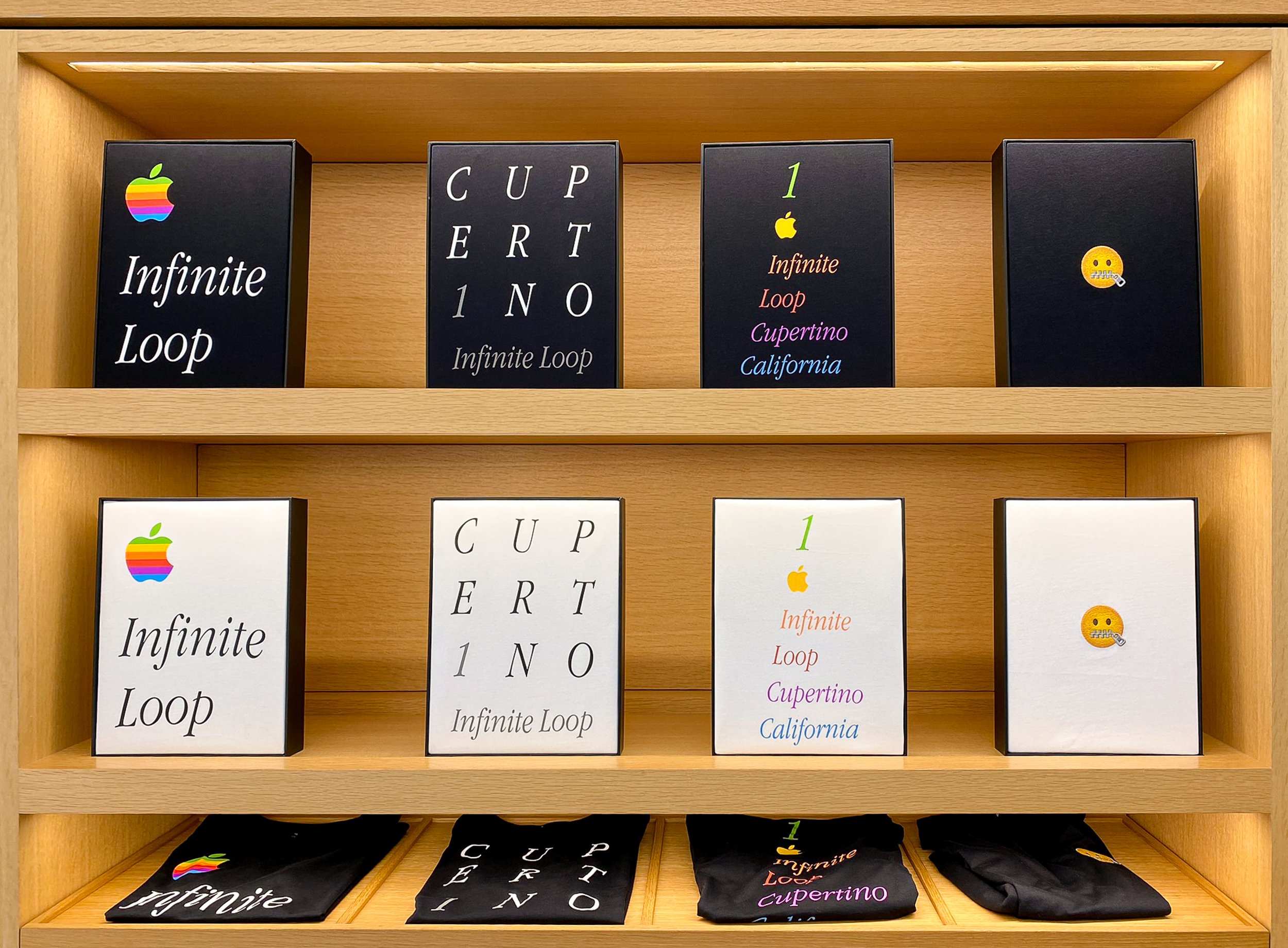
If you ever wanted a pen that perfectly matched the color of your MacBook Air, or a coffee mug or steel water bottle with an Apple logo, you're in luck. I picked up one of the canvas sketchbooks—in classic beige, of course. Thirty bucks for a half inch of smooth 60-to-80 pound 8x10 paper is a wildly overpriced alternative to a ten-dollar spiral bound drawing pad, but… eh, Apple tax, what're you gonna do. Meanwhile, the other side of the wall had the real cool stuff: T-shirts! Infinite Loop’s Apple apparel appeals to maniacal Macintosh mavens, with designs evoking eras long past. There’s a couple modern designs, like the "Mind Blown" emoji, but by and large these shirts look like they came straight from the nineties. Apple and the T-shirt are inseparable—there’s even a whole book chronicling the history of Apple-related T-shirts. I don't normally talk about clothing, but hey—it’s from Apple, it's soft, and you wear it. Good enough, let’s go.

A quick note: My own photos of the shirts had some issues, rendering them unusable for this segment, apparently. Please forgive me, 9to5mac, for, uh, borrowing yours.

  • Logo Infinite Loop. A large Apple logo along with Infinite Loop in white Apple Garamond Italic. This is a classic Apple shirt design and a must have, especially in black.

  • 1 Infinite Loop Cupertino Rainbow. More Apple Garamond Italic, but each line of text is a different color of Apple’s rainbow, along with a smaller Apple logo. If Logo Infinite Loop’s big Apple logo is too much, this is your alternative.

  • CUPERT1NO. The letters of the word Cupertino are arranged in a grid of white uppercase Apple Garamond. A gray numeral 1 replaces the letter I, which matches the gray “Infinite Loop” text below. Neat design, yes, but as someone who's actually designed shirts in his day, I think it'd look better on a poster.

  • Mind Blown Emoji. You can do better than an emoji. Skip it.

  • Hello. The latest version of the Macintosh’s Hello script as seen in the M1 iMac’s introduction. If you like subtle shirts, this is your pick. Mac fans will nod in approval, everyone else will just think you’re friendly.

  • Cupertino Script. The word “Cupertino” written in the same script as Hello. Same vibes as Hello, but even stealthier.

  • Pirates. An homage to the famous pirate flag that once flew above Apple HQ. The white variant has an emoji-style Jolly Roger flag, while the black version has a big skull and crossbones print on the chest. The eyepatch is a rainbow Apple logo, and printed on the inside neck is the famous Jobs quote “It’s better to be a pirate than join the navy.” The black version is a must have for any classic Apple fan.

  • Icons. A grid of Susan Kare’s legendary classic Mac OS icon designs are printed all over this shirt. There’s a spray can, stopwatch, command key, Apple logo, happy Mac, and even a bomb. A perfect match for the Classic Mac OS nerd, though the all over print is a very loud design. Whether or not Susan Kare is actually getting royalties for Icons, Pirates, or Hello, she deserves them.

While picking out these shirts, I was assisted by one of Apple’s retail employees. His name was Philippe, and we had a good time chatting about my visit to IL-1 and the various T-shirt designs. Folks like me who come by for a bit of the unique merch and seeing where it all happens aren’t uncommon, and Phil was a pro about it. He had stories about how he got into tech—his dad worked down the road at Sun Microsystems and he grew up surrounded by computers. We had a great talk about my time in the graphics industry and about this very blog, site, podcast—whatever. Hi, Phil! Thanks for listening! After paying for three T-shirts and a sketchbook, my time at the store was done. Now I was ready for the other reason I came to Infinite Loop.

Searching for Clarus

Clarus in the Garden

Clarus roams the garden.
Photo: George Sakkestad, Cupertino Courrier

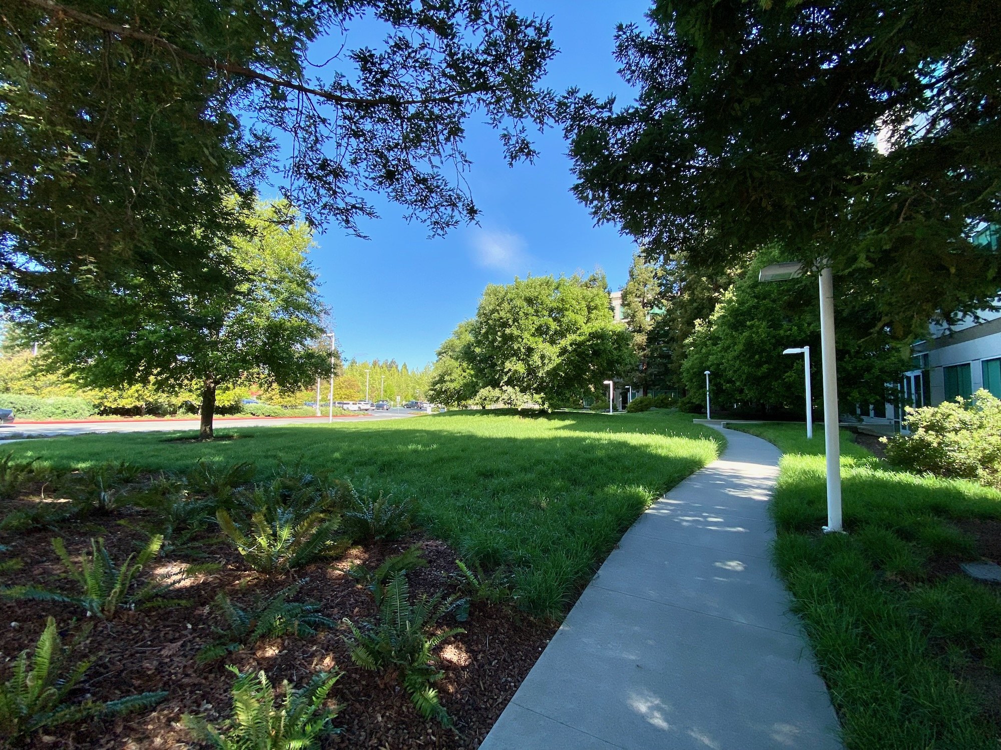
A small park lives at the corner of Infinite Loop 1 and 6. It’s somewhat larger than the other green spaces around the Infinite Loop buildings, with a concrete walkway and some trees dotting the interior. There’s not much to see there, save for those trees. Probably most people who head to the Apple Infinite Loop store walk right by this little patch of greenery without knowing its significance. But for longtime Apple employees and diehard fans who suffered through the bad old days, this otherwise unassuming park means just a little bit more.

Yes, this field is the former home of the famous—or maybe infamous—Icon Garden. As the legend goes, the government of Cupertino asked Apple to contribute to the beautification of their fair city. When Infinite Loop opened in 1993, Apple honored the city’s request by installing twelve foot tall sculptures of pixelated icons from Mac OS and MacPaint. Whether or not larger-than-life versions of icons like a paint bucket, the stopwatch, and Clarus the Dogcow count as art is open for debate, but it was good enough for the city of Cupertino. Thus, the Icon Garden was born. During its five years of existence the Garden was a place of pilgrimage for Apple acolytes—their way of paying homage to the whimsy that made them fall in love with a computer in the first place. This was when I was a teenager, so I only knew of the Garden through the pages of Mac magazines and Apple fansites. Taking a trip to Silicon Valley was out of the question, so I had to make do with an online QuickTime VR tour.

A morning stroll along the Garden.
Photo: Steve Castillo, Associated Press

But change was in the air with Steve Jobs’ return to Apple, and no dogcow was sacred. Employees arrived at Infinite Loop one morning in May of 1998 to find all the Icons missing from the Garden. Various theories and explanations as to why Clarus and company went AWOL emerged over the years. One Apple spokesperson said they were removed for cleaning, which was just a deflection. Another answer is from former Apple employee David Schlesinger, who said he cornered Steve at a company party and demanded an answer. Schlesinger posted the following in a Quora answer back in 2015:

“[Steve] admitted he’d had it done, he found them too pixellated, and that they were at that point sitting in a warehouse in Santa Clara.”

That’s a cromulent answer, but I think we should look at it from Steve's perspective. When Steve Jobs and Bill Gates were at the 2007 All Things Digital conference, the subject of righting the good ship Apple came up. Steve’s response is one found on many SEO content farm famous quotation pages today.

“And, you know, one of the things I did when I got back to Apple 10 years ago was I gave the museum to Stanford and all the papers and all the old machines and kind of cleared out the cobwebs and said, let’s stop looking backwards here. It’s all about what happens tomorrow. Because you can’t look back and say, well, gosh, you know, I wish I hadn’t have gotten fired, I wish I was there, I wish this, I wish that. It doesn’t matter. And so let’s go invent tomorrow rather than worrying about what happened yesterday.”

While this referred to Steve shipping off Apple’s in-house library and museum to Stanford, which happened in November 1997, it’s the same mentality that deemed the Icon Garden an anchor rather than an inspiration. I can’t fault Steve here, because Apple in that beleaguered era had a lot of problems, and one of them was an unwillingness to make a break with the past. Killing the past was the right thing to do, because Apple’s habit of navel-gazing often turned into abyss-gazing. The company was dying, and it desperately needed to rid itself of bad habits and dead weight. Mistakes like Copland, QuickDraw GX, and OpenDoc were in the past, and if Apple was to succeed, it needed to focus on the future. If that also meant putting away nostalgic memories of happier times, then so be it. With the museum shipped off and the Icon Garden dismantled, Apple set about inventing the future by designing new products to attract more than just the diehards.

And though wild dogcows no longer roam the fields of Cupertino, there have been recent sightings of this endangered species. Yes, Clarus returns in Mac OS Ventura’s page setup dialog box, where she does backflips in sync with your sheet orientation just like in the good old days. New iMacs proudly say hello in Susan Kare script as rainbows shine over Apple once more. Maybe Apple has found the right balance to honor their past without repeating its mistakes. Or maybe it's just a cynical tug at the heartstrings of people like me, diagnosed with a terminal case of retro brain.

The Icon Garden today.

Having paid tribute to an empty field, I hopped in my rental car and took a quick drive around the loop before I left. That’s when I noticed a fun little easter egg. Even though Steve had the icons dragged into the metaphorical trash, some pixelated parts of the past still persist. Each building is identified by a large numeral set in the classic Chicago font used everywhere in the Mac’s interface all those years ago. So although they weren’t technically part of the Garden, these links to Apple's visual past still remain at Infinite Loop. After completing my drive around the Loop, I set a course for across town. I had one more Apple destination to visit before returning to the airport: Apple Park.

The spaceship awaited.

And One Ring-Shaped Building Binds Them

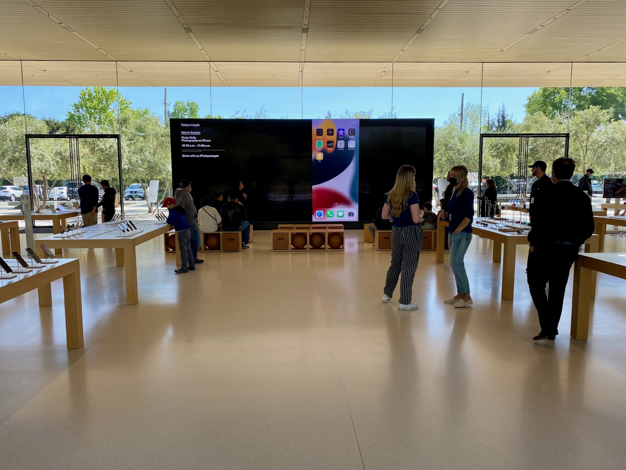
After a short drive down Stevens Creek Boulevard and a left onto North Tantau Drive, I arrived at the Apple Park Visitor Center. With its tall glass walls and a wooden slat roof, you’d be forgiven for thinking “wait a minute, that sounds like an Apple Store.” Congratulations—you’re right! If you’ve been to one of Apple’s flagship stores like Fifth Avenue, then you have an idea of the Visitor Center’s vibe. Unlike Infinite Loop the public isn’t allowed anywhere near the starship, so we have to settle for a shuttlecraft instead.

The majority of the Visitor Center’s floor space is dedicated to the usual tables lined with Macs, iPhones, and iPads. One wall of the store is dedicated to Apple merch, but the selection is different than Infinite Loop’s. Coffee cups and sketchbooks are out, and baby onesies, tote bags, and flash cards are in. The flash cards were amazing, and I regret not having taken a photo of them. They had a set of them permanently mounted to the wall, arranged like a flower so you could see all the individual cards. Unfortunately, they didn't have any sets for sale that day. On the other side of the wall was a selection of T-shirts, three of which—Mind Blown emoji, Hello, and Cupertino script—are carryovers from Infinite Loop. Apple Park’s location specific design is a color or monochrome ring resembling an aerial view of the spaceship with the words “Apple Park” written below.

The T-Shirt Collection at Apple Park.

Forget about that boring Ring design though, because Apple Park is lucky enough to get two absolutely classic Apple shirt designs with Rainbow Streak and Apple Garamond Rainbow. It’s tough to choose between an Apple logo blazing a rainbow across your chest or the classic rainbow Apple lettering—so I bought them both. Odds are you’ll be buying multiple shirts too. It’s hard to say which store has the better shirt selection. Ignoring the three overlapping designs, Apple Park has two absolute killers in Rainbow Streak and Apple Garamond Rainbow. Infinite Loop has two designs that are equally excellent but have more niche appeal: Pirates and Icons. Despite the awesomeness of Rainbow Streak and Apple Garamond Rainbow, I think the nod has to go to Infinite Loop because its location-branded shirts are better than Apple Park’s. Look at it this way—the Ring and emoji shirts are things I expect employees to wear. The One Infinite Loop shirts are far better souvenirs.

Mixed in with the various bits of merch on the wall is a small tribute to iconic Apple designs. Some photos of the Industrial Design Group’s greatest hits are arranged like plaques in a sports Hall of Fame. Superstars like the iPod and iMac G4 are there, of course, but I was pleasantly surprised to see that they've also got journeyman players like the original Pro Mouse and the clear subwoofer from the Harmon-Kardon Sound Sticks. Following these portraits leads you to Caffe Macs Apple Park, where you could take a break for a slice of pizza or a cup of coffee.

We’re waiting on the veteran’s committee to add a plaque for the cinema display.

After perusing the cafe, I climbed some nearby stairs to visit the center’s other big attraction: the observation deck. Some tables and chairs give the hungry Caffe Macs customers a place to sit back, enjoy their coffee or pizza, and take in a scenic overlook. Both the Steve Jobs Theater and the southeast quadrant of the spaceship are visible from this vantage point. It’s not exactly a sweeping vista that rivals the majesty of Yosemite, but it would be a nice place to watch the hustle and bustle around an Apple Event.

The Observation Deck at Apple Park.

As I took in the view of a meticulously manicured monument to Silicon Valley megalomania, an Apple employee came over to talk to me. I don’t quite remember her name—I’m pretty sure it was Stephanie—and she offered to snap a photo of me in front of the spaceship. I accepted and we got to chatting about my quick tour of both Apple campuses. Steph and I wound up having a great conversation about growing up with Commodore 64s. Having what amounts to an Apple Park Ranger on hand is a nice touch.

A Close Encounter of the Apple Kind.

Having seen and done everything I could at the Visitor’s Center, I hopped in the car and headed towards SFO to catch my flight back to Boston. Was it worth all the time and expense to visit the house that the Steves built? I certainly wouldn’t have planned a whole trip around it—flying from Boston to San Francisco just to buy a T-shirt and visit a patch of grass is well outside my budget. But I enjoy visiting San Francisco and the bay area. I’ve hiked amongst the redwoods, I’ve stood at the base of El Capitan, and I’ve listened to the waves in Monterey. Every time I go, I try to do something different, and this time Apple came up on the list.

Touring Infinite Loop also provided a bit of closure for one of my life’s many “what-ifs.” There’s a branching timeline where I could have been an Apple Genius. After I was laid off from a print shop job in January 2007, I spent a few months looking for new employment. In March I saw that Apple was hiring new Geniuses for their new store at the Holyoke Mall. That’s back when the Genius Bar was still something special, so I tossed my résumé into the mix. A few days later one of Apple’s many recruiters reached out for an interview.

It was one of the better interviews I had at the time. Aside from the usual job interview stuff, Apple put prospective Geniuses through a long, forty question test to determine their technical aptitude. I aced the test, even getting five of the six reasons for why a Mac Pro would have no video when four was sufficient. Both the technical and social sides of the interview went well, and then at the end, the recruiter said "One more thing…” No matter how advanced the skills of a potential employee, Apple sent all new technical hires on a two-week all expenses paid trip to Cupertino to instill the values of truth, justice, and the Jobsian way. At that time of my life I’d never been to San Francisco, and a two-week Apple boot camp sounded like a great opportunity. There was only one problem: the Holyoke Apple Store wouldn’t open until July, which was months away. My bank account was getting pretty thin, I had rent to pay, and I wasn’t sure if I could hold out until then.

Until we meet again, SFO.

While talking to Apple I also had an interview with what would eventually be my next employer. It was a job that was available right away and they would cover my relocation expenses so I could move to the Boston area. I said no to Apple, which was the right thing to do at the time. But whenever you make a choice, there’s always that nagging wonder that never goes away. What would my life have been like if I’d taken that two week trip to Cupertino? Maybe I would have been an Apple Store superstar, or maybe I would have turned into yet another jaded Apple employee. In the words of Little Texas, there’s no way to know what might have been. Life’s about making decisions, and you have to live with them—good or bad. Things worked out all right in the end, and now I can put those nagging thoughts out of my mind for good.

If you find yourself in the Cupertino area, stop by Infinite Loop. Technology is the way it is today because of the people that walked its paths, and it’s worth the trip if you’re like me and care about the mythology of personal computing. Or you can buy all the exclusive merch and lord it over your friends. No judgment on that front, because I’m a consumer whore too (and how!). Just make sure to leave a treat for Clarus on your way out.

Oh… one more thing.

With all the time I spent talking about the unique T-shirts offered at these stores, I should at least give an honest review of them as shirts. I admit to being slightly embarrassed over the amount of money I spent on what amounts to wearable corporate advertising—but only slightly. Apple’s obeying the laws of band shirt pricing at $40 apiece, so make sure you’re happy with the fit and style before spending the bills. Or just use the 14 day return policy—that’s what it’s for! I saved one shirt—Infinite Loop Rainbow—to open up at home and document what exactly that $40 gets you.

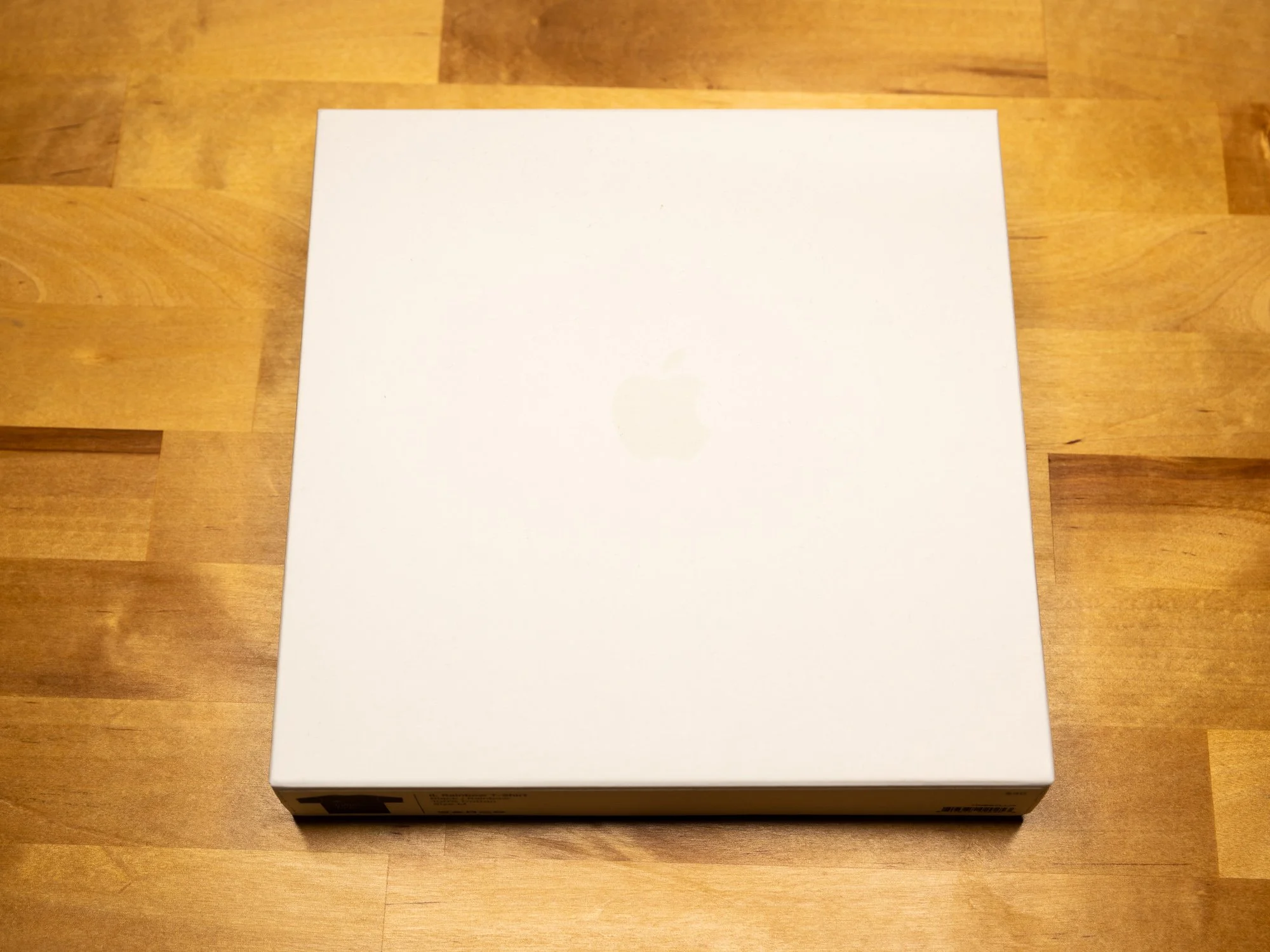
It won’t surprise you to learn that Apple shirts come packaged just like any other Apple accessory: in a plain white box with a varnished Apple logo. A protective plastic wrap covers the shirt itself, which is easily disposed of in the recycling. No manufacturer’s tag is present, but the shirts are made in China, just like Apple’s computers. The design is silkscreened onto a 100% lightweight cotton shirt, so set your durability expectations accordingly. I’d characterize the fit as athletic or slim, though I’m not sure how differently they cut the larger sizes versus the smaller ones. No size chart was available, and with no demo shirts to try on, you’re flying a little blind if you’re an inbetweener like me. I normally wear medium sized men’s T-shirts, and I’d characterize the fit as “exact.” There’s not much wiggle room, and the sleeves are a bit short. A large would be just so slightly too big, but with this style of fabric you’re better off going a size up if you’re unsure. I was allowed to buy a shirt, try it on, and return it if the fit wasn’t right, so I advise you to do the same if you’re an inbetweener.

Are these shirts worth forty clams? …Eh. The reality is no, they’re not—they’re probably the worst value of anything you can buy at the two stores. And unlike with band shirts, you don’t have the excuse that the extra margin goes to support the group. Even Nintendo doesn’t charge that much at their World Store in Rockefeller Center for a Samus Aran shirt, and they’re one step below Apple on the “we love our margins” chart. This is crass consumerism at its finest. But as bad of a value as they are… they’re infinitely cool. You’re paying for the excellence of the designs, not the shirt they’re printed on. Of course, if you think these are expensive, look how much a vintage Apple Garamond Rrainbow letter shirt goes for on eBay—buying new is actually cheaper. Just pick the one design you really like, make sure it fits, and take good care of it. Whether the money is worth it is between you, your bank account, and how much you love a rainbow Apple.

Apple’s Podcast Review Feature Is Terrible

Reading podcast reviews in Apple’s Podcast apps isn’t a good experience. I’m not even referring to the content of the reviews, which like most internet comment sections ranges from insightful to execrable. No, I’m talking about the process of navigating and reading those reviews. It’s been bad ever since iOS 9’s big refactoring of Podcasts.app and it hasn’t gotten any better since.

Why do podcast reviews matter? Apple’s operated one of the largest podcast catalogs on the planet since 2005. Millions of people used iTunes and owned devices that connected to it, like iPhones and iPods, and they were ready to tell you if a podcast was lousy or great. Apple also uses ratings and reviews to populate shows in its ranking and recommendation lists, which is why podcasters are often begging kindly requesting that you give them a five star rating and review in their show’s credits. Even if a friend referred you to a show, it might be nice to see what other people thought about it.

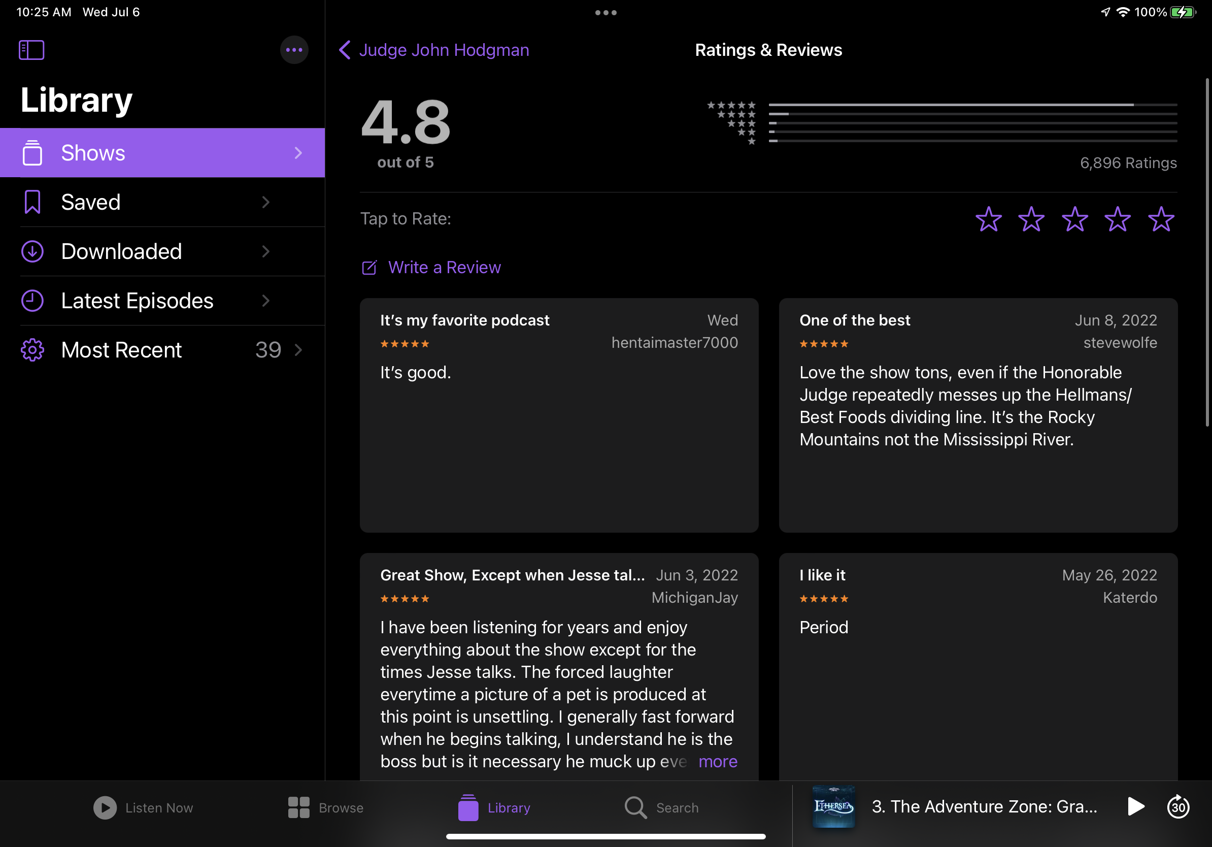
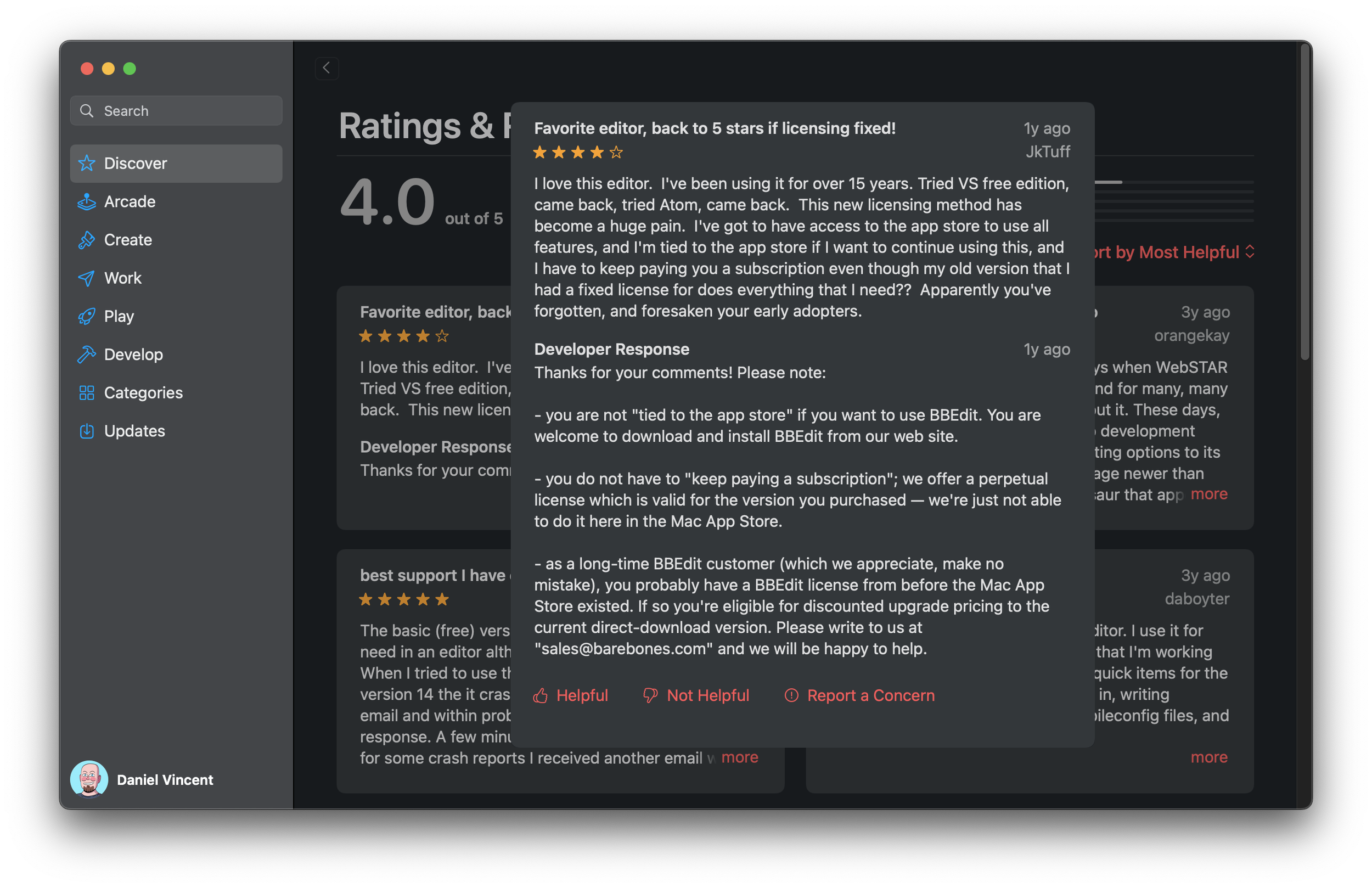
So why am I grumpy about the state of reviews? It’s all about user experience. Apple likes to crow about how Podcasts.app is a unified experience across all its devices, but that’s not always a good thing. It’s sometimes the worst of both worlds—each platform shares annoying limitations while having their own gotchas. On the iPhone, reviews are presented in an infinitely scrolling list, with no way to sort or filter them. The iPad presents reviews in a square grid, again with no sorting or filtering options. If you have a longer review, tapping “more” on the iPhone expands the block to show the complete text, while the iPad shows a maddeningly large modal pop-up that blurs out the rest of the screen.

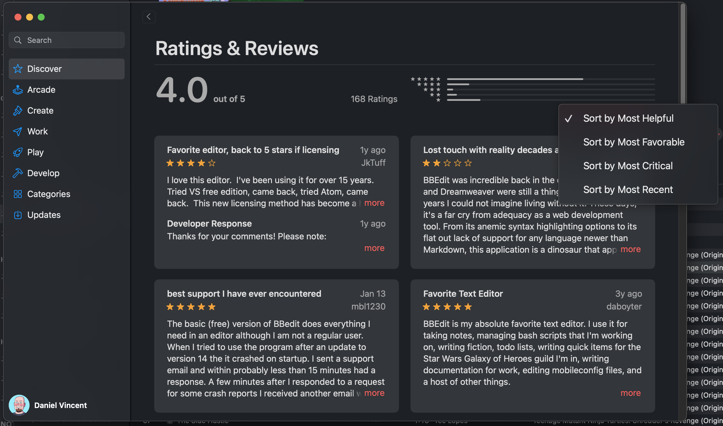
A dropdown. How’s about that?

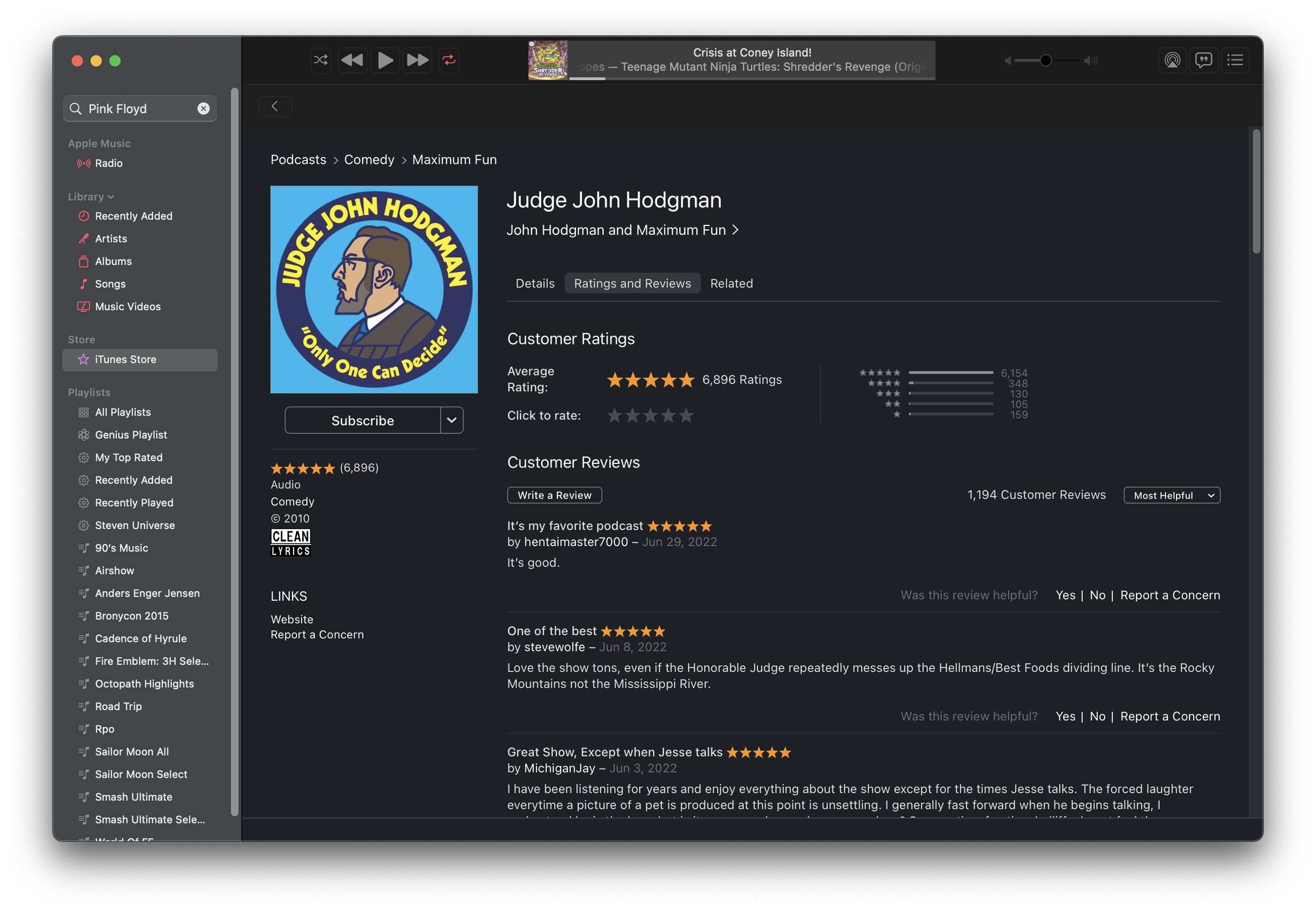
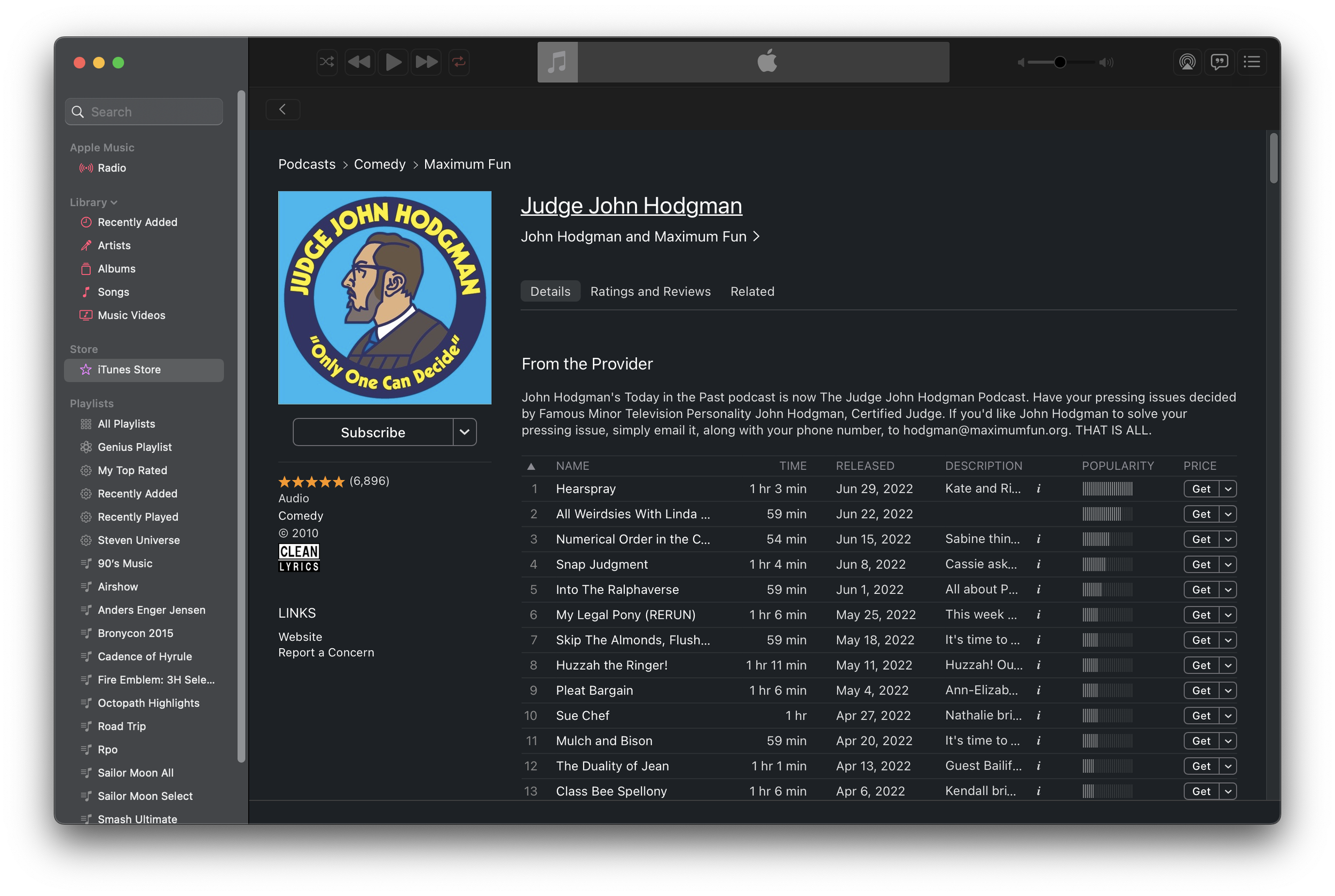
Mac users who used iTunes to listen to podcasts would see a reviews page that looked a lot like an album or app review page. First, iTunes allowed you to sort reviews. The default is an algorithmic “most helpful” that pushes reviews that have been marked as “helpful” to the top, but otherwise prioritizes newer reviews. If that’s not actually helpful, you can sort by most favorable or most critical, which is really sort by star rating. Lastly, you can sort by most recent, which shows the newest reviews first. The total number of reviews along with the number of each rating were listed, and if a review was too long clicking “more” expanded it to show the entire one without clunky modals. Plus, reviews can be marked as helpful or not, and if a review has issues like bad language or was spammy, you can report it. That’s all basic stuff you expect on most comment sections on the internet. The iPhone and iPad apps used to have these features too, but they disappeared in one of Apple Podcasts’ many UI redesigns over the past five years.

How Podcast reviews looked in iTunes.

Apple brought the iOS Podcasts experience to the Mac in 2019 when Mac OS Catalina split iTunes apart into separate apps. Now Mac users are subjected to Podcasts.app on the Mac, and it hasn’t improved one bit since. In fact, it’s actively worse than iTunes in several ways. You can no longer choose how to sort reviews, with reviews forced into the “Most Helpful” sorting order. “Most Helpful” means old reviews that could be long out of date get shown at the top because a lot of people marked them as “helpful” at some point. The thing is, you can’t mark reviews as “helpful” anymore on any Apple platform—only users of iTunes for Windows can still mark reviews as helpful because they still have the legacy interface. This just raises further questions, like “are those reviews still helpful if they’re old?” Those upvoting features aren’t the only casualties—the ability to report a review is gone too! With these community moderation features missing in action, Apple Podcast reviews are now less functional than YouTube comments.

But the most infuriating thing is that reading reviews is straight-up broken since the introduction of Podcasts.app to the Mac. Let’s say you’ve written a long, detailed review about a podcast. The main reviews listing will truncate it with a More… link as it did in iTunes, except when you click the More link Podcasts opens up a modal dialog box that truncates the review at four lines of text! Regardless of how large or small you size the window, you’ll never see the missing text. Despite feedbacks being filed, this still hasn’t been fixed. Given the lack of, well, any care given to podcast reviews in Apple Podcasts, I doubt Apple values them very much. I can confirm that this is just a bug with Podcasts.app on the Mac, as iOS, iPad OS and Apple Podcasts on the Web all show the full text of a review when clicking the More… link. Given the other problems in Podcasts.app, like its syncing issues and its inability to show a proper list of “recent” episodes without forgetting some shows, reviews seem like small fry. Still, Apple software is supposed to be about the little things. The joints on the back of the cabinet are supposed to be finished the same as the ones on the front.

Reviews on the Mac look similar to the iPad, but…

…as you can see, this is just broken. I don’t mean to pick on MichiganJay in particular—their review was just the first one that broke.

What’s even more annoying about this situation is that Apple has already proven it doesn’t have to be this way. There’s a lot wrong with App Store customer reviews from both a user and developer perspective, but at least an app’s review section has all the sorting and reporting features they had when they used to be in iTunes. App reviews can be sorted with the same four sorting options listed earlier. Bad or problematic reviews can be reported. Reviews can be marked as helpful or unhelpful. Developers can even respond to reviews, which is a feature that podcast hosts don’t get. And all of these features are available on the Mac OS, iOS, and iPad OS app stores. Marking a review as helpful or unhelpful in iOS wasn’t immediately obvious, but it pops up when long pressing the review. I tried the same thing in Podcasts.app and got nothing. Apple’s already proven it can be done, and as much as I dislike the UI of the App Store, the methods it used to implement them make sense in that context. Using the App Store as a model, all these features could be added back to Podcasts.app. Someone get that in the next sprint, please.

Bonus: Reading Podcast Reviews in Music.App

So if you’re on a Mac and you want to sort reviews or actually read their entire contents, are you screwed? No! Sure, you can see the whole review on Podcasts for the Web, but what if you want to sort or upvote a review? Believe it or not, there is a way! You may have noticed earlier that my screenshot of the “old” interface was actually in Music.app in Monterey. Despite the separation of iTunes into multiple apps, its all-in-one legacy lives on. You can open up podcast pages in Music.app just like iTunes. By crafting a music:// link to point to a podcast, Music will dutifully follow the link and open up the legacy podcast page.

Here’s an example: music://itunes.apple.com/us/podcast/judge-john-hodgman/id337713843 Just click it and you’ll be asked to open it in Music.app. The reviews tab for the show is right there, and you can write reviews, mark them as helpful, report them, and sort by newest added. You can even browse the old iTunes podcast catalog by using the breadcrumbs and going up to the top level. So long as iTunes for Windows still exists, I bet this functionality won’t go away from Music.app.

You can even play and subscribe, though I don’t think subscribe would actually work.

Honestly, I just want to be able to read a complete review and sort them by date added. That shouldn’t be too hard, but Apple seems to care more about extracting a percentage of podcaster’s revenue than actually making a good user experience these days. If Apple wants more people to treat Apple Podcasts like a community, then it needs to start actually making it like one.

The 2021 MacBook Pro Review

Here in Userlandia, the Power’s back in the ‘Book.


I’ve always been a fan of The Incredibles, Brad Bird’s exploration of family dynamics with superhero set dressing. There’s a bit in the movie where Bob Parr—Mister Incredible—has one of his worst days ever. Getting chewed out by his boss for helping people was just the start. Indignities pile up one after another: monotonous stop-and-go traffic, nearly slipping to death on a loose skateboard, and accidentally breaking the door on his comically tiny car. Pushed to his absolute limit, Bob Hulks out and hoists his car into the air. Just as he’s about to hurl it down the street with all of his super-strength, he locks eyes with a neighborhood kid. Both Bob and the kid are trapped in an awkward silence. The poor boy’s staring with his mouth agape, his understanding of human strength now completely destroyed. Bob, realizing he accidentally outed himself as a superhero, quietly sets the car down and backs away, hoping the kid will forget and move on.

Time passes, but things aren’t any better the next time we see Bob arriving home from work. He’s at his absolute nadir—you’d be too for being fired after punching your boss through four concrete walls. Facing another disruptive relocation of his family, Bob Parr can’t muster up the anger anymore—he’s just depressed. Bob steps out of his car, and meets the hopeful gaze of the kid once again. “Well, what are you waiting for?” asks Bob. After a brief pause, the kid shrugs and says “I dunno… something amazing, I guess.” With a regretful sigh, Mister Incredible forlornly replies: “Me too, kid. Me too.”

For the past, oh, six years or so, Apple has found itself in a Mister Incredible-esque pickle when it comes to the MacBook Pro. And the iPhone, and iPad, and, well, everything else. People are always expecting something amazing, I guess. Apple really thought they had something amazing with the 2016 MacBook Pro. The lightest, thinnest, most powerful laptop that had the most advanced I/O interface on the market. It could have worked in the alternate universe where Intel didn’t fumble their ten and seven nanometer process nodes. Even if Intel had delivered perfect processors, the design was still fatally flawed. You have to go back to the PowerBook 5300 to find Apple laptops getting so much bad press. Skyrocketing warranty costs from failing keyboards and resentment for the dongle life dragged these machines for their entire run. Most MacBook Pro users were still waiting for something amazing, and it turned out Apple was too.

Spending five years chained to this albatross of a design felt like an eternity. But Apple hopes that a brand-new chassis design powered by their mightiest processors yet will be enough for you to forgive them. Last year’s highly anticipated Apple Silicon announcements made a lot of crazy promises. Could Apple Silicon really do all the things they said? Turns out the Apple Man can deliver—at least, at the lower end. But could it scale? Was Apple really capable of delivering a processor that could meet or beat the current high end? There’s only one way to find out—I coughed up $3500 of my own Tricky Dick Fun Bills and bought one. Now it’s time to see if it’s the real deal. 

Back to the (Retro) Future

For some context, I’ve been living the 13 inch laptop life since the 2006 white MacBook, which replaced a 15 inch Titanium PowerBook G4 from 2002. My current MacBook Pro was a 2018 13 inch Touch Bar model with 16 gigabytes of RAM, a 512 gigabyte SSD, and four Thunderbolt ports. My new 16 inch MacBook Pro is the stock $3499 config: it comes equipped with a M1 Max with 32 GPU cores, 32 gigabytes of RAM, and a 1 terabyte SSD.

Think back thirteen years ago, when Apple announced the first aluminum unibody MacBook Pro. The unibody design was revealed eight months after the MacBook Air, and the lessons learned from that machine are apparent. Both computers explored new design techniques afforded by investments in new manufacturing processes. CNC milling and laser cutting of solid aluminum blocks allowed for more complex shapes in a sturdier package. For the first time, a laptop could have smooth curved surfaces while being made out of metal. While the unibody laptops were slightly thinner, they were about the same weight as their predecessors.

Apple reinvested all of the gains from the unibody manufacturing process into building a stronger chassis. PowerBooks and early MacBooks Pro were known for being a little, oh, flexible. The Unibody design fixed that problem for good with class-leading structural rigidity. But once chassis flex was solved, the designers wondered where to go next. Inspired by the success of the MacBook Air, every future MacBook Pro design pushed that original unibody language towards a thinner and lighter goal. While professionals appreciate a lighter portable—no one really misses seven pound laptops—they don’t like sacrificing performance. Toss Intel’s unanticipated thermal troubles onto the pile and Apple’s limit-pushing traded old limitations for new ones. It was time for a change.

Instead of taking inspiration from the MacBook Air, the 2021 MacBook Pro looks elsewhere: the current iPad Pro, and the Titanium PowerBook G4. The new models are square and angular, yet rounded in all the right places. Subtle rounded corners and edges along the bottom are reminiscent of an iPod classic. A slight radius along the edge of the display feels exactly like the TiBook. Put it all together and you have a machine that maximizes the internal volume of its external dimensions. Visual tricks to minimize the feeling of thickness are set aside for practical concerns like thermal capacity, repairability, and connectivity.

I’m seeing double. Four PowerBooks!

The downside of this approach is the computer feels significantly thicker in your hands. And yet the new 16 inch MacBook Pro is barely taller than its predecessor—.66 inches versus .64 (or 168mm versus 166). The 14 inch model is exactly the same thickness as its predecessor at .61 inches or 150mm. It feels thicker because the thickness is uniform, and there’s no hiding it when you pick it up from the table. The prior model's gentle, pillowy curves weren’t just for show—they made the machine feel thinner because the part you grabbed was thinner.

Memories of PowerBooks past are on display the moment you lift the notebook out of its box. I know others have made this observation, but it’s hard to miss the resemblance between the new MacBooks and the titanium PowerBook G4. As a fan of the TiBook’s aesthetics, I understand the reference. The side profiles are remarkably similar, with the same square upper body and rounded bottom edges. A perfectly flat lid with gently rolled edges looks and feels just like a Titanium. If only the new MacBook Pro had a contrasting color around the top case edges like the Titanium’s carbon-fiber ring—it really makes the TiBook look smaller than it is. Lastly, blacking out the keyboard well helps the top look less like a sea of silver or grey, fixing one of my dislikes about the prior 15 and 16 inchers.

What the new MacBook Pro doesn’t borrow from the Titanium are weak hinges and chassis flex. The redesigned hinge mechanism is smoother, and according to teardowns less likely to break display cables. It also fixes one of my biggest gripes: the dirt trap. On the previous generation MacBooks, the hinge was so close to the display that it created this crevice that seemed to attract every stray piece of lint, hair, and dust it could find. I resorted to toothbrushes and toothpicks to get the gunk out. Now, it’s more like the 2012 to 2015 models, with a wide gap and a sloping body join that lets the dust fall right out. Damp cloths are all it takes to clean out that gap, like how it used to be. That gap was my number one annoyance after the keyboard, and I thank whoever fixed it.

Something else you’ll notice if you’re coming from a 2016 through 2020 model is some extra mass. The 14 and 16 inch models, at 3.5 and 4.7 pounds respectively, have gained half a pound compared to their predecessors, which likely comes from a combination of battery, heatsink, metal, and screen. There’s no getting around that extra mass, but how you perceive it is a matter of distribution. I toted 2011 and 2012 13 inch models everywhere, and those weighed four and a half pounds. It may feel the same in a bag, but in your hands, the bigger laptop feels subjectively heavier. If you’re using a 2012 through 2015 model, you won’t notice a difference at all—the new 14 and 16 inch models weigh the same as the 13 and 15 inchers of that generation.

I don’t think Apple is going to completely abandon groundbreaking thin-and-light designs, but I do think they’re going to leave the envelope-pushing crown to the MacBook Air. There is one place Apple could throw us a bone on the style front, though, and that’s color choices. I would have bought an MBP in a “Special edition” color if they offered it, and I probably would have paid more too. Space Gray just isn’t dark enough for my tastes. Take the onyx black shade used in the keyboard surround and apply it to the entire machine—it would be the NeXT laptop we never had. I’d kill to have midnight green as well. Can’t win ‘em all, but I know people are dying for something other than “I only build in silver, and sometimes, very very dark gray.”

Alone Again, Notch-urally

There’s no getting around it: I gotta talk about the webcam. Because some people decided that bezels are now qualita non grata on modern laptops, everyone’s been racing to make computers as borderless as possible. But the want of a bezel-free life conflicts with the need for videoconferencing equipment, and you can’t have a camera inside your screen… or can you? An inch and a half wide by a quarter inch tall strip at the top of the display has been sacrificed for the webcam in an area we’ve collectively dubbed “the notch.” Now the MacBook Pro has skinny bezels measuring 3/16s of an inch, at the cost of some menu bar area.

Oh, hello. I didn’t… see you there. Would you like some… iStat menu items?

Dell once tried solving this problem in 2015 by embedding a webcam in the display hinge of their XPS series laptops. There’s a reason nobody else did it—the camera angle captured a view straight up your nose. Was that tiny top bezel really worth the cost of looking terrible to your family or coworkers? Eventually Dell made the top bezel slightly taller and crammed the least objectionable tiny 720p webcam into it. When other competitors started shrinking their bezels, people asked why Apple couldn’t do the same. Meanwhile, other users kept complaining about Apple’s lackluster webcam video quality. The only way to get better image quality is to have a bigger sensor and/or a better lens, and both solutions take up space in all three axes. Something had to give, and the loyal menu bar took one for the team.

The menu bar’s been a fixture on Macintoshes since 1984—a one-stop shop for all your commands and sometimes questionable system add-ons. It’s always there, claiming 20 to 24 precious lines of vertical real estate. Apple’s usually conservative when it comes to changing how the bar looks or operates. When they have touched it, the reactions haven’t been kind. Center-aligned Apple logo in the Mac OS X Public Beta, anyone? Yet here we are, faced with a significant chunk of the menu bar’s lawn taken away by an act of eminent domain. As they say, progress has a price.

A few blurry pictures of a notched screen surfaced on MacRumors a few days before the announcement. I was baffled by the very idea. No way would Apple score such an own-goal on a machine that was trying to right all the wrongs of the past five years. They needed to avoid controversy, not create it! I couldn’t believe they would step on yet another rake. And yet, two days later, there was Craig Federighi revealing two newly benotched screens. I had to order up a heaping helping of roasted crow for dinner.

Now that the notch has staked its claim, what does that actually mean for prospective buyers? First, about an inch and a half of menubar is no longer available for either menus or menu extras. If an app menu goes into the notch, it’ll shift over to the right-hand side automatically. Existing truncation and hiding mechanisms in the OS help conserve space if both sides of your menu bar are full. Second, fullscreen apps won’t intrude into the menubar area by default. When an app enters fullscreen mode the menu bar slides away, the mini-LED backlights turn off, and the blackened area blends in with the remaining bezel and notch. It’s as if there was nothing at all—a pretty clever illusion! Sling your mouse cursor up top and menu items fade back in, giving you access to your commands. When you’re done, it fades to black again. If an app doesn’t play nice with the notch, you can check a box in Get Info to force it to scale the display below the notch.

Menu bar gif

How the menu bar fades and slides in fullscreen mode.

But are you losing any usable screen space due to the notch? Let’s do some math. The new 16 inch screen’s resolution is 3456 pixels wide by 2234 tall, compared to the previous model’s 3072 by 1920. Divide that by two for a native Retina scale and you get usable points of 1728 by 1117 versus 1536 by 960. So if you’re used to 2x integer scaling, the answer is no—you’re actually gaining vertical real estate with a notched Mac. Since I hate non-native scaling, I’ll take that as a win. If you’re coming from a prior generation 15 inch Retina MacBook Pro with a 1440 point by 900 display, that’s almost a 24 percent increase in vertical real estate. You could even switch to the 14 inch model and net more vertical space and save size and weight!

Working space

What did the menu bar give up to make this happen? The notch claims about ten percent of the menu bar on a 16 inch screen, and fifteen percent on a 14 inch. In point terms, it takes up about 188 horizontal points of space. Smaller displays are definitely going to feel the pinch, especially if you’re running a lot of iStat Menus or haven’t invested in Bartender. Some applications like Pro Tools have enough menus that they’ll spill over to the other side of the notch. With so many menus, you might trip Mac OS’ menu triage. It hides NSMenuBar items first, and then starts truncating app menu titles. Depending on where you start clicking, certain menu items might end up overlapping each other, which is disconcerting the first time you experience it. That’s not even getting into the bugs, like a menu extra sometimes showing up under the notch when it definitely shouldn’t. I think this is an area where Apple needs to rethink how we use menulings, menu extras, or whatever you want to call them. Microsoft had its reckoning with Status Tray items two decades ago, and Apple’s bill is way past due. On the flip side, if you’re the developer of Bartender, you should expect a register full of revenue this quarter.

Audacity's window menu scoots over.

Audacity’s Window menu scoots over to the other side of the notch atuomatically.

On the vertical side, the menu bar is now 37 points tall versus the previous 24 in 2x retina scale. Not a lot, but worth noting. It just means your effective working space is increased by 44 points, not 57. The bigger question is how the vertical height works in non-native resolutions. Selecting a virtual scaled resolution keeps the menu bar at the same physical size, but shrinks or grows its contents to match the scaling factor. It looks unusual, but if you’re fine with non-native scaling you’re probably fine with that too. The notch will never dip below the menu bar regardless of the scaling factor.

What about the camera? Has its quality improved enough to justify the land takings from the menu bar? Subjective results say yes, and you’ll get picture quality similar to the new iMac. People on the other side of my video conferences noticed the difference right away. iPads and iPhones with better front cameras will still beat it, but this is at least a usable camera versus an awful one. I’ve taken some comparison photos between my 2018 model, the new 2021 model, and a Logitech C920x, one of the most popular webcams on the market. It’s also a pretty old camera and not competitive to the current crop of $200+ “4K” webcams—and I use that term loosely—but it’s good enough quality for most people.

The 720p camera on the 2018 model is just plain terrible. The C920x is better than that, but it’s still pretty soft and has bluer white balance. Apple actually comes out ahead in this comparison in terms of detail and sharpness. Note that the new cameras field of view is wider than the old 720p camera—it’s something you’ll have to keep in mind.

Looking at the tradeoffs and benefits, I understand why Apple went with the notch. Camera quality is considerably improved, the bezels are tiny, and that area of the menu bar is dead space for an overwhelming majority of users. It doesn’t affect me much—I already use Bartender to tidy up my menu extras, and the occasional menu scooting to the other side of it is fine. Unless your menu extras consume half of your menu bar, the notch probably won’t affect your day to day Mac life either.

Bartender in action.

Without Bartender, I would have a crowded menu bar—regardless of a notch.

But there’s one thing we’ll all have to live with, and that’s the aesthetics. There’s a reason that almost all of Apple’s publicity photos on their website feature apps running in fullscreen mode, which conveniently blacks out the menubar area. All of Apple’s software tricks to reduce the downsides of the notch can’t hide the fact that it’s, well… ugly. If you work primarily in light mode, there’s no avoiding it. Granted, you’re not looking at the menu bar all the time, but when you do, the notch stares back at you. If you’re like me and you use dark mode with a dark desktop picture, then the darker menu bar has a camouflage effect, making the notch less noticeable. There’s also apps like Boring Old Menu Bar and Top Notch that can black out the menubar completely in light mode. Even if you don’t care about the notch, you might like the all-black aesthetic.

Is it worse than a bezel? Personally, I don’t hate bezels. It’s helpful to have some separation between your content and the outside world. I have desktop displays with bezels so skinny that mounting a webcam on top of them introduces a notch, which also grinds my gears. At least I can solve that problem by mounting the webcam on a scissor arm. I also like the chin on the iMac—everyone sticks Post-Its to it and that’s a valid use case. It’s also nice to have somewhere to grab to adjust the display angle without actually touching the screen itself. Oh, and the rounded corners on each side of the menu bar? They’re fine. In fact, they’re retro—just like Macs of old. Round corners on the top and square at the bottom is the best compromise on that front.

All the logic is there. And yet, this intrusion upon my display still offends me in some way. I can rationalize it all I want, but the full-screen shame on display in Apple’s promotional photos is proof enough that if they could get tiny bezels without the notch, they would. It’s a compromise, and nobody likes those. The minute Apple is able to deliver a notch-less experience, there will be much rejoicing. Until then, we’ll just have to deal with it.

We All Scream for HDR Screens

The new Liquid Retina ProMotion XDR display’s been rumored for years, and not just for the mouthful of buzzwords required to name it. It’s the first major advancement in image quality for the MacBook Pro since the retina display in 2012. Instead of using an edge-lit LED or fluorescent backlight, the new display features ten thousand individually addressable mini-LEDs behind the liquid crystal panel. If you’ve seen a TV with “adaptive backlighting zones,” it’s basically the same idea—the difference is that there’s a lot more zones and they’re a lot smaller. Making an array of tiny, powerful, efficient LEDs with great response time and proper color response isn’t trivial. Now do it all at scale without costs going out of control. No wonder manufacturers struggled with these panels.

According to the spec sheet, the 16 inch MacBook Pro’s backlight consists of 10,000 mini-LEDs. I’ll be generous and assume each is an individually addressable backlight zone. The 16.2 inch diagonal display, at 13.6 by 8.8 inches, has about 119.5 square inches of screen area that needs backlighting. With 10,000 zones, that results in about 83.6 mini-LEDs per square inch. Each square inch of screen contains 64,516 individual pixels. That means each LED is responsible for around 771 pixels, which makes for a zone area of 27.76 pixels squared. Now, I’m not a math guy—I’ve got an art degree. But if you’re expecting OLED per-pixel backlighting, you’ll need to keep waiting.

All these zones means adaptive backlighting—previously found on the Pro XDR display and the iPad Pro—is now a mainstream feature for Macs. Overall contrast is improved because blacks are darker and “dark” areas are getting less light than bright areas. It largely works as advertised—HDR content looks great. For average desktop use, you’ll see a noticeable increase in contrast across the board even at medium brightness levels.

Safari HDR support

Safari supports HDR video playback on youtube, and while you can’t see the effects in this screenshot, it looks great on screen.

But that contrast boost doesn’t come for free. Because backlight zones cover multiple pixels, pinpoint light sources will exhibit some amount of glow. Bright white objects moving across a black background in a dark room will show some moving glow effect as well. Higher brightness levels and HDR mode make the effect more obvious. Whether this affects you or not depends on your workflow. The problem is most noticeable with small, bright white objects on large black areas. If you want a surefire way to demonstrate this, open up Photoshop, make a 1000x1000 document of just black pixels, and switch to the hand tool. Wave your cursor around the screen and you’ll see the subtle glow that follows the cursor as it moves. Other scenarios are less obvious—say, if you use terminal in dark mode. Lines of text will be big enough that they straddle multiple zones, so you may see a slight glow. I don’t think the effect is very noticeable unless you are intentionally trying to trigger it or you view a lot of tiny, pure white objects on a black screen in a dark room. I’ve only noticed it during software updates and reboots, and even then it is very subtle.

Watch this on a Mini-LED screen to see the glow effect. It’s otherwise unnoticeable in daily usage.

I don’t think this is a dealbreaker—I don’t work with tiny white squares on large black backgrounds all day long. But if you’re into astrophotography, you might want to try before you buy. Edge-lit displays have their own backlight foibles too, like piano keys and backlight uniformity problems, which mini-LEDs either eliminate or reduce significantly. Even CRTs suffered from bloom and blur, not to mention convergence issues. It’s just a tradeoff that you’ll have to judge. I believe the many positives will outweigh the few negatives for a majority of users.

The other major change with this screen and Mac OS Monterey is support for variable refresh rates. With a maximum refresh rate of 120Hz, the high frame rate life is now mainstream on the Mac. If you’re watching cinematic 24 frames per second content, you’ll notice the lack of judder right away. Grab a window and drag it around the screen and you’ll see how smooth it is. Most apps that support some kind of GPU rendering with vsync will yield good results. Photoshop’s rotate view tool is a great example—it’s smooth as butter. System animations and most scrolling operations are silky smooth. A great example is using Mission Control—the extra frames dramatically improve the shrinking and moving animations. Switching to fullscreen mode has a similar effect.

But the real gotcha is that most apps don’t render their content at 120 FPS. It’s a real mixed bag out there at the moment, and switching between a high frame rate app to a boring old 60Hz one is jarring. Safari, for instance, is stuck at 60 FPS. This is baffling, because a browser is the most used application on the system. Hopefully it’s fixed in 12.1.

But pushing frames is just one part of a responsive display. Pixel response time is still a factor in LCD displays, and Apple tends to use panels that are middle of the pack. Is the new MacBook Pro any different? My subjective opinion is that the 16 inch MBP is good, but not great in terms of pixel response. Compared to my ProMotion equipped 2018 iPad Pro, the Mac exhibits a lot less ghosting. Unfortunately, it’s not going to win awards for pixel response time. Until objective measurements are available, I’m going to hold off from saying it’s terrible, but compared to a 120 or 144Hz gaming-focused display, you’ll notice a difference. 

In addition to supporting variable and high refresh rates on the internal screen, the new MacBooks also support DisplayPort adaptive refresh rates—what you might know as AMD’s FreeSync. Plug in a FreeSync or DisplayPort adaptive refresh display using a Thunderbolt to DisplayPort cable and you’ll be able to set the refresh rate along with adaptive sync. Unfortunately, Adaptive Sync doesn’t work via the built-in HDMI port, because HDMI Variable Refresh Rate requires an HDMI 2.1 port. Also, Apple’s implemented the DisplayPort standard, and FreeSync over HDMI 2.0 is proprietary to AMD. I’m also not sure if Thunderbolt to HDMI 2.1 adapters will work either, because I don’t have one to test.

LG Display Prefs

The LG 5K2K Ultrawide works perfectly with these Macs and Monterey.

Speaking of external displays, I have a bunch that I tested with the M1 Max. The good news is that my LG 5K ultrawide works perfectly fine when attached via Thunderbolt. HiDPI modes are available and there’s no issues with the downstream USB ports. The LG 5K ultrawide is the most obscure monitor I own, so this bodes well for other ultrawide displays, but I can’t speak definitively about those curved ultrawides that run at 144Hz. I wasn’t able to enable HDR output, and I believe this is due to a limitation of the display’s Thunderbolt controller—if I had a DisplayPort adapter, it might be different. My Windows PC attached via DisplayPort switches to HDR just fine. I can’t definitely call it until tested that way. My aging Wacom Cintiq 21UX DTK2100 works just fine with an HDMI to DVI adapter. An LG 27 inch 4K display works well over HDMI, and HDR is supported there too. The only missing feature with the LG 4K is Adaptive Sync, which requires a DisplayPort connection from this Mac. Despite that, you can still set a specific refresh rate via HDMI.

If multi-monitor limitations kept you away from the first round of M1 Macs, those limits are gone. The M1 Pro supports two 6K external displays, and the Max supports three 6K displays plus a 4K60 over HDMI. I was indeed able to hook up to three external displays, and it worked just like on my Intel Macs. I did run into a few funny layout bugs with Monterey’s new display layout pane, which I’m sure will be ironed out in time. Or not—you never know what Apple will fix these days.

This happened a few times. Sometimes it fixed itself after a few minutes, other times it just sat there.

How about calibration? Something I’ve seen floating around is that “The XDR displays can’t be hardware calibrated,” and that’s not true. What most people think of as “hardware calibrating” is actually profiling, where a spectrophotometer or colorimeter is used to linearize and generate a color profile for managing a display’s color. You are using a piece of hardware to do the profiling, but you’re not actually calibrating anything internal to the monitor. For most users, this is fine—adjusting the color at the graphics card level does the job. For very demanding users, this isn’t enough, and that’s why companies like NEC and Eizo sell displays with hardware LUTs that can be calibrated by very special—and very expensive—equipment.

You can still run X-Rite i1 Profiler and use an i1 Display to generate a profile, and you can still assign it to a display preset. But the laptop XDR displays now have the same level of complexity as the Pro Display XDR when it comes to hardware profiles. You can use a spectroradiometer to fine-tune these built-in picture modes for the various gamuts in System Preferences, and Apple has a convenient support document detailing this process. This is not the same thing as a tristimulus colorimeter, which is what most people think of as a “monitor calibrator!” I’m still new to this, so I’m still working out the process. I’m used to profiling traditional displays for graphic arts, so these video-focused modes are out of my wheelhouse. I’ll be revisiting the subject of profiling these displays in a future episode.

Fine tune calibration

Here there be dragons, if you’re not equipped with expensive gear.

Related to this, a new (to me) feature in System Preference’s Display pane is a Display Presets feature, allowing you choose different gamut and profile presets for the display. This was only available previously for the Pro Display XDR, but a much wider audience will see these for the first time thanks to the MacBook Pro. Toggling between different targets is a handy shortcut, even though I don’t think I’ll ever use it. The majority are video mode simulations, and since I’m not a video editor, they don’t mean much to me. If they matter to you, then maybe the XDR might make your on-the-go editing a little easier.

Bye Bye, Little Butterfly

When the final MacBook with a butterfly keyboard was eliminated from Apple’s portable lineup in the spring of 2020, many breathed a sigh of relief. Even if you weren’t a fan of the Dongle Life, you’d adjust to it. But a keyboard with busted keys drives me crazier than Walter White hunting a troublesome fly. The costs of the butterfly keyboard were greater than what Apple paid in product service programs and warranty repairs. The Unibody MacBook Pro built a ton of mind- and marketshare for Apple on the back of its structural integrity. It’s no ToughBook, but compared to the plasticky PC laptops and flexible MacBook Pro of 2008, it was a revelation. People were buying Macs just to run Windows because they didn’t crumble at first touch. All that goodwill flew away thanks to the butterfly effect. Though Apple rectified that mistake in 2020, winning back user trust is an uphill battle.

Part of rebuilding that trust is ditching the Touch Bar, the 2016 models’ other controversial keyboard addition. The 2021 models have sent the OLED strip packing in favor of full-sized function keys. Apple has an ugly habit of never admitting fault. If they made a mistake—like the Touch Bar—they tend to frame a reversion as “bringing back the thing you love, but now it’s better than ever!” That’s exactly what Apple’s done with the function keys—these MacBooks are the first Apple laptop to feature full-height function keys. Lastly, the Touch ID-equipped power button gets an upgrade too—it’s now a full sized key with a guide ring.

Keyboard 2 Keyboard.

How does typing feel on this so-called “Magic” keyboard? I didn’t have any of the Magic keyboard MacBooks, but I do have a desktop Magic keyboard that I picked up at the thrift store for five bucks. It feels nearly the same as that desktop keyboard in terms of travel. It felt way more responsive than a fresh butterfly keyboard, and I’m happy for the return of proper arrow keys.  Keyboards are subjective, and if you’re unsure, try it yourself. If you’re happy with 2012 through 2015 MacBook Pro keyboards, you’ll be happy with this one. My opinion on keyboards is that you shouldn’t have to think about them. Whatever switch type works for you and lets your fingers fly is the right keyboard for you. My preferred mechanical switch is something like a Cherry Brown, though I’ve always had an affinity for the Alps on the Apple Extended Keyboard II and IBM’s buckling springs.

Since the revised keyboard introduced in the late 2019 to spring 2020 notebooks hasn’t suffered a sea of tweets and posts claiming it’s the worst keyboard ever, it’s probably fine. I’m ready to just not think about it anymore. My mid-2018 MacBook Pro had a keyboard replacement in the fall of 2019. It wasn’t even a year old—I bought it in January 2019! That replacement keyboard is now succumbing to bad keys, even though it features the “better” butterfly switches introduced in the mid-2019 models. My N key’s been misbehaving since springtime, and I’ve nursed it along waiting for a worthy replacement. On top of mechanical failures, the legends flaked off a few keys, which had never happened to me before on these laser-etched keycaps. With all of the problems Apple’s endured, will the new keyboard be easier to repair? Based on teardown reports, replacing the entire keyboard is still a very involved process, but at least you can remove keycaps again without breaking the keys.

More people will lament the passing of the Touch Bar than the butterfly, because it provided some interesting functionality. I completely understand the logic behind it. F-keys are a completely opaque mechanism for providing useful shortcuts, and the Fn key alternates always felt like a kludge. The sliders to adjust volume or brightness are a slick demo, and I do like me some context-sensitive shortcut switching. But without folivora’s BetterTouchTool, I don’t think I would have liked the Touch Bar as much as I did. 

BetterTouchTool

Goodbye, old friends. You made the Touch Bar tolerable.

Unfortunately, Apple just didn’t commit to the Touch Bar, and that’s why it failed. An update with haptic feedback and an always-on screen would have made a lot of users happy. At least, it would have made me happy, but haptic feedback wouldn’t fix the “you need to look at it” or “I accidentally brushed against it” problems. But I think what really killed it was the unwillingness to expand it to other Macs by, say, external keyboards. The only users that truly loved the Touch Bar were the ones who embraced BetterTouchTool’s contextual presets and customization. With every OS update I expected Apple to bring more power to the Touch Bar, but it never came. Ironically, by killing the Touch Bar, Apple killed a major reason to buy BetterTouchTool. It’s like Sherlocking, but in reverse… a Moriartying! Sure, let’s roll with that.

I’ll miss my BTT shortcuts. I really thought Apple was going to add  half-height function keys and keep the Touch Bar. Maybe that was the plan at some point. Either way, the bill of materials for the Touch Bar has been traded for something else—a better screen, the beefier SOC, whatever. I may like BettterTouchTool, but I’m OK with trading the Touch Bar for an HDR screen.

Regardless of the technical merits for or against the Touch Bar, it will be remembered as a monument to Apple’s arrogance. They weren’t the first company to make a laptop with a touch-sensitive OLED strip on the keyboard. Lenovo’s Thinkpad X1 Carbon tried the same exact idea as the Touch Bar in 2014, only to ditch it a year later. Apple’s attempt reeked of “anything you can do, I can do better!” After all, Apple had vertical integration on their side and provided third-party hooks to let developers leverage this new UI. But Apple never pushed the Touch Bar as hard as it could have, and users sense half-heartedness. If Apple wanted to make the Touch Bar a real thing, they should have gone all-out. Commit to the bit. Without upgrades and investments, people see half-measure gimmicks for what they really are. Hopefully they’ve learned a lesson.

Any Port in a Storm

When the leaked schematics for these new MacBooks spoiled the return of MagSafe, HDMI, and an SD card slot, users across Mac forums threw a party. Apple finally conceded that one kind of port wasn’t going to rule them all. It’s not the first time Apple’s course corrected like this—adding arrow keys back to the Mac’s keyboard, adding slots to the Macintosh II, everything about the 2019 Mac Pro. When those rumors were proven true in the announcement stream, many viewers breathed a sigh of relief. The whole band isn’t back together—USB A didn’t get a return invite—but three out of four is enough for a Hall of Fame performance.

From left to right: MagSafe, Thunderbolt4, and headphones.

Let’s start with the the left-hand side of the laptop. Two Thunderbolt 4 ports are joined by a relocated headphone jack and the returning champion of power ports: MagSafe. After five years of living on the right side of Apple’s pro notebooks, the headphone jack has returned to its historical home. The headphone jack can double as a microphone jack when used with TRRS headsets, and still supports wired remote commands like pause, fast forward, and rewind. Unfortunately, I can’t test its newest feature: support for high-impedance headphones, but if you’re interested in that, Apple’s got a support document for you. Optical TOSLINK hasn’t returned, so if you want a digital out to an amplifier, you’ll need to use HDMI or an adapter.

Next is the return of MagSafe. If you ask a group of geeks which Star Trek captain was the superior officer, you might cause a fistfight. But poll that same group about laptop power connectors, and they’ll all agree that MagSafe was the perfect proprietary power port. When the baby pulls your power cable or the dog runs over your extension cord, MagSafe prevents a multi-thousand dollar disaster. After all, you always watch where you’re going. You’d never be so careless… right? Perish the thought.

But every rose has its thorns, just like every port has its cons. Replacing a frayed or broken MagSafe cord was expensive and inconvenient because that fancy proprietary cable was permanently attached to the power brick. When MagSafe connectors were melting, Apple had to replace whole bricks instead of just swapping cables. Even after that problem was solved, my MagSafe cables kept fraying apart at the connector. I replaced three original MagSafe blocks on my white MacBook, two of which were complementary under Apple’s official replacement plan. My aluminum MacBook Pro, which used the right-angle style connector, frayed apart at a similar rate. Having to replace a whole power brick due to fraying cables really soured me on this otherwise superior power plug.

Meet the new MagSafe—not the same as the old MagSafe.

When Apple moved away from MagSafe in 2016, I was one of the few people actually happy about it! All things equal, I prefer non-proprietary ports. When Lightning finally dies, I’ll throw a party. By adopting USB Power Delivery, Apple actually gave up some control and allowed users to charge from any PD-capable charger. Don’t want an expensive Apple charger? Buy Anker or Belkin chargers instead! Another advantage I love is the ability to charge from either side of the laptop. Sometimes charging on the right hand side is better! You could also choose your favorite kind of cable—I prefer braided right-angle ones.

But with every benefit comes a tradeoff. USB Power Delivery had a long-standing 100 watt limit when using a specially rated cable. If a laptop needed more power, OEMs had no choice but to use a proprietary connector. What’s worse, 100 watts might not be enough to run your CPU and GPU at full-tilt while maintaining a fast charging rate. If USB-C was going to displace proprietary chargers, it needed to deliver MORE POWER!

The USB Implementation Forum fixed these issues in May when they announced the Power Delivery 3.1 specification. The new spec allows for 140, 180, and 240 watt power supplies when paired with appropriately rated cables. These new power standards mean the clock is ticking on proprietary power plugs. So how can MagSafe return in a world where USB-C is getting more powerful?

Logo Soup

Of course, the proliferation of standards means adding a new logo every time. Thus sulving the problem once and for all.

The good news is that the new power supply has a Type C connector and supports the new USB Power Delivery 3.1 standard. Apple’s 145 watt power supply will work just fine with 140W USB C cables. It so happens that Apple’s cable has Type C on one end and MagSafe on the other. That makes it user replaceable, to which I say thank freakin’ God. You can even use the MagSafe cable with other PD chargers, but you won’t get super fast charging if you use a lower-rated brick. The cable is now braided, which should provide better protection against strain and fraying, and the charging status light is back too.

Don’t fret if you use docks, hubs, or certain monitors—you can still charge over the Thunderbolt ports, though you’ll be limited to 100W of power draw. This means no half-hour fast charging on the 16 inch models, but depending on your CPU and GPU usage you’ll still charge at a reasonable rate. If you lose your MagSafe cable or otherwise need an emergency charge, regular USB power delivery is ready and waiting for you. I’ve been using my old 65W Apple charger and 45W Anker charger with the 16 inch and it still charges, just not as quickly.

Does the third iteration of MagSafe live up to the legacy of its forebears? Short answer: yes. The connector’s profile is thin and flat, measuring an eighth of an inch tall by three quarters wide. My first test was how well it grabs the port when I’m not looking at it. Well, it works—most of the time. One of the nice things about the taller MagSafe 1 connector was the magnet’s strong proximity effect. So long as the plug was in the general vicinity of the socket, it’d snap right into place. MagSafe 2 was a little shorter and wider, necessitating more precision to connect the cord. That same precision is required with MagSafe 3, but all it means is that you can’t just wave the cord near the port and expect it to connect. As long as you grasp the plug with your thumb and index finger you’ll always hit the spot, especially if you use the edge of the laptop as a guide.

In a remarkable act of faith, I subjected my new laptop to intentional yanks and trips to test MagSafe’s effectiveness. Yanking the cable straight out of the laptop is the easiest test, and unsurprisingly it works as expected. It takes a reasonable amount of force to dislodge the connector, so nuisance disconnects won’t happen when you pick up and move the laptop. The next test was tripping over the cord while the laptop was perched on my kitchen table. MagSafe passed the test—the cable broke away and the laptop barely moved. It’s much easier to disconnect the connector when pulling it up or down versus left or right, and that’s due to the magnet’s aspect ratio. There’s just more magnetic force acting on the left and right side of the connector. I would say this is a good tradeoff for the usual patterns of yanks and tugs that MagSafe defends against, like people tripping over cables on the floor that are attached to laptops perched on a desk, sofa, or table. The downside is that if your tug isn’t tough enough, you might end up yanking the laptop instead. USB-C could theoretically disconnect when pulled, but more often than not a laptop would go with it. Or your cable would take one for the team and break away literally and figuratively. Overall, I think everyone is glad to have MagSafe back on the team.

Oh, and one last thing: the MagSafe cable should have been color matched to the machine it came with. If Apple could do that for the iMac’s power supply cable, they should have done it for the laptops. My Space Gray machine demands a Space Gray power cable!

From left to right: UHS-II SD Card, Thunderbolt 4, and HDMI 2.0.

Let’s move on to the right-hand side’s ports. Apple has traded a Thunderbolt port for an HDMI 2.0 port and a full-sized SD card slot. These returning guests join the system’s third Thunderbolt 4 port. The necessity of these connections depends on who you ask, but for the MacBook Pro’s target audience of videographers, photographers, and traveling power users, they’ll say “yes, please!” TVs, projectors, and monitors aren’t abandoning HDMI any time soon. SD is still the most common card format for digital stills and video cameras, along with audio recorders. Don’t forget all the single board computers, game consoles, and other devices that use either SD or MicroSD cards.

First up: the HDMI port. There’s already grousing and grumbling about the fact that it’s only HDMI 2.0 compatible and not 2.1. There’s a few reasons why this might be the case—bandwidth is a primary one, as HDMI 2.1 requires 48 gigabits per second bidirectional to fully exploit its potential. There’s also the physical layer, which is radically different compared to HDMI 2.0 PHYs. 4k120 monitors aren’t too common today, and the ones that do exist are focused on gamers. The most common use case for the HDMI port is connecting to TVs and projectors on the go, and supporting a native 4k60 is fine for today. It might not be fine in five years, but there’s still the Thunderbolt ports for more demanding monitors. You know what would have been really cool? If the HDMI port could also act like a video capture card when tethered to a camera. Let the laptop work like an Atomos external video recorder! I have no idea how practical it would be, but that hasn’t stopped me from dreaming before.

The SD card sticks out pretty far from the slot.

Meanwhile, the SD slot does what it says on the tin. The port is capable of UHS-II speeds and is connected via PCI Express. Apple System Profiler says it’s a 1x link capable of 2.5GT/s—basically, a PCI-E 1.0 connection. That puts an effective cap of 250MB/s on the transfers. My stable of UHS-I V30 SanDisk Extreme cards work just fine, reading and writing the expected 80 to 90 megabytes per second. Alas, I don’t have any UHS-II cards to test. The acronym soup applied to SD cards is as confusing as ever, but if you’re looking at the latest crop of UHS-II cards, they tend to fall in two groups: slower v60, and faster v90. The fastest cards can reach over 300 megabytes per second, but Apple’s slot won’t go that fast. If you have the fastest, most expensive cards and demand the fastest speeds, you’ll still want to use a USB 3.0 or Thunderbolt card reader. As for why it’s not UHS-III, well, those cards don’t really exist yet. UHS-III slots also fall back to UHS-I speeds, not UHS-II. Given these realities, UHS-II is a safe choice.

Even if you’re not a pro or enthusiast camera user, the SD slot is still handy for always-available auxiliary storage. The fastest UHS-II cards can’t hope to compete with Apple’s 7.4 gigabytes-per-second NVME monster, but you still have some kind of escape hatch against soldered-on storage. Just keep in mind that the fastest UHS-II cards are not cheap—as of this writing, 256 gig V90 cards range between $250 and $400 depending on the brand. V60 cards are considerably cheaper, but you’ll sacrifice write performance. Also, the highest capacity UHS-II card you can buy is 256 gigs. If you want 512 gig or one terabyte cards, you’ll need to downgrade to UHS-I speeds. Also, an SD card sticks out pretty far from the slot—something to keep in mind if you plan on leaving one attached all the time.

I know a few people who attach a lot of USB devices that are unhappy about the loss of a fourth Thunderbolt port. But the needs of the many outweigh the needs of the few, and there are many more who need always available SD cards and HDMI connectors without the pain of losing an adapter. Plus, having an escape hatch for auxiliary storage takes some of the sting out of Apple’s pricey storage upgrades.

Awesome. Awesome to the (M1) Max.

Yes, yes, we’ve finally arrived at the fireworks factory. Endless forum and twitter posts debated the possibilities of  what Apple’s chip design team could do when designing a high-end chip. Would Apple stick to a monolithic die or use chiplets? How many GPU cores could they cram in there? What about the memory architecture? And how would they deal with yields? Years of leaks and speculation whetted our appetites, and now the M1 Pro and Max are finally here to answer those questions.

The answer was obvious: take the recipe that worked in the M1 and double it. Heck, quadruple it! Throw the latest LPDDR5 memory technology in the package and you’ve got a killer system on chip. It honestly surprised me that Apple went all-out like this—I’m used to them holding back. Despite all its power, the first M1 was still an entry level chip. Power users who liked the CPU performance were turned off by memory, GPU, or display limitations. Now that Apple is making an offering to the more demanding user, will they accept it?

M1, M1 Pro, M1 Max

The M1 Pro is a chonky chip, but the M1 Max goes to an absurd size. (Apple official image)

Choosing between the M1 Pro and M1 Max was a tough decision to make in the moment. If you thought ARMageddon would mean less variety in processor choices, think again. It used to be that the 13 inch was stuck with less capable CPUs and a wimpy integrated GPU, while the 15 and 16 inch models were graced with more powerful CPUs and a discrete GPU. Now the most powerful processor and GPU options are available in both 14 and 16 inch forms for the first time. In fact, the average price difference between an equally equipped 14 and 16 inch model is just $200. Big power now comes in a small package.

Next, let’s talk performance. Everyone’s seen the Geekbench numbers, and if you haven’t, you can check out AnandTech. I look at performance from an application standpoint. My usage of a laptop largely fits into two categories: productivity and creativity. Productivity tasks would be things like word processing, browsing the web, listening to music, and so on. The M1 Max is absolutely overkill for these tasks, and if that’s all you did on the computer, the M1 MacBook Air is fast enough to keep you happy. But if you want a bigger screen, you’ll have to pay more for compute you don’t need in a heavier chassis. I think there’s room in the market for a 15 inch MacBook Air that prioritizes thinness and screen space over processor power. I’ll put a pin in that for a future episode.

In average use, the efficiency cores take control and even the behemoth M1 Max is passively cooled. My 2018 13 inch MacBook Pro with four Thunderbolt ports was always warm, even if the fans didn’t run. My usual suspects include things like Music, Discord, Tweetdeck, Safari, Telegram, Pages, and so on. That scenario is nothing for the 16 inch M1 Max—the bottom is cool to the touch. 4K YouTube turned my old Mac into a hand warmer, and now it doesn’t even register. For everyday uses like these, the E-cores keep everything moving. Just like the regular M1, they keep the system responsive under heavy load. Trading two E-cores for two P-cores negatively affects battery life, but not as much as you’d think. Doing light browsing, chatting, and listening to music at medium brightness used about 20% battery over the course of two and a half hours. Not a bad performance at all, but not as good as an M1 Air. The M1 Pro uses less power thanks to a lower transistor count, so if you need more battery life, get the Pro instead of the Max.

Izotope

Izotope RX is a suite of powerful audio processing tools, and it’s very CPU intensive.

How about something a bit more challenging? These podcasts don’t just produce themselves—it takes time for plugins and editing software to render them. My favorite audio plugins are cross-platform, and they’re very CPU intensive, making them perfect for real-world tests. I used a 1 hour 40 minute raw podcast vocal track as a test file for Izotope RX’s spectral de-noise and mouth de-clicker plugins. Izotope RX is still an Intel binary, so it runs under Rosetta and takes a performance penalty. Even with that penalty, I’m betting it’ll have good performance. My old MacBook Pro would transform into a hot, noisy jet engine when running Izotope. Here’s hoping the M1 Max does better.

These laptops also compete against desktop computers, so I’ll enter my workstation into the fight. My desktop features an AMD Ryzen 5950X and Nvidia 3080TI, and I’m very curious how the M1 Max compares. When it’s going full tilt, the CPU and GPU combined guzzle around 550 watts. I undervolt my 3080TI and use curve optimizer on my 5950X, so it’s tweaked for the best performance within its power limits.

For a baseline, my 13 inch Pro ran Spectral De-Noise at 4:02.79. The M1 Max put in two minutes flat. The Max’s fans were barely audible, and the bottom was slightly warm. It was the complete opposite of the 13 inch, which was quite toasty and uncomfortable to put on my lap. It would have been even hotter if the fans weren’t running at full blast. Lastly, the 5950X ran the same test at 2:33.8. The M1 Max actually beat my ridiculously overpowered PC workstation, and it did it with emulation. Consider that HWInfo64 reported 140W of CPU package power draw on the 5950X while Apple’s power metrics reported around 35 watts for the M1X. That’s nearly one quarter the power! Bananas.

Izotope RX Spectral De-Noise

Time in seconds. Shorter bars are better.

Next is Mouth De-click. It took my 13 inch 4 minutes 11.54 seconds to render the test file. The de-clicker stresses the processor in a different way, and it makes the laptop even hotter. It can’t sustain multi-core turbo under this load, and if it had better cooling it may have finished faster. The M1 Max accomplished the same goal in one minute, 26 seconds, again with minimum fan noise and slight heat. Both were left in the dust by the 5950X, which scored a blistering fast 22 seconds—clearly there’s some optimizations going on. While the 5950x was pegged at 100% CPU usage across all cores on both tests, the de-noise test only boosted to 4.0GHz all-core. De-clicker boosted to 4.5GHz all-core and hit the 200W socket power limit. Unfortunately, I don’t know about the inner workings of the RX suite to know which plugins use AVX or other special instruction sets.

Izotope RX Mouth De-Click

Time in seconds. Shorter bars are better.

How about video rendering? I’m not a video guy, but my pal Steve—Mac84 on YouTube—asked me to give Final Cut Pro rendering a try. His current machine, a dual-socket 2012 Cheesegrater Mac Pro, renders an eleven minute Youtube video in 7 minutes 38 seconds. That’s at 1080p with the “better quality” preset, with a project that consists of mixed 4K and 1080P clips.  The 13 inch MBP, in comparison, took 11 minutes 54 seconds to render the same project. Both were no match for the M1 Max, which took 3 minutes 24 seconds. Just for laughs, I exported it at 4K, which took 12 minutes 24 seconds. Again, not a video guy, but near-real time rendering is probably pretty good! I don’t have any material to really push the video benefits of the Max, like the live preview improvements, but I’m sure you can find a video-oriented review to test those claims.

Final Cut Pro 1080p Better Quality Export

Time in minutes. Shorter bars are better.

Lightroom Classic is another app that I use a lot, and the M1 Max shines here too. After last year’s universal binary update, Lightroom runs natively on Apple Silicon, so I’m expecting both machines to run at their fullest potential. Exporting 74 Sony a99ii RAW files at full resolution—42 megapixels—took 1 minute 25 seconds on the M1 Max. My 5950x does the same task in 1 minute 15 seconds. Both machines pushed their CPU usage to 100% across all cores, and the 5950X hit 4.6GHz while drawing 200W. If you trust powerstats, the M1 Max reported around 38 watts of power draw. Now, I know my PC is overclocked—an out-the-box 5950x tops out at 150W and 3.9GHz all-core. But AMD’s PBO features allow the processor to go as fast as cooling allows, and my Noctua cooler is pretty stout. Getting that extra 600 megahertz costs another 40 to 50 watts, and that nets a 17 percent speed improvement. Had I not been running Precision Overdrive Boost 2, the M1 Max may very well have won the match. Even without the help of PBO, it’s remarkable that the M1 Max is so close while using a fifth of the power. If you’re a photo editor doing on-site editing, this kind of performance on battery is remarkable.

Adobe Lightroom Classic 42MP RAW 74 Image Export

Time in seconds. Shorter Bars are better.

Lastly, there’s been a lot of posting about game performance. Benchmarking games is very difficult right now, because anything that’s cross platform is probably running under Rosetta and might not even be optimized for Metal. But if your game is built on an engine like Unity, you might be lucky enough to have Metal support for graphics. I have one such game: Tabletop Simulator. TTS itself still runs in Rosetta, but its renderer can run in OpenGL or Metal modes, and the difference between the two is shocking. With a table like Villainous: Final Fantasy, OpenGL idles around 45-50 FPS with all settings maxed at native resolution. Switch to the Metal renderer and TTS locks at a stable, buttery smooth 120FPS. Even when I spawned several hundred animated manticores, it still ran at a respectable 52 FPS, and ProMotion adaptive sync smoothed out the hitches. Compare that to the OpenGL renderer, which chugged along at a stutter-inducing 25 frames per second. TTS is a resource hungry monster of a game even on Windows, so this is great performance for a laptop. Oh, and even though the GPU was running flat out, the fans were deathly quiet. I had to put my ear against the keyboard to tell if they were running.

Tabletop Simulator Standard

Frames per Second. Taller bars are better.

Tabletop Simulator Stress Test

Frames per Second. Taller bars are better.

My impression of the M1 Max is that it’s a monster. Do I need this level of performance? Truthfully, no—I could have lived with an M1 Pro with 32 gigs of RAM. But there’s something special about witnessing this kind of computing power in a processor that uses so little energy. I was able to run all these tests on battery as well, and the times were identical. Tabletop Simulator was equally performant. Overall, this performance bodes well for upcoming desktop Macs. Most Mac Mini or 27 inch iMac buyers would be thrilled with this level of performance. And of course, the last big question remains: If they can pull off this kind of power in a laptop, what can they do for the Mac Pro?

But it’s not all about raw numbers. If your application hasn’t been ported to ARM or uses the Metal APIs, the M1 Max won’t be running at its full potential, but it’ll still put in a respectable performance. There are still a few apps that won’t run at all in Rosetta or in Monterey, so you should always check with your app’s developers or test things out before committing.

Chips and Bits

Before I close this out, there’s a few miscellaneous observations that don’t quite fit anywhere else.

  • The fans, at minimum RPM, occasionally emit a slight buzz or coil whine. It doesn’t happen all the time, and I can’t hear it unless I put my ear against the keyboard. It doesn’t happen all the time, either.

  • High Power Mode didn’t make a difference in any of my tests. It’s likely good only for very long, sustained periods of CPU or GPU usage.

  • People griped about the shape of the feet, but you can’t see them at all on a table because the machine casts a shadow! I’m just glad they’re flat again and not those round things.

  • Kinda bummed that we still have a nearly square edge along the keyboard top case. I’m still unhappy with those sharp corners in the divot where you put your thumb to open the lid. You couldn’t round them off a little more, Apple?

  • The speakers are a massive improvement compared to the 2018 13 inch, but I don’t know if they’re better than the outgoing 16 inch. Spatial audio does work with them, and it sounds… fine, usually. The quality of spatial audio depends on masters and engineers, and some mixes are bad regardless of listening environment.

  • Unlike Windows laptops with rounded corners, the cursor follows the radius of the corner when you mouse around it. Yet you can hide the cursor behind the notch. Unless a menu is open, then it snaps immediately to the next menu in the overflow.

  • If only Apple could figure out a way to bring back the glowing Apple logo. That would complete these laptops and maybe get people to overlook the notch. Apple still seems to see the value too, because the glowing logo still shows up in their “Look at all these Macs in the field!” segments in livestreams. Apple, you gotta reclaim it back from Razer and bring some class back to light-up logos!

  • Those fan intakes on the bottom of the chassis are positioned right where your hands want to grab the laptop. It feels a little off, like you’re grabbing butter knives out of the dishwasher. They’ve been slightly dulled, but I would have liked more of a radius on them.

  • I haven’t thought of a place to stick those cool new black Apple stickers.

Comparison Corner

So should you buy one of these laptops? I’ve got some suggestions based on what you currently use.

  • Pre-2016 Retina MacBook Pro (or older): My advice is to get the 14 inch with whatever configuration fits your needs. You’ll gain working space and if you’re a 15 inch user you’ll save some size and weight. A 16 inch weighs about the same as a 15 inch, but is slightly larger in footprint, so if you want the extra real estate it’s not much of a stretch. This is the replacement you’ve been waiting for.

  • Post-2016 13 inch MacBook Pro: The 14 inch is slightly larger and is half a pound heavier, but it’ll fit in your favorite bag without breaking your shoulder. Moving up to a 16 inch will be a significant change in size and weight, so you may want to try one in person first. Unless you really want the screen space, stick to the 14 inch. You’ll love the performance improvements even with the base model, but I’d still recommend the $2499 config.

  • Post-2016 15 and 16 inch MacBook Pro: You’ll take a half-pound weight increase. You’ll love the fact that it doesn’t cook your crotch. You won’t love that it feels thicker in your hands. You’ll love sustained performance that won’t cop out when there’s heat all about. If you really liked the thinness and lightness, I’m sorry for your loss. Maybe a 15 inch Air will arrive some day.

  • A Windows Laptop: You don’t need the 16 inch to get high performance. If you want to save size and weight, get the 14 inch. Either way you’ll either be gaining massive amounts of battery life compared to a mobile workstation or a lot of performance compared to an ultrabook-style laptop. There’s no touch screen, and if you need Windows apps, well… Windows on ARM is possible, but there are gotchas. Tread carefully.

  • An M1 MacBook Air or Pro: You’ll give up battery life. If you need more performance, it’s there for you. If you need or want a bigger screen, it’s your only choice, and that’s unfortunate. Stick to the $2699 config for the 16 inch if you only want a bigger screen.

  • A Mac Mini or Intel iMac: If you’re chained to a desk for performance reasons, these machines let you take that performance on the road. Maybe it makes sense to have a laptop stand with a separate external monitor—but the 16 inch is a legit desktop replacement thanks to all that screen area. If you’re not hurting for a new machine, I’d say wait for the theoretical iMac Pro and Mac Mini Pro that might use these exact SoCs.

Two Steps Forward and One Step Back—This Mac Gets Pretty Far Like That

In the climactic battle at the end of The Incredibles, the Parr family rescues baby Jack-Jack from the clutches of Syndrome. The clan touches down in front of their suburban home amidst a backdrop of fiery explosions. Bob, Helen, Violet, and Dash all share a quiet moment of family bonding despite all the ruckus. Just when it might feel a little sappy, a shout rings out. “That was totally wicked!” It turns out that little neighbor boy from way back witnessed the whole thing, and his patience has been rewarded. He finally saw something amazing.

If you’re a professional or power user who’s been waiting for Apple to put out a no-excuses laptop with great performance, congratulations: you’re that kid. It’s like someone shrank a Mac Pro and stuffed it inside a laptop. It tackles every photo, video, and 3D rendering job you can throw at it, all while asking for more. Being able to do it all on battery without throttling is the cherry on top.

So which do you choose? The price delta between similarly equipped 14 and 16 inch machines is only $200, so you should decide your form factor first. I believe most users will be happy with the balance of weight, footprint, and screen size of the 14 inch model, and the sweet spot is the $2499 config. Current 13 inch users will gain a ton of performance without gaining too much size and weight. Current 15 inch users could safely downsize and not sacrifice what they liked about the 15 incher’s performance. For anyone who needs a portable workstation, the 16 inch is a winner, but I think more people are better served with the smaller model. If you just need more screen space, the $2699 model is a good pick. If you need GPU power, step up to the $3499 model.

We’ve made a lot of progress in 30 years.

There’s no getting around the fact that this high level of performance has an equally high price tag. Apple’s BTO options quickly inflate the price tag, so if you can stick to the stock configs, you’ll be okay. Alas, you can’t upgrade them, so you better spec out what you need up front. The only saving grace is the SD slot, which can act as take-anywhere auxiliary storage. Comparing to PC laptops is tricky. There are gamer laptops that can get you similar performance at a lower price, but they won’t last nearly as long on battery and they’ll sound like an F-22. Workstation-class laptops cost just as much and usually throttle when running on batteries. PCs win on upgradability most of the time—it’s cheaper to buy one and replace DIMMs or SSDs. Ultimately I expect most buyers to buy configs priced from two to three grand, which seems competitive with other PC workstation laptops.

The takeaway from these eleven thousand words is that we’ve witnessed a 2019 Mac Pro moment for the MacBook Pro. I think the best way of putting it is that Apple has remembered the “industrial” part of industrial design. That’s why the the Titanium G4 inspiration is so meaningful—it was one of the most beautiful laptops ever made, and its promise was “the most power you can get in an attractive package.” Yes, I know it was fragile, but you get my point. It’s still possible to make a machine that maximizes performance while still having a great looking design. That’s what we’ve wanted all along, and it’s great to see Apple finally coming around. Now, let’s see what new Mac Pro rumors are out there…