Apple’s Podcast Review Feature Is Terrible
Reading podcast reviews in Apple’s Podcast apps isn’t a good experience. I’m not even referring to the content of the reviews, which like most internet comment sections ranges from insightful to execrable. No, I’m talking about the process of navigating and reading those reviews. It’s been bad ever since iOS 9’s big refactoring of Podcasts.app and it hasn’t gotten any better since.
Why do podcast reviews matter? Apple’s operated one of the largest podcast catalogs on the planet since 2005. Millions of people used iTunes and owned devices that connected to it, like iPhones and iPods, and they were ready to tell you if a podcast was lousy or great. Apple also uses ratings and reviews to populate shows in its ranking and recommendation lists, which is why podcasters are often begging kindly requesting that you give them a five star rating and review in their show’s credits. Even if a friend referred you to a show, it might be nice to see what other people thought about it.
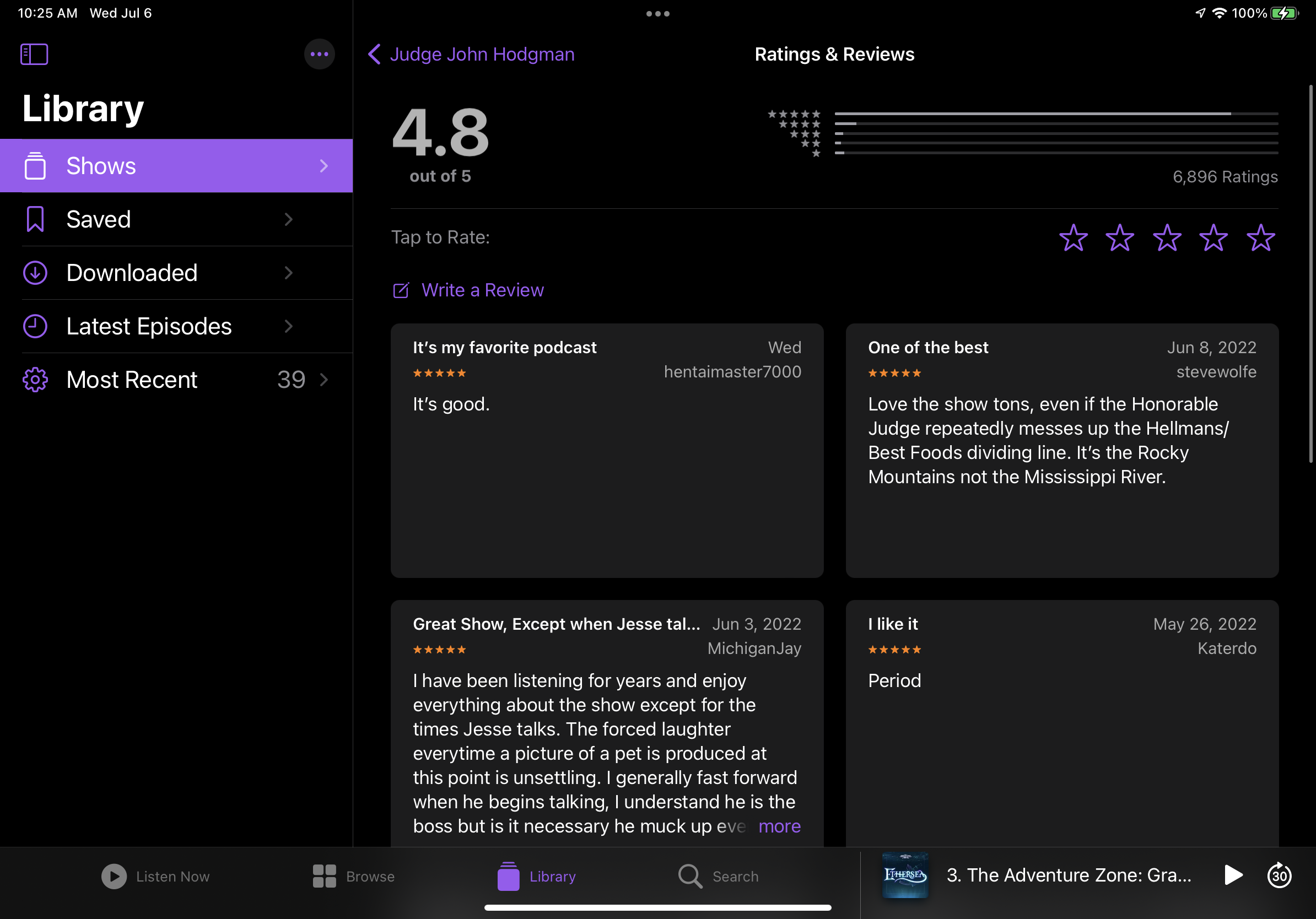
So why am I grumpy about the state of reviews? It’s all about user experience. Apple likes to crow about how Podcasts.app is a unified experience across all its devices, but that’s not always a good thing. It’s sometimes the worst of both worlds—each platform shares annoying limitations while having their own gotchas. On the iPhone, reviews are presented in an infinitely scrolling list, with no way to sort or filter them. The iPad presents reviews in a square grid, again with no sorting or filtering options. If you have a longer review, tapping “more” on the iPhone expands the block to show the complete text, while the iPad shows a maddeningly large modal pop-up that blurs out the rest of the screen.
A dropdown. How’s about that?
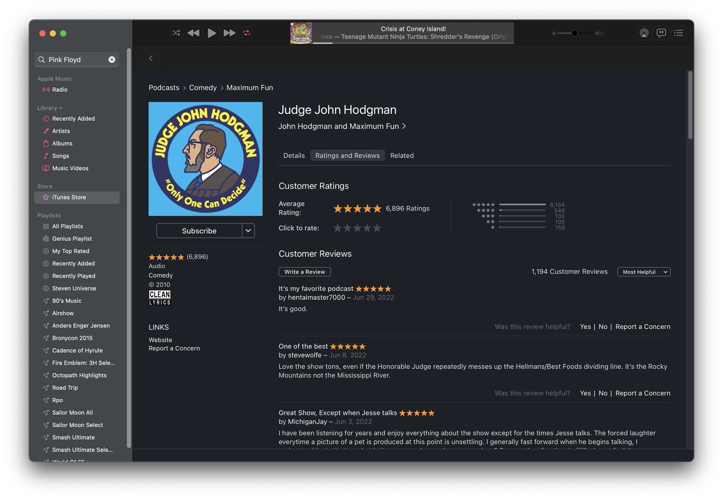
Mac users who used iTunes to listen to podcasts would see a reviews page that looked a lot like an album or app review page. First, iTunes allowed you to sort reviews. The default is an algorithmic “most helpful” that pushes reviews that have been marked as “helpful” to the top, but otherwise prioritizes newer reviews. If that’s not actually helpful, you can sort by most favorable or most critical, which is really sort by star rating. Lastly, you can sort by most recent, which shows the newest reviews first. The total number of reviews along with the number of each rating were listed, and if a review was too long clicking “more” expanded it to show the entire one without clunky modals. Plus, reviews can be marked as helpful or not, and if a review has issues like bad language or was spammy, you can report it. That’s all basic stuff you expect on most comment sections on the internet. The iPhone and iPad apps used to have these features too, but they disappeared in one of Apple Podcasts’ many UI redesigns over the past five years.
How Podcast reviews looked in iTunes.
Apple brought the iOS Podcasts experience to the Mac in 2019 when Mac OS Catalina split iTunes apart into separate apps. Now Mac users are subjected to Podcasts.app on the Mac, and it hasn’t improved one bit since. In fact, it’s actively worse than iTunes in several ways. You can no longer choose how to sort reviews, with reviews forced into the “Most Helpful” sorting order. “Most Helpful” means old reviews that could be long out of date get shown at the top because a lot of people marked them as “helpful” at some point. The thing is, you can’t mark reviews as “helpful” anymore on any Apple platform—only users of iTunes for Windows can still mark reviews as helpful because they still have the legacy interface. This just raises further questions, like “are those reviews still helpful if they’re old?” Those upvoting features aren’t the only casualties—the ability to report a review is gone too! With these community moderation features missing in action, Apple Podcast reviews are now less functional than YouTube comments.
But the most infuriating thing is that reading reviews is straight-up broken since the introduction of Podcasts.app to the Mac. Let’s say you’ve written a long, detailed review about a podcast. The main reviews listing will truncate it with a More… link as it did in iTunes, except when you click the More link Podcasts opens up a modal dialog box that truncates the review at four lines of text! Regardless of how large or small you size the window, you’ll never see the missing text. Despite feedbacks being filed, this still hasn’t been fixed. Given the lack of, well, any care given to podcast reviews in Apple Podcasts, I doubt Apple values them very much. I can confirm that this is just a bug with Podcasts.app on the Mac, as iOS, iPad OS and Apple Podcasts on the Web all show the full text of a review when clicking the More… link. Given the other problems in Podcasts.app, like its syncing issues and its inability to show a proper list of “recent” episodes without forgetting some shows, reviews seem like small fry. Still, Apple software is supposed to be about the little things. The joints on the back of the cabinet are supposed to be finished the same as the ones on the front.
Reviews on the Mac look similar to the iPad, but…
…as you can see, this is just broken. I don’t mean to pick on MichiganJay in particular—their review was just the first one that broke.
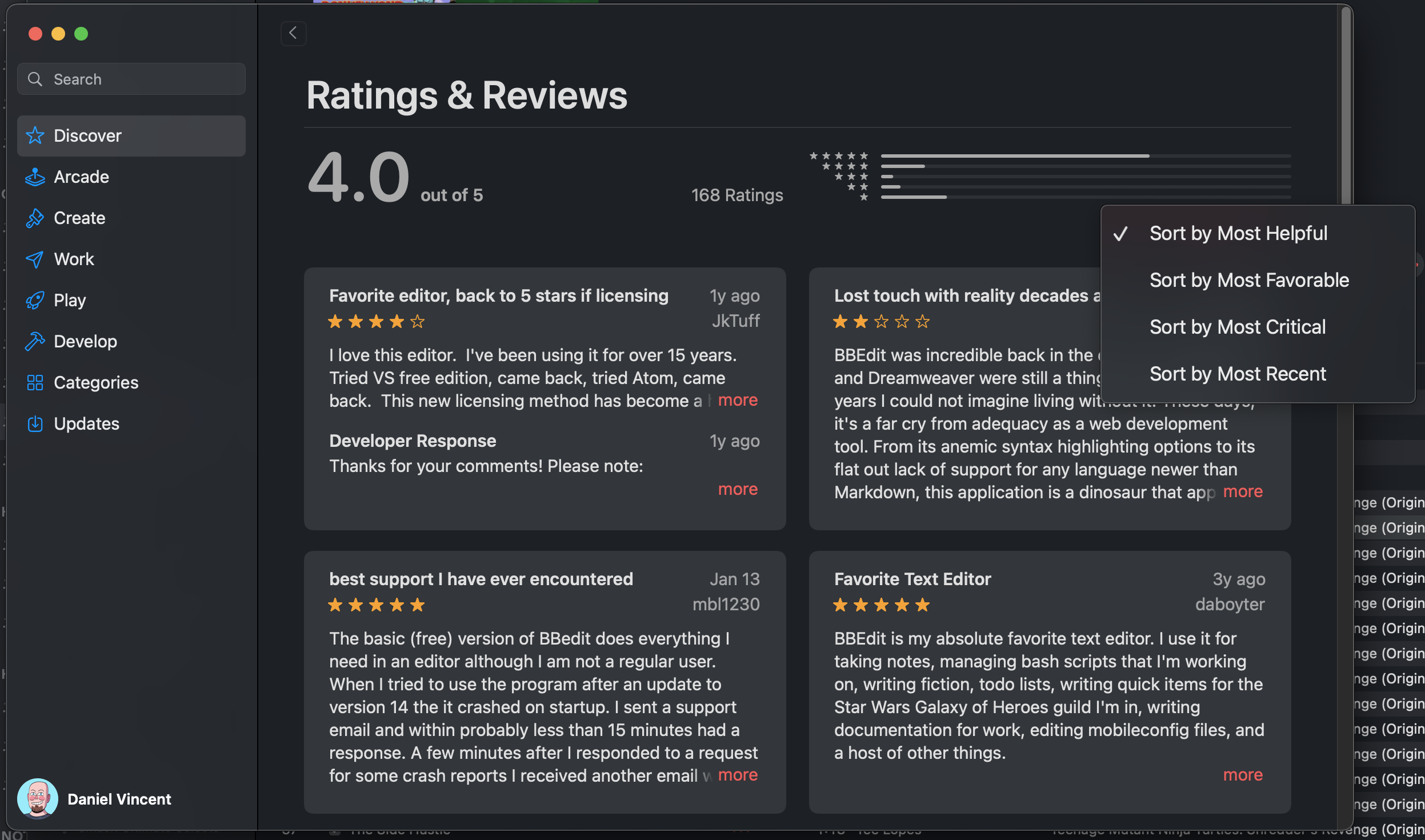
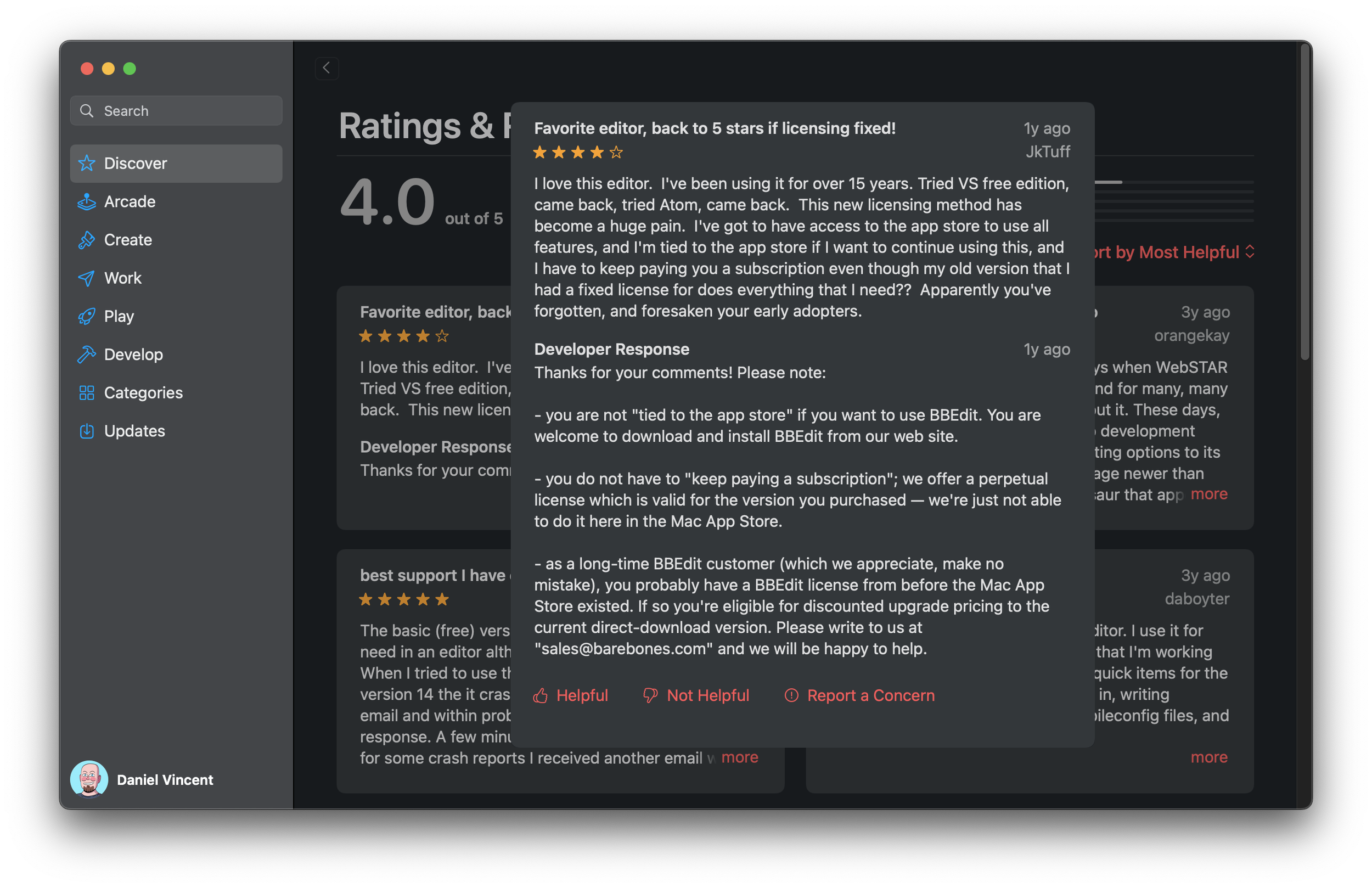
What’s even more annoying about this situation is that Apple has already proven it doesn’t have to be this way. There’s a lot wrong with App Store customer reviews from both a user and developer perspective, but at least an app’s review section has all the sorting and reporting features they had when they used to be in iTunes. App reviews can be sorted with the same four sorting options listed earlier. Bad or problematic reviews can be reported. Reviews can be marked as helpful or unhelpful. Developers can even respond to reviews, which is a feature that podcast hosts don’t get. And all of these features are available on the Mac OS, iOS, and iPad OS app stores. Marking a review as helpful or unhelpful in iOS wasn’t immediately obvious, but it pops up when long pressing the review. I tried the same thing in Podcasts.app and got nothing. Apple’s already proven it can be done, and as much as I dislike the UI of the App Store, the methods it used to implement them make sense in that context. Using the App Store as a model, all these features could be added back to Podcasts.app. Someone get that in the next sprint, please.
Bonus: Reading Podcast Reviews in Music.App
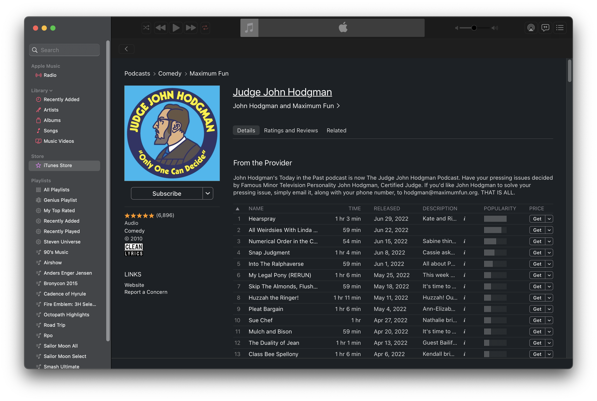
So if you’re on a Mac and you want to sort reviews or actually read their entire contents, are you screwed? No! Sure, you can see the whole review on Podcasts for the Web, but what if you want to sort or upvote a review? Believe it or not, there is a way! You may have noticed earlier that my screenshot of the “old” interface was actually in Music.app in Monterey. Despite the separation of iTunes into multiple apps, its all-in-one legacy lives on. You can open up podcast pages in Music.app just like iTunes. By crafting a music:// link to point to a podcast, Music will dutifully follow the link and open up the legacy podcast page.
Here’s an example: music://itunes.apple.com/us/podcast/judge-john-hodgman/id337713843 Just click it and you’ll be asked to open it in Music.app. The reviews tab for the show is right there, and you can write reviews, mark them as helpful, report them, and sort by newest added. You can even browse the old iTunes podcast catalog by using the breadcrumbs and going up to the top level. So long as iTunes for Windows still exists, I bet this functionality won’t go away from Music.app.
You can even play and subscribe, though I don’t think subscribe would actually work.
Honestly, I just want to be able to read a complete review and sort them by date added. That shouldn’t be too hard, but Apple seems to care more about extracting a percentage of podcaster’s revenue than actually making a good user experience these days. If Apple wants more people to treat Apple Podcasts like a community, then it needs to start actually making it like one.


