Garmin iQue 3600: How A Palm OS PDA with GPS Predicted The Future

How do you get the-ah from hee-ah? Here in Userlandia we’re piloting a car with Palm OS.

It’s hard to get lost nowadays. After forty-odd years of research and development we’ve finally arrived at our science fiction future where magic devices pulled from our pockets can pinpoint our positions precisely. But as revolutionary as they are, smartphones are just the latest milestone in a long trail of satellite navigation tools. Milestones like this: the Garmin iQue 3600.

At first glance it looks like a normal Palm OS personal digital assistant with its normal apps. But there’s something about it that most PDA users don’t know about. It has a secret—a GPS antenna! Garmin released the first StreetPilot portable automotive GPS in 1998, so it’s only logical that they were the first to combine a GPS with a PDA. The iQue was announced at the January 2003 Consumer Electronics Show and shipped six months later at an MSRP of $589. That seems high for a PDA, but consider how much it cost to buy comparable devices. A Palm Tungsten T2 was $399 and a Garmin StreetPilot 2610 was $799, so the iQue combining both of them into one device for half the price seemed like quite the bargain.

I found this one complete in box at the thrift store for $13, and I couldn’t resist bringing it home. Inside that box is the PDA itself, a dashboard mount with car charger, HotSync Cradle, software CDs, and manuals. The only item that appears to be missing is the leather flip-cover, which is too bad because half the fun of a PDA is flipping the cover open like Lois Lane when she’s jotting down a big scoop.

From a design standpoint the iQue doesn’t stand out from the crowd of silvery rectangular PDAs. It’s got the same aura as a silver Toyota Camry: practical, reliable, and tasteful. Such designs were popular because there were two kinds of people who bought PDAs: geeks and traveling businesspeople. They could take out a subtle silver PDA on location or at a business meeting and not feel like they’re waving money in their clients’ faces. If Garmin showed these road warriors a pocketable device that told them how to get from point A to point B in unfamiliar territory, they’d scream “shut up and take my money!”

What the iQue lacks in flash it makes up for in function. There’s a bevy of buttons for quickly controlling its intuitive interface. Three of the four standard Palm face buttons are there—the Date Book, Address Book, and Todo List—and the fourth cycles through Garmin’s GPS-enabled apps like the QueMap, QueTurns, and GPS status. On the side of the device is a shortcut button for recording voice clips, a scroll rocker, and an escape button for backing out of dialogs or returning to the home screen.

Garmin also included decent connectivity options. Along the top is a headphone jack, an SD card slot, an external GPS antenna port, and an infrared transceiver for wireless data transfer. On the bottom is the Palm Universal Connector for attaching cradles, keyboards, and accessories designed for Palm devices. The included USB HotSync cradle is surprisingly hefty due to its metal construction. A car cradle is also included, complete with a charger and a beanbag to keep it planted on your dashboard.

The integrated GPS receiver adds some thickness, but Garmin’s designers styled it to minimize its impact. Between the tapered back, rounded edges, and strategic bevels it still fits well in my hand and in my pocket. Popping the stylus in and out of its slot is a satisfying fidget exercise, complete with a lovely click.. Many of its contemporaries had plastic styli, so credit to Garmin for not pinching pennies here.

Inside the iQue is a 200MHz Motorola DragonBall MXL ARM9 CPU paired with 32MB of memory, which is comparable to other premium PalmOS devices of its day. A transflective color backlit screen which allows you to turn off the backlight outdoors and still see the display is also class competitive. Ditto its expandable storage and MP3 playback capability. The only downside was price—similarly specced Palm Tungstens or Sony Cliés cost $399, nearly $200 less than the iQue.

But the iQue isn’t an ordinary multimedia PDA. Garmin bragged that the iQue was the first PDA with an integrated GPS, and based on my research that appears to be true. Some mobile phones had an integrated GPS, and there were GPS devices built on Windows CE, but they weren’t PDAs. The first Windows PocketPC with a GPS, the Mitac Mio 168, wouldn’t debut for another year. So was the GPS worth the extra cost in 2003? And is it still useful today?

Inside the iQue

Out of the box the iQue wasn’t very useful because it shut down when removed from its cradle. The first order of business with any portable device old enough to drink is changing its battery. Fortunately, reasonably priced replacements are available on eBay and Amazon. This job wasn’t difficult thanks to an instructional video from NewPower99.com. Now that the iQue can hold a charge, it’s safe to set it up and go mobile.

Setup starts with Garmin’s software CD and a two-disc MapSource map library. Tough luck, Mac users, cause Garmin’s map software is a Windows exclusive. In case you’re missing the installer disc, Garmin’s website still hosts support pages with manuals and software downloads. That’s nice, considering they discontinued support back in 2008. I transferred these installers to an era appropriate host PC: a ThinkPad T21 running Windows 2000.

The downloaded Palm Desktop installer turned out to be a dud because it wanted to download online InstallShield dependencies that no longer existed. I had to fall back to the installer disc which wound up being the same version as the one from the web. After running the disc’s installer, the web installer started working—go figure. I’ve uploaded an ISO to archive.org in case you need it.

Now I need to update the iQue’s OS. Garmin’s firmware support was solid for the era; they released six updates over the course of four years. Pro tip: obey the instructions to the letter unless you want to put your device into a boot loop. After I followed all the steps the device finally started up to Palm OS version 5.2.1r6.

The next step is to install some maps, and the process is similar to other Garmin GPSes of the era. The base map has a 5 mile scale that only shows major highways and byways. To get detailed maps and points of interest you’ll need to install the included MapSource City Select mapping database. It’s a hefty amount of data, totaling over 1.2GB of disk space. Although the iQue supports 2GB SD cards, they weren’t available when it was launched. You couldn’t buy a 1GB card until January 2004 and at $499 it cost almost as much as an iQue itself. Most users methodically managed multiple megabytes of mapping memory by syncing maps as needed or swapping between map sets stored on multiple 128 or 256MB cards.

After wrapping up the installations I was ready for an iQue test. This meant going outside, folding out the flip-up GPS receiver, and waiting. This thing has a satisfying thunk when you close it, like a good flip phone. Getting its first satellite fix took a while—almost five minutes. Unlike modern devices there’s no cell tower triangulation or constellation assistance data to speed up this process. But I have good news on the 2019 GPS date rollover front! The clock displayed the correct time after acquiring a fix, which meant Garmin’s engineers either anticipated or fixed the problem—nice.

You can customize this Que button to add or remove apps from the cycle, and by default that’s QueMap, QueTurns, QueTrip, and QueFind. I added the QueRoute controls. If there’s no active route the map will follow along as you’re driving just like a modern phone or GPS. The update rate ain’t exactly great—I figure it’s two, maybe three frames per second at best. The size of the map display is decent, and more can be shown by collapsing the speed and compass overlay. Rocking the scroll wheel zooms in and out while dragging the stylus pans the map.

When you’re ready to hit the road the QueFind app will be your guide. There’s a point of interest database of interesting points like hotels, tourist attractions, roadside services, and more. If where you need to go isn’t in the database you can enter a specific address, intersection, or city name instead. After tapping Route To the iQue generates a list of turn-by-turn directions for your trip.

This experience is surprisingly close to a modern smartphone map app. Maybe not in the presentation standpoint, what with the mediocre frame rate, lack of 3D projection, and pixelated map lines. But from a function standpoint it’s all there. Need to make multiple stops? Use the Add Vias feature. Need to get around road closures or traffic? Go ahead and request a detour. Want a preview of a long trip? Simulated drives are there to guide you. Do you drive a truck, motorcycle, or taxi? Select a specific vehicle type to optimize your routing, even if you’re walking or cycling. Boats and off-roaders aren’t left out either thanks to support for nautical charts and topographical maps. Garmin didn’t hold back—they crammed all the functionality and features of a StreetPilot into a PDA without compromising on user experience.

Rounding out the app suite are programs aimed at traditional handheld GPS users. QueTracks creates a virtual trail of breadcrumbs while the GPS is active, and these logs can be saved as paths to review on the QueMap or downloaded to a desktop PC. Hunt&Fish tries to predict the best time of day for hunting and fishing based on the Solunar theory. Sun&Moon isn’t a Pokémon game; it shows the predicted time of sunrise and sunset, moon phases, and the position of those celestial bodies relative to your location and orientation.

Garmin also extended GPS functionality to other areas of Palm OS. Want to navigate to your favorite bar in the Berkshires? Just open its Address Book card and tap the Route button. Same goes for appointments in the Date Book. You can even attach your current location to a voice memo! We take these integrations for granted today, but in 2003 these were clever and cutting edge.

All these features made for a pretty capable navigation device, so long as you were driving, boating, or walking. But there’s another group that hungered for real-time GPS navigation: airplane pilots! Introduced in January 2005 for $1,099, the aviation-focused iQue 3600A added aeronautical amenities like Jeppesen charts, terrain data, and virtual flight displays. Also included was a yoke-mounted smart cradle with extra controls to navigate the map and input data without using a stylus. And because it’s still a 3600 at heart, Garmin offered the automotive adapter kit which includes the dashboard mount and the MapSource road maps for an extra $200. The 3600A automatically switches between aviation and automotive modes when placed in the appropriate cradle—nice touch!

Navigating with the iQue

Given how advanced the iQue was for its time it raises an obvious question: can it still be useful for navigation today? Let’s hit the road and find out! My regular thrifting route from Wilmington, Massachusetts to Hudson, New Hampshire is a good test route. There’s plenty of twists and turns along a mixture of highways, suburban arterials, and country roads. I know it well enough to judge the iQue’s routing quality, and since the roads haven’t changed much over the past twenty years the old maps should still work.

Planning a route starts with the QueFind app. My hunch that the circa 2004 POI database wouldn’t be helpful was proven correct when my searches returned zero results. Even back then there was always a possibility that the database wouldn’t have what you needed, so I searched for my destinations’ addresses instead and saved them as waypoints. Waypoints are actually entries in the Palm Address Book, which is a clever way to exploit an existing database.

Entering this data was easy enough—search for address, save waypoint, and repeat—but it required my full attention. Being out of practice with Graffiti didn’t help. Doing this in motion would be impossible. At least the rocker can scroll through lists and select waypoints or address book entries. I wouldn’t call the UI sluggish, but it’s definitely not snappy. After creating the waypoints I added them to a route using Add Vias and saved it in QueRoute.

After I activated the route the iQue spent about six seconds calculating turn-by-turn directions, which isn’t fast by today’s standards but it's good for 2003. It dutifully announced my upcoming turns and destinations using voice clips with progressive distances like “in 1.6 miles turn right, in 1000 feet turn right,” and so on. And this guidance comes through loud and clear from the auxiliary speaker built in to the power adapter, even when tucked away in a center console. When you approach that turn the map automatically zooms in to preview the intersection. Combine this with an overlay that displays the current speed, compass direction, and the next turn and the iQue provides a pretty good overview of where you’re going. You can also drive around without an active route and it’ll tell you the name of the road you’re on as well as upcoming cross streets. Overall I’d rate its routing as acceptable, and when I veered off-course it recalculated an update to get me back on course.

The included dashboard mount is well designed and securely grabs the iQue when placed in the cradle. When you’re ready to get out of the car a press of the release button frees it from the cradle with no fiddling required. There’s horizontal and vertical articulation to help angle the iQue for visibility, which you’ll absolutely need because the display’s viewing angles aren’t great. The transflective display puts up a valiant effort but the end result is still a little dim when it can’t catch direct sunlight. It’s still usable but this would’ve been called out in a review twenty years ago. At least the angle of polarization didn’t conflict with my polarized shades. Unfortunately the base wasn’t heavy or grippy enough to stay planted during spirited driving, and I’m sure my car’s smooth pleather dashboard didn’t help.

There’s a couple other gotchas. Even though the resistive touch screen recognizes finger taps, the touch targets like the re-center button are teensy tiny and impossible to activate without a stylus. I, uh, wouldn’t recommend doing that while driving. The iQue also locked up a few times during my journey, and I’m guessing these hangs were thermal related because it felt fairly warm when I pulled it from the cradle. I won’t hold these crashes against it; this is a twenty year old device after all. Thankfully it automatically resumed navigation after a restart.

If someone handed me an iQue in 2003 I would’ve been ecstatic. Back then I was using road atlases and printouts from MapQuest to find my way around in unfamiliar territory. Being able to get instant turn-by-turn directions with live maps from my pocket computer would make me feel like Geordi La Forge. The only thing that compares would’ve been a dedicated unit like the StreetPilot, and those just as uncommon in 2003. And even with its very real 2003-era limitations it’s amazingly close to a modern navigation experience!

Now while the iQue was the first PDA with integrated GPS, that didn’t mean it was the first PDA to use a GPS. People connected a GPS to a PDA using a serial cable to log their locations, and the GPS makers noticed. They soon unveiled devices designed to attach directly to specific PDA models, and some even offered turn-by-turn navigation. As luck turns out I have one right here: the Rand McNally StreetFinder Deluxe for the Palm V.

Released in the year 2000—three years before the iQue—the StreetFinder has so many limitations that it puts the minimum in minimum viable product. The Palm Vx’s 8MB of memory and lack of SD slot means it can barely hold any map data—and God help you if you have a vanilla 2MB Palm V. Routes and map data must be calculated ahead of time on a desktop PC and then HotSynced, which takes forever over a serial cable. And when you finally hit the road the experience is grade-A jank. There’s no voice guidance for upcoming turns, which would be okay except the pea-green screen isn’t very readable in a car. If you get lost or need to make a detour there’s no dynamic re-routing. And the map display doesn’t move along with you—it’s always north-up and when you reach the edge of the screen it scrolls to a new page. I could go on and on about the limitations of this setup, and I recognize that this was the best they could do at the time given limited memory and processing power. I’m not saying it’s completely useless; it’s that reaching for turn-by-turn navigation was beyond this device’s grasp. If you use it to log data or to show your location on a static map, it’s a similar experience to a serial GPS except it’s easier to connect and takes up less space.

Unlike the StreetFinder the iQue is capable enough that if it had modern maps it could be a viable navigational aid today. So it’s too bad that Garmin stopped publishing map updates for it. Oh egads, my trip is ruined! But what if… I were to load new, up-to-date maps on this obsolete PDA with a GPS? Ho ho ho ho, delightfully devilish, Daniel! There’s plenty of maps on the web in Garmin’s IMG format, or you can roll your own if you’re feeling plucky. I downloaded OpenStreetChest’s database for the Northeast US, which is based on OpenStreetMap data. After installation the new tile set showed up in the Map Installer plugin and I could send them to the iQue’s SD card. The downside is that these maps consume more storage, which means longer HotSync times and more card swapping. The fact that I could load new maps without any trouble is a wonderful surprise—I really thought I’d have to do some hacking to load new data. Thanks, OpenMapChest!

Garmin also created an API so other Palm OS mapping apps like PathAway could use the iQue’s GPS. And it does work! PathAway is more like a traditional map-and-compass setup, perfect for folks who like geocaching, boating, or wilderness exploration. It’s not a turn-by-turn navigation app, so it can’t replace the Que suite, but that’s okay. Because the iQue’s a general purpose device, you can extend its capabilities much like modern smartphones. A StreetPilot has advantages like a bigger screen and car-focused controls, but you’ll never be able to run games or spreadsheets on it. So how well does it wear both hats?

The iQue as a PDA

2003 was a busy year for the PDA market. Manufacturers needed new features to differentiate their devices once color screens were commonplace. They also faced increasing pressure for pocket space from cell phones, MP3 players, and digital cameras. Sony Clies added hardware keyboards, wireless networking, and digital cameras. Handspring created the Treo smartphone by combining the Handspring Visor and its VisorPhone Springboard module into one device. So Garmin embedding a GPS into a Palm PDA was a gambit in line with the overall market trend towards convergence.

The iQue is a PDA at its core, and people bought one instead of a StreetPilot because they needed to do PDA things like managing contacts and appointments. The good news is that Garmin licensed Palm OS instead of rolling their own system. The iQue runs Palm OS 5.2.1 and takes advantage of its many improvements like support for ARM processors, SD cards, audio mixing, and a collapsible on-screen Graffiti zone to give apps more screen real estate. OS 5.2 also introduced the Status Bar, which Garmin customized with Que app shortcuts, the GPS status indicator, and buttons to adjust brightness and volume.

Palm OS users will be right at home with an iQue. Basic organizer functions are fulfilled by the standard Palm app suite. All your favorites are there, like the Address Book, Date Book, Todo list, and Memo Pad. It’s a shame that the iQue came out a few months before Palm completely redesigned their suite for the Tungsten T3, but it’s still perfectly usable. Some default apps, like Expense and Mail, are missing entirely. You could use the bundled Documents to Go spreadsheet app to track your expenses—that is, until the free trial runs out and you had to cough up 50 bucks to keep using it.

The missing Mail app demonstrates the iQue’s blind spot around networking. 2003 was a big year for wireless connectivity for PDAs. SDIO Bluetooth and Wifi cards let small, pocketable devices join networks or tether to a cell phone to receive texts and emails. The iQue 3600 doesn’t support these cards at all, and you must use a cable to physically tether a phone. Even if you wanted to HotSync email for offline reading you’ll need a third-party client. A trial copy of MailToGo is on the installer disc, but I think making users pay for an offline email app is rough.

Garmin also included some non-GPS focused apps in their Que suite, and these are QueClock, QueAudio, and QueVoice. QueClock is a straightforward alarm app that lets you set single or repeating alarms without needing to dive into the Date Book. It also shows the current precise time and your next upcoming event. It should really be a world clock, too, but there’s plenty of those out there for Palm OS if you wanted one.

QueAudio is a bare-bones MP3 player that lets you listen to files stored in an SD card’s Audio directory. There’s no playlists and sorting is very rudimentary, but it does have a shuffle function. It choked on many of my modern MP3 files—I suspect it doesn’t like 48KHz sample rates—so I dug up an old one to give it a test. The speaker’s audio quality is, well, bad, but it sounds fine through headphones. It’s no iPod, but it’s on par with other PDAs.

QueVoice records voice memos when you press and hold the record button. The audio quality isn’t great, thanks to the mediocre mic and the crushing 11KHz sample rate. There’s an option to use ADPCM compression which significantly cuts down on file size without compromising the file’s already rough quality. It works, but don’t use it to record your demo reel.

There’s one last criteria to judge the iQue as both a PDA and a GPS: battery life. And it’s not great! Garmin’s public statements about the iQue’s longevity didn’t inspire confidence. Quote: “approximately 10 days if used an average of 30 minutes per day with backlight off.” I find that answer vague and unconvincing. It’s just like saying my car gets 40 miles per gallon if I always drive downhill and lay off the turbo. More useful numbers are found in the 3600A’s manual, which claims 5 hours of battery life with the backlight set to 50%.

After spending some time with a fresh battery I’m inclined to agree with that five hour estimate. That is, until I turn on the GPS and the battery drains even faster. Reviews at the time were not kind to its battery usage, with CNet calling it “gluttonous.” If you want any kind of reasonable runtime outdoors with the GPS enabled you must forego the backlight and rely on the transflective display. The GPS polling rate can be reduced to save battery, but I would only suggest turning that knob for hiking or walking. Be sure to plug it in to a power port while driving.

Take The Long Way Home

A convergence device often ends up being less than the sum of its features, but that’s not the case with the iQue. It’s a Peanut Butter Cup fusion of Palm PDA and Garmin GPS thanks to good software design. Much like the Treo gave us a preview of our data-connected computer phone future, so did the iQue for our omnipresent navigational device.

I say this a lot, but it bears repeating: part of the fun of the retro experience is using something you couldn’t afford or didn’t know about back in the day. I had PDAs. I had a GPS. But I never had a PDA GPS. And seeing just how much Garmin got right years before location-aware smartphones is uncanny. They might not have known at the time but this was the precursor to how millions—perhaps billions—across the globe navigate their daily lives.

Garmin tried to grow their share of the PDA market by making more models at different price and feature points. In addition to the Palm-based iQues they produced Windows Mobile Pocket PCs like the iQue M5, M4, and M3. If you already had a PDA you could pick up one of Garmin’s Compact Flash or Bluetooth receivers which came with the same suite of iQue apps as the 3600.

But the iQue’s time in the navigator’s seat was short lived. Garmin shipped their last PDA in 2006. Support for all iQue products ended in June 2008, which in an interesting coincidence is the same month Apple announced their first phone with a GPS: the iPhone 3G. I don’t think the iPhone had anything to do with the discontinuation of iQues—other market forces were to blame. PDAs were already disappearing because Blackberries, feature phones, and early smartphones were choking them out of their market niche. Meanwhile the portable automotive GPS business kicked off by Garmin’s own StreetPilot was booming. They became so cheap and useful that regular people were buying them to install into their cars—or buying a car that had a navigation system built-in.

Still, I’m happy to add it to my collection, even if I won’t be using the GPS much. Why have a boring regular Palm when I can have something with a twist? Even if I didn’t have one of these back in the day, I can see the appeal, and I applaud Garmin for showing us how to find our way before it went mainstream.

The Rise and Fall of Lian Li Aluminum PC Cases - Nifty Thrifties

Here in Userlandia: Lian Li and the Case of the Aluminum Computer Case.

When you're hunting for old junk, it's best to keep your expectations low, so that you can be pleasantly surprised. As the Onion warned us way back in 1997, people love retro just a little too much, which can make it hard to find bargains. The truly rare and expensive stuff gets filtered out and shipped to warehouses for listing on online auction sites. The stuff that's good but not mind-blowing gets placed in glass cases at the front of the store, tagged with, let's say optimistic prices sourced from Buy It Now listings. I might be willing to pay $25 for that SCSI slide scanner… if it wasn’t missing its power supply. Nevertheless, you sometimes find gold among the dross. Gold… or other metals.

I visited the Goodwill in Hudson, New Hampshire one frigid February afternoon expecting to find nothing of importance. This store is a bust more often than not, but it’s on my drive from Salem to Nashua, so I might as well stop to investigate. To my amazement, there in the new arrivals section was a new-in-box Lian Li aluminum PC case. Lian Li made some of the highest rated cases of the early aughts, so this was a nice find indeed. The box top was already cut open for easy inspection, and the case looked brand new. All the accessories were included and it was still wrapped in a protective plastic bag. Even the original shipping label was intact. And it was tagged at thirty dollars? That felt awful low. If I’d bought this new in 2003, it would have set me back $180—that’d be $280 today, thanks to our friend inflation. Even now, it'd still cost $100 on a used gear site, and that's not counting $50 for shipping. I wasn’t expecting to spend $30 on a computer case that day, but a deal like that, for a quality PC component like this, doesn't show up very often.

Doesn’t look fancy on the outside…

Maybe they were fooled by the box. With its bold fonts, solid colors, and starburst badge shouting “Pentium 4 Compatible,” the packaging looked like something you'd make in your first-year graphic design class. “C+, solid effort.” Someone at Lian Li decided to cut costs that year, because although they shelled out for color printing… they only had one box design. And they used it for far more models than they should have.

But mint on the inside.

I'm not criticizing their translation—“details are various from different models” might not be perfect English, but it's perfectly clear. You and I both know exactly what they meant to say—which is the problem. Each box had an extra label on the side, with the model number and specs. My Goodwill find was a PC-6077—which you'd never know just from looking at the box, which showed a PC-60. While this strategy probably saved Lian Li some production costs, it probably also caused countless headaches in the stock room at Micro Center. Regardless, I can’t judge a box by its cover. Can this chassis hold up to twenty years of hindsight? Let’s start with its exterior design.

Exterior Design

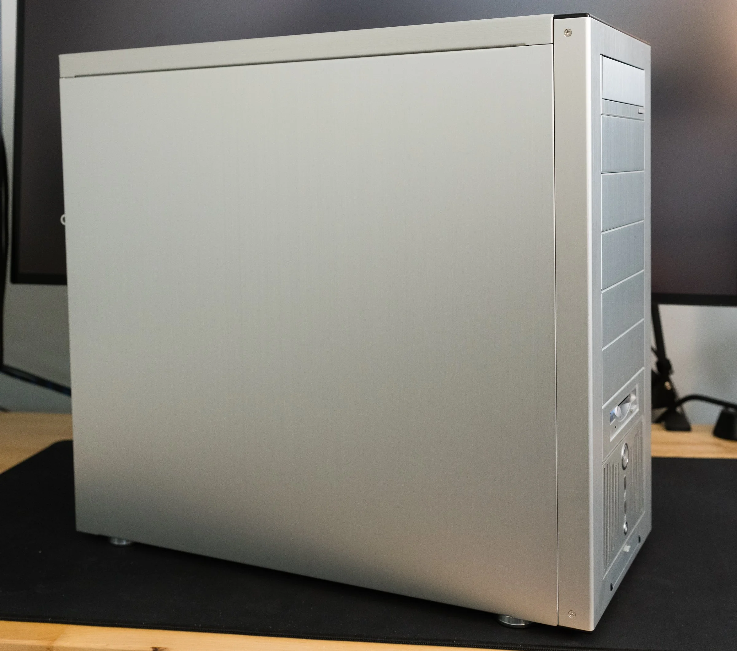
The PC-6077 in all its brushed metal glory.

Lian Li’s trademark silver fuselage still looks great twenty years later. A brushed aluminum finish stands out amongst the ranks of mostly beige, white, and sometimes black painted boxes of the early 21st century. But as unique as it was in the computer market, this style isn’t exactly original. Plop a silver Lian Li case next to my grandpa’s Onkyo stereo system from the 1970s and the resemblance is uncanny. Brushed aluminum was being used in A/V equipment and appliances for years before PC case makers decided it was cool. If the retro hi-fi style wasn’t to your taste, Lian Li also offered their cases in a subtle anodized black finish. Still, if you want people to know you have a fancy aluminum case, that brushed metal look shouted it from the rooftops.

The aluminum case craze started in the year 2000 with the Cooler Master ATC-200 and Lian-Li’s series of cases. Cooler Master claims they made the “first aluminum PC case” with the ATC-200, but corroborating that claim is difficult. Lian Li had started their aluminum rack mount computer case business back in the eighties. But rack frames, rack mount server cases, and rolling server cabinets weren’t on the front page of the Tiger Direct catalog in the Web 1.0 days. The earliest documentation and references I could find for both manufacturers’ consumer aluminum cases are dated sometime in late 1999. My hunch is that Cooler Master’s case debuted in the USA first, while Lian Li was first shipping in Asian markets. In Ars Technica’s Case and Cooling forum, there are posts raving about the ATC-200 dated a few months before the first Lian Li thread. Without more definitive proof—and a manufacturer saying “we did it first” doesn’t count—I’ll give this one to Cooler Master.

Enough history—let’s get back to the case design. And there’s one word I’d use to describe that design: classy. There’s no colorful look-at-me LED or fluorescent lighting. There’s no overwrought curves and flourishes. Touching it feels classy, like the aluminum dashboard trim in a sports car. Even the front bezel is made out of aluminum. Most case bezels are plastic, and factories back then had trouble matching the color between painted metal and plastic. Brushed aluminum dodged that problem entirely. Still, Lian Li couldn’t avoid using some plastic, with satin black strips adorning the top and bottom of the bezel. Shame they weren’t carbon fiber like some other Lian Li models. Still, they complement the brushed metal finish and fit the classy aesthetic. I understand why these are plastic—they’re the part of the bezel that actually clips to the frame. It’s easier and more reliable to make these bits out of plastic, so it’s just the right material for the job.

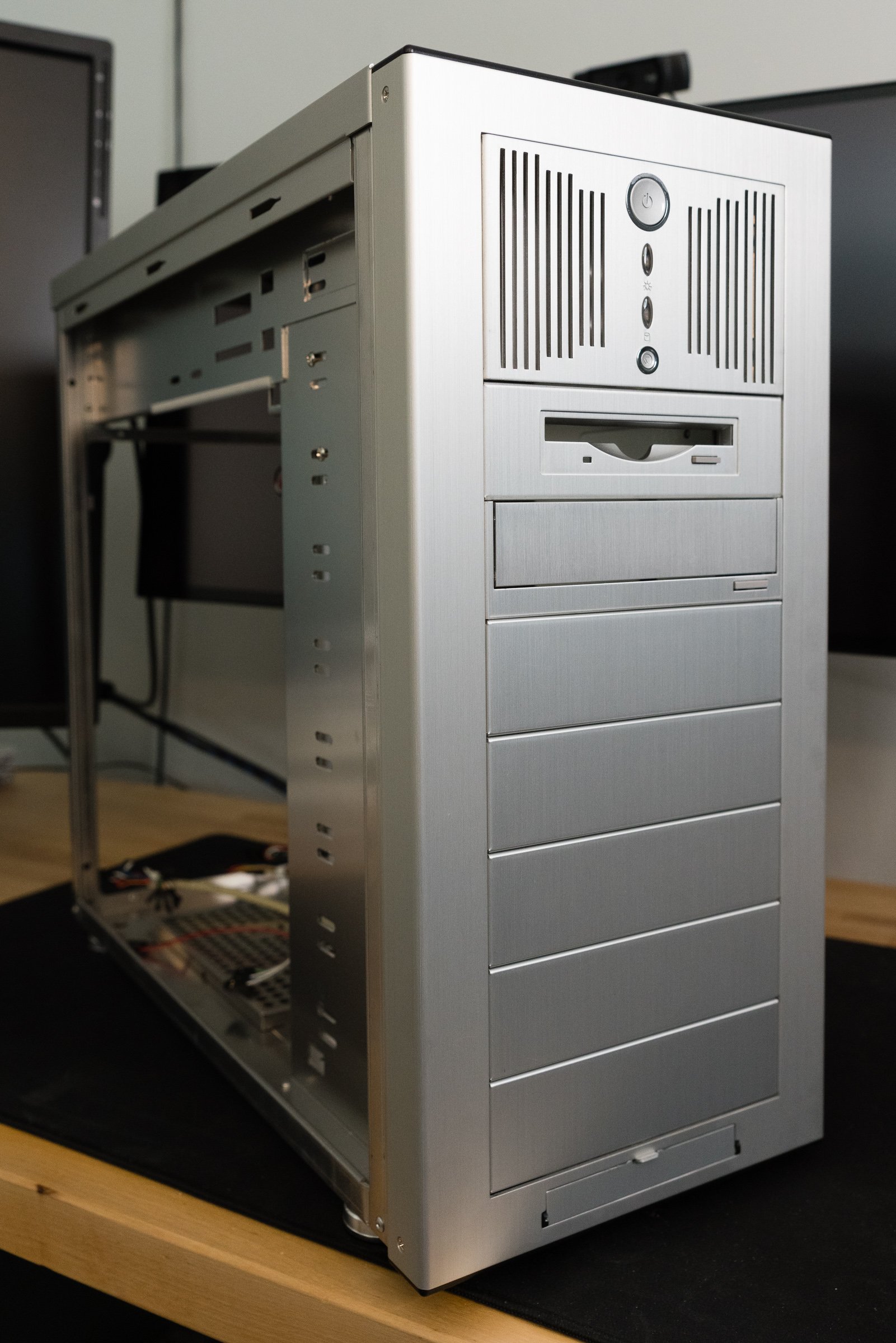
Speaking of the front section, the most interesting design decision isn’t just for looks. An array of nine 5 1/4” drive bays sets this case apart from its competition. Yeah, that’s right—nine 5 1/4s. Most PC cases of the era had several different types of drive bays: external 5 1/4” for optical drives, external 3 1/2” for floppies or other removable media, and internal 3 1/2” for hard disks. Most mid-tower cases arranged these bays in a 4-3-3 setup. To get more than four 5 1/4s you usually had to step up to an enormous full-tower case, like Lian Li’s PC-70 or the Chieftec Dragon.

Using all 5 1/4s wasn’t exactly a new idea. Just like the brushed aluminum finish, this drive bay setup was a retro throwback. The original IBM PC only had 5 1/4” bays, as did many clones. Granted, they were arranged horizontally, but you get my drift. Over the years as hard drives and floppy disks got smaller, PC manufacturers traded some 5 1/4” bays for more 3 1/2” bay. But the all-5 1/4 setup didn’t vanish—it migrated to server builds, where hot-swap drive cages fit perfectly into 5 1/4” bays. Other manufacturers would also experiment with an all-bay setup—the Cooler Master Stacker, Antec Nine Hundred, and Thermaltake Tai Chi, to name just a few.

I actually dig the aesthetics of the uniform bay approach. There’s a nice symmetry to it—take out all the bezels and brackets and the front of the case has an opening perfect for any of the lovely items in Lian Li's catalog full of accessories—or, if you really insisted, something made by another company. Included with the case were aluminum trim covers for optical and floppy drives, which blend their usually beige bezels into the box. If you needed more, they were just an online order away. Fan controllers, hard drive cages, and fan mounts were also on tap, and given enough coin you could build a clean, all-aluminum computer.

You’re free to put anything anywhere, so long as you can mount it.

But as classy as my thrift store treasure is, I've discovered a few flaws in its design. First up is the front panel I/O door. USB, FireWire, and audio connectors are hidden behind one of the cheapest feeling mechanisms I’ve used in a long time. It works… technically. but it just flaps around with clanky metal sounds. Despite being made out of aluminum like the optical drive trim plate it doesn’t have the same smooth feel because there’s no levers or springs or anything to dampen the opening. I would have preferred exposed, flush mounted ports instead. At least put a little engineering effort into the door instead of this pitiful excuse for a hinge.

Next, the power and reset buttons are built into the stock 3-in-2 bay hard drive cage. This isn't all bad: you can move it from the standard location at the bottom of the case to anywhere, really. If you’re not happy with the default location at the bottom of the case, you can move it to the top or middle. But that’s the only positive thing I can say about it. Both the power and reset buttons are spongy and noisy. The spring's noise reverberates into the trim plate—and it's a high-pitched little thing, just enough to be annoying instead of a satisfying click. It’s what they’d call “bad switchgear” in the car business. It's amazing how cheap it feels, really—you turn a computer on and off all the time. If you bought this case back in the day, you spent a lot of money on it, and you wanted buttons that felt expensive—or at least normal. Lian Li did such a good job on everything else that this bit of chintziness stands out. There’s plenty to say about the wimpy 80mm fan, but that’s better saved for later when we talk about cooling. This case’s full-tower brother, the PC-7077, offered a 4-in-3 bay cage with a 120mm fan instead—it should have been in this case too. You could order one from Lian Li if you really wanted one, but that shouldn’t have been necessary. The buttons and LEDs should have been built into the top or side of the bezel.

Front panel I/O Door

Last is the unfortunate fact that actually utilizing those 5 1/4” bays gets ugly—literally. Add a single drive or accessory that doesn’t match and now your silvery ingot is blemished with a beige bruise. Opting for the black anodized finish minimized the problem because many aftermarket accessories came in black, but what if you wanted the all-shiny experience? The Lian Li accessories catalog was right there, full of drive kits, fan grilles, and trim covers, but your wallet wasn’t going to like the prices. So if you wanted the brushed metal case, and you cared about aesthetics, you had to go all-in.

Internals and Build Considerations

Of course, aluminum cases aren’t just about aesthetics. Consider the era in which these Lian Li, Cooler Master, and other “premium” boxes debuted. It was the turn of the millennium, and the market for do-it-yourself PC building was growing rapidly. Online parts sellers made it easier than ever to buy the exact components you needed for your ultimate computing machine. LAN parties drove demand for better looking equipment to impress onlookers. Processors and graphics cards were breaking performance records, but they needed better cooling to do so. Enthusiasts who in the past might have upgraded one or two components from a prebuilt system were now building entire PCs from scratch. Consequently, these builders suffered from the numerous design flaws of contemporary case construction. Nerds everywhere cursed as they cut their fingers and scraped their knuckles working inside cases that hadn’t changed much since the eighties. After years of casual casualties, they called for an end to difficult and cramped PC cases.

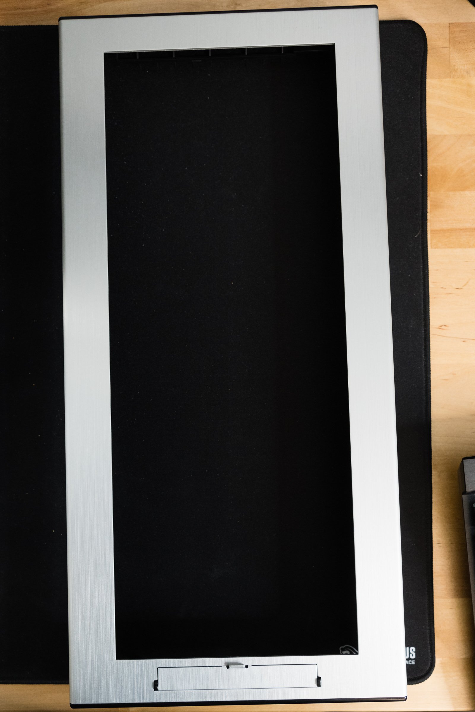
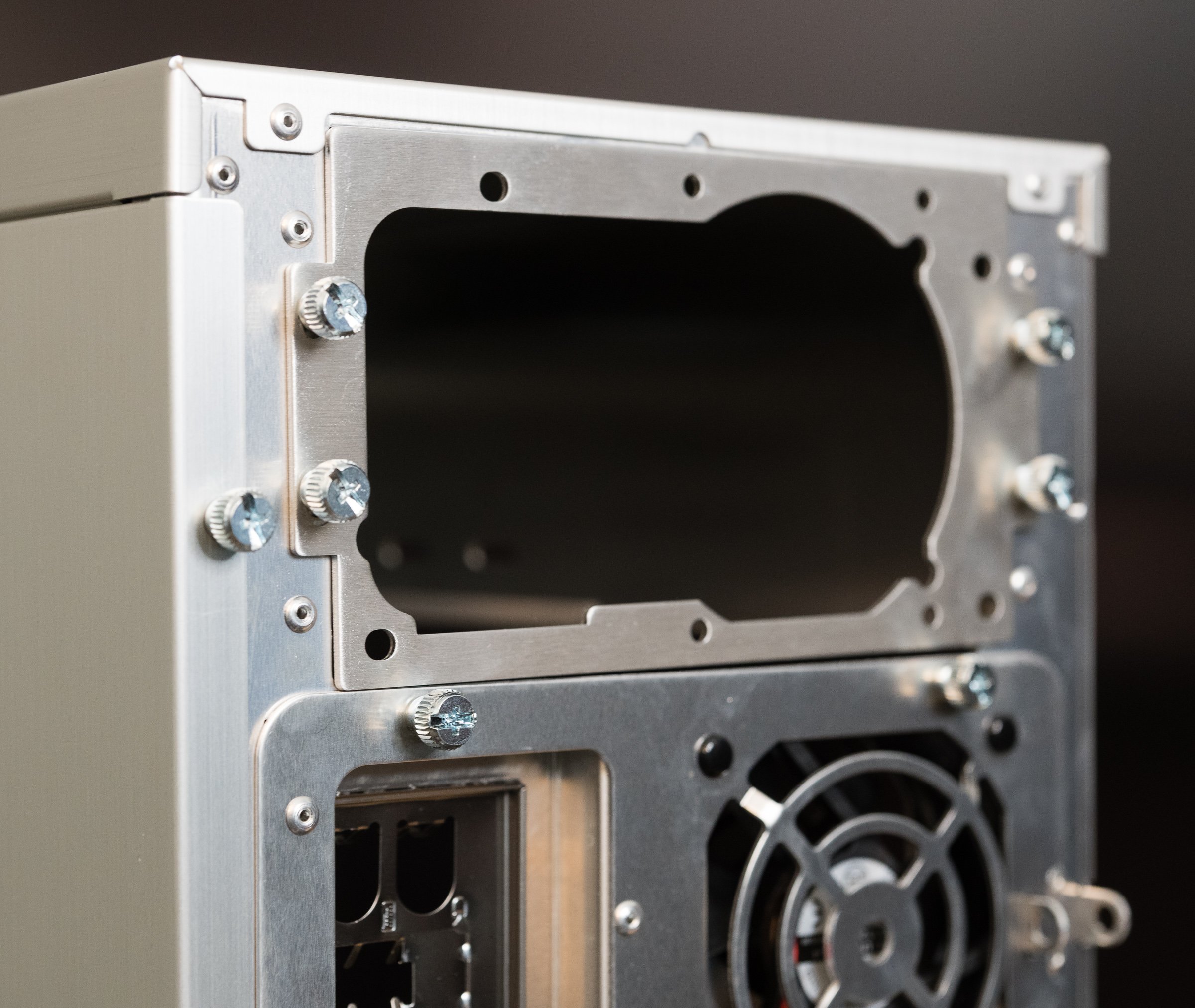
An obscure Zen Buddhist scholar named Steve Jobs once said that design isn’t how something looks and feels, it’s how it works. So if you spent the extra money on one of the new wave of premium PC cases, did you actually get a product that worked, or did it just look nicer? Let's take a look inside and see if beauty is more than bezel deep. First thing to do is pull off that front bezel, which is easy thanks to a convenient cutout along the bottom edge. Many cases of the nineties required the removal of side panels and interior parts to detach their bezels, so this is already a good sign. More nice touches include large thumbscrews that secure the side panels, motherboard tray, and power supply bracket. There’s no trick latches or breakable clips on the side panels—they slide right out with no hitches or hiccups. Anyone who’s struggled with opening an intransigent side panel or shell will appreciate this smooth action.

You might be thinking “Don’t all PCs have removable side panels and bezels?” And that’s true, but you need to consider them in the context of the whole case. These boxes aren’t just supposed to look good—they’re supposed to feel good. You know what feels good after removing your side panels? Finding a slide-out motherboard tray and an external power supply bracket. Assuming you're the sort of person who removes the side panels from your computer cases, anyway. Lian Li didn’t invent any of these features, but they implemented them in a thoughtful way.

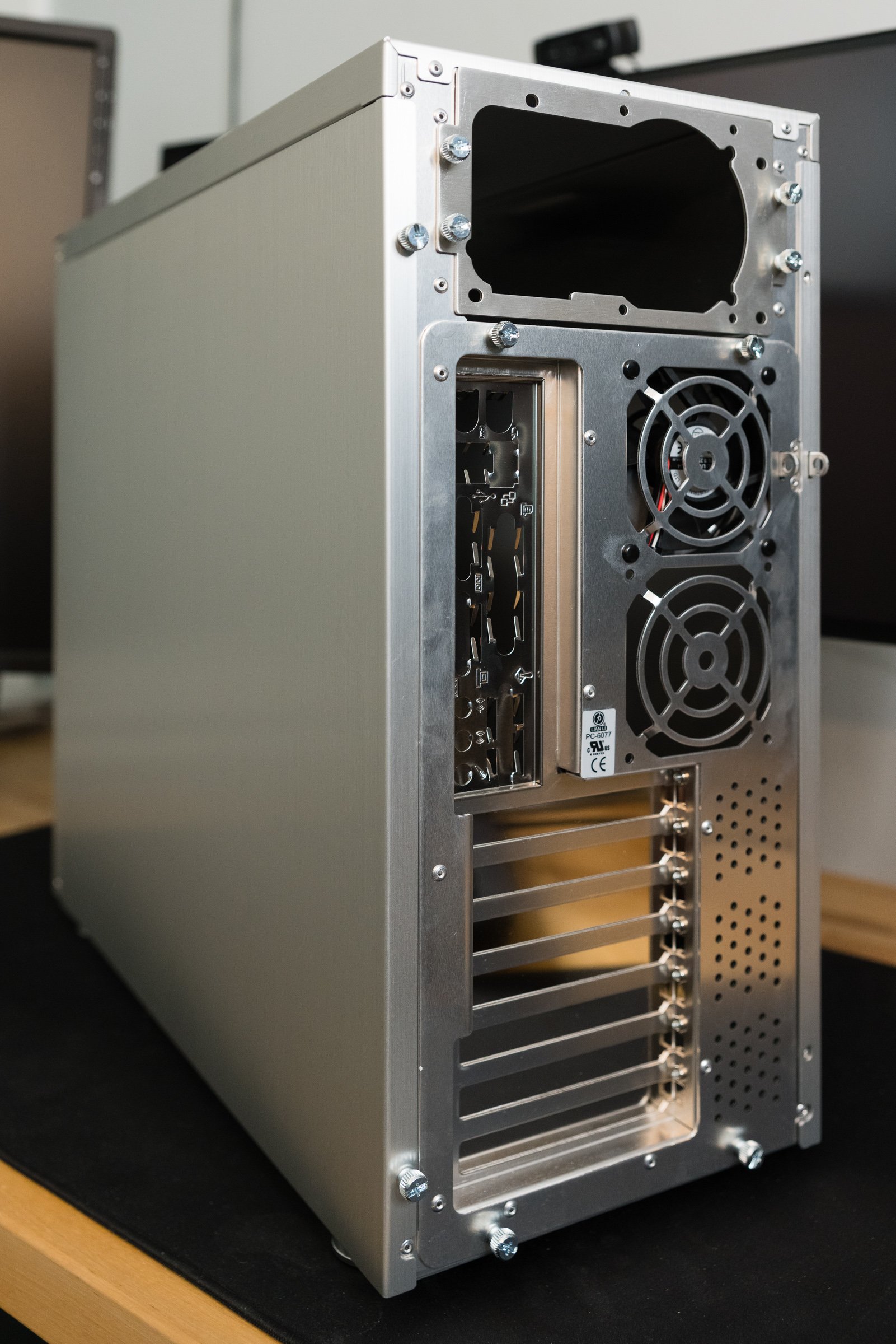
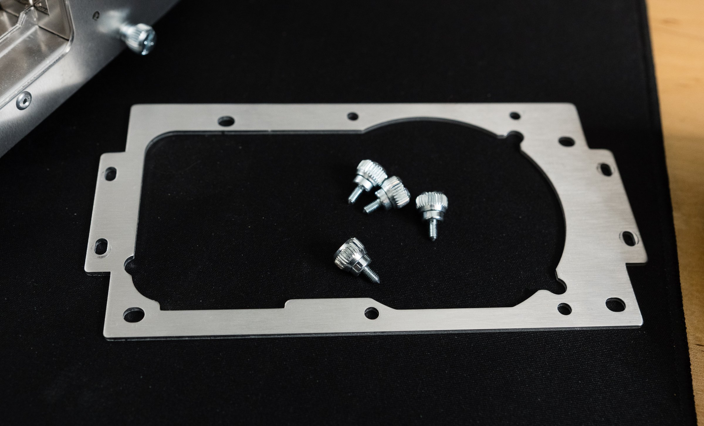
Let’s start with the power supply bracket. In most cases—pun intended—a power supply was fastened directly to the frame with some screws. Sometimes creative hand gymnastics were required—hold the supply with your right hand, turn the magnetic tipped screwdriver with your left, and hope you've screwed it in… and not screwed it up. There might be a little flange that helps hold the power supply in place, but that’s not guaranteed because I’ve repaired several machines that lacked PSU supports. I’m sure there’s lefty builders out there chuckling at this—they had an advantage for once! And that's just for installation. Removal could be even trickier, if you'd added in one of those giant Zalman flower heatsinks or some water cooling. An external bracket neatly solves these problems. After attaching the bracket to the PSU, simply slide it and the cables into the case. Removal is just as easy.

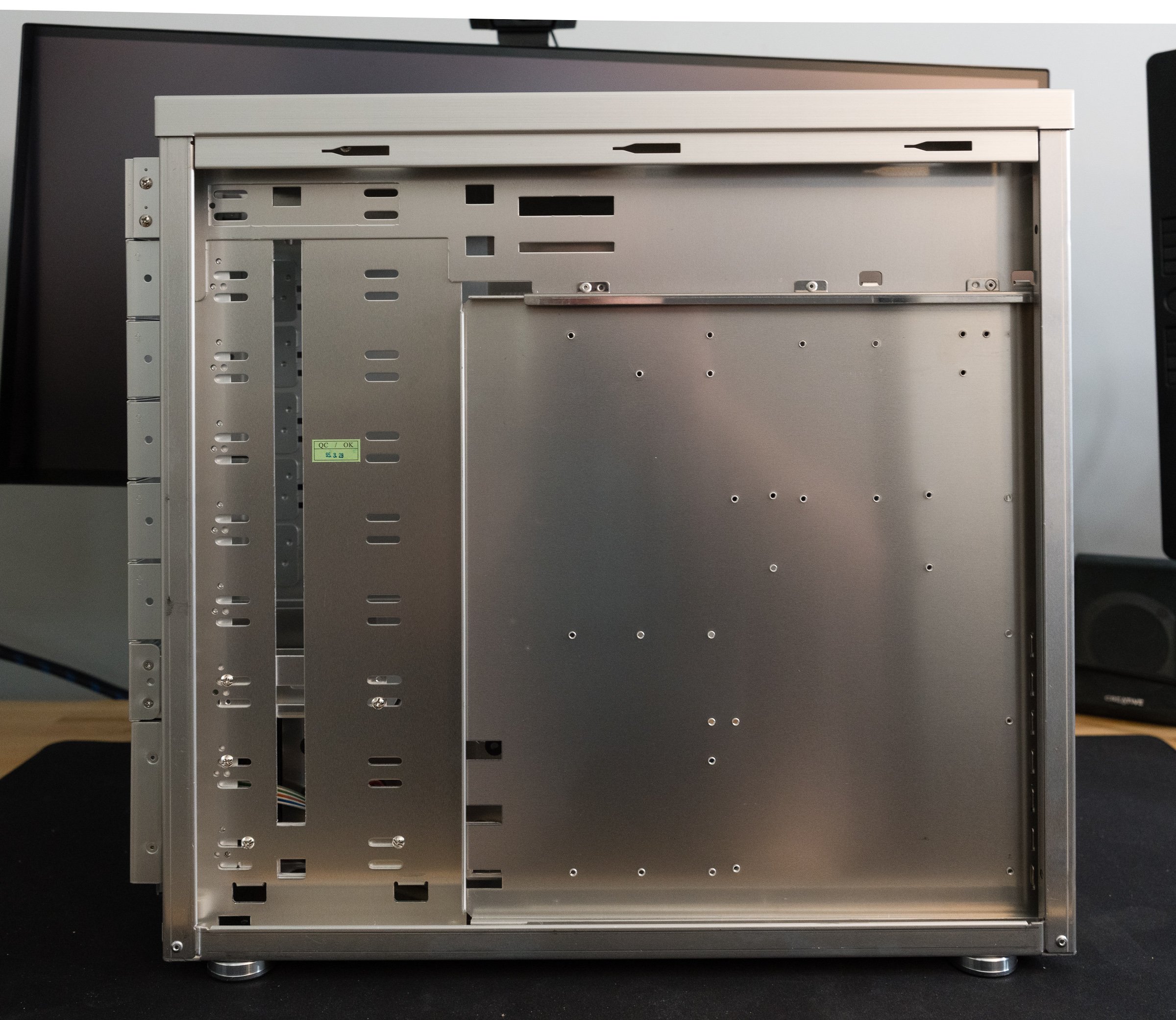
But that power supply bracket is just the opening act—the real star was the slide-out motherboard tray. Though most mid-tower cases had a sensible amount of space inside, you were still working inside a box. Sliding out a motherboard tray is like dropping the engine from a car to replace the cylinder heads—it’s easier to do complex mechanical work in an open space. Less risk of scraping your knuckles on the drive racks when installing a motherboard or CPU if you’re working outside the box. Power supplies and their wiring don’t get in the way of tightening heatsink screws. Did you drop a screw or jumper? No worries—just tilt the tray to one side and grab it. You could even open-air bench test a system if you were feeling frisky. For most users this is a one- or two-time convenience. But then, 'most users' weren't the target market here. The people who bought these cases were tinkerers, and tinkerers loved these trays. Case modders were always moving boards in and out of their project boxes. You don’t want delicate electronics inside your case when you're cutting holes in the side or constructing custom water cooling loops. True, you won't get a tsunami, but a few ounces of coolant in the wrong place can kill a machine—or a very unlucky tinkerer. You did remember to unplug everything first, right?

I can already see the tweets asking  “if removable trays are so great, why have they vanished from most modern PC cases?” My gut says there’s two reasons for their disappearance. First, there’s good old fashioned bean counting. A removable tray is extra complexity of the mechanical and manufacturing varieties, and that’s not free. Like I said earlier: most users aren't tinkerers. If the tray is just a one- or two-time convenience, maybe it's more economical to spend those engineering resources elsewhere. Second, a fixed tray is better for a case’s structural integrity, especially when there’s a cutout for processor heatsink backplates. A few modern cases like the beQuiet Dark Base still have a removable tray, but instead of a slide-out design, it’s reversible. Only a few screws stand between mounting your motherboard on the left- or right-hand side of the case. You know, so you can put your PC on the left- or right-hand side of your desk and still ogle your RGB LED light show.

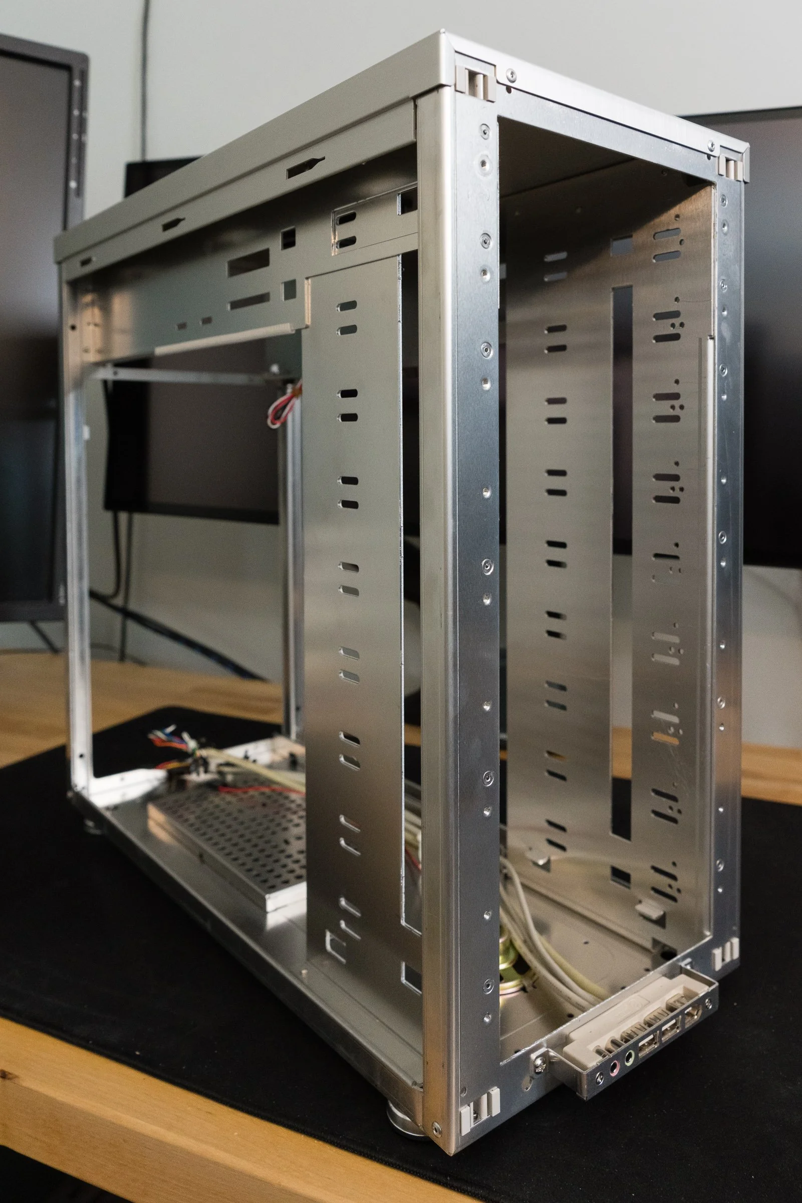
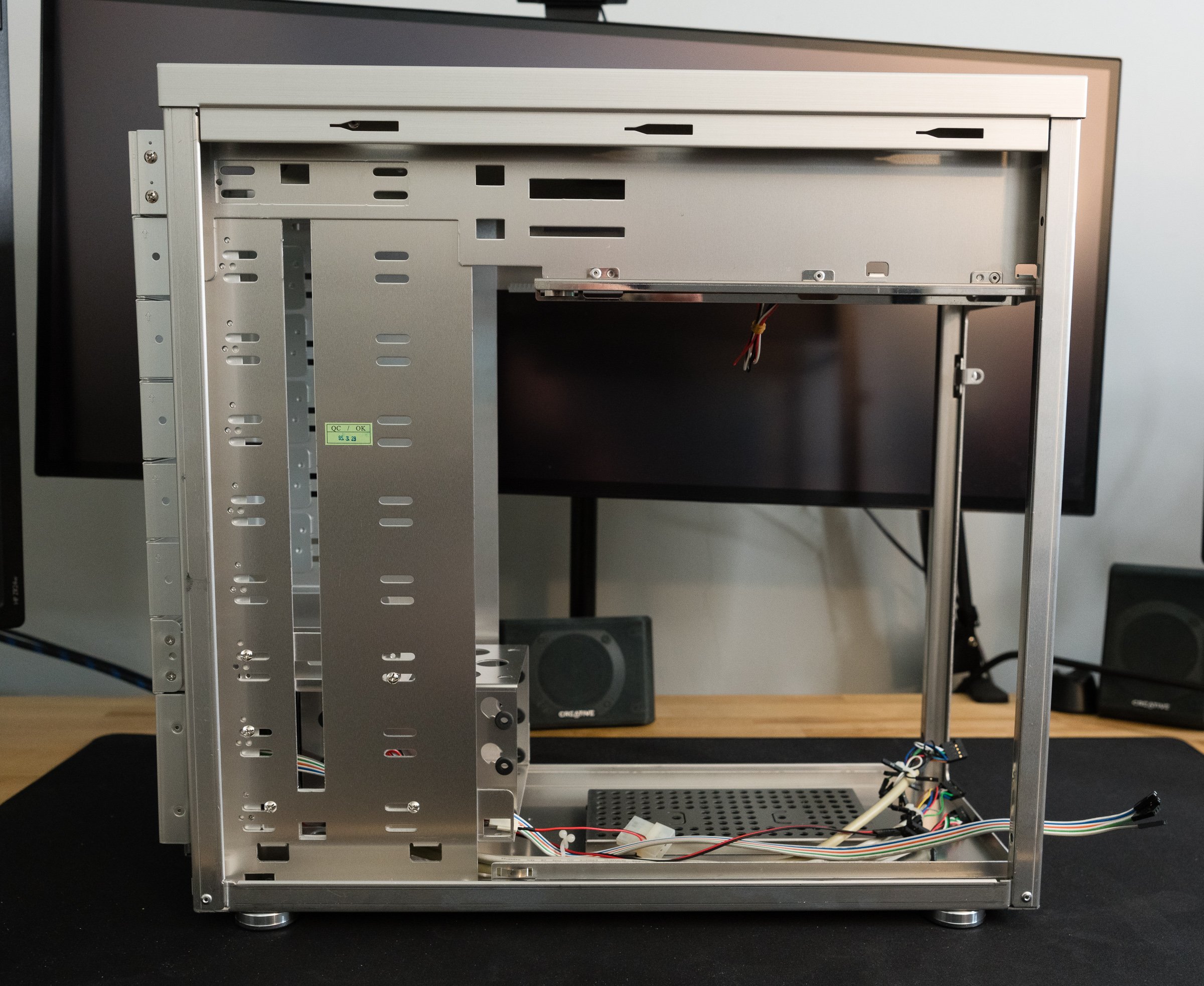
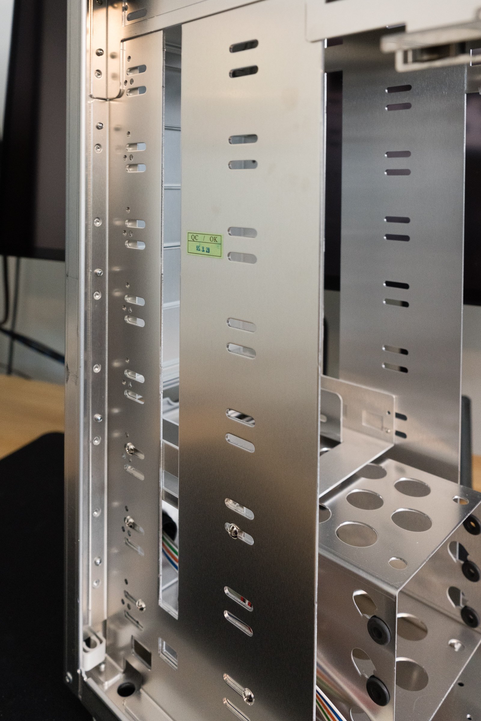
With the motherboard tray and power supply bracket removed, we’re left with the PC-6077’s frame, power supply shield, and the drive bay rack. These are all riveted together, since welding aluminum is more complicated than welding steel. A lack of sharp edges and some strategically placed plastic trim meant no more cut fingers and cursing fits. Hard drives and optical drives are secured by ordinary screws, not tool-less clips or rails. However, the hard drive cage does have rubber grommets to insulate the case from spinning disk vibrations. Aside from being made from aluminum, the construction is on par with other high-end cases of the time.

The PC-6077’s 3-in-2 hard drive cage.

The Pros and Cons of Aluminum

That aluminum structure feels solid and sturdy, but also quite light—which, granted, is the whole point of aluminum. My postal scale weighs the PC-6077 at around thirteen pounds empty. Most steel mid-towers of the era weighed around twenty pounds or more, but that weight savings comes at a price. Aluminum objects have always been more costly to manufacture than steel ones—Wikipedia will tell you more than you want to know about the Hall-Héroult process. But if you’re lugging your liquid-cooled Pentium 4 to the LAN-o-rama every Saturday, you’d happily pay the difference to cut your computer’s tonnage. Lian Li could have made the PC-6077 even lighter if they used more plastic, but the few ounces saved wouldn’t be worth losing perceived quality. That strategy was reserved for their entry level products, like the PC-10 which used a plastic front bezel.

Cost wasn’t aluminum’s only downside. On the one hand, it's ductile, which encourages modifications! On the other hand, it's ductile, which makes it vulnerable to flexing. Anyone who used a PowerBook or MacBook Pro before the unibody era knows just how bendy aluminum computers can be. Just take off the side panels and you can feel them flexing with normal handling. There are plenty of sad posts on forums from people who dented their cases with an errant foot, or dropped them and actually bent the frames. If you want more structural rigidity, you need to add more weight - which defeats the purpose of buying an aluminum case to begin with.

Aluminum’s lower density had another unintended consequence: noise. I've got some experience in voiceover, and I can tell you, mass plays an essential role in soundproofing. A lighter aluminum case absorbs less sound than a heavier steel one. A few overlapping metal pieces inside the case like the power supply frame and drive bay frame aren’t riveted together. Two of the three included fans are mounted using plastic rivets, which are better than screws but worse than isolated rubber mounts. Those rubber grommets I mentioned earlier from the hard drive bays were thin, and easily compromised. All of this adds up to a case that is susceptible to vibrations, sympathetic or otherwise.

None Like It Hot

“But my case doesn’t rattle or vibrate,” you say. Well, that’s great, but there’s another factor that impacts the acoustic qualities of a case: cooling. Whether it's case fans, heatsink fans, or radiator fans, it’s always been a challenge to build the fastest computer that’s also the quietest. What would you say if I told you that Lian Li has your best interests in mind? Why, right on the side of the box it says in big, bold letters that “Lian Li aluminum cases release heat faster than other cases!” Hey, they used a bold font—it must be true! But even if it was set in a different font, it’s still a bold claim by Lian Li. It’s easy to prove that an aluminum case is lighter—just put it on a scale. But proving that an aluminum case cools better? That’s more complicated.

They wouldn’t lie, would they?

Aluminum is a common heatsink material because it’s a good conductor with decent thermal capacity at an affordable price. Car radiators and AC evaporators are made out of aluminum. PCs were already using aluminum heatsinks on various chips—so why not make the case out of aluminum too? Posters on usenet and web forums extolled the benefits of an aluminum case for improving cooling performance, because SpeedFan showed lower temperatures after transplanting their builds into a shiny aluminum tower. “That proves it,” they’d say, like Philip J. Fry watching blurry, grainy videos of Bigfoot.

But as smart as PC nerds like to think they are, sometimes they forget that correlation doesn’t equal causation. These claims are all marketing hype. Aluminum might be a good conductor, but you know what isn’t? Air. Heatsinks need to touch components to actually sink the heat, and there’s usually some kind of thermal compound binding them together. So if the case isn’t touching any hot components, it’s not actually cooling them. I can already hear the next counterpoint: “But wouldn’t the case material absorb heat from hot case air?” I suppose it could, but let’s think about that for a second.

Heatsinks and radiators use mass and exposed surface area to exchange heat with air, and they have a certain amount of thermal capacity before saturation. That capacity can be increased in three ways: more mass, more surface area, or more airflow. There are some cases designed to be passively cooled, like the Streamcom ST-DB4, but the case itself is a giant finned heatsink directly connected to hot components. The PC-6077 doesn’t do any of that, and like a normal steel case its thermal performance is at the mercy of airflow. I don’t know about yours, but my cases obey the laws of thermodynamics.

Cooling wasn’t exactly priority number one for most case makers. Most PC cases of the late nineties had one rear case fan working in tandem with the power supply fan. As these fans exhausted hot air from the interior, fresh air was pulled in from vents at the front of the case. When faced with serious warmth—say, from a Pentium 4 processor and a Nvidia GeForce FX graphics card—this cooling setup couldn’t beat the heat. Consumer PCs needed more fans that could move more cubic feet of air through the case to cool more effectively.

We could shove so many fans in there!

The truth is that Lian Li's claims about releasing heat had nothing to do with the case's aluminum construction. Their cases cooled better because they included more preinstalled fans. More fans means more airflow which means more cooler, in that Tim Allen sort of way. The PC-6077, like most cases of the early aughts, had mounts for multiple intake and exhaust fans. Three 80mm fans were included in the stock configuration: an intake fan up front, an exhaust on the motherboard tray, and an exhaust at the top of the case. The power supply’s fan made four in total. This created a negative pressure system, which was sensible for most builds of the time. But PC enthusiasts back then were just like the PC enthusiasts of today—they wouldn't settle for sensible! Fortunately—for a given value of “fortunately”—the PC-6077 was pretty flexible when it came to cooling. Those beautiful, wide open drive bays were perfect for adding extra fans, and Lian Li was more than happy to sell you drive cages with fan mounts. Oh, and look—there’s one more 80mm mounting spot on the motherboard tray, just perfect for adding another fan!

What about the competition? Cooler Master’s aluminum cases had similar fan mounting options. Chenming’s model 601—which you might know better as the Chieftec Dragon, the Antec SX1030, the Thermaltake Xaser, or the case used by Alienware—had multiple front and rear fan mounts along with side panel fan mounts. So that means they all have fantastic cooling right? Think again. Some cases with lots of fan mounts only had one, maybe two fans installed, and they might not have been installed in optimum positions. A critical examination of these enthusiast cases—including Lian Li’s—show that most manufacturers just shoved fans in their cases with no real consideration for fluid dynamics.

Talk about a choked-off intake.

Look at the intakes—they’re choked by layers of of metal gratings, foam filters, and narrow bezel vents. That’s not all—the intake fans are sandwiched on the other side by hard drive cages! Whatever air that’s lucky enough to make it past the drives has to contend with a jungle of ribbon cables and power wires. At least exhaust fans were positioned near the CPU, and some OEMs were smart enough to install dual 80mm or a single 120mm fan to really suck out the air. But let’s say for the sake of argument that there were no blockages or cables or restrictions. The exhaust fans aren’t in line with the intake fans, which means there isn’t a straight path for air to move through the case. The result is a case riddled with turbulence and dead zones, where fans have to work harder—and therefore louder—to cool your computer.

When it came to acoustics, fans back then were kinda… meh. Pulse-width modulated variable fan speed was still years away. Four 80mm fans spinning at a constant two to three thousand RPM meant these suckers were loud. Good thing there’s plenty of bays in the PC-6077, because you’ll need a fan controller to dial things back when you don’t need maximum power. But be careful, because even ball-bearing fans could make mechanical noise at certain speeds. Multiply the mechanical noises by reverberations in the case, and you’ve got a computer cacophony. Before you know it you’re reading SilentPCReview.com and testing all the various isolation mounts to see which combination worked best.

Thermals are even more important today than they were twenty years ago, and PC case makers have largely caught on to what works and what doesn’t. There’s still duds out there, but it’s pretty easy to filter them out thanks to the Youtube Tech Personality Industrial Complex. The same market pressure that forged the aluminum cases of the early aughts is still pushing manufacturers to make quieter, cooler chassis…es…es with better functionality today.

This Old Tower, Today

So what’s left to do with this like-new PC-6077? The obvious idea is to fill it with vintage parts and make it a Windows XP gaming beast. Yes, an Athlon 64 X2 with a GeForce 6800 Ultra would be right at home, serving up some Battlefield 2 with a side of SimCity 4. Install a Fanbus, a SoundBlaster Audigy control panel, dual CD/DVD burners, and a removable hard drive carrier and you’ve got the classiest gamer box on the block… assuming you still live in 2005.

But what if you wanted to stuff a modern computer inside? Some would cry sacrilege, but I know people who’ve used and re-used their Lian Li cases for over a decade. I don’t think it’s that crazy of an idea, especially for a platform like the PC-6077. Lian Li’s appeal to the 5 1/4 lovers makes it remarkably easy to convert this case into an airflow-focused silver sleeper. Yanking out all of the trim covers and blanking plates gives you plenty of room to do whatever you want. Fit some 120mm fan adapters and replace the stock 80mm fans with Noctuas and you have airflow competitive with most modern cases. If you feel up to the task, there’s enough room to 3D print or fabricate a dual 140mm fan bracket. Fit a mesh front covering into the bezel and you’d make something that could blend right in with modern airflow oriented cases.

You’ll run into other issues, of course. Closed-loop liquid coolers aren’t an option without fabricating a bracket to mount them into the drive bays. You could take a page from the LAN partiers of yore and build a custom open-loop liquid cooling system. Many medium to large sized air coolers will fit within the PC-6077’s confines, like Cooler Master Hypers, Noctua NH-U12s and beQuiet Black Rocks. But the truly massive air coolers, like the Noctua NH-D15, won’t stand a chance. Modular power supplies mitigate the cable management problems somewhat, since you can just omit the cables you don’t need. Still, cleanly routing the PCI Express power, 24 pin ATX, and the EPS 12 volt cables will take some—no, all of your cunning. Stick to NVME solid state drives and you won’t have to worry about any SATA power or data cables. If you plan your build carefully, you could conceal a killer modern system in this twenty year old shell and have a PC that looks like nobody else’s.

The G5’s thermal design was a benchmark for other systems.

Yet the only fully aluminum cases on Lian Li’s website these days are a few small form factor boxes—fully-aluminum tower cases are nowhere to be found. So why did Lian Li stop making cases like this? There’s two factors for the decline of the fully aluminum mid-tower case. First, other companies used steel to build better designs, with more features, for half as much. Meanwhile, Lian Li spent too much time imitating the Power Mac G5, and not enough time innovating. Yes, there was a demand from PC users for cases that looked like the G5 or Mac Pro, because nothing looked like G5 cases. Apple had learned their lesson about hot components and bad acoustics with the Mirrored Drive Doors Power Mac G4, and had gone back to the drawing board to solve their problems with a clean sheet design. Thus the Power Mac G5 got a brand new case design with straight-through airflow and dedicated thermal zones, which made for a quiet, high performance computer. Lian Li’s PC V-1000 might have looked like a G5, but just because something has a cheese grater front panel doesn't mean it works like a G5. The V-series sold well, but Lian Li mortgaged their future by copying Apple.

The second factor that spelled doom—no pun intended—for aluminum cases was the decline of the LAN party. Home internet got fast enough that most people had a good enough time blasting their buddies without departing their desks. If you’re not moving your computer around all the time, you don’t care as much about saving weight. The extra money spent on an aluminum chassis could be spent elsewhere, like on more fans, liquid cooling, or RGB LED lights. After all, who cares about subtlety when you can put on a light show that rivals a Pink Floyd concert? The remaining buyers who valued weight savings could buy even smaller and lighter aluminum Mini-ITX small form factor cases. Mini-ITX has its own compromises, but the finished product saves a lot of space. If you have to move your computer around a lot, why not just make it as small as possible?

To its credit, Lian Li diversified long before the collapse of the market by creating the Lancool series of steel cases in 2009. Lancool catered to cost-conscious buyers while Lian Li continued to sell aluminum boxes to their traditional enthusiast clientele. Even as other manufacturers abandoned the aluminum case market, Lian Li doggedly stuck to it. Unfortunately, Lian Li abandoned their fully aluminum product line in the mid-2010s. Current Lian Li cases like the 011 Dynamic are steel frames with aluminum accents or panels. They still make a few aluminum small form factor cases—check out their collaboration with Dan Cases for some neat mini-ITX designs—but those are now rare exceptions. Most builders who valued the classy looks and functional design of Lian Li migrated to companies like Fractal Design, whose Define, Meshify, and Torrent series of cases are beloved for both gaming PCs and workstations.

Still, it’s remarkable that this old case can competitively cool a modern system with only a few minor upgrades. Someone could have bought a PC-6077 in 2003 and used it for their primary build for twenty years, which isn’t something you can say about most of its contemporaries. It seems like a happy accident that the all-bay design actually made it future-proof despite the obsolescence of 5 1/4” drives. During my research I found all sorts of forum and Reddit posts looking for cases just like this. Storage box builders are settling for used cases to fill with hot swap hard disk cages because the modern case market is leaving them high and dry. Server cases—then and now—are just too expensive and there’s no new mid-towers with lots of 5 1/4” drive bays. That’s why prices are still fairly high on eBay, and why I was shocked to find one at a thrift store. Sometimes fortune smiles upon thee, and this case will serve an honorable role as a vintage powerhouse. That is, once I decide what to put inside it.

The Toshiba Satellite Pro 460CDT - Nifty Thrifties

Here in Userlandia: a new home for wayward laptops.

Do you like searching for old tech? Sure, you can try Craigslist, Letgo, or even—ugh—Facebook Marketplace. But if you're really feeling adventurous, there's nothing like a trip to a thrift store. If you're someone who'd rescue a lonely old computer abandoned by the side of the road, then Nifty Thrifties is the series for you. After all, one person’s obsolete is another’s retro treasure. Like most retro enthusiasts, I’m always on the hunt for old junk. My usual thrifting circuit consists of Savers, Goodwill, and Salvation Army stores in the Merrimack River valley of Massachusetts and southern New Hampshire. I leave empty handed more times than I care to admit, but every once in a while fortune smiles upon me and I find something special.

Here’s a recent example. Back in August, I was combing through the usual pile of DVD players and iPod docks in the electronics section at the Savers in Nashua, New Hampshire. It was about to be another regulation day ending in regulation disappointment when two platinum slabs caught my eye. I dug them out and was quite surprised to find two identical Toshiba Satellite Pro 460CDT laptops, tagged at $7 apiece. Dock connectors, PCMCIA ethernet cards, and Pentium MMX stickers pegged their vintage around 1997. Toshiba always made good laptops, and Satellite Pros were business machines aimed at a demanding clientele. Both laptops were in decent physical condition, but they lacked power supplies—hence the low price. Missing power adapters don’t faze me since I have a universal laptop power adapter. Whatever their problems, I figured I could probably make one working laptop out of two broken ones. I happily paid the fourteen dollars total and headed home with my prize.

Not bad, for a machine old enough to drink.

The first order of business when picking up old tech is a thorough cleaning. “You don’t know where they’ve been,” as my mom would say. Although these didn't look too dirty, a basic rubdown with a damp cloth still removed a fair bit of grime. After cleanup comes the smoke test. We begin with laptop A, distinguished by a label on the bottom referencing its previous owner—hello, JG! After a bit of trial and error, I found the correct tip for the universal charger, plugged it in, and held my breath. After a tense moment, the laptop’s power and charge LEDs glowed green and orange. Success—the patient has a pulse!

Confident that the laptop wouldn’t burst into flames, I pressed the power button and waited for signs of life. An old hard drive spun up with a whine, but no grinding or clicking noises—a good sign. Next came the display, whose backlight flickered with that familiar active matrix glow. A few seconds later the BIOS copyright text announced a Chips and Technologies BIOS, a common one for the time. Things were looking good until my new friend finished its memory test. A cursor blinked at me, cheerfully asking: “Password?” My new friend had a BIOS supervisor password! I tried a few basic guesses—Toshiba? Password? 12345?—but JG hadn't been that sloppy. New Friend called me out with a loud beep and shut itself down.

Well, there was always laptop B. I plugged in the charger, the LEDs came on, I powered it up… and got the same result. Both of the laptops had supervisor passwords. Great. Adding injury to insult, laptop B’s display panel had multiple stripes of dead pixels. At least everything else on both computers seemed to be working. I bet they’d boot just fine if I could get around the password. This would be a delicate operation, one that required a light touch—like a safecracker.

Breaking Through The Back Door

Security for personal computing was an afterthought in the early days. Operating systems for single-user home computers were, well, single-user, and didn’t need any permissions or login security. But when laptops were invented, people asked inconvenient questions like "what happens when somebody steals one?” The laptop makers didn't have a good answer for that, so they hastily threw together some almost-solutions, like password-lock programs that ran during OS startup. In MS-DOS land, startup programs or drivers were specified in the autoexec.bat and config.sys files, and there were plenty of ways to bypass them. Even a password program embedded in a hard drive’s bootloader can’t stop someone from booting the computer with a floppy disk. It's like tying your bike to a parking meter with a rope. Inconvenient to defeat, but easy if you know how and have the right tools. There’s got to be a better way!

Well, that better way was a supervisor password. When a PC starts up, the system’s BIOS gets things moving by performing a power-on self test and configuring hardware devices. After finishing its work, the BIOS hands control over to a bootloader which then starts the operating system. A supervisor password sits in-between the self-test and hardware configuration stages. If you don’t know the magic word, the BIOS will never finish its startup routine and thus will never start the bootloader. This closes the external storage loophole and ensures only an authorized user could start the operating system.

Early supervisor passwords were stored in the battery-backed CMOS settings memory—the very same memory used for disk configuration data and the real-time clock. To clear these passwords, all you had to do was unplug the computer’s clock battery. To close that hole, laptop makers pivoted to non-volatile memory. A password stored in an EEPROM or flash memory chip would never be forgotten even if batteries were removed, went flat, leaked acid, or—as can happen if you're really unlucky—literally exploded. So what kind of lock did my new friends have?

Some light Googling revealed that Toshiba laptops made from 1994 until sometime around 2006 stored the password in a reprogrammable ROM chip on the motherboard. Because Toshiba anticipated users forgetting their supervisor passwords, they included a backdoor in their password system. An authorized Toshiba service tech could convince the machine to forget its password by plugging a special dongle into the parallel port and powering on the locked laptop. Apparently this service cost $75, which is a bargain when you're locked out of a $3000 laptop.

Now, backdoors are generally a bad thing for security. But users and administrators are always making tradeoffs between security and usability. Businesses wanted the security of the password, but they also wanted the ability to reset it. In principle, only Toshiba and its techs knew about the backdoor. But once customers knew that resetting the passwords was possible, it was only a matter of time before some enterprising hacker—and/or unscrupulous former Toshiba employee—figured out how to replicate this. And the backdoor was just one of the Satellite’s security flaws. The hard disk carrier was held in place by a single screw. Anyone with physical access could yoink out the disk and read all its data, since there was no support for full disk encryption. Odds are, Toshiba thought being able to save customers from themselves was more important than pure security.

So how does this backdoor work? It’s actually quite simple— for a given value of “simple.” Toshiba used a parallel port loopback. By connecting the port’s transmit pins back to its own receive pins, the computer is able to send and receive data to itself. It’s a common way to test a port and make sure all its data lines are working. When the laptop is powered on, it sends a signal to the parallel port’s transmit pins. If that signal makes it back to the receive pins, the BIOS clears the password stored on the EEPROM and the computer is ready to boot.

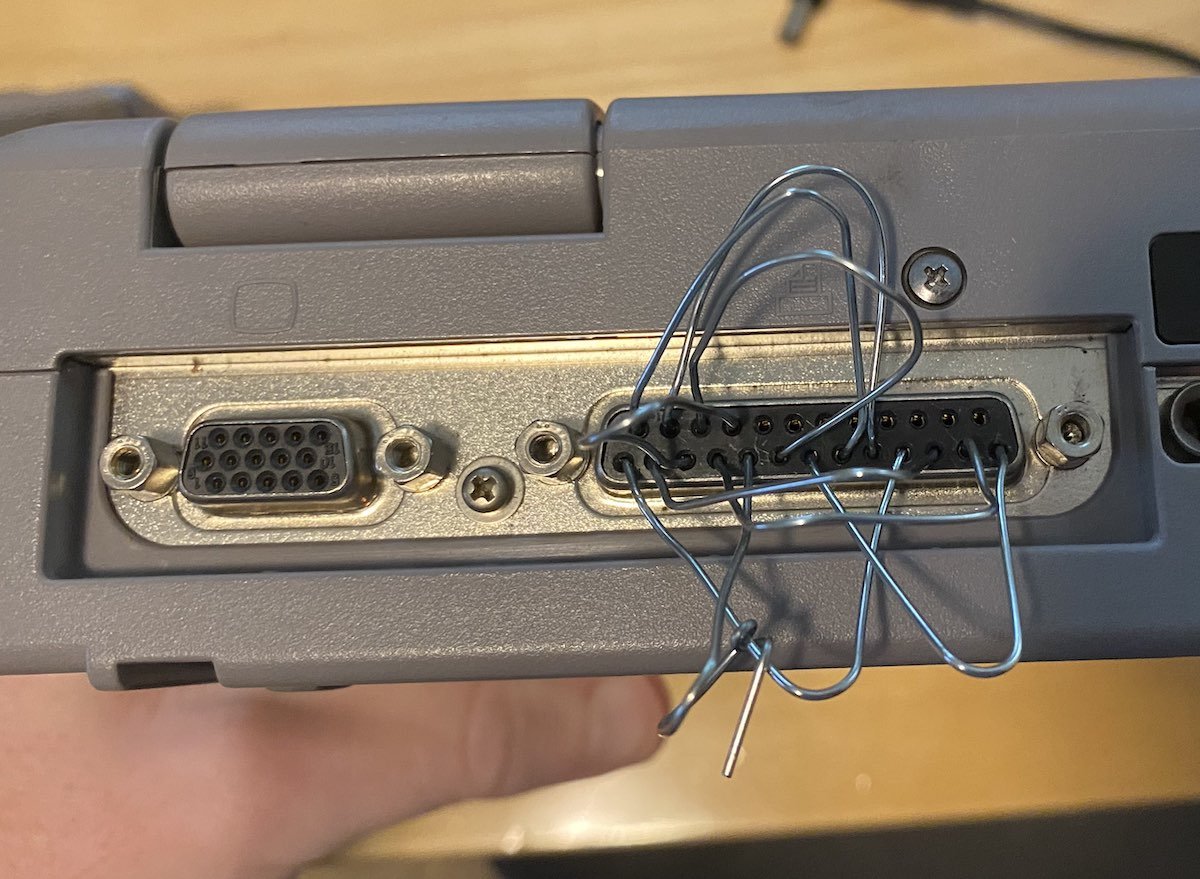
So how would you reset the password without paying Toshiba to do it, just in case they stopped supporting those laptops fifteen years ago? Just wire up a homemade loopback dongle! It's easy enough—again, for a given value of “easy.” Multiple websites have instructions for building a DIY password reset dongle. You can cut up a parallel cable, solder some wires together to connect the right pins to each other, and you'll have those laptops unlocked before you know it.

Of course, I didn't actually have any parallel cables I could cut up, no. That would have been too convenient. Since I only needed this to work once for each machine, I took a page from Angus MacGyver's playbook and connected the pins using paperclips. If you want to try this yourself, just make sure none of the paperclips touch each other, except the ones for pins one, five, and ten. Make sure to unplug the power supply first and wear a grounded wrist strap while connecting the pins. And... well, basically, read all the instructions first.

As with the best MacGyver stories, the paperclips worked perfectly. Once the paperclips were in place, I powered the machines back on, and the password prompts disappeared. Both laptops carried on with their boot sequence and the familiar Windows 95 splash screen graced both displays. I opened the locks, but that was just step one in bringing these computers back to life.

Laptop B—the one with the half-working screen—made it to a working desktop. Unfortunately those black stripes running through the screen meant I needed an external display to do anything useful. Laptop A, which had a functioning screen, was problematic in other ways. It crashed halfway through startup with the following error:

"Cannot find a device file that may be needed to run Windows or a Windows application. The Windows registry or SYSTEM.INI file refers to this device file, but the device file no longer exists. If you deleted this file on purpose, try uninstalling the associated application using its uninstall program or setup program.”

I haven’t used a Windows 9x-based system in nearly two decades, but I still remember a lot from that era. I didn’t need Google to know this error meant there was a problem loading a device driver. Usually the error names which driver or service is misbehaving, but this time that line was blank. I rebooted while pressing the F8 key to start in safe mode—and it worked! I got to the desktop and saw a bunch of detritus from the previous owner. This machine hadn’t been cleanly formatted before it was abandoned, likely because nobody could remember the supervisor password. Safe Mode meant the problem was fixable—but Windows wasn’t going to make it easy.

Microsoft’s impressive ability to maintain backwards compatibility has a downside, and that downside is complexity. Troubleshooting startup problems in the Windows 9x era was part science, part art, and a huge helping of luck. Bypassing autoexec.bat and config.sys was the first step, but that didn’t make a difference. Next was swapping in backup copies of critical system configuration files like win.ini and system.ini, which didn’t help either. With the easy steps out of the way, I had to dig deeper. I rebooted and told Windows to generate a startup log, which would list every part of the boot sequence. According to the log, the sequence got partway through the list of VxDs—virtual device drivers—and then tripped over its own feet. Troubleshooting VxD problems requires a trip to that most annoying of places: the Windows Registry.

I can understand the logic behind creating the registry. It was supposed to order the chaos created from the sea of .INI files that programs littered across your hard drive. But in solving a thousand scattered small problems, Microsoft created one big centralized one. Even though I know the registry's logic and tricks, I avoid going in there unless I have to. And it looked like I had to. Since the problem was a VxD, I had to inspect every single key in the following location:

HKEY_LOCAL_MACHINE\System\CurrentControlset\Services\VxD

After inspecting dozens of keys, I found the culprit: a Symantec Norton Antivirus VxD key was missing its StaticVXD path. Without that path the OS tries to load an undefined driver, and the boot process stumbles to a halt. An antivirus program causing more problems than it solves? Whoever heard of such a thing! I deleted the entire key, rebooted, and New Friend started just fine. Hooray! I landed at a desktop full of productivity applications and Lotus Notes email archives. According to their labels, these laptops belonged to salespeople at a national life insurance company. Don’t worry—I cleaned things up, so all that personally identifiable information is gone. Still, it bears repeating: when disposing of old computers, format the disks. Shred your hard drives if you have to.

Where Do You Want To Go Today?

1997 was an amazing year for technology, or maybe for being a technologist. No one knew then that the merger of Apple and NeXT would change the world. Microsoft and Netscape’s browser war was drawing the attention of the US Justice Department. Palm Pilots were finally making handhelds useful. Sony’s PlayStation had finally wrested the title of most popular game console away from Nintendo. Demand for PCs was at a fever pitch because nobody wanted to miss out on the World Wide Web, and laptops were more affordable and user-friendly than ever before.

If you were looking for a laptop in 1997, what would you buy? Apple was selling the fastest notebook in the world with the PowerBook 3400C, but if you couldn’t—or wouldn’t—run Mac OS, that speed wasn’t helpful to you. DOS and Windows users were reaping the benefits of competition, with big names like IBM, Compaq, Dell, HP, and of course Toshiba, dueling for their dollars. Most buyers were shopping for midrange models, and Toshiba aimed the 1997 Satellite range directly at these Mister Sensible types. The lineup started with the Satellite 220CDS at $1899 and topped out with the 460CDT at $3659 according to an October 1997 CDW catalog. That works out to $3,272 to $6,305 in 2021 dollars. The Satellite family featured similar cases, ports, and expansion options across the lineup. What differentiated the models were case colors, types of screens, CPU type and speed, the amount of memory, and available hard drive space.

If you had the scratch for a 460CDT, you scored a well equipped laptop. The bottom-line specs are all competitive for the time: a 166MHz Pentium MMX processor, 32 megabytes of RAM, and a staggeringly huge two gigabyte hard drive. CD-ROMs were standard equipment across all of Toshiba’s Satellite laptops, though there wasn’t enough room for both a floppy and CD-ROM drive at the same time. Don’t worry, because the SelectBay system allowed the user to quickly swap the CD-ROM for a floppy drive, hard drive, or a second battery. Multimedia games and PowerPoint presentations were no problem thanks to integrated stereo sound and 24-bit true color Super VGA video output.

Despite all these standard features, laptops of 1997 were still significant compromises compared to their desktop counterparts. Active matrix color TFT screens looked beautiful—but only if your eyes stayed within a narrow viewing angle. Trackpoints and trackpads may have kicked trackballs to the curb, but most users still preferred a mouse when at a desk. Memory often came on proprietary boards, hard drives were smaller and more fragile, and PCMCIA cards were expensive. Power management features in Windows laptops were rudimentary at best—standby never worked very well and it drained the battery faster than a Mac’s sleep function. But this was the tradeoff for portability. To us, today, it's obvious that these are significant disadvantages. But back then, they were top of the line. Think about the average laptop buyer in 1997: mobile IT professionals, road warrior businesspeople, and well-off college students. They were not just willing, but eager to accept these compromises in the name of true portability.

In their prime, these laptops were beloved by demanding business users. Today they’re worth only a fraction of their original price tags, fated to rot in an attic or get melted down by a recycler. So if you stumbled across one in the wild, why would you grab it? Well, it turns out these laptops are decent retro gaming machines. It’s a bit ironic, because serious gamers in 1997 wouldn’t touch a laptop. But hear me out—for playing MS-DOS and Windows 95-era games, these machines are a great choice.

Most laptops of this era fall into a Goldilocks zone of compatibility. A Pentium MMX-era PC can still natively run MS-DOS along with Windows 95, 98, or even NT 4.0. Windows is still snappy and responsive, and demanding DOS games like Star Wars: Dark Forces are buttery smooth. Unlike most older laptops, these Toshiba models have built-in SoundBlaster-compatible digital sound with a genuine Yamaha OPL-3 synthesizer for authentic retro music. Though it lacks a 3D accelerator, the Chips & Technologies graphics processor supports your favorite DOS video modes and has good Windows performance. There’s even a joystick port, although granted, it requires an adapter. External video is available (and recommended), but the LCD panel can run both in scaled and unscaled modes, giving some flexibility compared to laptops that are forced to run 320x240 in a tiny portion of the panel.

Running some games across all these eras was painless—again, for a given value of “painless.” I tried my favorite DOS games first: Doom 2 and Warcraft 2. Blasting demons and bossing peons around was effortless on this Pentium machine. Windows and DOS versions of SimCity 2000 ran A-OK, though the FM synth version of the soundtrack isn’t my favorite. But this CD-ROM machine was made for multimedia masterpieces like You Don’t Know Jack, and announcer Cookie Masterson came through crystal clear on the built-in speakers. The most demanding game I tried, Quake, still ran acceptably in software rendering mode. For seven bucks, this is one of the best retro values I’ve ever picked up—and I have two of them! It’s a testament to Toshiba’s history as an innovator in the portable space that these machines still work this well twenty five years on.

The Toshiba Satellite Legacy

Toshiba’s been a leading Japanese heavy manufacturing concern for over a century. Like Sony, their name is on so many products that it’s probably easier to list what they don’t make. With a history in computing stretching back to the mainframe era, and their expertise in consumer electronics, Toshiba personal computers were inevitable. After designing a few microcomputers of their own, Toshiba joined Microsoft and other Japanese electronics companies to form the MSX consortium. Toshiba’s MSX machines were perfectly fine, but they were mostly known only in Asian markets. If they wanted to compete on the global stage, they’d need to bring something unique to the table.

Everything changed for Toshiba in 1985 when they introduced the T1100, one of the first laptop computers. Toshiba liked to hype up the T1100 as “the first mass market laptop,” which is true from a certain point of view. It’s not the first clamshell laptop—that honor belongs to the GRiD Compass. Other clamshell-style machines followed suit, like the Sharp PC-5000 and the Gavilan SC. Don’t forget the Tandy TRS-80 Model 100 either, which was just as much of a laptop despite a flat slab chassis. So what did Toshiba bring to the table?

Each of those predecessors had some kind of compromise. The GRiD Compass was the first clamshell, but since it didn’t have a battery its portability was limited to wherever you could plug in to a power socket. Gavilan and Sharp’s offerings had batteries, but both machines had compromised displays that could only show eight lines of text at a time. What about operating systems? GRiD wrote a custom operating system for its PCs, while Sharp and Gavilan used MS-DOS. But they weren't fully MS-DOS compatible, because MS-DOS expected a 25-line display instead of that measly 8. The T1100 managed to beat them all by having a 25 line display, battery power, integrated 3.5 inch floppy drive, and full MS-DOS compatibility.

Weighing in at 8.8 pounds, the T1100 was also the lightest of the first battery-powered clamshells. Toshiba’s PC engineers pitched it as a go-anywhere machine for a demanding user, but according to project leader Atsuoshi Nishida, Some Toshiba Executives Who Would Rather Not Be Named had their doubts about whether there was a market for something so expensive. The T1100 met Nishida’s first year sales target of ten thousand units in Europe, proving that MS-DOS portable computers didn’t have to be back-breaking suitcase-sized luggables.

In 1989, Toshiba introduced the first super-slim, super-light notebook computer. They dubbed it Dynabook—the name computer pioneer Alan Kay had suggested for an always-connected, take-anywhere computer. The chief of Toshiba’s computer division, Tetsuya Mizoguchi, easily secured that name in European markets. Japan and the US were more difficult, because some other companies had trademarked that name already. In Japan, that was the ASCII Corporation. Mizoguchi called the president of ASCII, Kazuhiko Nishi, and secured a license for the Dynabook name. Unfortunately, Mizoguchi didn’t have those special connections in America. Because Toshiba wouldn’t—or couldn’t—cough up the licensing fees, models for the US market omitted the Dynabook name.

Steve Jobs running OpenStep on a Toshiba Tecra laptop.

Toshiba maintained a leadership position in the laptop market despite competition from the likes of Compaq, Dell, and IBM because they pushed the envelope on power and features. Toshiba laptops were some of the first to feature hard drives, lithium ion batteries, CD-ROM drives, PCMCIA card slots, and more. When NeXT was in its post-hardware days, Steve Jobs ran OpenStep on a Toshiba laptop, and it’s hard to find a better endorsement than that.

By the mid-nineties, competition in the laptop sector was stiff. Toshiba adapted to changing times by creating multiple product lines to attack all levels of the market. The Satellite and Satellite Pro series were the mainstream models, preferred by perpetrators of PowerPoint for their rugged construction and balanced feature list. If you desired something less weighty, the compact Portégé subnotebook gave you the essentials for portable computing in a smaller, lighter package. If the Portégé was still too big, you could try the Libretto: a petite palmtop with paperback proportions packing a Pentium-powered punch. Lastly, there’s the Tecra series. As Toshiba’s desktop replacements, Tecras had the biggest screens, the fastest processors, and a veritable Christmas list of features. All it cost you was most of your bank account and a tired shoulder from lugging all the weight around.

This strategy served Toshiba well for nearly two decades, but you know what they say about all good things. You might’ve seen the news in 2020 that Toshiba left the laptop market. Like IBM selling its PC business to Lenovo in 2005, Toshiba decided to call it quits after years of cutthroat, low-margin business. The first sell-off was in 2018, when Sharp purchased an 80% share in Toshiba’s Dynabook division. Two years later, Sharp bought the remaining 20%, completing Toshiba’s exit from the market. What used to be Toshiba laptops now bear the Dynabook name everywhere, not just Japan.

It’s not like Toshiba hadn’t faced competition before. There were just as many companies making laptops in 1997 as there were in 2018. We still have the old stalwarts like Dell, Sony, and HP, and though the labels say Lenovo the ThinkPad is always a popular choice. Don’t forget Apple’s still sniping at all of them too. Old names like Winbook, AST, Micron, and NEC may have fallen to the wayside, but Asus, Acer, MSI, and Razer have taken their place. The field’s just as crowded today as it was back then. Why did Toshiba bail out of the market they helped create?

Like IBM before them, Toshiba simply decided that they had enough of chasing razor-thin margins in a cutthroat market. Their money could be better spent elsewhere. Business gotta business, I suppose. Seeing Toshiba exit the laptop market is like seeing Minolta leave the camera business. These companies were innovators that changed the very core of their markets, and seeing them fall to the wayside breaks my heart. In the case of Minolta, they wisely sold their camera division to another company with a history of innovation: Sony. Every Sony Alpha and RX series camera sold today has some Minolta expertise inside. I can only hope that Sharp carries the legacy of Toshiba to new heights.

The future may be uncertain, but when it comes to the past Sharp might be all right. Dynabook’s website has a wealth of drivers, spec sheets, and knowledge base articles for decades-old computers. Go ahead and try to find drivers for a Compaq Armada of similar vintage on HP’s website—yeah, try. Most manufacturers are terrible about keeping any kind of support for vintage machines online, so major props to Toshiba and now Dynabook for providing some kind of long-term support.

I didn’t own a Toshiba laptop back in the day, but I’ve always had a lot of respect for what they could do. Or at least, respect for what they could do, according to the tech journalists in PC/Computing magazine. Part of the fun of reviving these retro relics is experiencing first-hand the things you lusted after and seeing if the reality lives up to the legend. Thanks to a little effort and a little luck, I was able to appreciate these machines for a fraction of their eBay prices. These Satellites are welcome in my orbit anytime.

Aldus PageMaker 4.0 for Windows - Nifty Thrifties

It wasn’t that long ago that you could find all sorts of big box PC software at the thrift store. But as the years go on, it gets rarer and rarer. People who don’t know about the collector’s market just toss old software in the trash. People who do know about the collector’s market are putting anything remotely interesting on eBay, which cuts into the number of bargain finds. It’s still worth the effort, though, because interesting items cross my path now and again. Luck was on my side in October when I found a boxed copy of Aldus PageMaker at a thrift store in southern New Hampshire. I brought home a piece of my career history for the cool cost of four dollars—a fraction of its original MSRP.

PageMaker found in store.

It belongs in a computer museum!

I first encountered PageMaker when I enrolled in my high school’s graphic arts program. I didn’t know a point from a pica, but I was a budding artist and a hopeless computer nerd, and so computer graphic design seemed like the best way to mash all of my interests together.. Before I knew it I was thrust into a world of Illustrator, Photoshop, and yes, PageMaker. My high school used PageMaker extensively, thanks to educational licensing deals with Adobe. QuarkXPress had completely captured the professional market by the late nineties, but it was too XPensive for us. Adobe squeezed revenue out of the flagging PageMaker by catering to price sensitive organizations like schools. Plenty of millennial designers like me graduated into PageMaker after an elementary curriculum of Print Shop and KidPix.
 If you’ve got eagle eyes, you might notice that this copy of PageMaker is for Windows. The Mac’s long reign as the king of graphic arts was thanks largely to PageMaker being the Mac’s first killer app. But Paul Brainerd, founder of Aldus, knew that staying exclusive to the Mac would limit Aldus’ growth. IBM PC users needed page layout programs too, so in 1987 Aldus released PageMaker for IBM compatibles.

One problem with porting to IBM was that PageMaker required a graphical user interface. Instead of rolling their own GUI toolkit, Aldus ported PageMaker to Microsoft Windows and included a copy of Windows 1.0 in the box. It was a bold move at the time, since Windows was rough around the edges and years away from being the dominant PC OS we all know and tolerate. Later versions utilized the stripped-down Windows runtime to provide a graphical interface without the expense of a full copy of Windows. Shipping a GUI runtime with an app wasn’t unusual at the time—Microsoft did this with Word and Excel for years, and America Online’s standalone version used the Windows runtime too. By version 4.0 Aldus expected you to supply your own copy of Windows 3.0—there’s no runtime included at all. If Windows wasn’t your jam, PageMaker was also available for IBM’s 32-bit operating system, OS/2. That might be the business equivalent of lighting money on fire, but I’m sure OS/2 users appreciated it.

Aldus wasn’t the only company bringing graphical page layout apps to the PC. Ventura Publisher and Frame Technology’s FrameMaker were just a few of PageMaker’s contemporary competitors. There was a healthy business selling to PC users, but the Mac continued to dominate the graphics and publishing industries. There was just one problem—Apple’s mid-nineties malaise meant that if Apple went down, they’d take the graphics industry ship with them. Eventually Quark and Adobe followed Aldus’ lead and ported their applications to Windows, giving them insurance against Apple’s business blunders.
What’s In The Box?

If you were one of those Windows users who bought a copy of PageMaker, what did you get in the box? The software itself comes on five 1.2 megabyte high density 5 1/4 inch floppy diskettes. In addition to these actual-floppies, Aldus offered PageMaker 4.0 on seven 3 1/2 inch 720k not-so-floppies. You could even order a copy on 360K double-density 5 1/4 inch disks, but I bet only a handful took Aldus up on that offer. I wonder which format was more popular, because computers of 1991 often had both styles of floppy drive. Since the 3 1/2 inch disks are 720K, that version needs seven disks compared to five for the larger format. Version 4.0 was the last version to offer 5 1/4 inch floppies, since 5.0 offered a CD-ROM option in their place.

Inside the box is a full complement of manuals and documentation. The first group is what I’d call the supplementary materials. Things like a quick reference for keyboard shortcuts, a printed version of the software license agreement, and a listing of Aldus-approved educational materials, training companies, and service bureaus. A printed template guide provided a handy visual reference for all the included design templates for things like business cards, newsletters, and calendars.

The most amusing of these pack-in items is a very condescending anti-piracy leaflet. It implores you to think of all the theoretical sales you’re depriving from the poor Aldus Corporation when you copy that floppy. I won’t dwell on that leaflet too long, except to point out the irony of Aldus lecturing someone who already paid them for the software in question.

Next is a quick start guide along with the primary reference manual, table editor guide, and the version supplement. The quick start guide has all the steps for installing the software, a listing of menus and tools, and a quick tutorial for making a sample document. It’s nice and all, but that’s just a warmup for the main event: the reference manual. I love the reference manual—it’s well written and comparable to a guide book you’d buy in a store. This was back in the day when manuals were written like actual books, and companies ran their documentation teams like real publishers. Manuals like these died for a variety of reasons—they were heavy, costly, and not as convenient as online help. I also think a lot of companies—especially Adobe—realized that manuals were an untapped source of revenue. It’s no coincidence that Classroom in a Book's popularity soared after Adobe excised the printed materials from their software.

Improvements in PageMaker 4.0

If you ponied up $150 of 1991 dollars to buy a PageMaker 4.0 upgrade, you got a lot of new features for your money. A lot of these were playing catch-up to QuarkXPress after it stole a lot of PageMaker’s marketshare at the end of the eighties. Still, if you were an everyday user, a lot of these features seem mighty compelling. Let’s check them out.

  • Long document support. PageMaker 3.0 had a 128 page limit per file. 4.0 introduced a 999 page limit per file, which as far as I can remember hung on until the bitter end of 7.0.

  • Color graphics support. Version 3.0 supported spot colors and you could colorize text or linework, but displaying actual color images was right out. 4.0 added support for 24-bit full color images. Better late than never.

  • Story editor with spell checking. Instead of writing in the pasteboard view, a word processor-like story editor allowed for composing long text documents without writing them in a different word processor first.

  • Search and Replace. Searching a document isn’t just for words, it’s also for styles and metadata. PageMaker 4.0 added style-based search and replace, making it easy to reformat documents without needing to manually select every instance of fourteen point Helvetica.

  • Inline graphics placement. Previous versions always required placing images in their own frames. Now you could place graphics inside of a text box. This made PageMaker easier to use for users coming from word processing programs like Microsoft Word. Inline images didn’t replace the old frame method, so you could use whichever mode you preferred.

  • Paragraph line control. Customizable paragraph break controls prevented widows and orphans from ruining the flow of your document. Hyphenation support was also new for 4.0.

  • Advanced type and text controls. PageMaker 4.0 could scale or compress type for stylish effects. 90 degree rotations for text lines were added as well. Kerning, tracking, and leading precision were also enhanced in 4.0. This was in response to QuarkXPress, which had much better type handling than PageMaker 3.0.

  • Book publication features. Previous versions of PageMaker lacked features that could help assemble books. Things like indexing, automatic page numbering with special section formats, and tables of contents were all new to 4.0. No more manually adjusting your TOC and page counts after cutting a weak chapter or page!

  • File linking improvements. PageMaker could now tell you the date and time that you placed or updated linked images and text files. It could even offer to update them automatically if it detected a new version. This was also in response to Quark, which had better link management. Alas, this is an area where PageMaker was always playing catchup.

  • Tables and chart support. A new utility could read table and chart data from various database and spreadsheet applications. Lotus 1-2-3, Microsoft Excel, and Ashton-Tate dBase were just a few of the available data sources.

Making the Page

It’s one thing to list and read about features—let’s give PageMaker a spin and check them out first-hand. Unfortunately, I don’t have a system with 5 1/4 inch disk drives to run this exact copy of PageMaker, so running a copy in DOSbox will have to do. There’s an installer app that copies all the files and configures all the settings, and it’s about as easy as 1991-era installers go. If hard drive space is tight, you can omit unnecessary printer drivers and template files during installation. One advantage of DOSox is that things are much zippier thanks to solid-state storage. Actual hardware would require a lot more time and floppy swapping, so that’s one bullet dodged. Printer drivers come on a separate disk, and PageMaker supports HP LaserJets, a generic PCL device, and a generic PostScript device. PostScript Printer Description files—PPDs—are included for common PostScript printers of the day, like Apple LaserWriters. There’s no copy protection other than a serial number, though I wouldn’t be surprised if it checked for other copies running on a local area network.

After the installation finished there was a shiny new Aldus group in Program Manager. After the first launch complained about configuration settings—I needed to add some PATH entries to autoexec.bat—PageMaker finally came to life. So many memories came back to me after perusing the palettes and combing through the commands. I didn’t even need a refresher from the manual to place an image, set some text, and print a file—just like old times! PageMaker 4.0’s user interface is remarkably bare compared to 1990s Quark XPress, let alone modern InDesign. It’s riddled with modal dialog boxes and pull-down menus—definitely signs of a pre-toolbar and tabbed palette world. Speaking of those dialog boxes, their layouts were ripped right out the Mac version. Seasoned PageMaker users will appreciate the consistency, but they definitely look out of place in a Windows environment. When it comes to toolboxes, three palettes are all you get for your computer pasteup needs: tools, styles, and colors. Make it work, designers!

Despite its age, this software can still produce legitimate work—after all, PostScript is one of its output options. Just tell the PostScript printer driver to write your output to a PS file and you’ve got something that can be opened in Illustrator or distilled to a PDF. If you have a PostScript-compatible printer, I bet you could print to it directly with the appropriate PPD. I made a quick test document with some text and a graphic, saved it to a PostScript file, and dumped it into Acrobat Distiller. After a few seconds, I had a PDF file that I could send to any print shop in the world. If you go to the blog post for this episode, you can compare PageMaker’s on-screen display versus the finished PDF, which is equivalent to a “printed” piece. PageMaker’s display is a jagged, low resolution mess, while printed output is crisp and precise. Quite the difference, no?

Despite the popularity of “What You See Is What You Get” marketing, the actual quality of our screens paled in comparison to what a laser printer could do. 1991 was still the era of separate screen and printer fonts. Screen fonts were hand-drawn with pixels to match specific point sizes, whereas printer fonts used glyphs composed from curves and lines that could be rasterized to any point size. This was necessary at the time because computers were too slow to dynamically render those outline fonts to the display. Screen fonts also had hints to help fonts look better on low-resolution computer displays. So long as you stuck to the provided point sizes, you’d be fine. But choosing a non-standard point size with a screen font transformed your type into terrible tacky trash. Eventually programs like Adobe Type Manager brought the power of outline fonts to computer displays using antialiasing techniques, so long as you had a computer powerful enough to use it without lag.

Graphics also used low-resolution previews to save precious memory and CPU cycles. Vector graphics were infinitely scalable when printed, but all the user saw on screen was a blocky, low-resolution proxy. Raster images could also use a proxy workflow thanks to another Aldus invention: the Open Prepress Interface, or OPI for short. A designer would place a low-res proxy image into their document along with an OPI link to a high resolution file. At print time the raster image processor follows the link and overwrites the low-res image with the high-res one. By using OPI, all the heavy high-res files could live on a big, beefy server and reduce the time it takes to spool files to a printer or imagesetter. Because of these limitations, I frequently printed scrap proofs to double check my work. When InDesign launched with a high resolution preview mode for images and graphics, it was a revelation.

To Aldus’ credit, they ate their own dog food—the manuals and boxes were designed with PageMaker and Freehand. The jury’s out on whether they used SuperPaint for the raster graphics. Even with all the improvements included in PageMaker 4.0 and 5.0, nothing could really stem the bleeding of users to Quark XPress, because XPress’ frame-based toolset and mathematical precision were just that good. It made layout easier and more predictable than PageMaker, and its library of third-party XTensions helped you create designs that were impossible in PageMaker.

How could Aldus beat Quark under those tough circumstances? PageMaker’s code aged poorly, and rewriting it would take a lot of time and money. Maybe it was time to start over. Aldus was already developing a replacement for PageMaker at the time of their merger with Adobe in 1994. This project, codenamed K2, wouldn’t just replace PageMaker; it would challenge QuarkXPress for the title of desktop publishing champion. Speaking of Quark, they attempted to buy Adobe in 1998. This incensed Adobe cofounder John Warnock. What gave Quark, a company a third the size of Adobe, the right to commit a hostile takeover? Fueled by Adobe’s money and spite, the former Aldus team redoubled their efforts to build a Quark killer. K2 launched as Adobe InDesign in 1999, featuring high-res previews, native Illustrator and Photoshop file support, and killer typography. By 2003 it was the hot new design package everyone wanted to use—but we’ll come back to that story another day.

Looking back, I don’t think I have much fondness for PageMaker as a program. I was more productive when I used QuarkXPress, and the work I produced with Quark looked better, too. But it’s hard for me to separate my memories of PageMaker from my memories of learning the basics of design. It’s like looking back at the Commodore 64—I recognize PageMaker’s achievements, and the things we did together, but I’m perfectly fine with not using it on a daily basis anymore. I produced a lot of printed materials for the city of Pittsfield, Massachusetts and its public schools using PageMaker. None of it was particularly good or remarkable, but all artists say that about their early work. Still, I couldn’t have built my career in the graphic arts without PageMaker. I’m glad I found this copy, and I hope it enjoys a comfortable retirement on my shelf.